It is probably close to 15 years ago that Rob wrapped a vintage steel tractor tire hoop with a string of incandescent holiday lights, and hung it in a tree. On a whim, I might add. A hank of ten ends jute attached to the top of the ring at one end, and a stout branch of the tree on the other end, also provided cover for the electrical cord at the end of the light string that would run across the top of the branch and back to the main trunk. Once that cord dropped to the ground, an extension cord would deliver the electricity needed to light up that ring. So unexpectedly beautiful -a lighted circle effortlessly suspended from a branch of a tree. With no apparent source of electricity. Magic, this. And not to mention simple. One lighted ring 3′ in diameter would speak loud and clear to the holiday and winter season ahead – every day and all through the night.
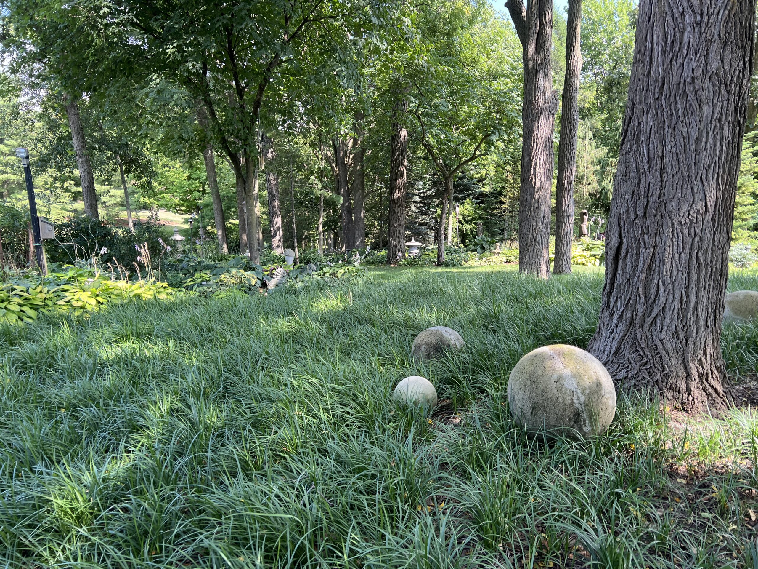
In its most basic form, a circle is a powerful and compelling shape. It has no beginning or end. The history and importance of the circle in art, engineering, music, mathematics, astronomy, design and so on dates back centuries. There is much more to the symbolism and meaning of a circle than its geometry. Very little of human endeavour does not touch on or recall the circle in some way. Every circle I design in to a landscape recalls all of that history. A circle has an aura that comes with it. Every lighted circle displayed over the winter and holiday season makes that aura visible.
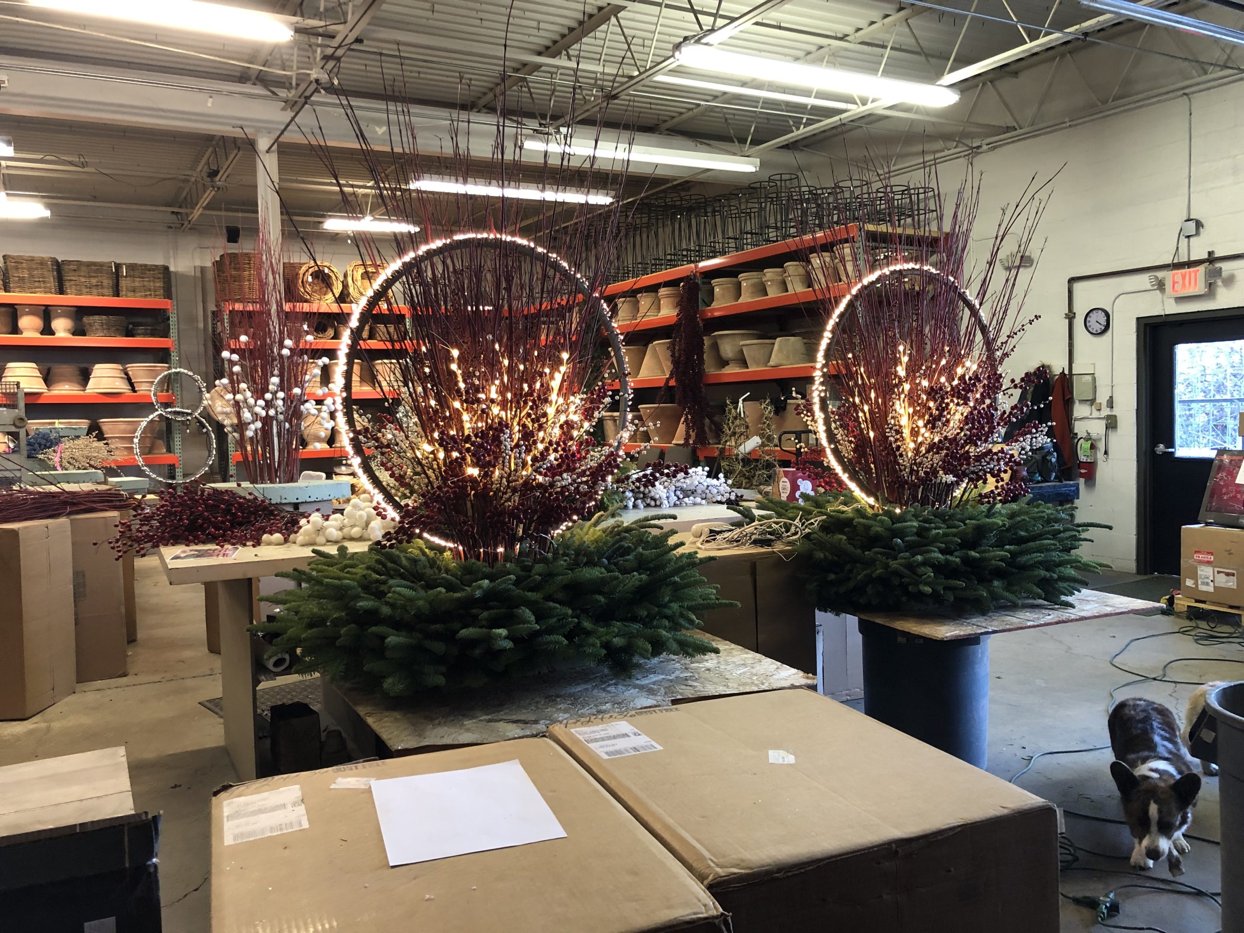
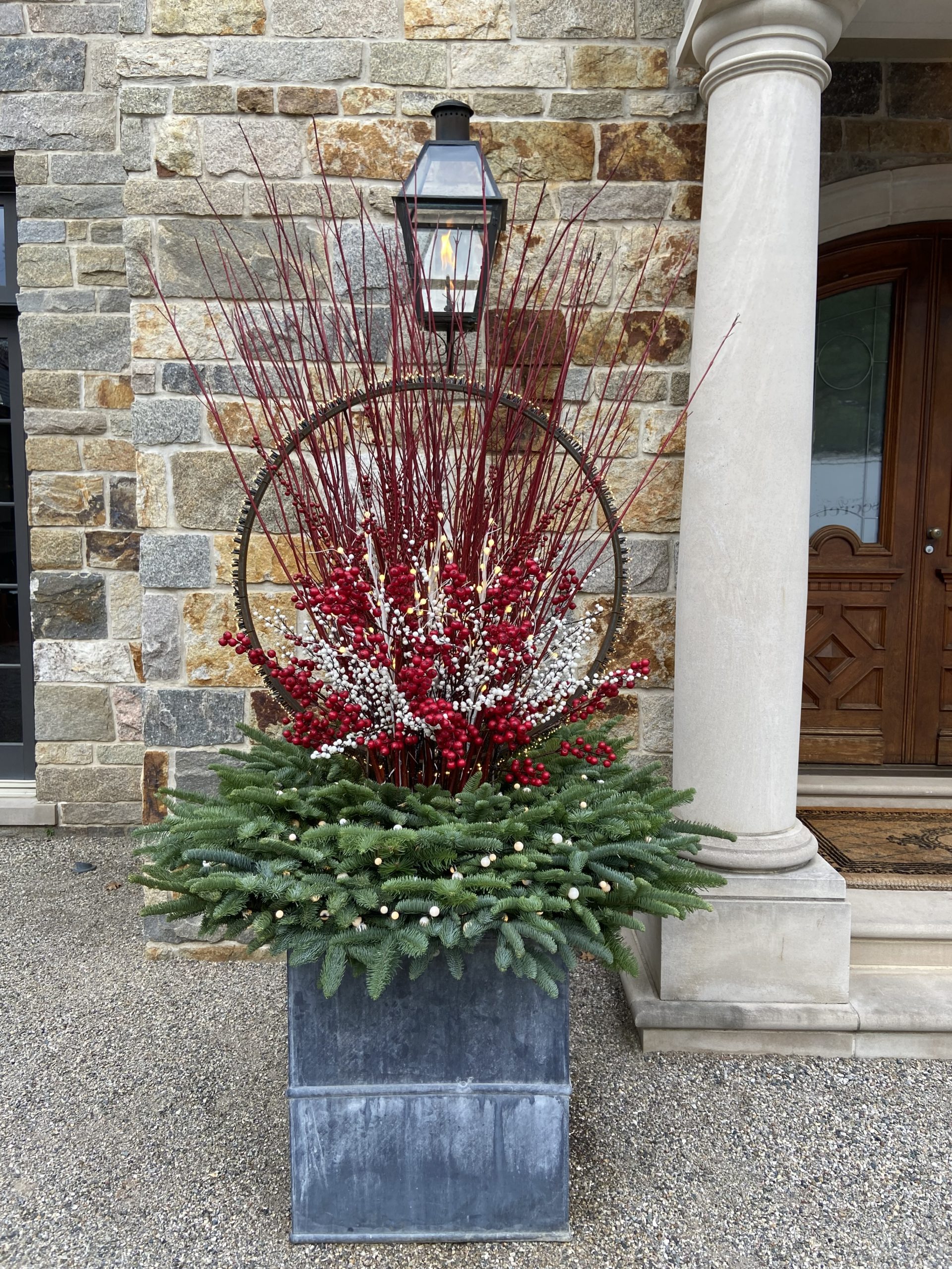
That first lighted hoop gave way to a channel steel version designed by Rob in various sizes, and manufactured for Detroit Garden Works. Later came his rather brilliant design for a spiked hoop held aloft by a steel rectangle whose four long rod steel legs could be inserted into the soil in a pot or in the ground. Lighted hoops featured in winter and holiday pots and container arrangements delighted my clients. They have become a mainstay of our winter season. Soon we were shipping the lighted rings all over the country. I was so pleased to see our gardening clientele coming to Detroit Garden Works to shop for materials for that 4th season. The winter.
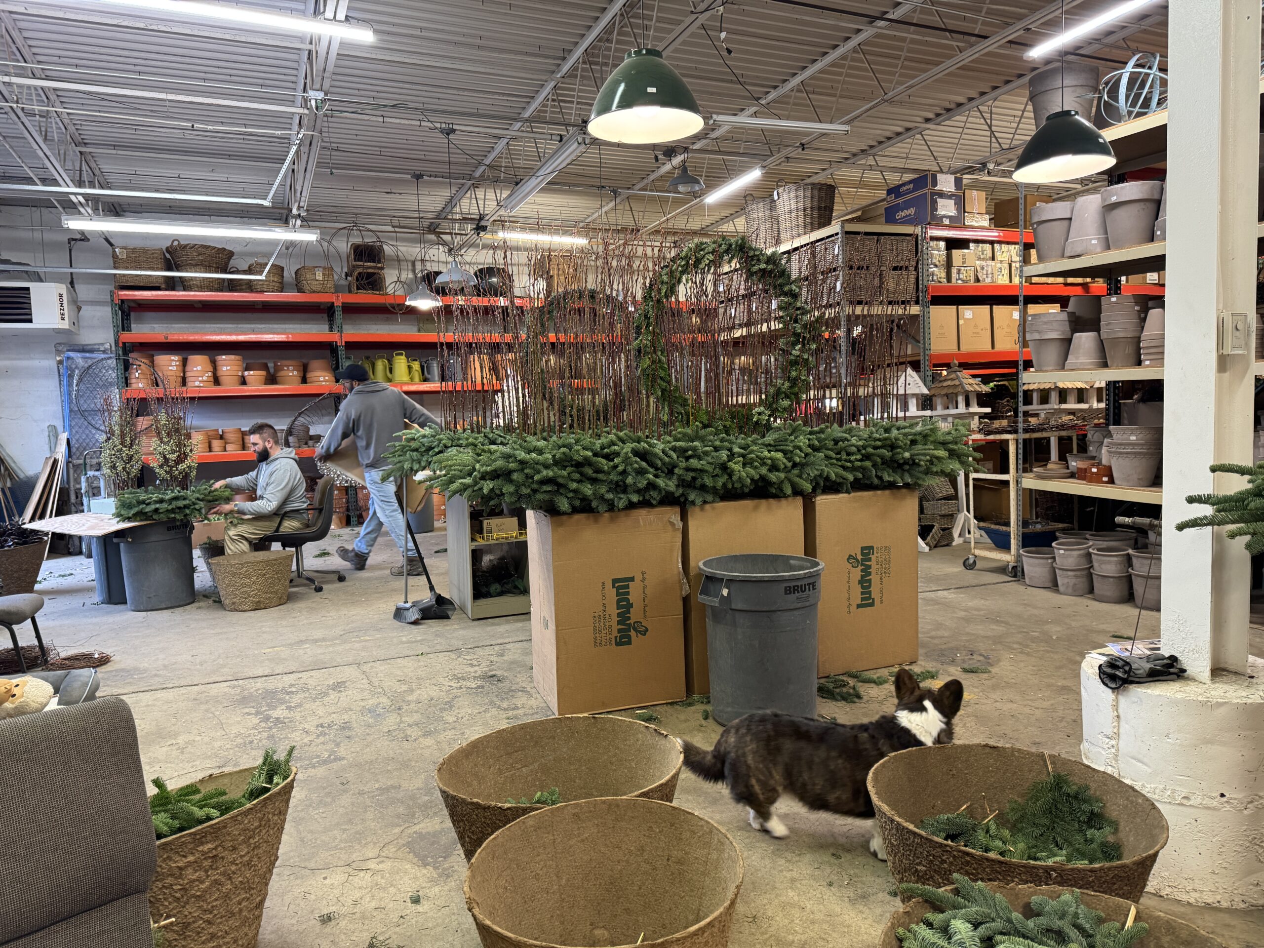
Those original hanging light rings from years ago did a brave job of keeping the dreary part of the winter at bay. The dark part, that is. Having moved the design and construction of our winter container arrangements indoors means we have time to study on the design and construction. The time constraints of the winter container season is an invitation to hurry. Hurried work can look hurried. So we have had some time to study on those light rings, and think about how else we could use them. Or what we could add to them.
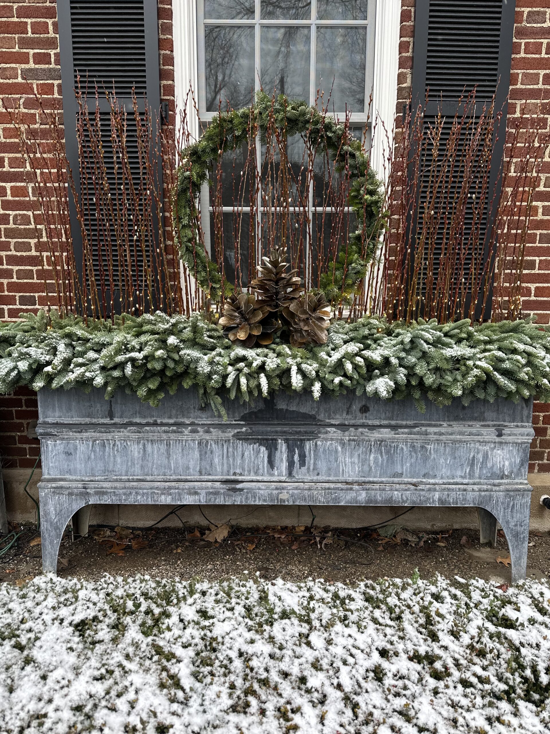
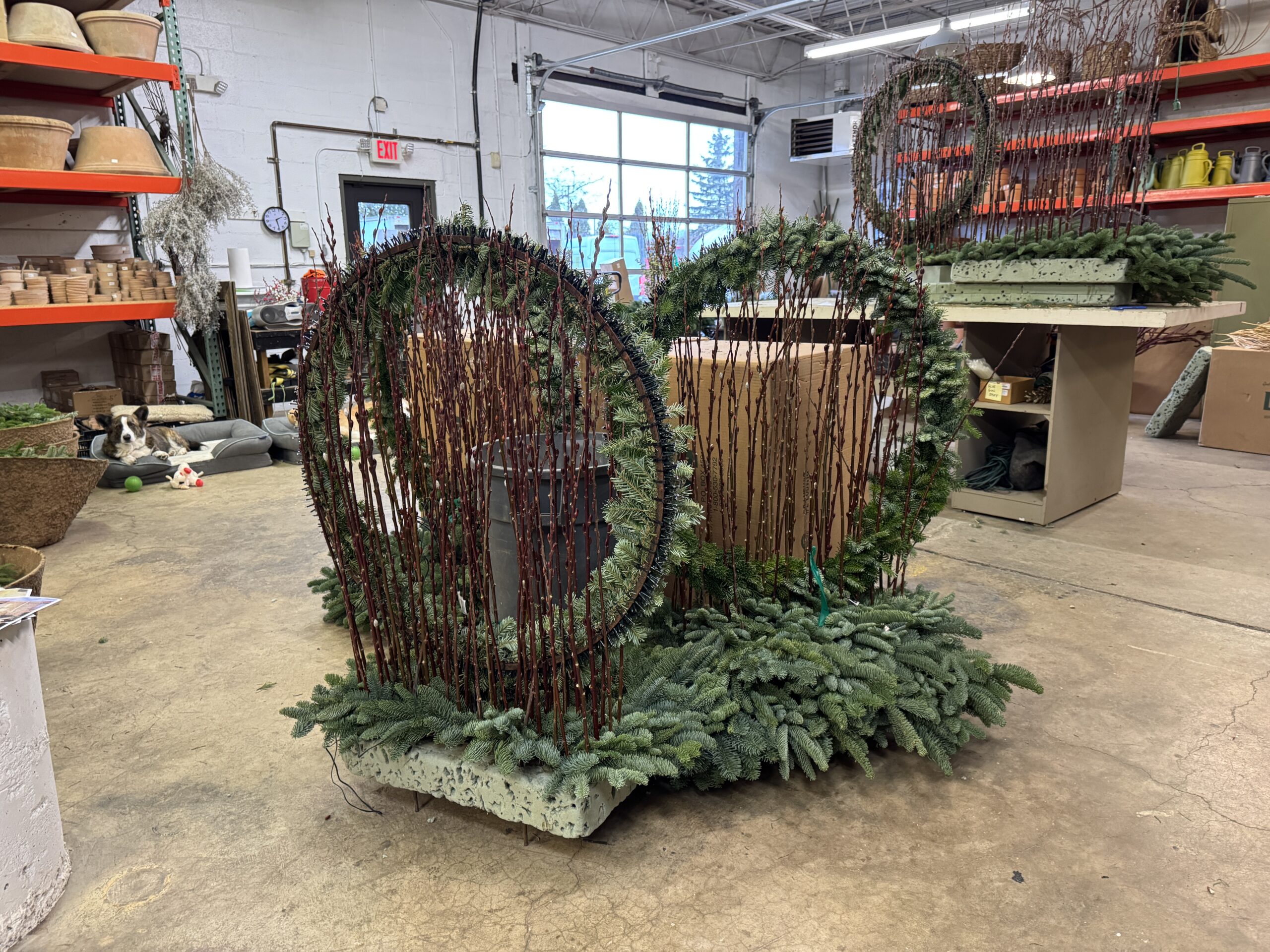
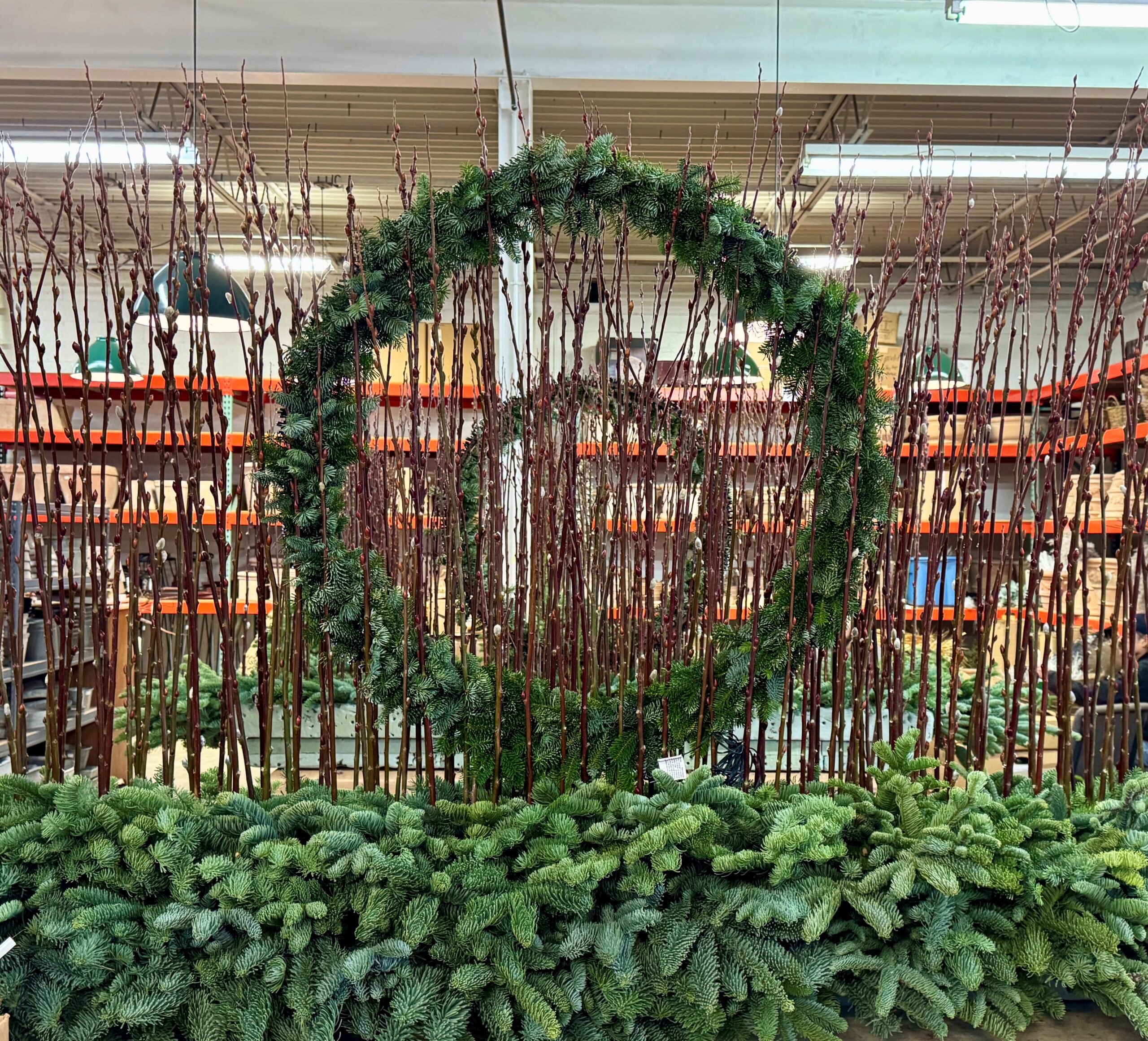
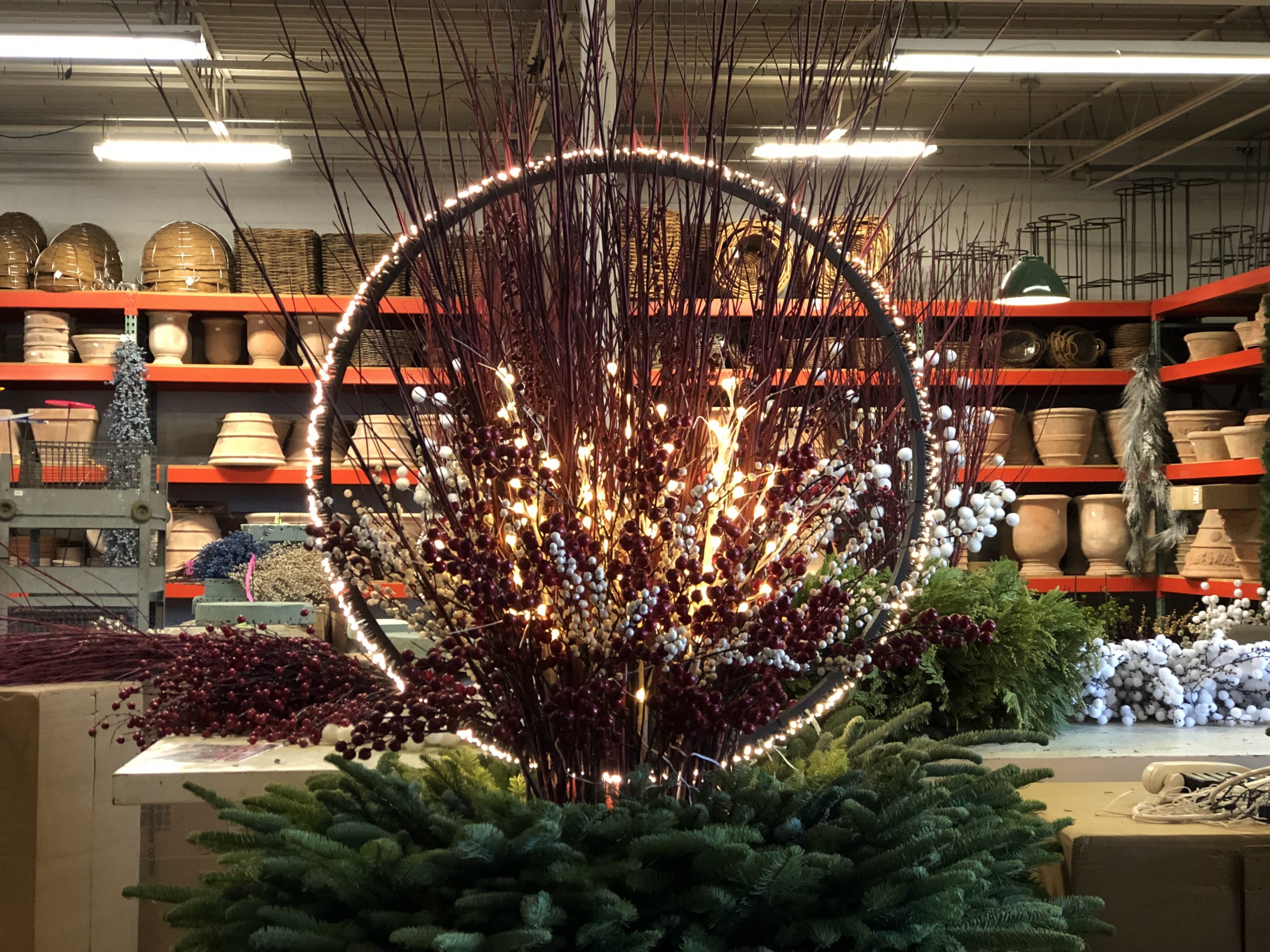
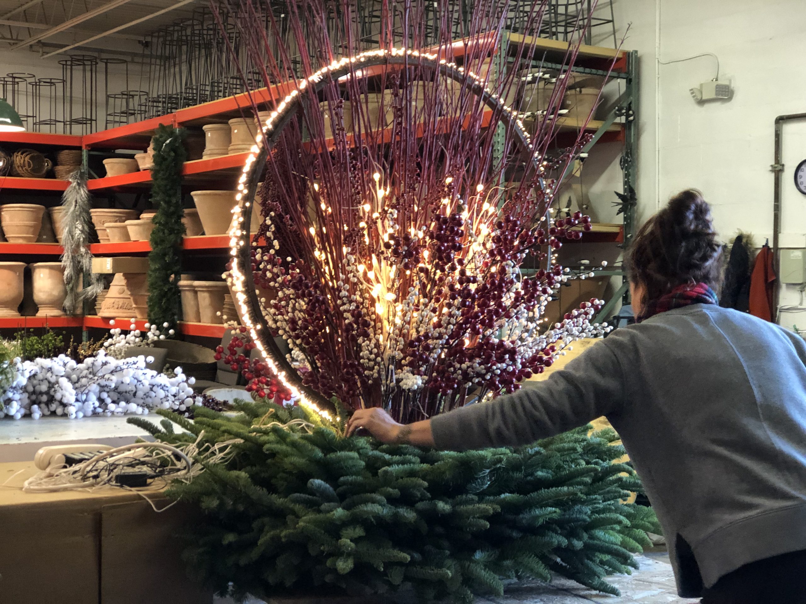
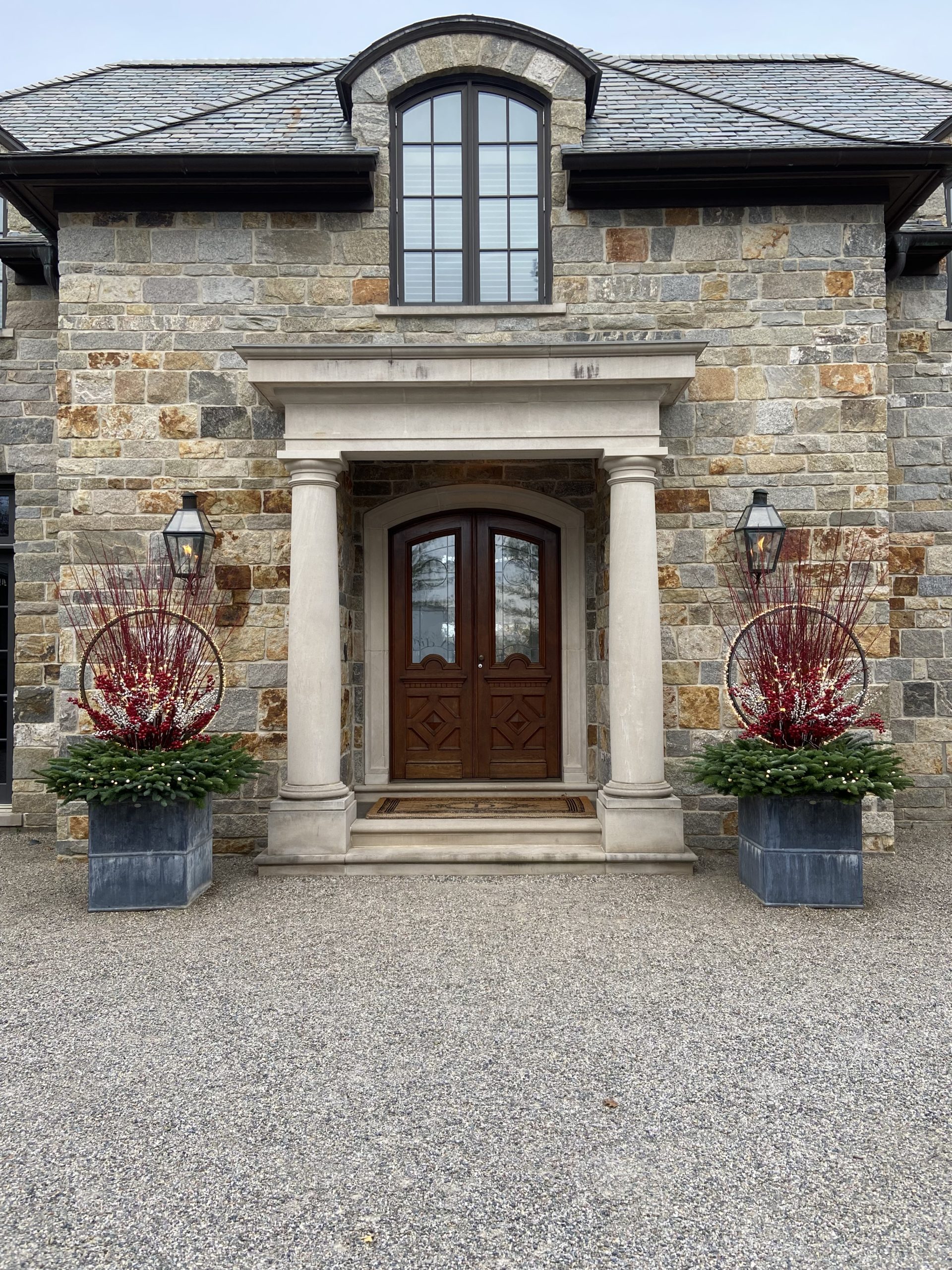
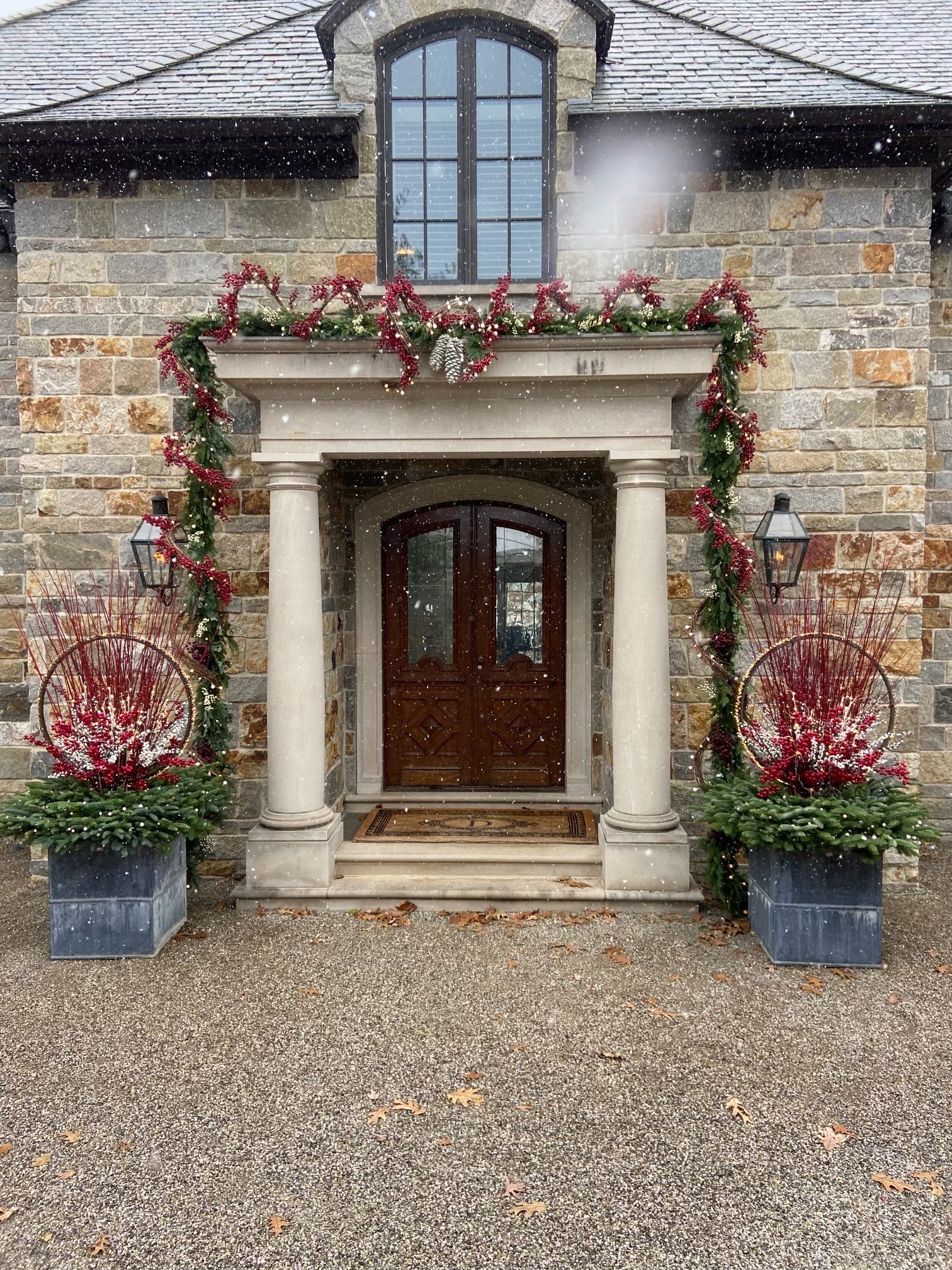
It was inevitable that given enough time and exposure, we would start to tinker with that basic light ring. Maybe a different style of light would change things up. Perhaps the ring could be a structure – an armature upon which something else beautiful and sculptural could be built. For this project, the lighted ring was lined with a diminutive evergreen garland that would connect that steel circle visually with the evergreens populating the box. The circle is stronger, and is a more important part of the composition, given the additional emphasis that the garland provides. The trio of over scaled steel pine cones that Rob had sourced overseas anchors the ring to the ground plane of the box.
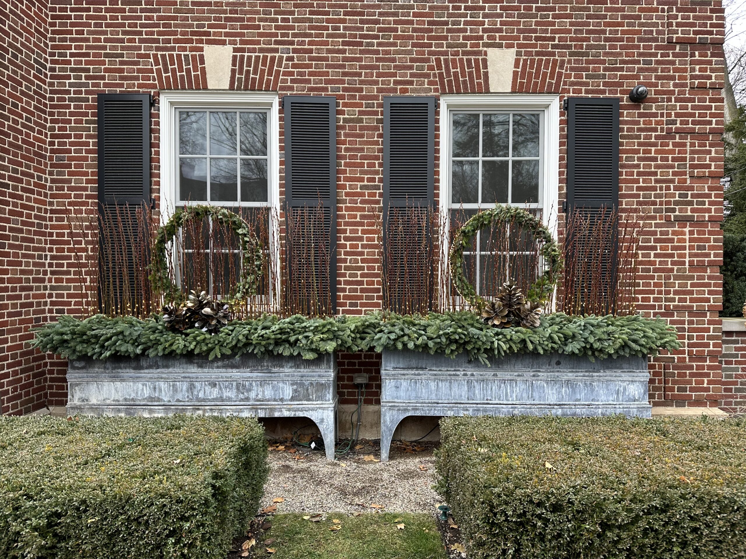
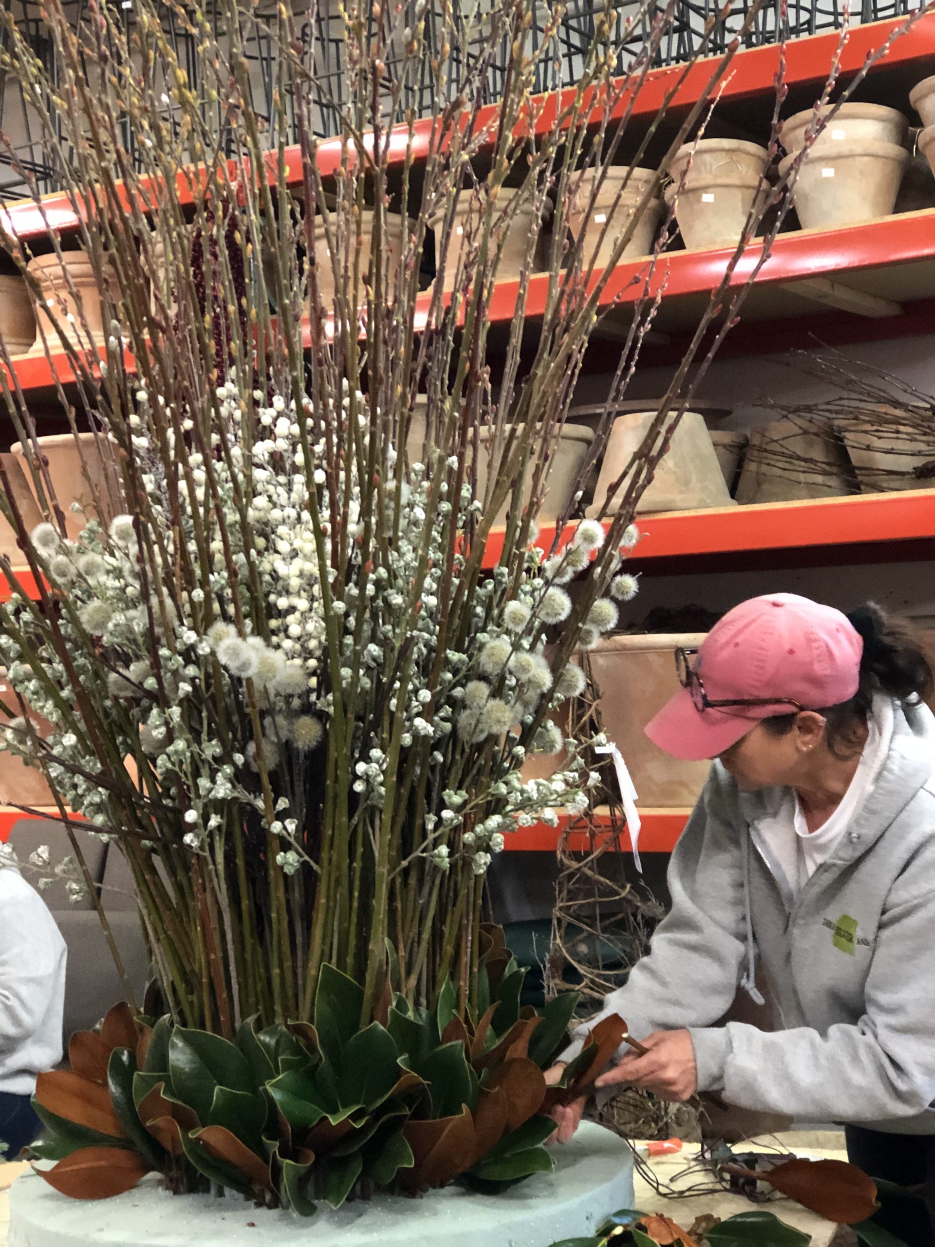
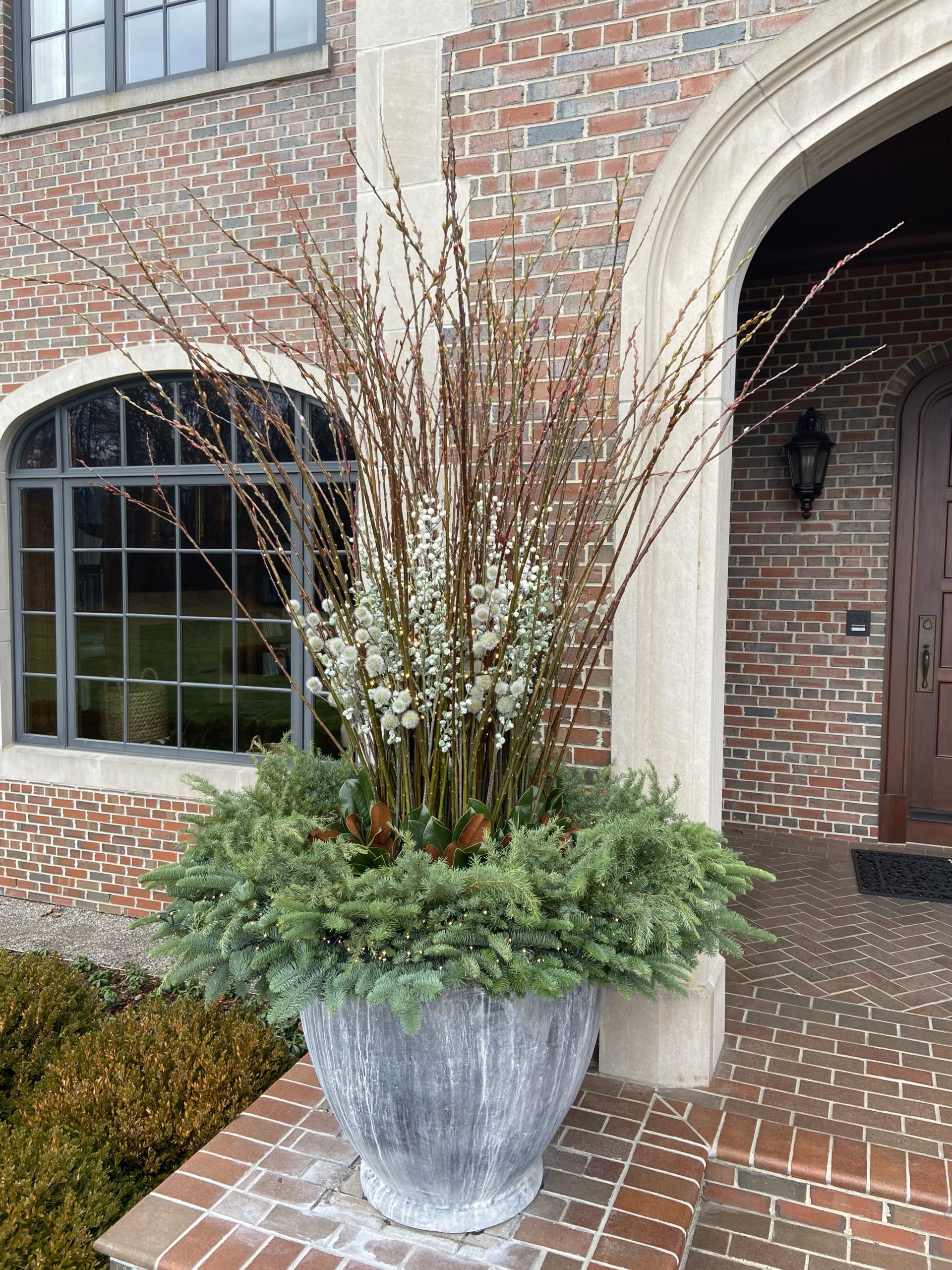
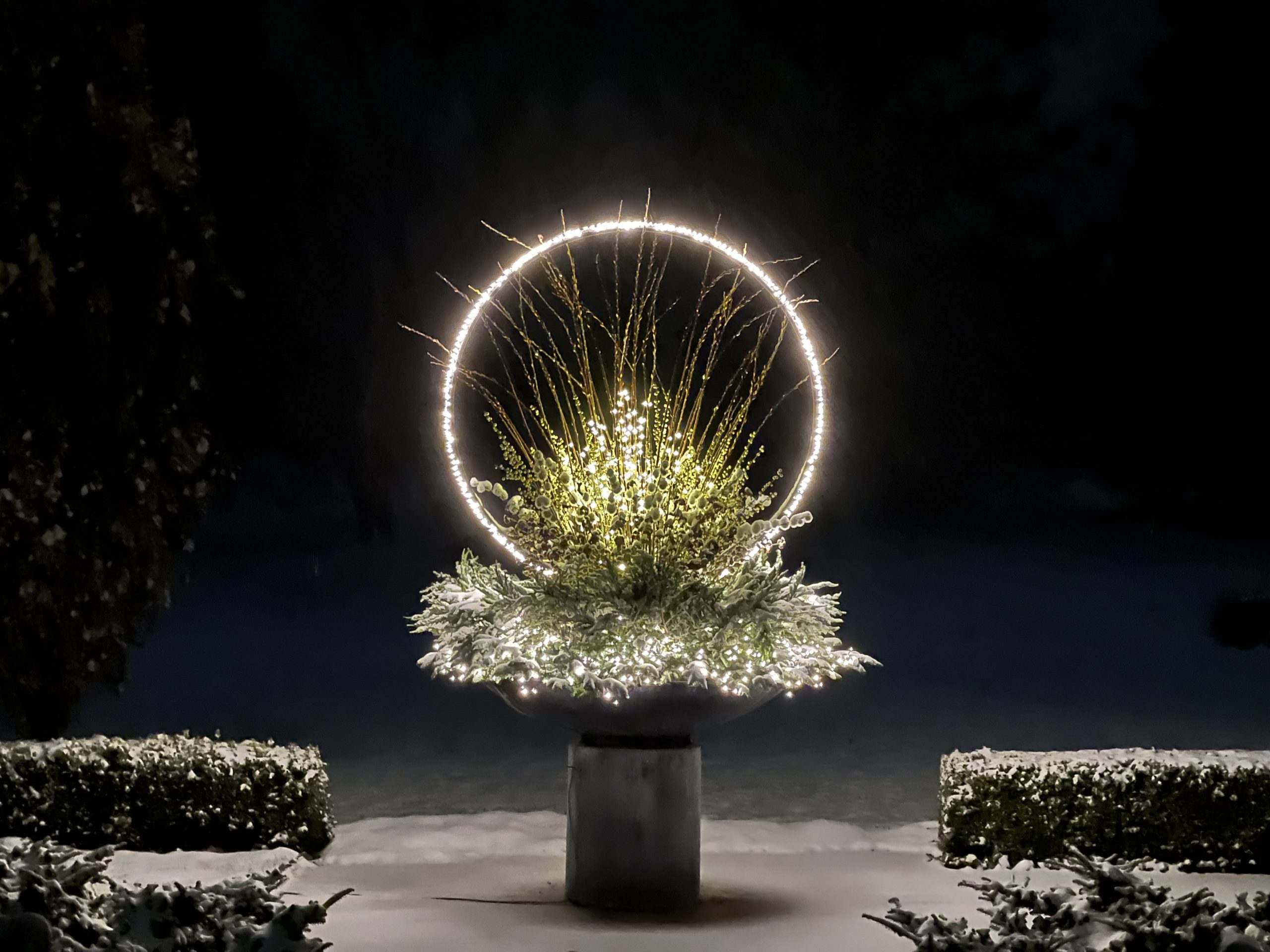
Each of the four light rings are immersed in alternating rows of red bud pussy willow stems. Two fingers between each branch is how we space them. That thicket softens the geometry of the circle. It provides some mystery. The mass of them soften the light shining back into the windows. The twigs, and greens surrounding them suggest a garden environment – similar to and reminiscent of those places outdoors that gardeners treasure. Needless to say, I have clients that keep their light rings powered up all year round. Given how little power the LED lights draw, there is no reason not to enjoy them all winter long.
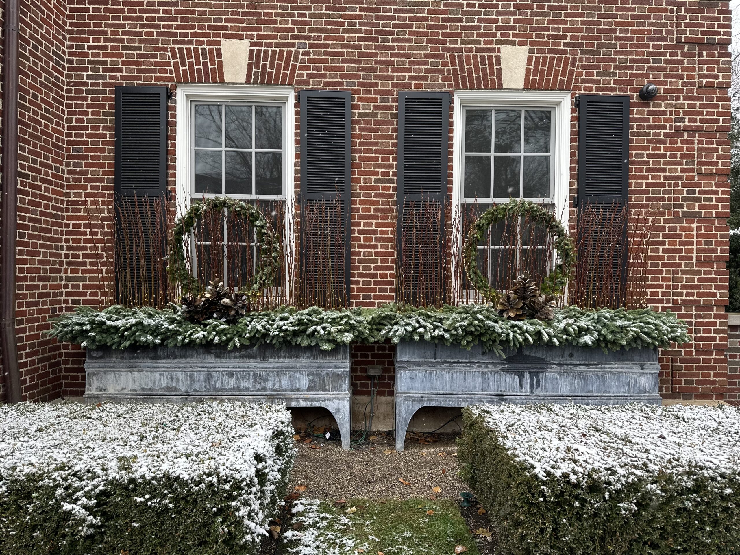
Whether the weather obliges with one inch or 10 inches of snow, the rings will keep beaming.
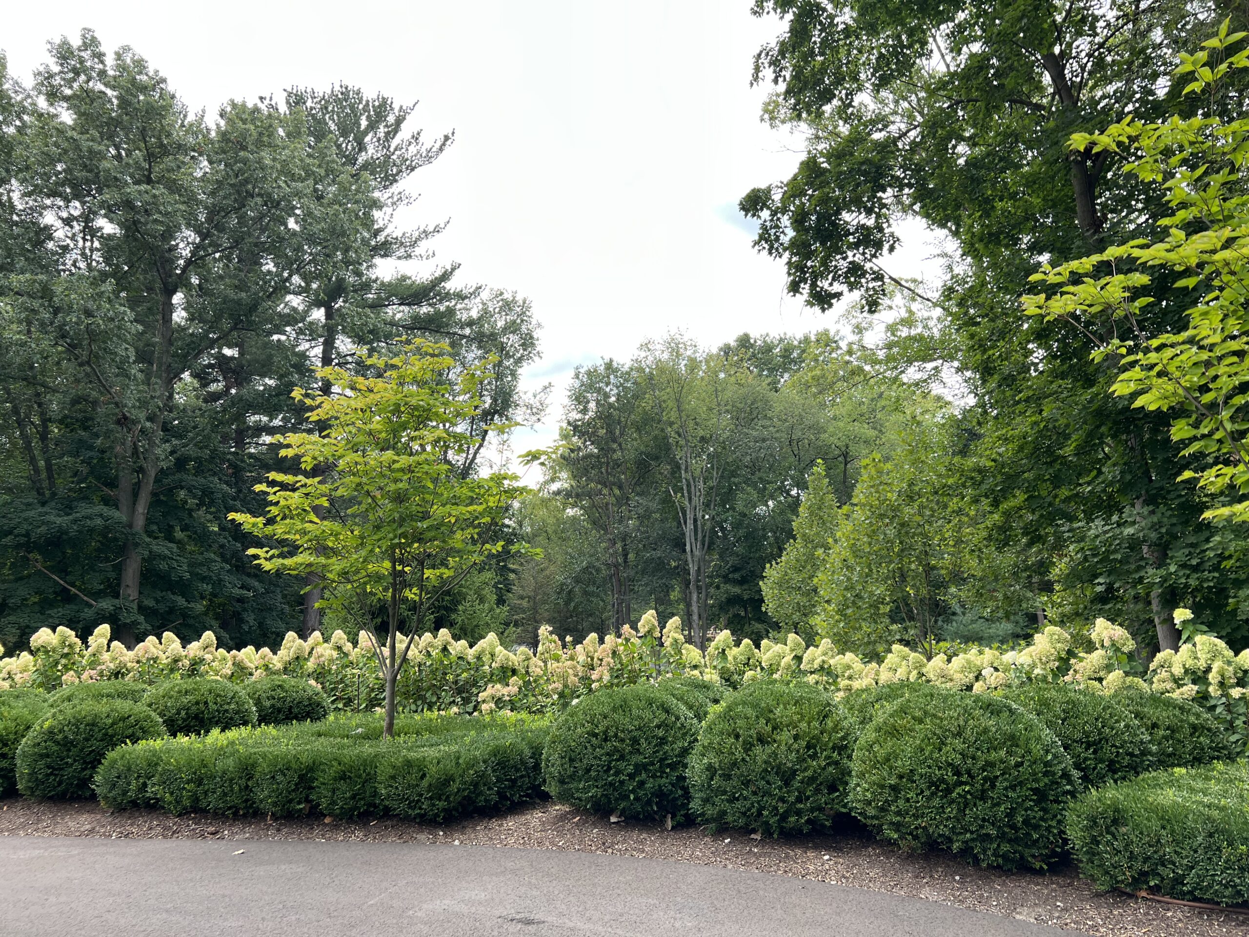
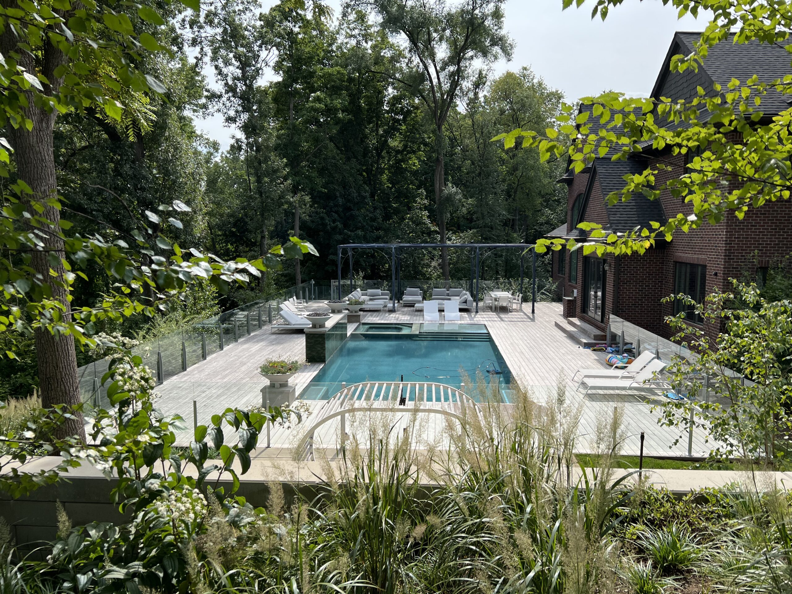
 I am not posting any pictures of the fountain garden. Better that you see it in person. It is completely and shockingly different than it once was. Everything has a life span, including a landscape and garden. This part of my landscape has only been in 2 years.
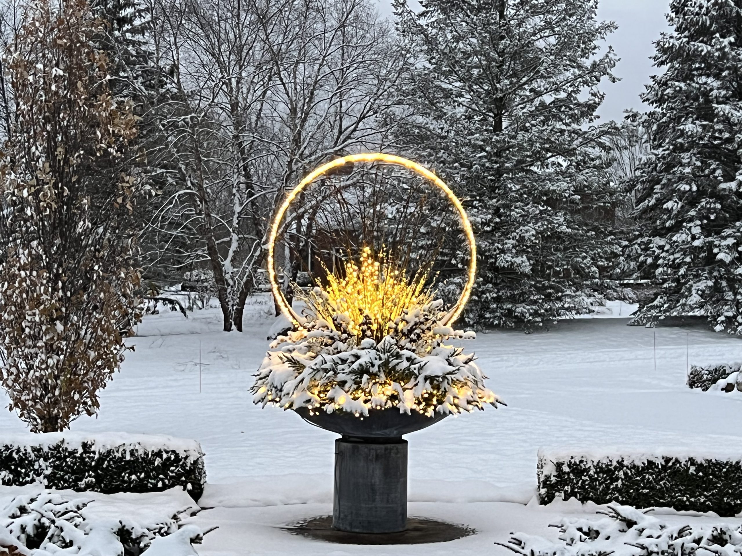
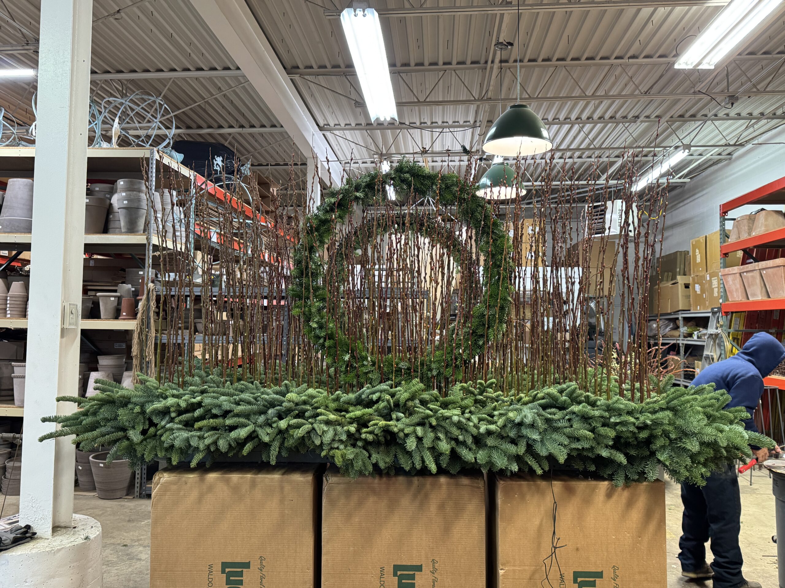
 This picture reveals the look of the light ring from the side. We frequently make a separate foam form for the light ring, which will sit on top of the form that holds the greens. This makes for an easy installation of the light ring. Barely visible at the bottom is the triangular steel armature for the ring. This form is incredibly strong and stable.
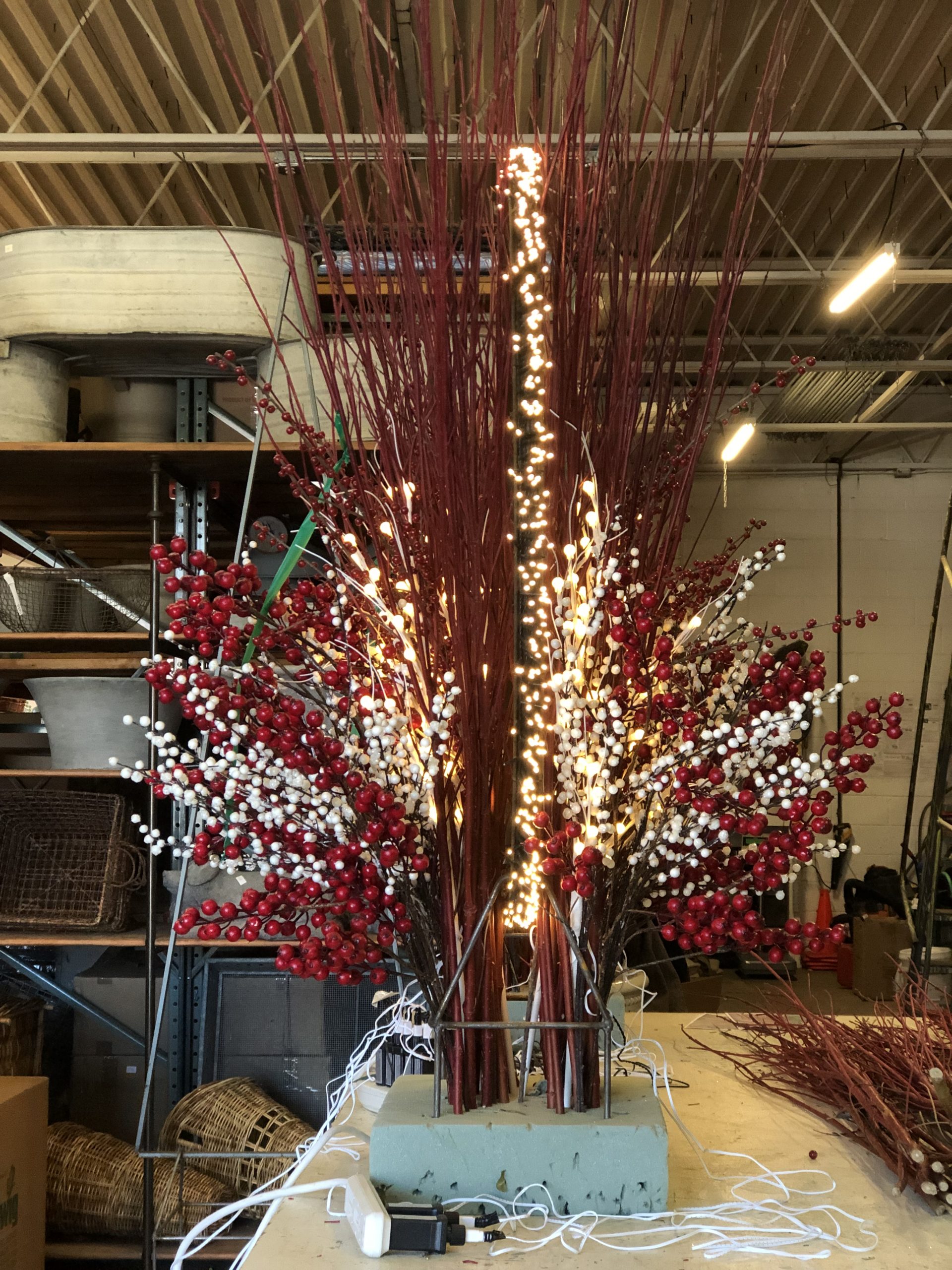
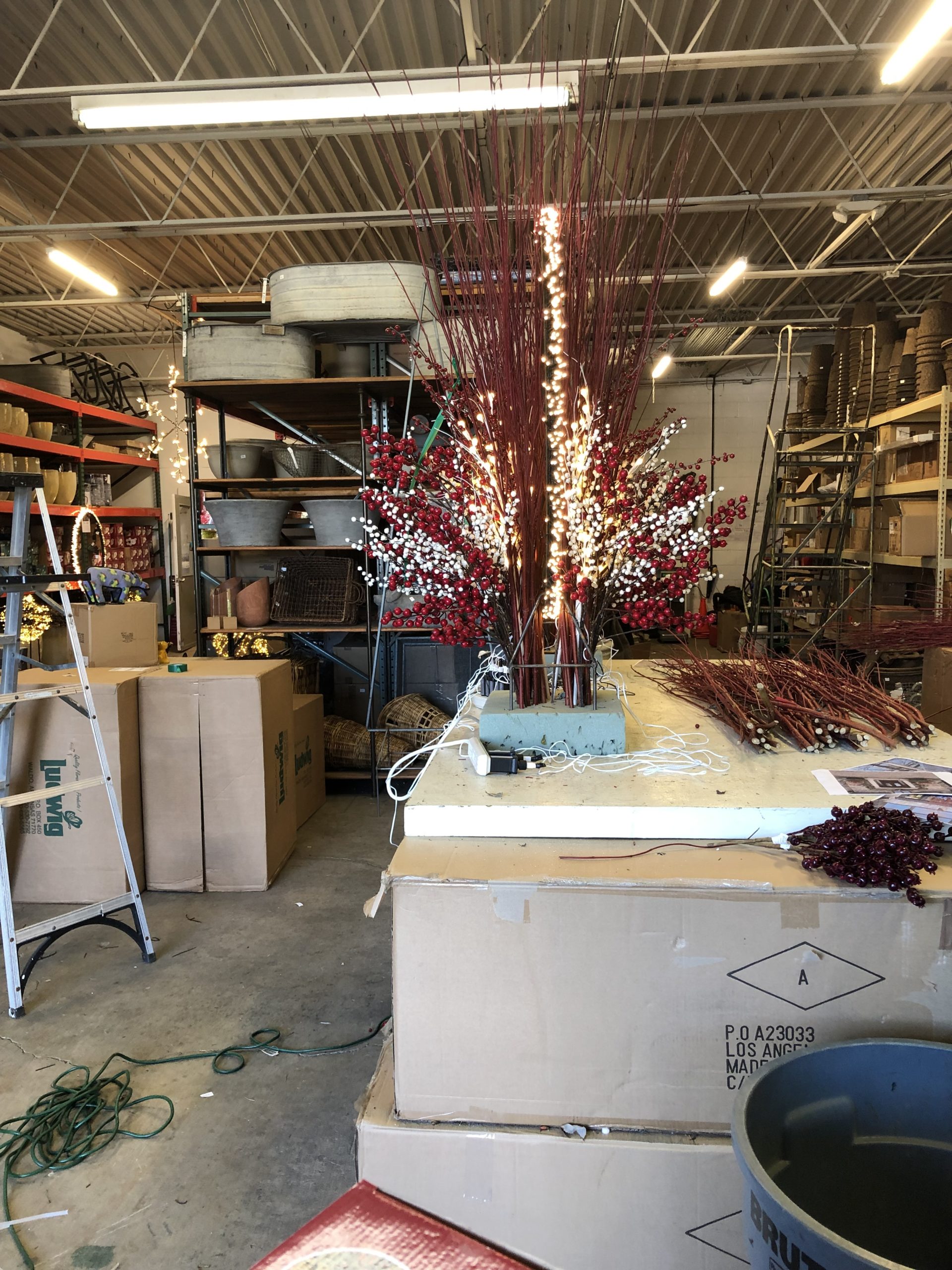
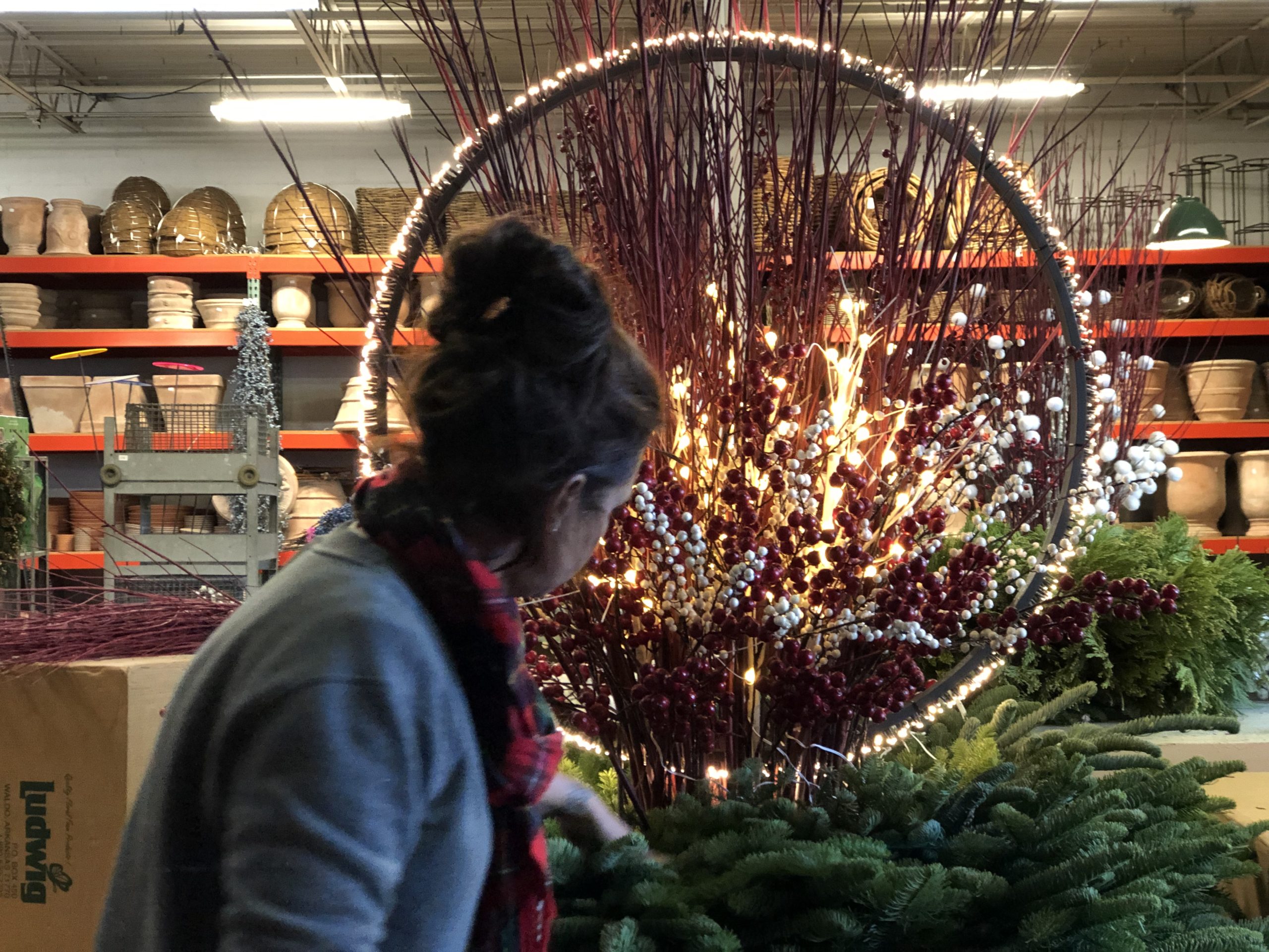 Though the twigs, picks light sticks look wonderfully chaotic, the process of assembling them so all the elements are evenly and brightly lit asks for a focused hand.
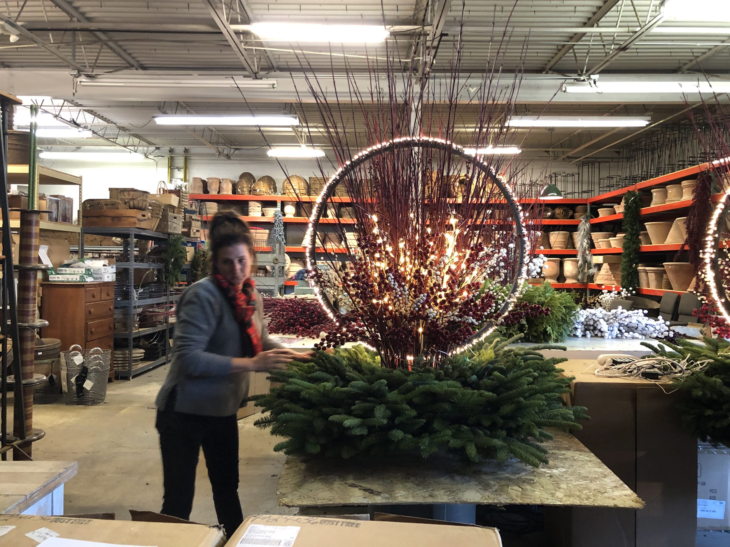
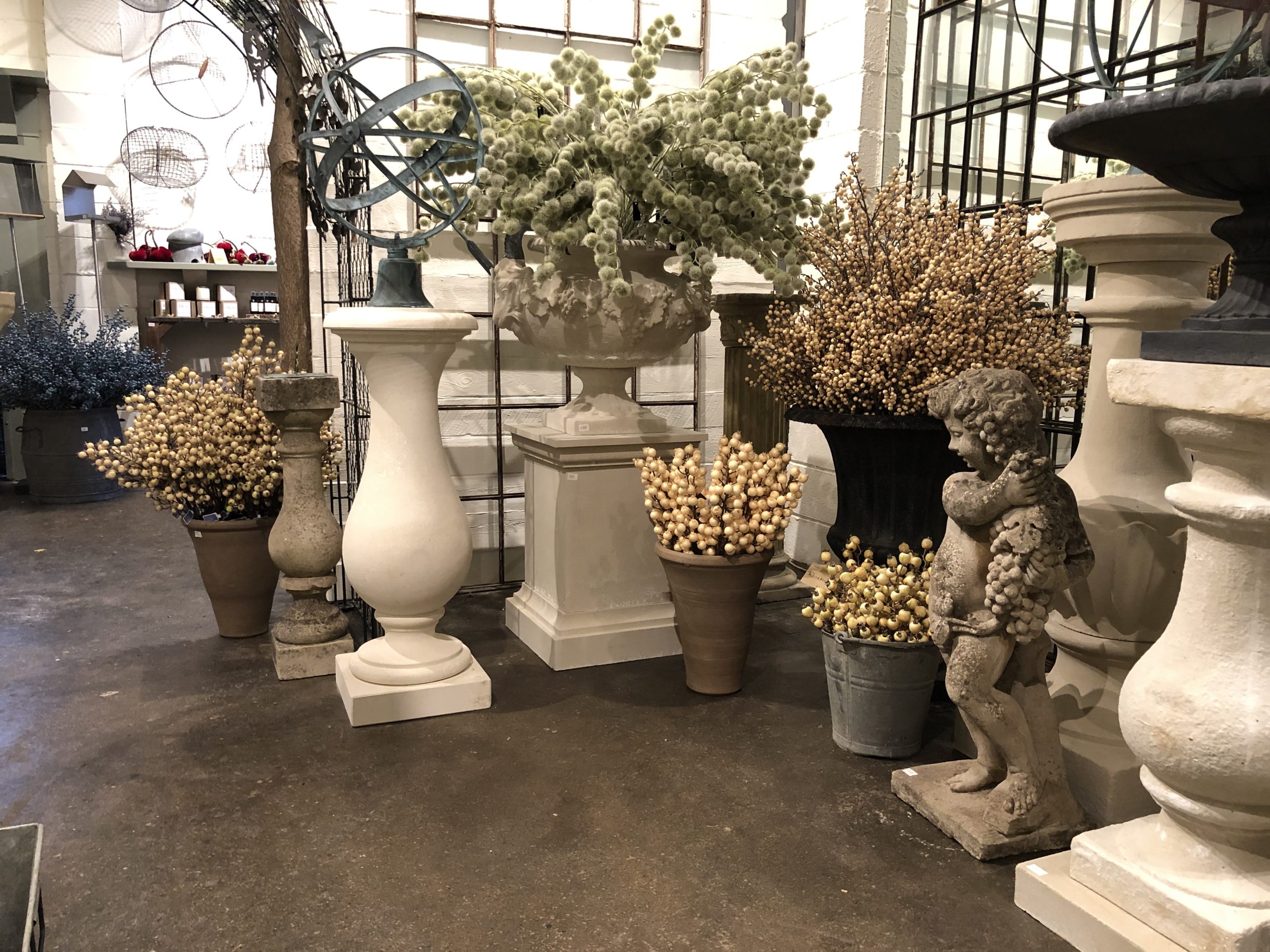
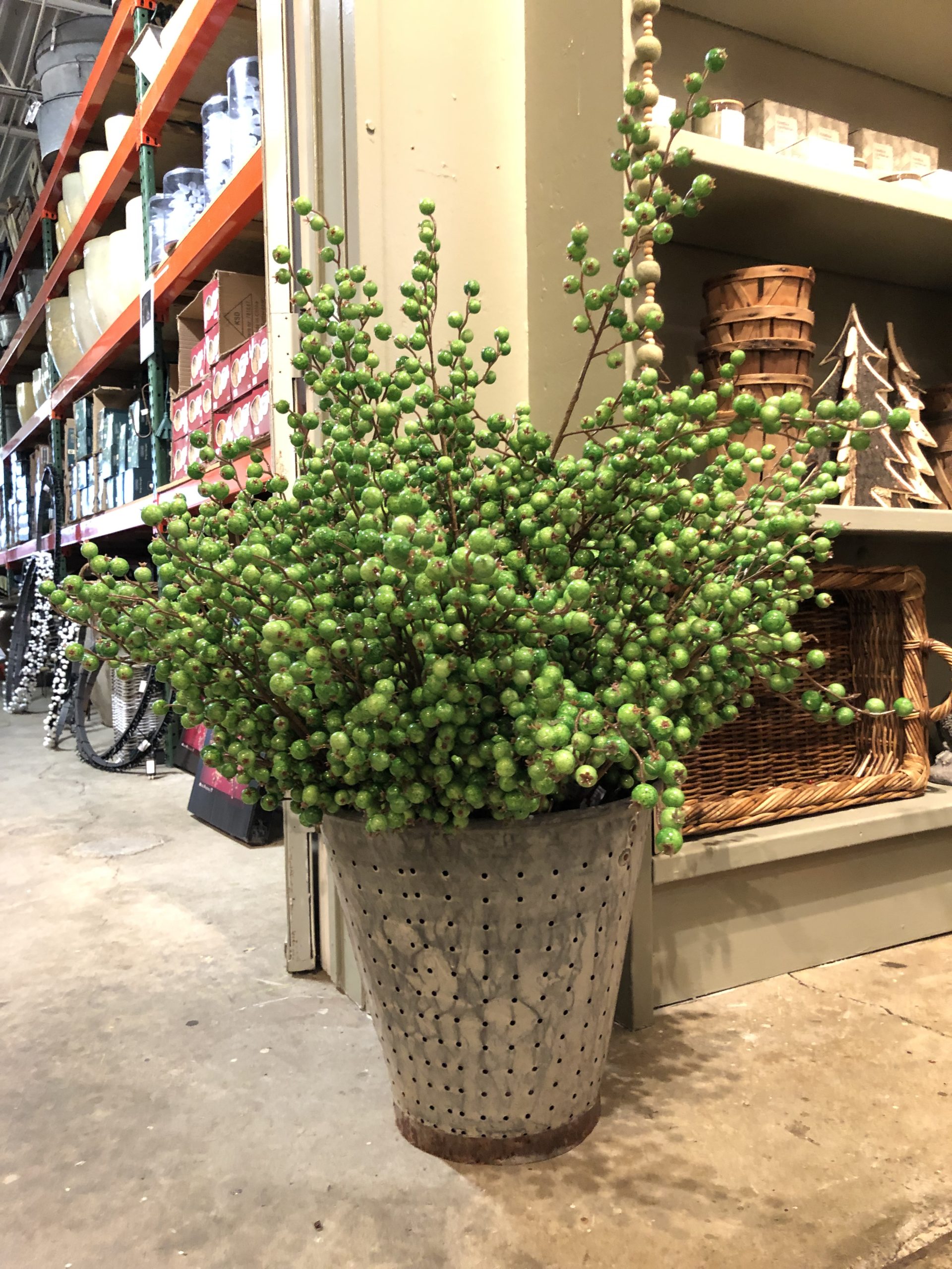
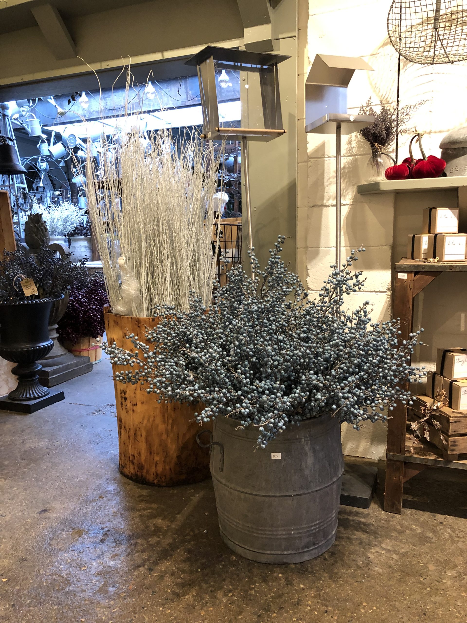
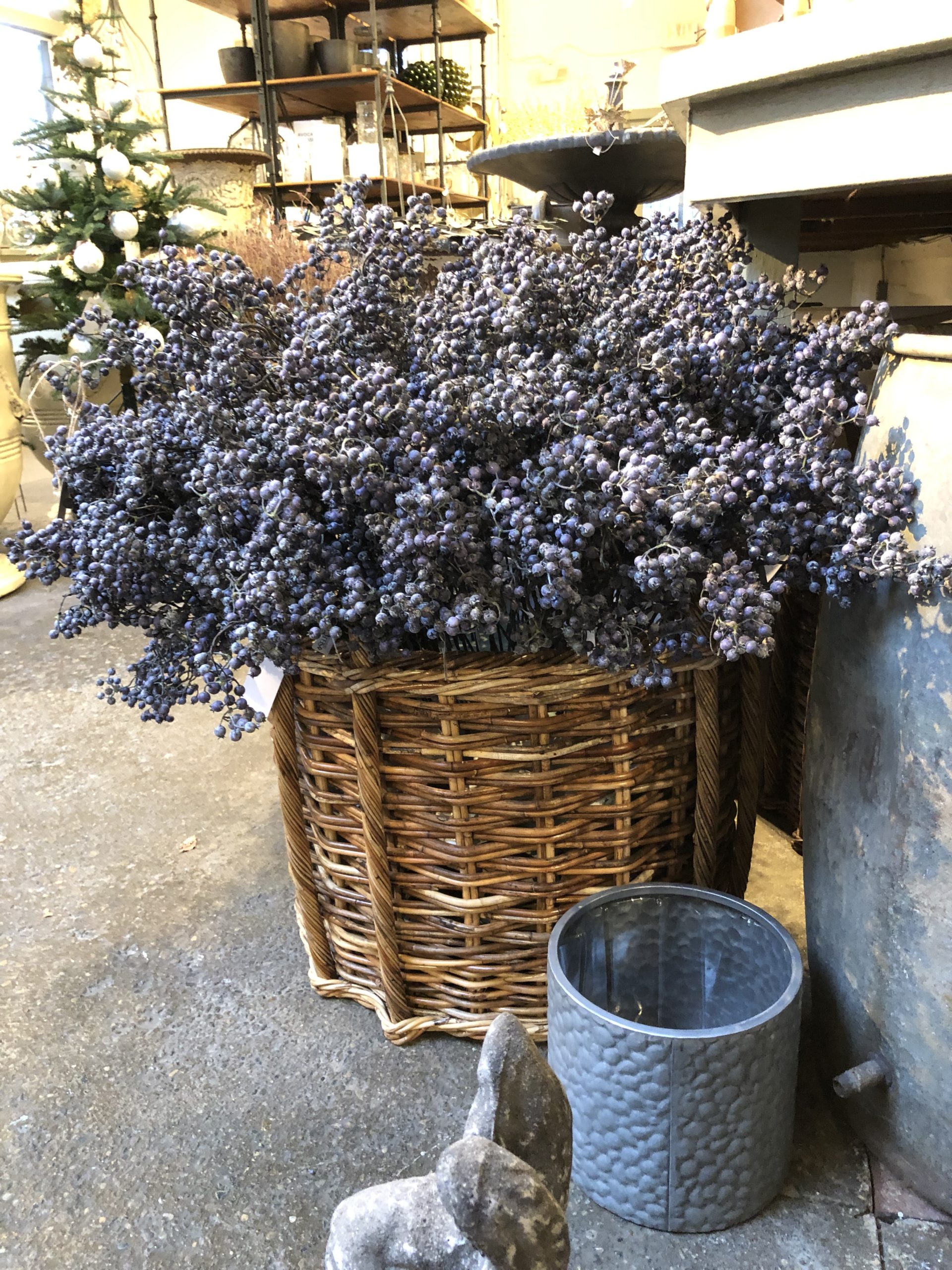
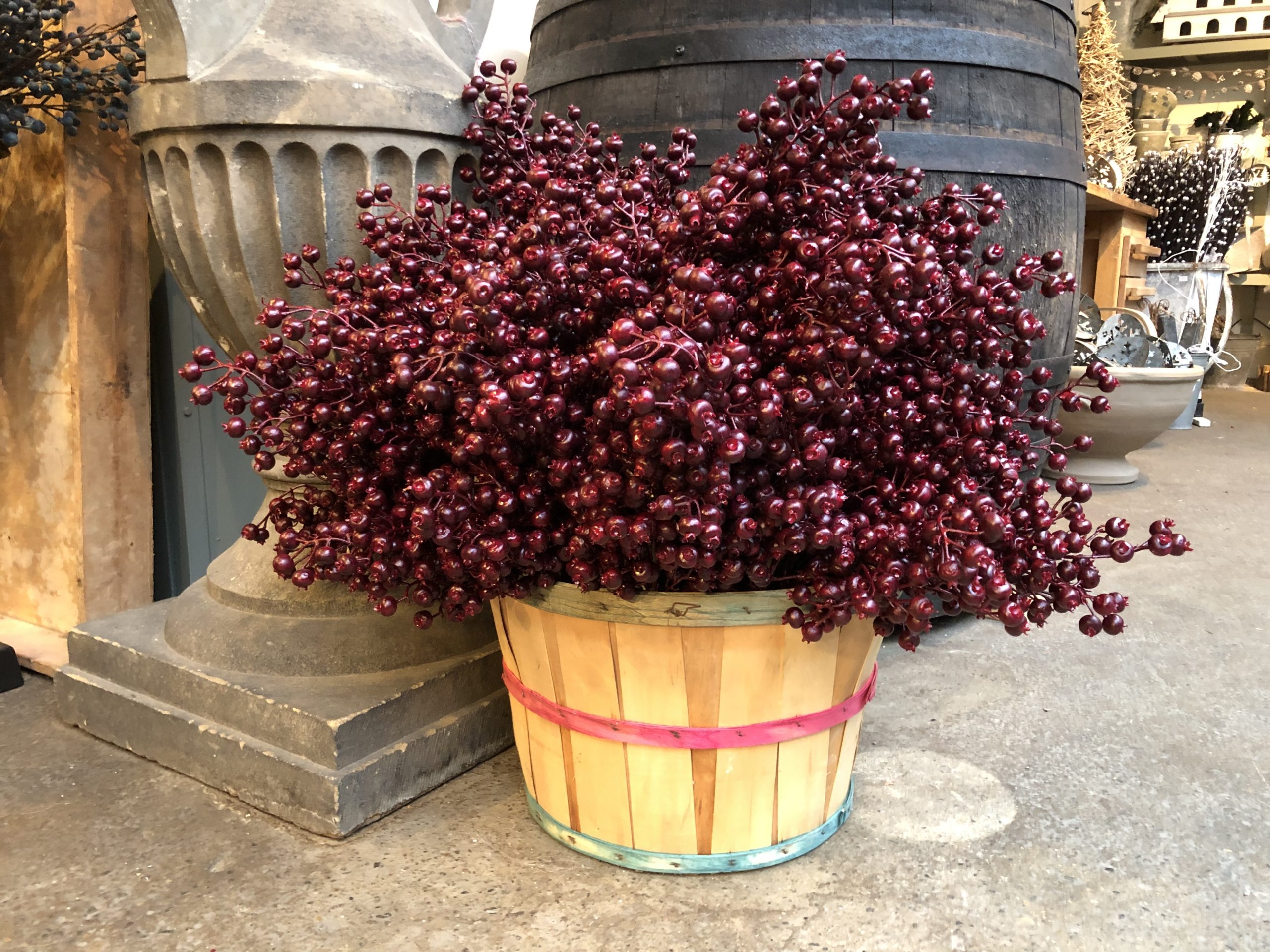
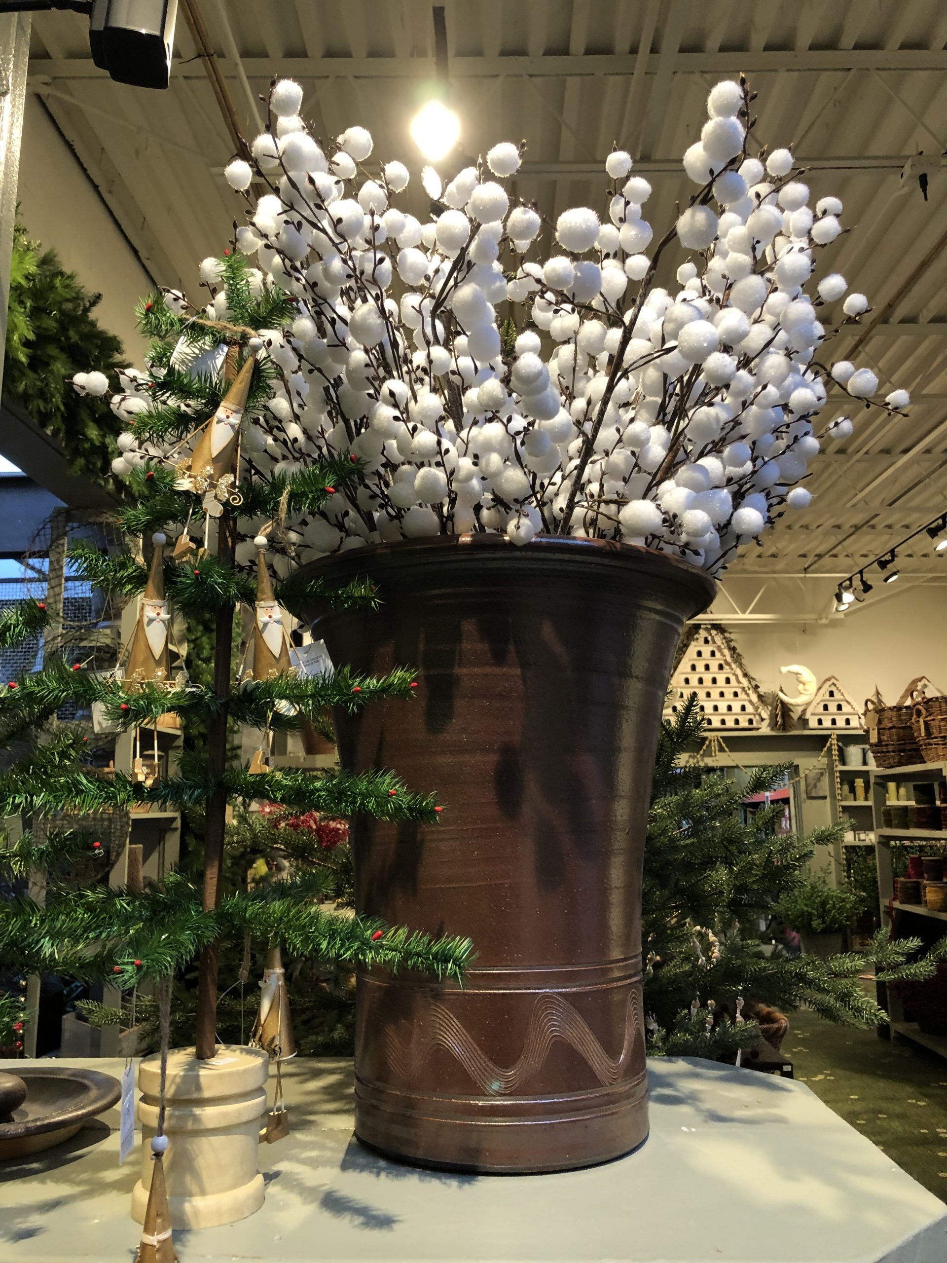
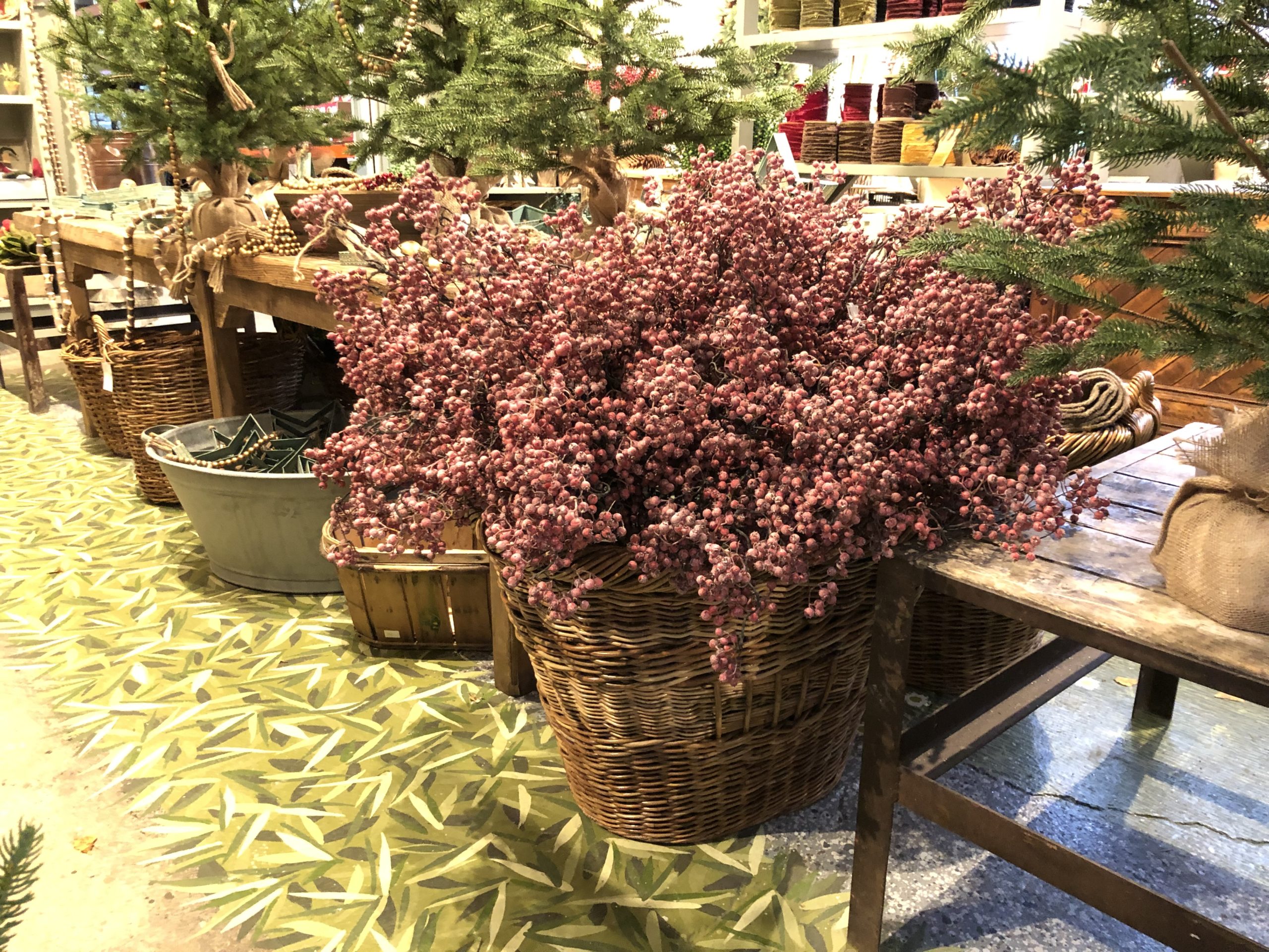
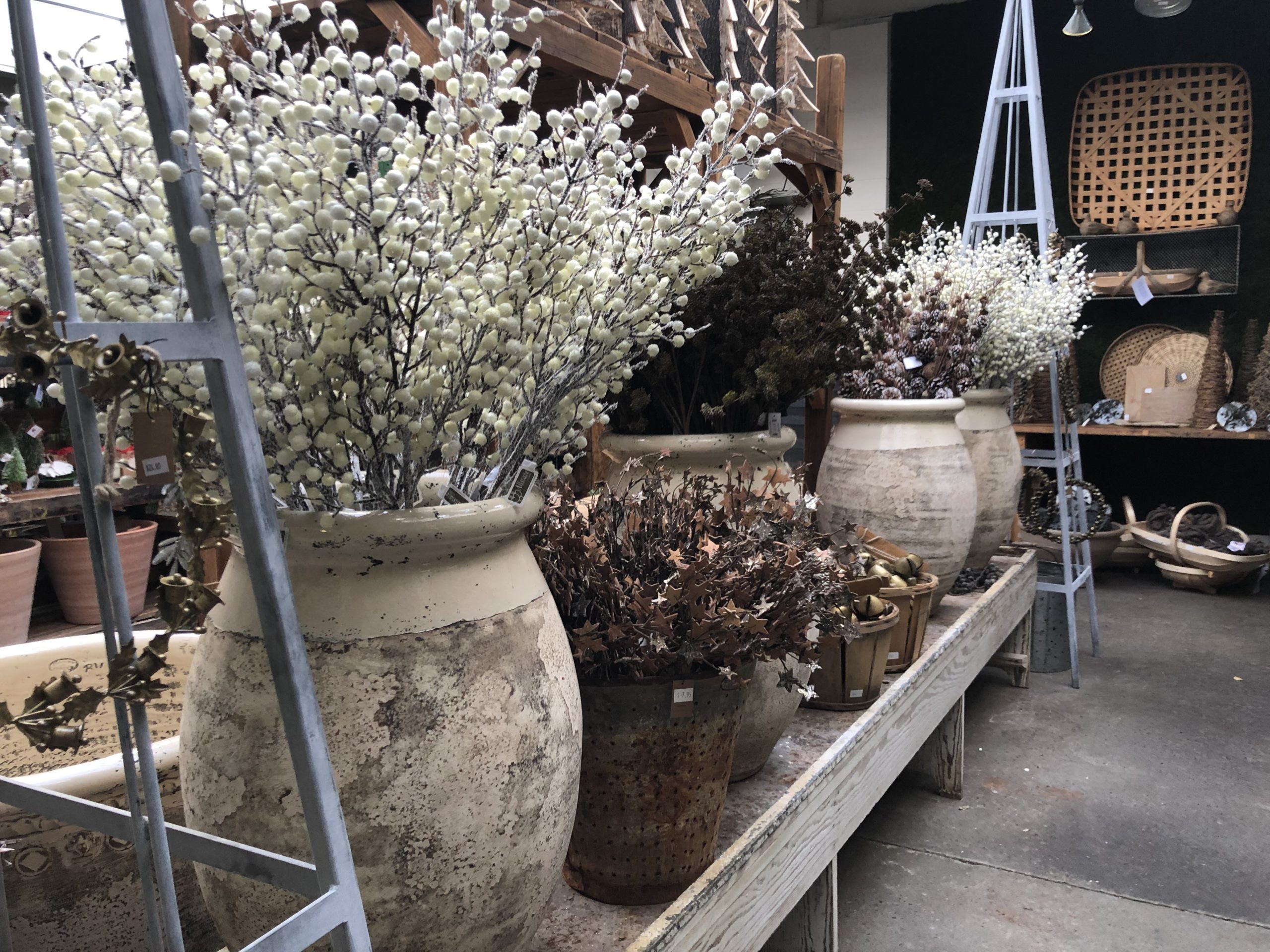
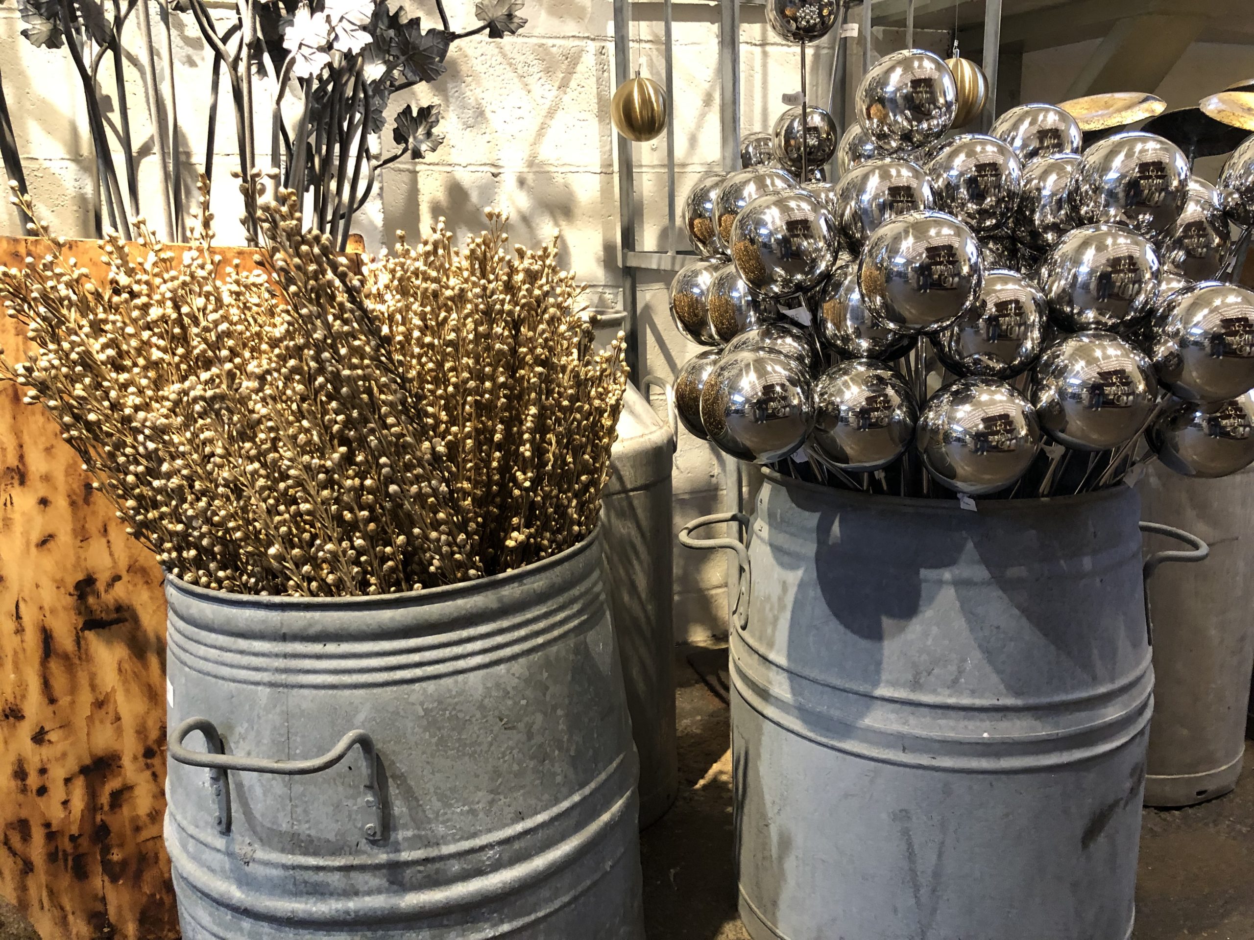
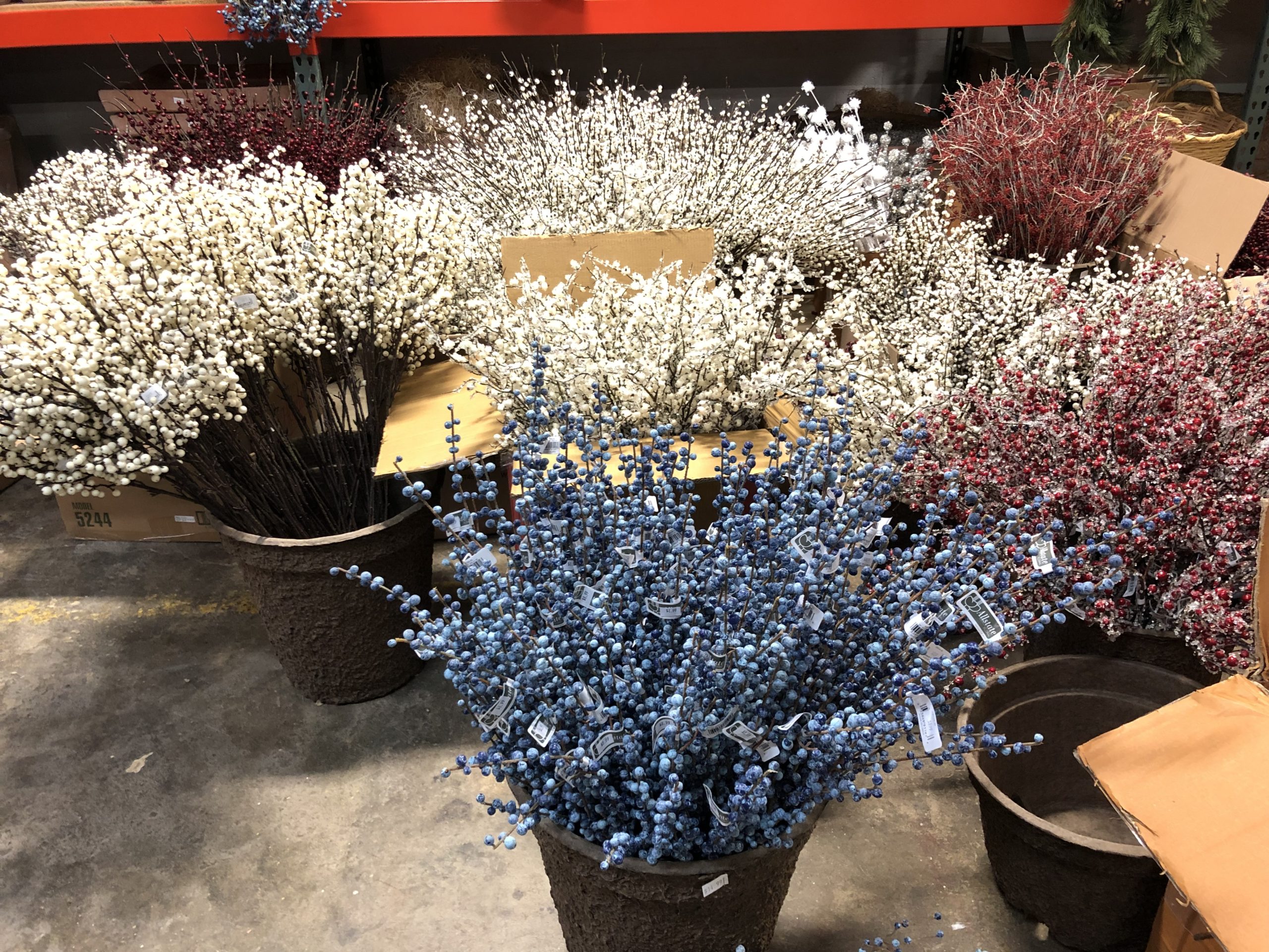
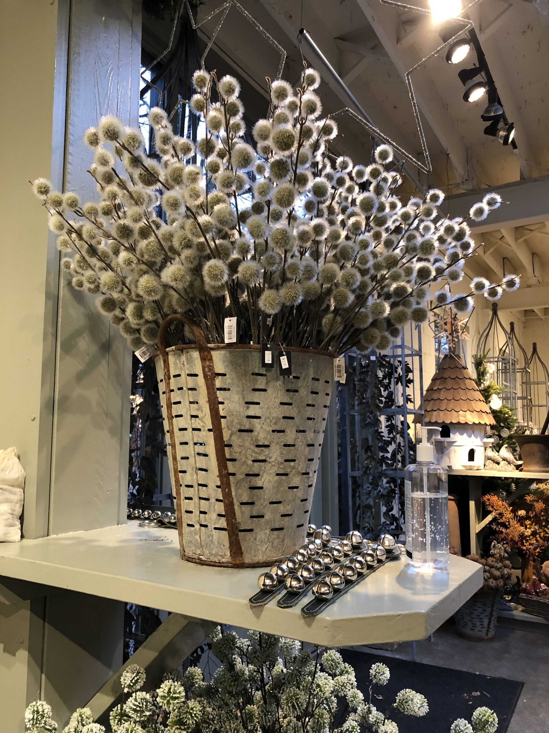
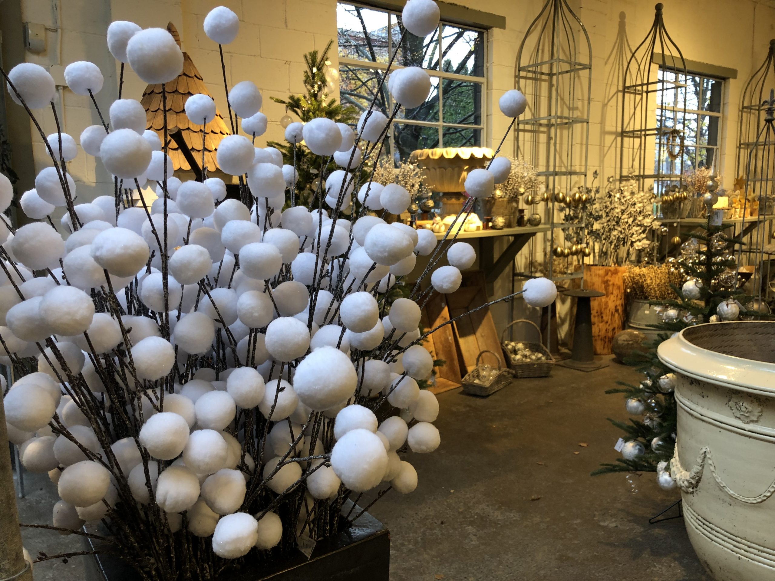 Ordering materials for containers on line or from a print catalogue is incredibly difficult. I have tried it, and I have had plenty of materials delivered that were not great. As in, did I buy this, no kidding??? I have tried to avoid shopping on line. I shopped the holiday and winter materials in person with Rob for 5 or 6 years. I liked being able to hold a pick in my hand. I could see the color. I could assess what its durability would be in a container. I could see the finished height-and the width. I could see how it would read. I could see how the shape, mass, and color would work with other elements under consideration. I could see what picks would be investment caliber, and which would be a one season fling. My shopping days are over now. I am happy to turn over the shopping for the winter season materials to Rob and Sunne. I have confidence that their choices will work for a wide range of my projects. And I respect and am intrigued by what materials they chooses from their own individual aesthetic. It is up to me to put what they buy together in such a way that my clients feel their taste is represented. If you are thinking that my design for holiday and winter container arrangements is fueled by beautiful materials- you are right.