Given that there are 3 primary colors, and three secondary colors, and infinite possible combinations and permutations of those 6 colors, makes the topic of color a big one. Have you ever tried to pick a color for a room from 10,00 paint chips? I will admit I buy a lot of quarts to try before I commit to gallons of a color. Understanding and working with color is hard. Annual and tropical plants provide a level and longevity of color I do not get from my trees, shrubs and perennials. It could very well be that the reason that I so love container plantings is that they enable me to explore the element of color-over and over again. The relationship of one color to another, or a color scheme, is of interest to me as a garden designer. Planting annuals is the best way to try a color scheme on-before you commit to it in the landscape. Explaining why certain color combinations are attractive, interesting is not so easy. Pictures make things easier. This dark red nicotiana pops when it is paired with a contrasting color, and when it is placed so the light shines through the petals. This scheme-electrically charged by the rays of the sun.
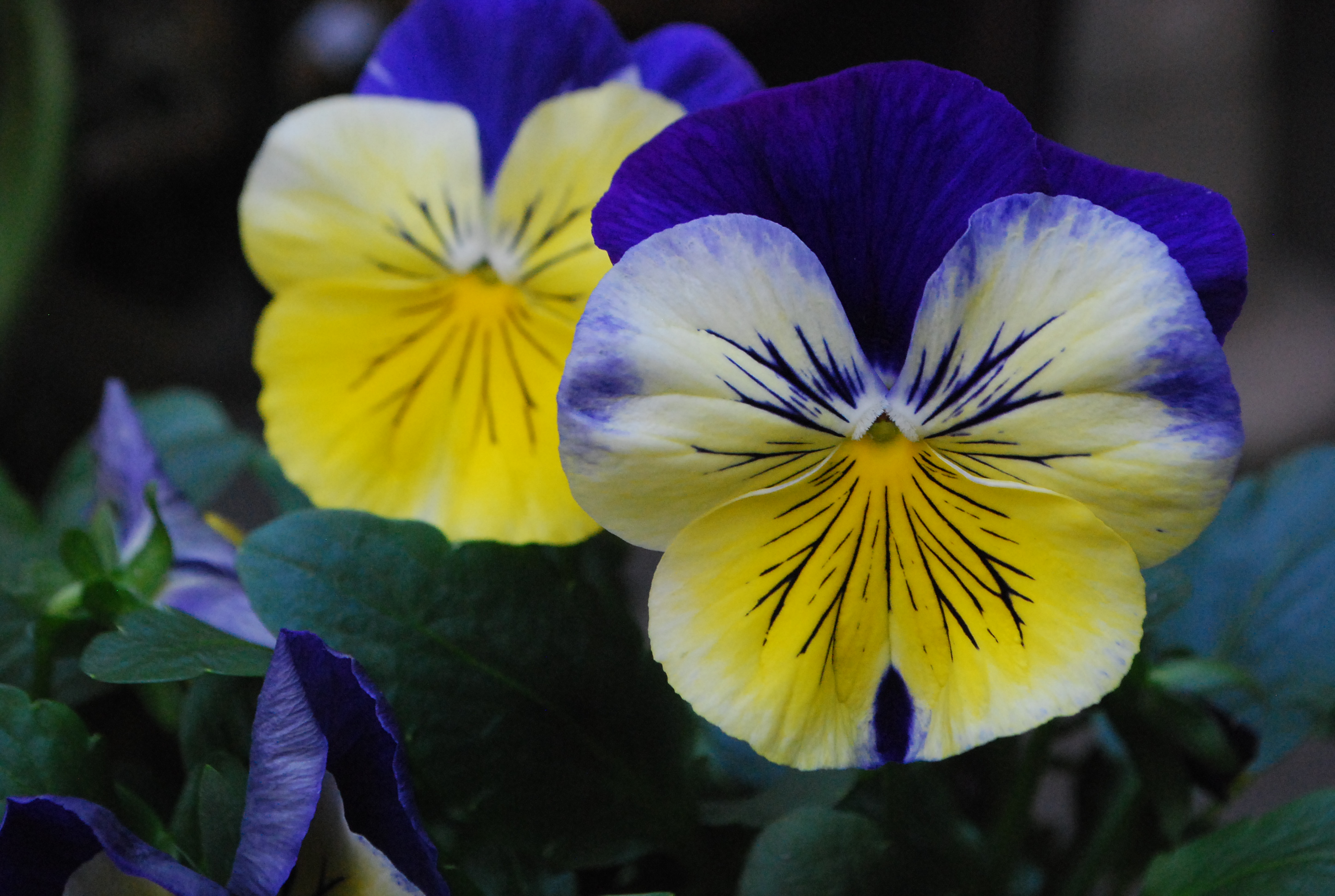
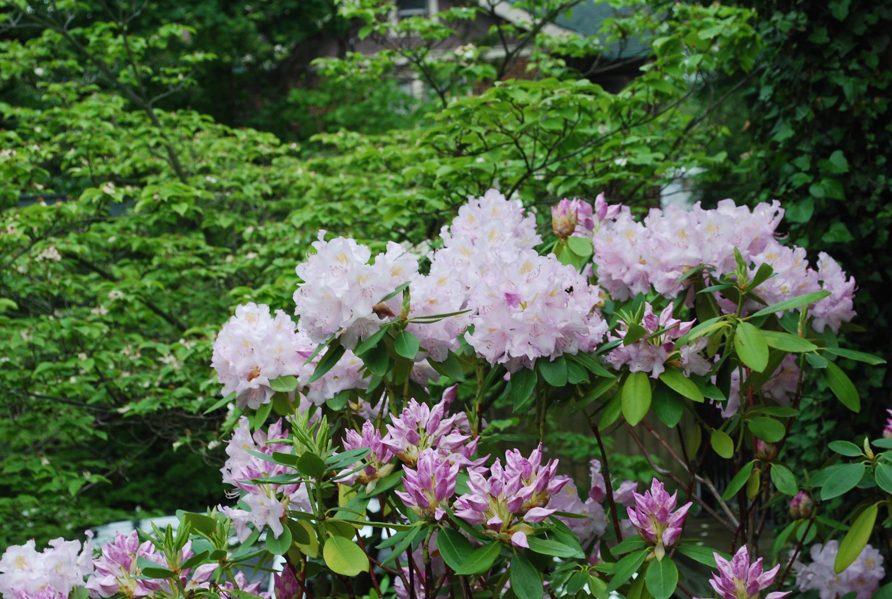
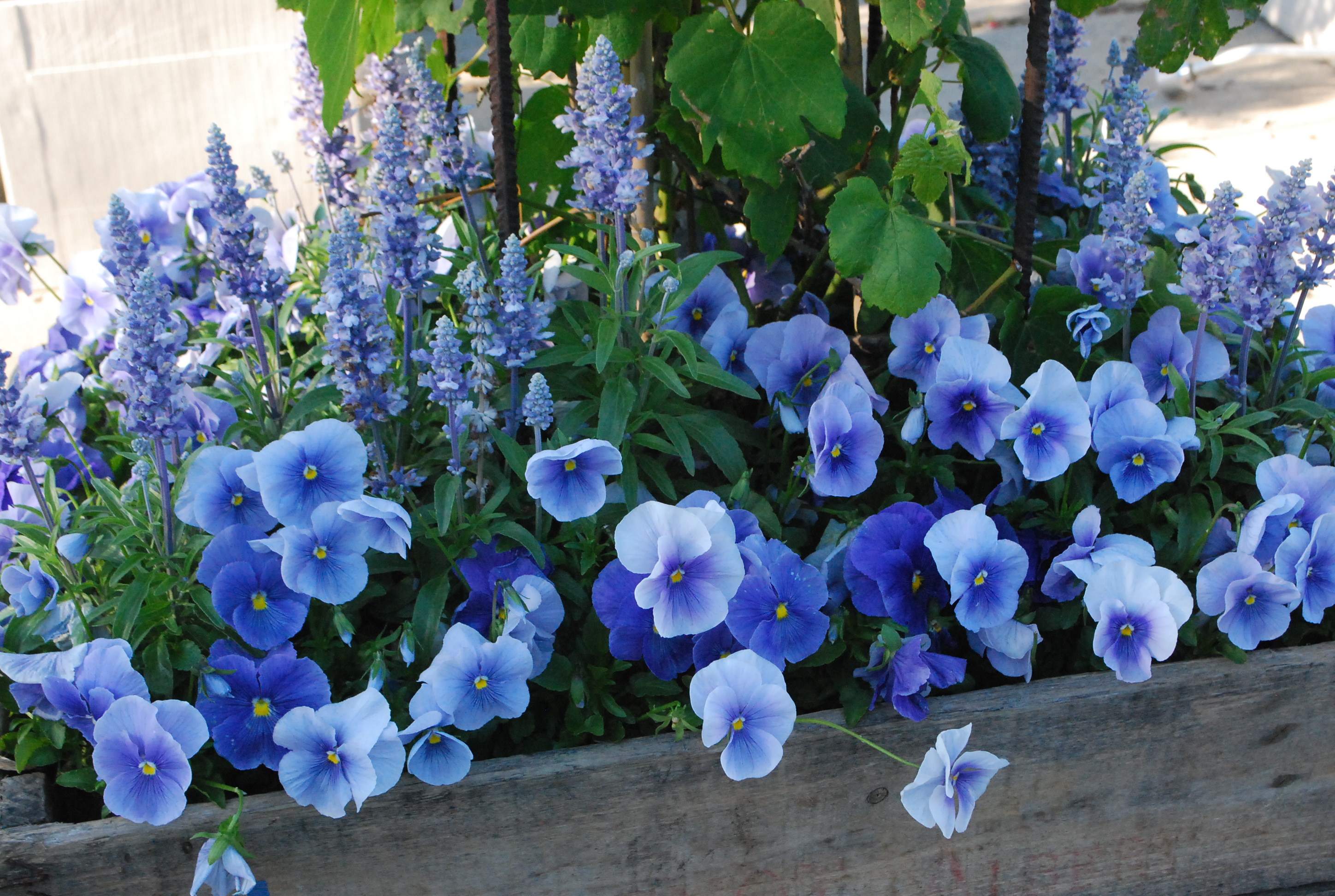
 Explaining why certain color combinations work, and why some schemes are attractive and interesting to my eye-not so easy. My approach to color is very personal and intuitive. I am just like every other gardener. Some schemes seem right-others seem off putting. But there are some observations I can make about color that might abet your choices. This picture makes it clear that pale colors appear to come forward, while dark colors appear to recede. The idea here? If I have a mind to plant dark colored flowers, I plant pale colored flowers behind them. A light background helps a dark color to read.
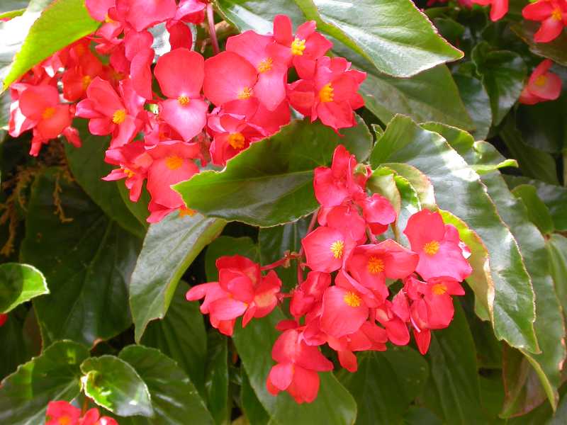
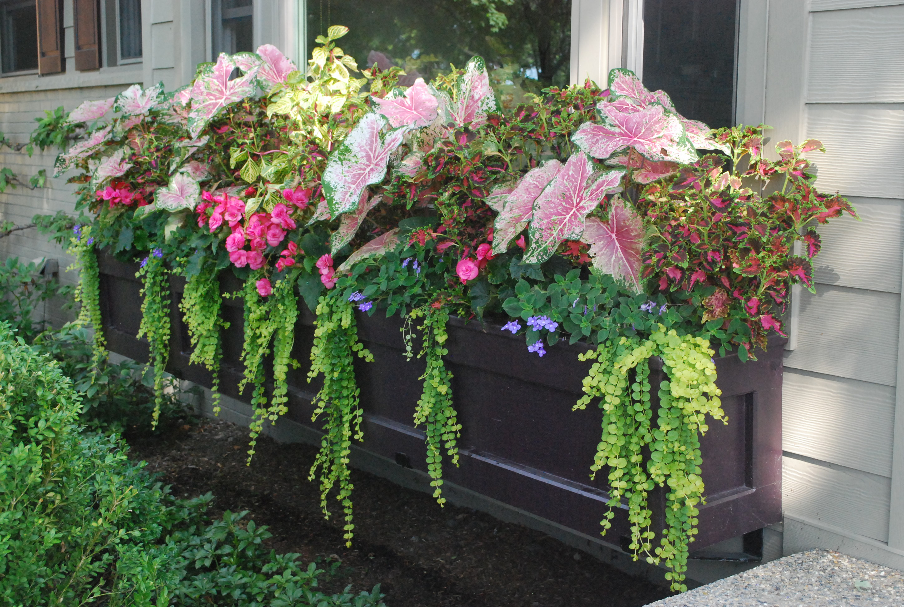
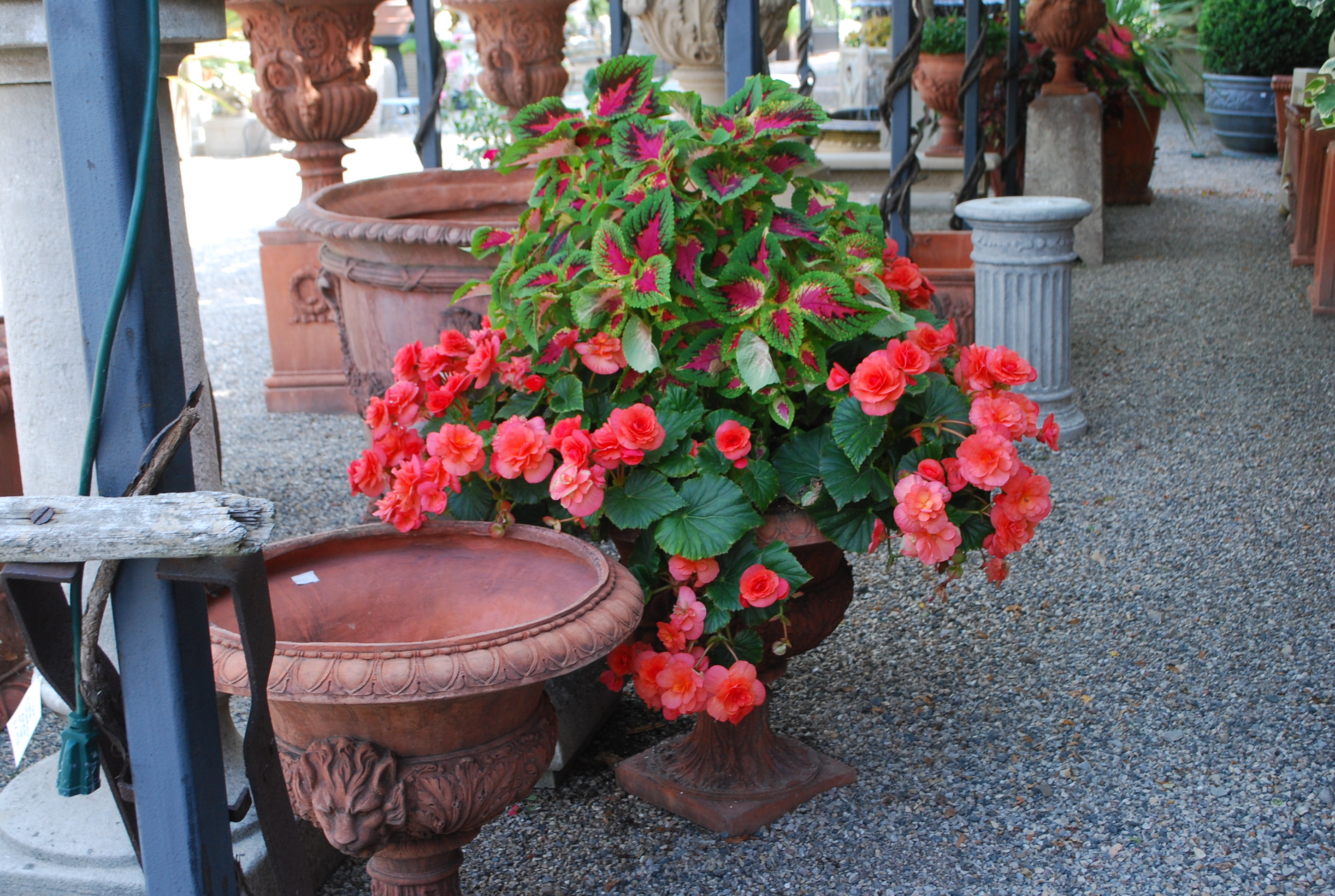
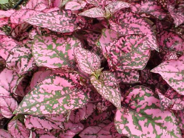
 Hot colors-as in red, yellow, orange, and hot pink, light up a shadier spot. Fancy leaved geraniums contribute to a color composition via their leaves. The Skies of Italy geranium has leaves of red, burgundy, green and yellow. The color of the leaves of this geranium can help knit a color composition together.
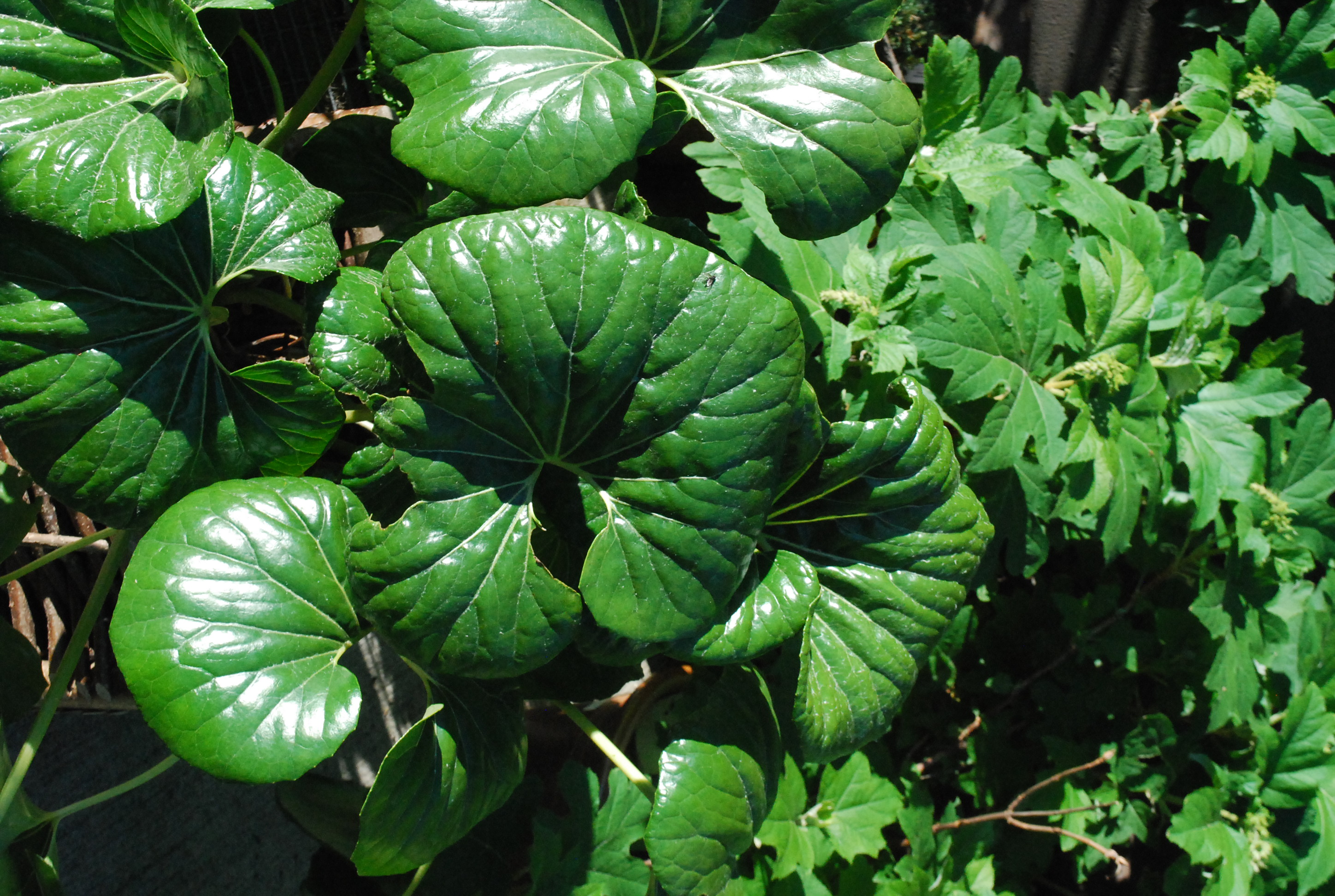 Shiny green is a very different green than matte green. The surface of a color can influence how that color reads. A dining room painted in red high gloss lacquer is a much different dining room than one painted in matte wine red paint. Color provokes emotional and associative reactions. The reaction that matters? yours. Look at a lot of color combinations before you commit. This makes good design sense. Emerald green is a combination of yellow and blue, fairly evenly matched. How does this emerald green look with the colors of the flowers you have chosen? Choose your greens!
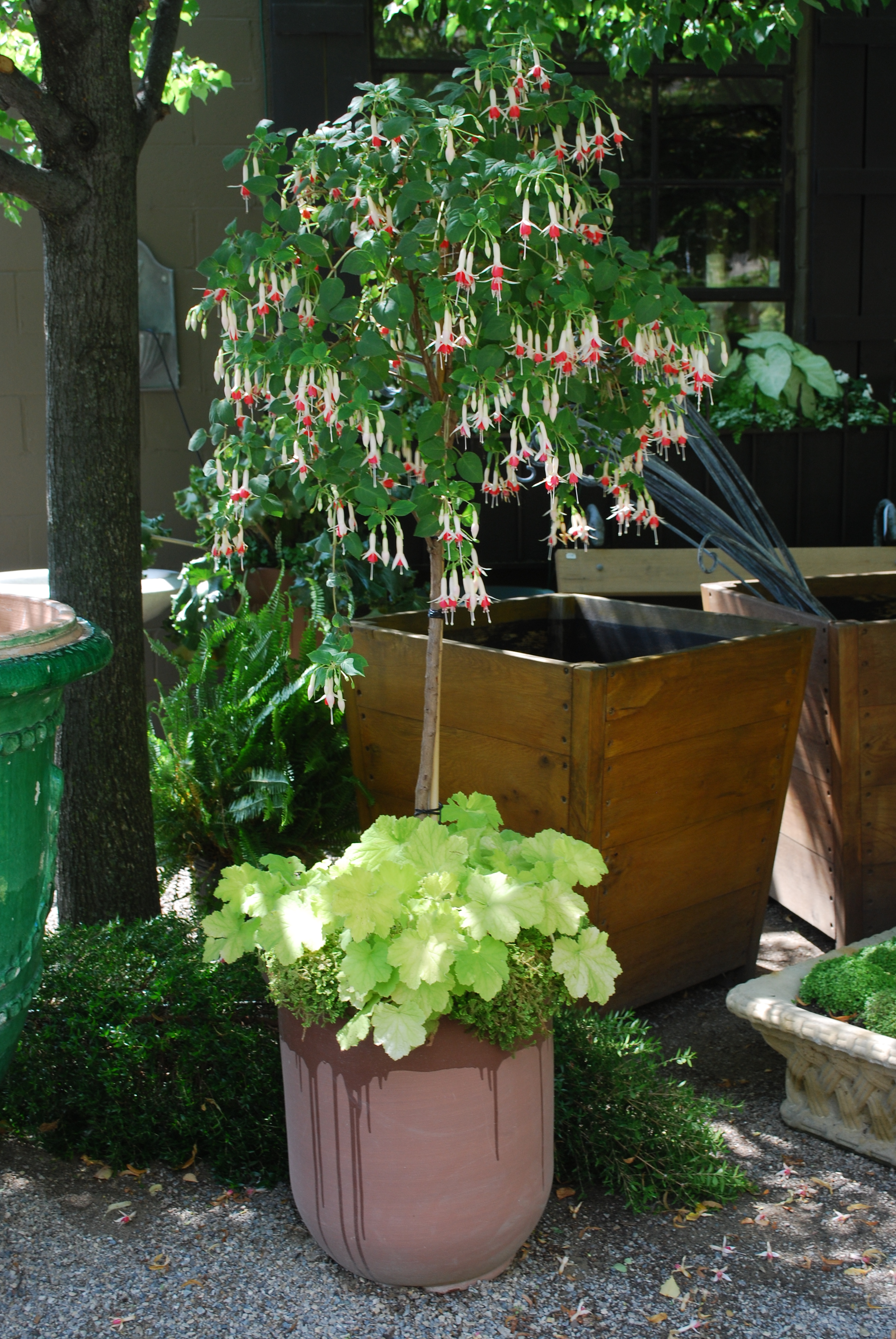
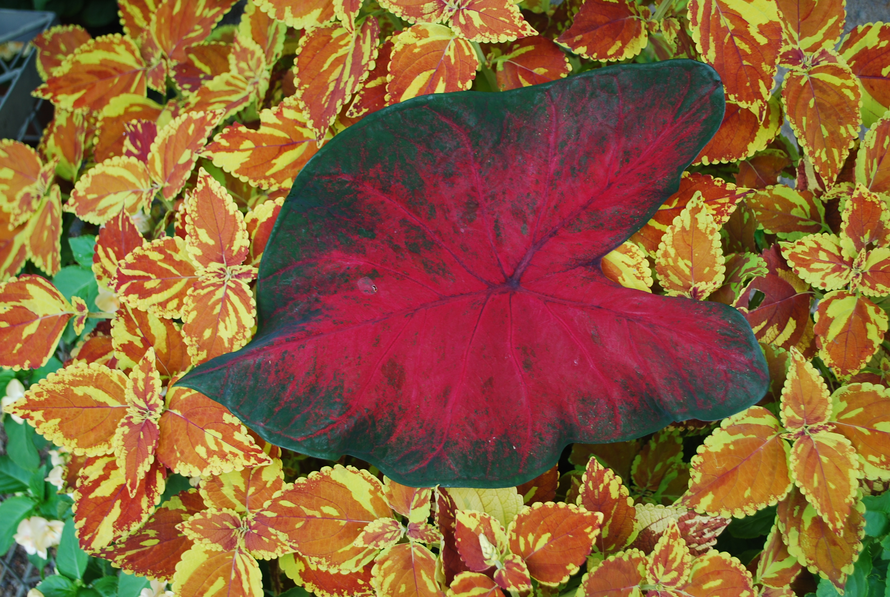
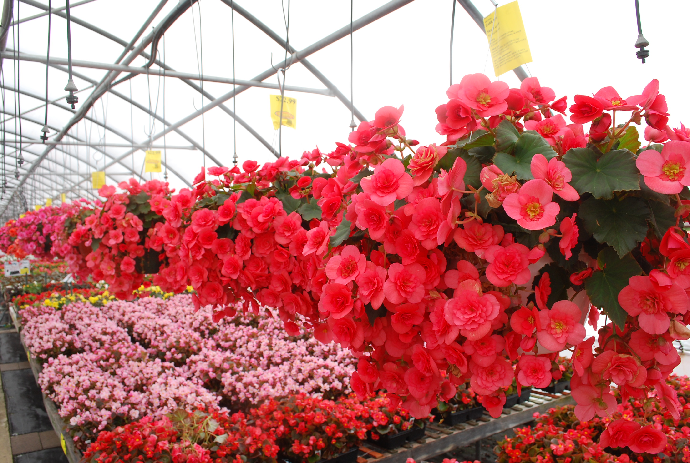
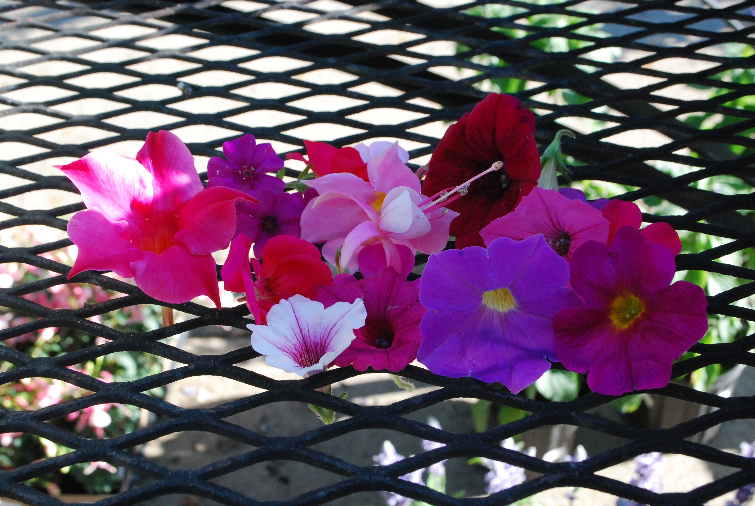
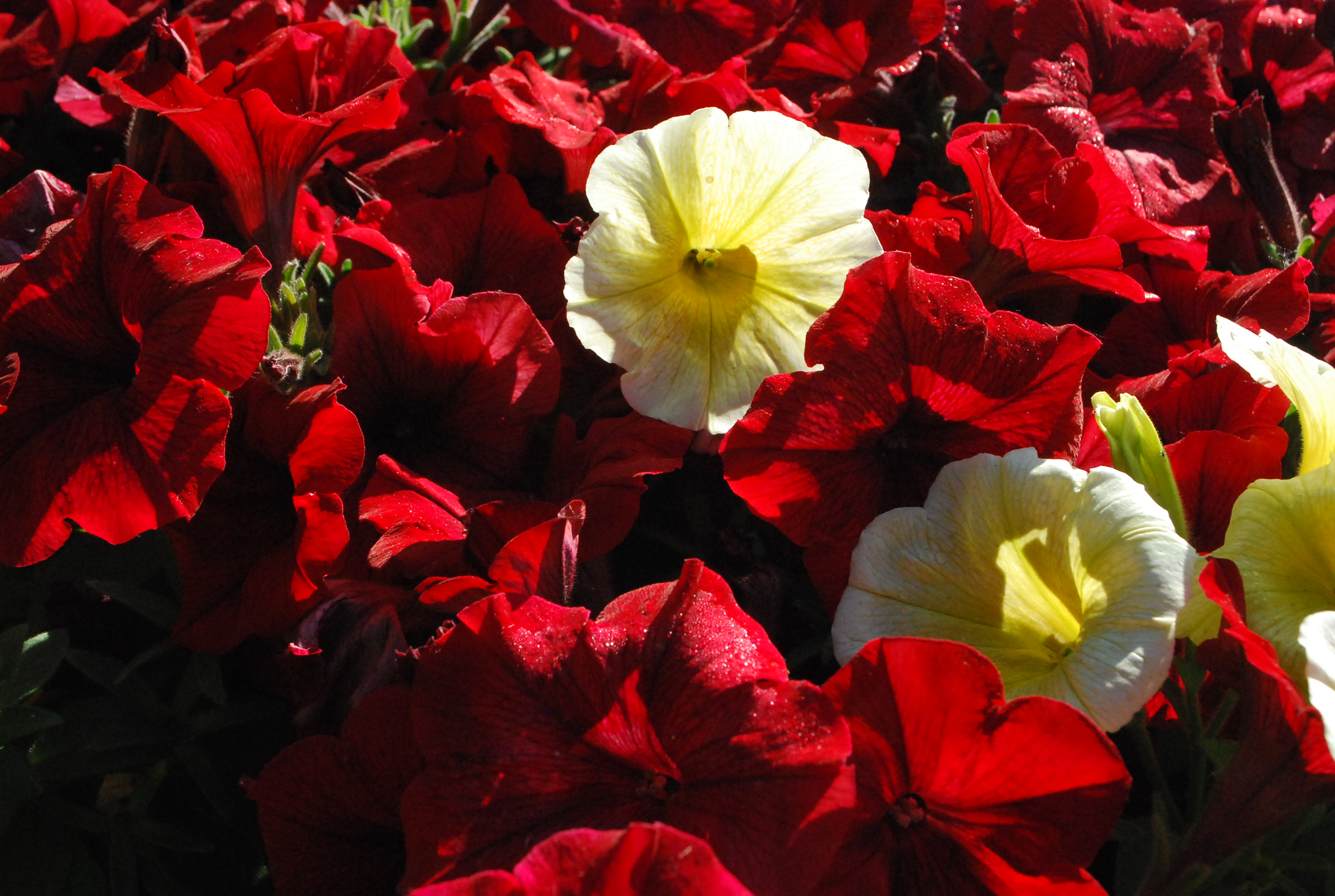 Red can be dark and moody in the garden. It can be royally rich-when paired with yellow. Pale yellow with dark red is not quite the brass band that fire engine red and gold yellow makes. Pasiring red and yellow has many possible interpretations. A variation on a traditional color theme can be very striking. My advice-if you are developing a color scheme, pick 3 colors. Two colors is a story with not enough detail. The third color facilitates the relationship between the first two.
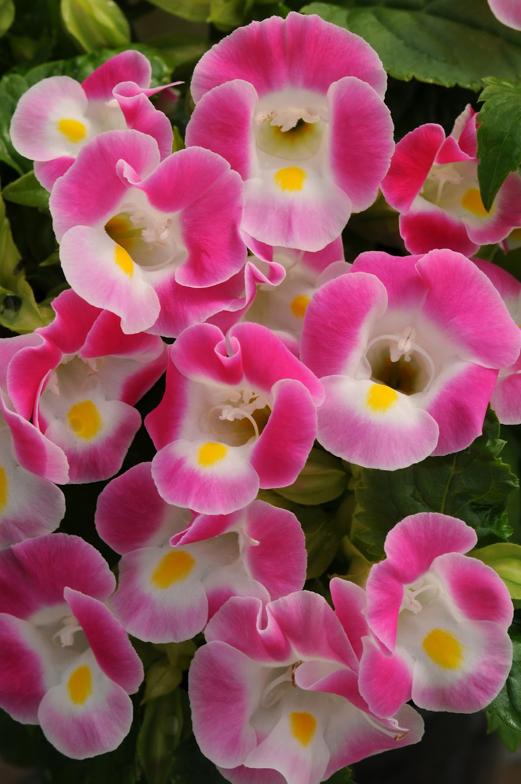
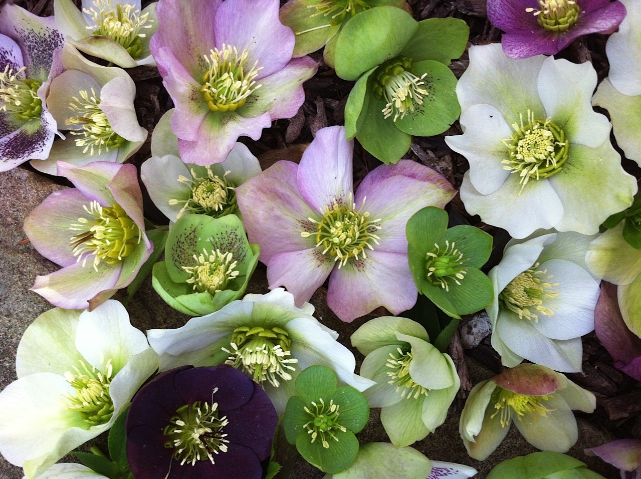
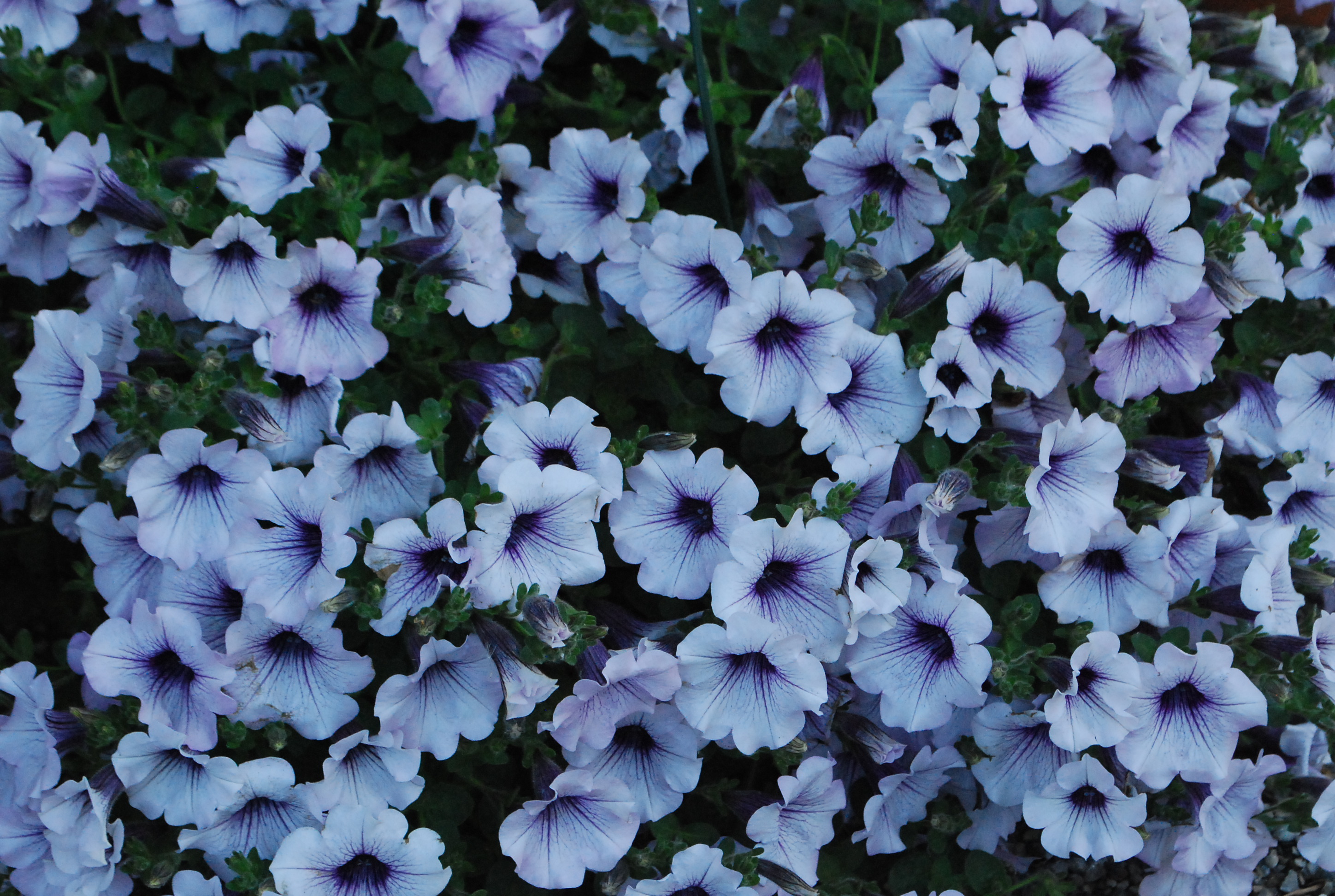 How many shades of white are there? White white. cream white. blue white. rosy white. Greenish white. Even an all white color scheme asks for some attention to be paid to the particular shade of white that works. Some white flowers have yellow centers. This would suggest that a yellow green foliage would compliment that shade of white. Blue-white flowers, such as this silverberry petunia-yellow flowers would contrast. Dark purple flowers would harmonize.
 Harmonious colors tend to be quieter. More serene. Contrasting colors provide visual excitement. Lime green foliage always looks fresh and spring like. Red with lime-very pleasing. Lime with white-fresh. Lime and orange-provocative. Lime and purple-don’t you like this? Lime green in the sun? oo la la. Lime green in the shade-the lights are on in this garden. Lime green and pink-so Coco Chanel or Lily Pulitzer. Pale lime and pale pink-fragile, ephemeral-breathtaking. Wildly lime-a light fantastic version of green.
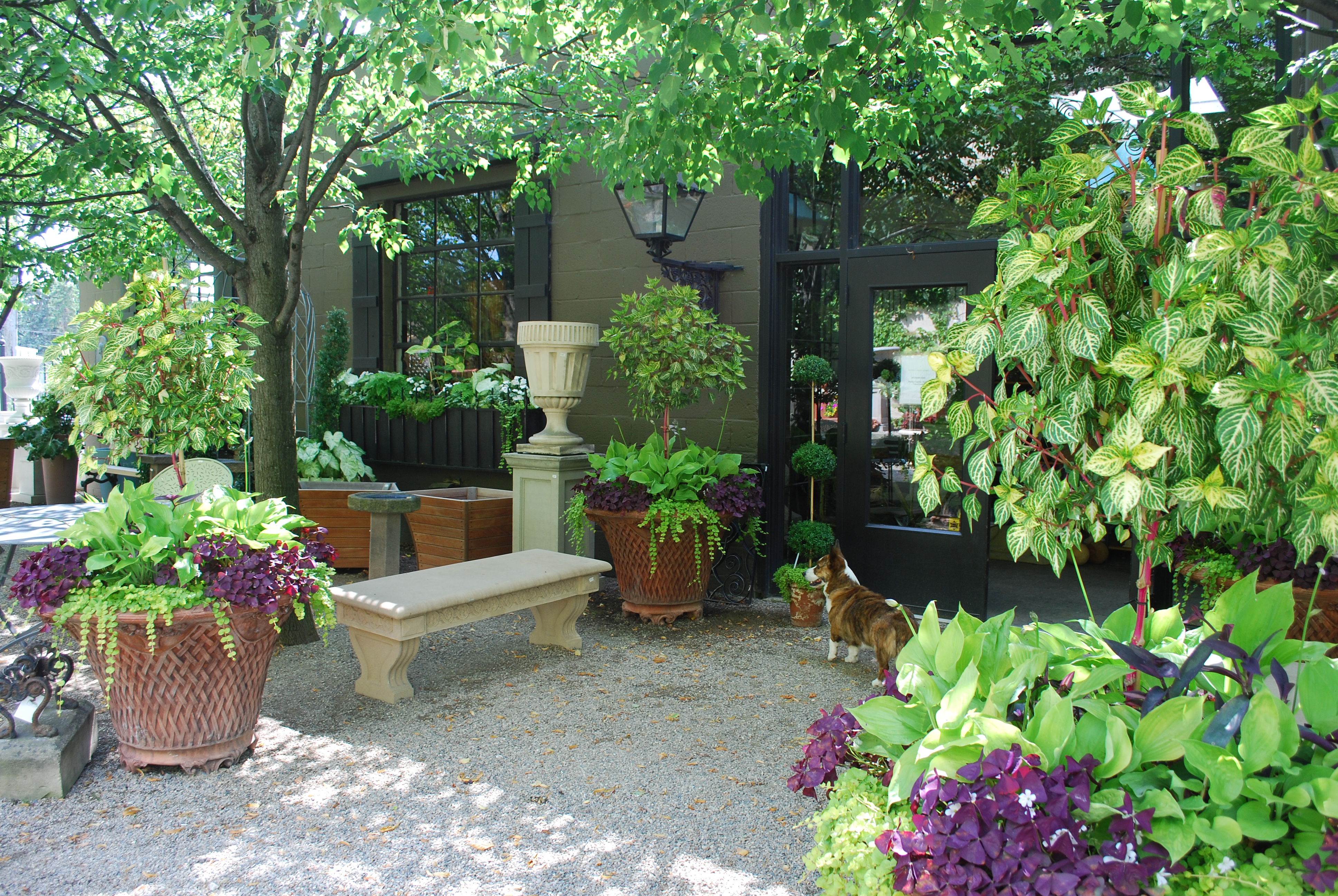
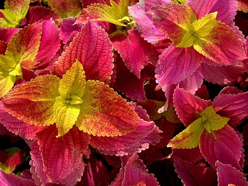
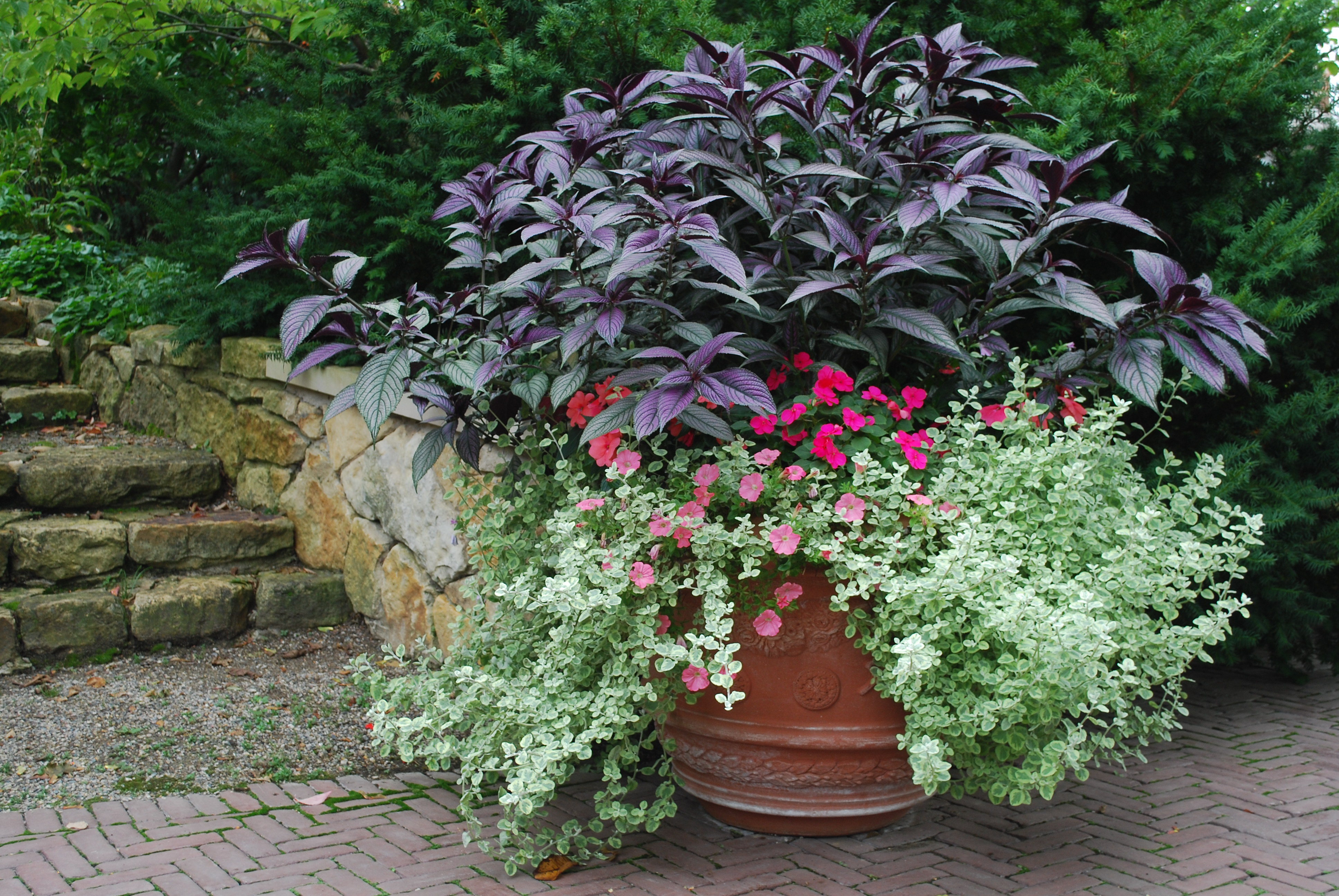
 I will admit I like planting containers with plants all of the same tone and color. The exploration of a single color in a lot of different plants makes a strong visual statement. It focuses the eye on texture-another important design element. If you are a big fan of texture, stay steady as you go with the color. Contrast the texture.
 Are you a fan of pink? Which pink? Carmine pink. blue pink. coral pink? pale pink? Dark carmine pink? Blue pink? Not all pink flowers harmonize. If you are hoping to stir things up, plant a variety of pinks, and let the chips fall where they may. More interested in a strong and harmonious statement about a blue pink-you eye will tell you when a yellow based pink is gumming up the works. Put lots of plants in your cart. Put back those plant whose flowers threaten to dilute your idea. As for right and wrong-that applies only to moral questions. This is gardening. Enjoy it. Just take the time to sort through the color relationships.
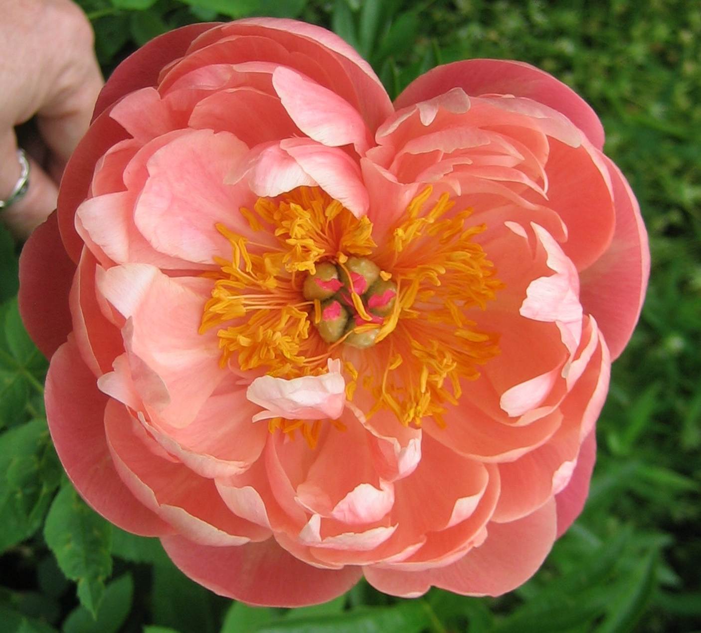 I have had this photograph of a Coral Charm peony on my computer for a long time-I do not know the photographer. If this is your photograph, please write me. I am posting it, as the color of this peony is so striking and unique, that it surely would inspire a color scheme-a spring color scheme-that would pay tribute to such an extraordinary color.
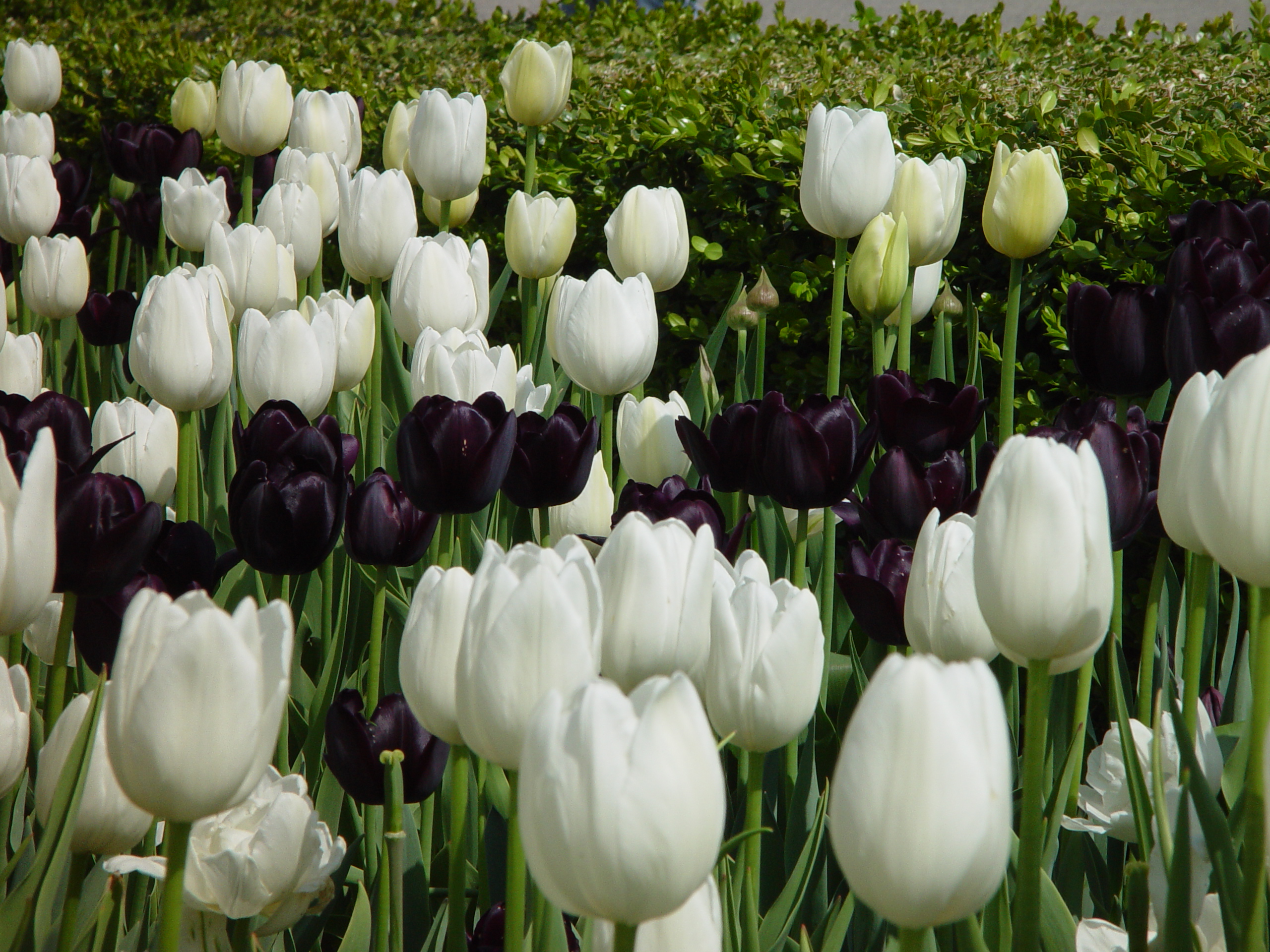
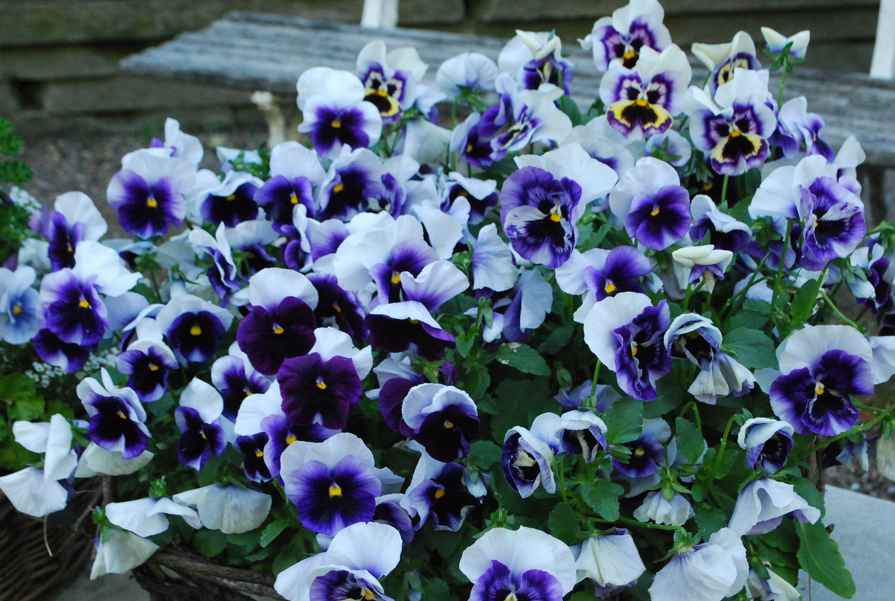 Light and dark colors-the contrast is lively.
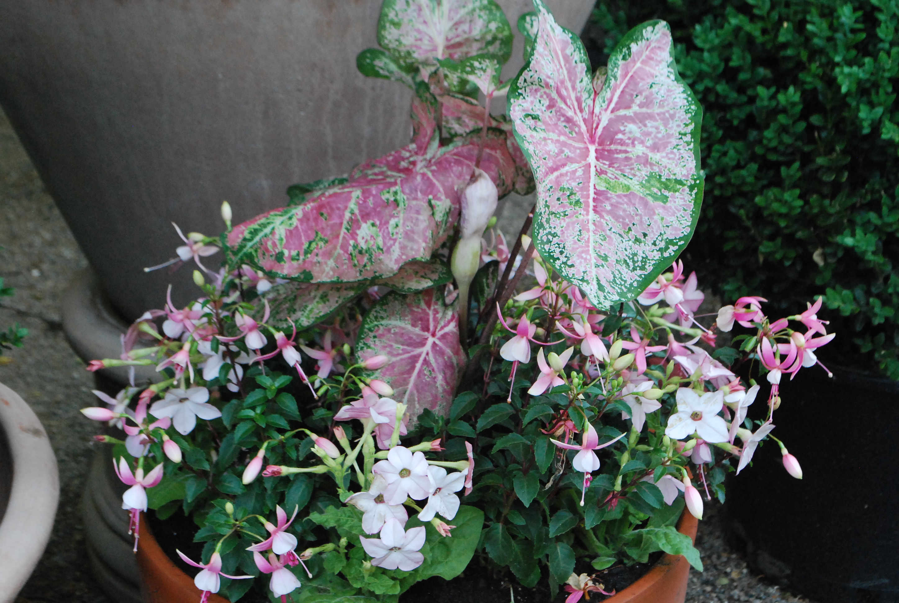 Pale pinks with blue green foliage-a great scheme for semi shady places.
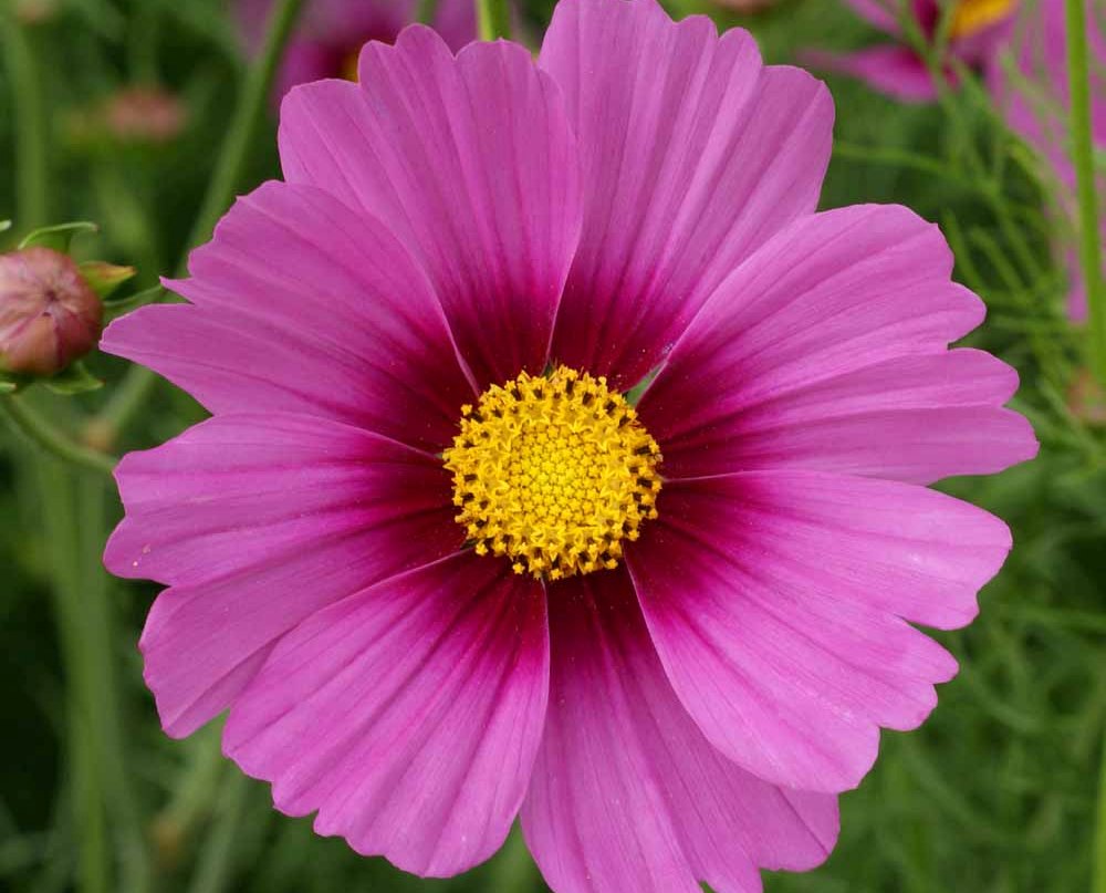 The carmine pink of this cosmos flower is all the more visually dramatic-given the yellow center, and the burgundy red corolla. The contrast of the yellow and red center makes that carmine pink shine.
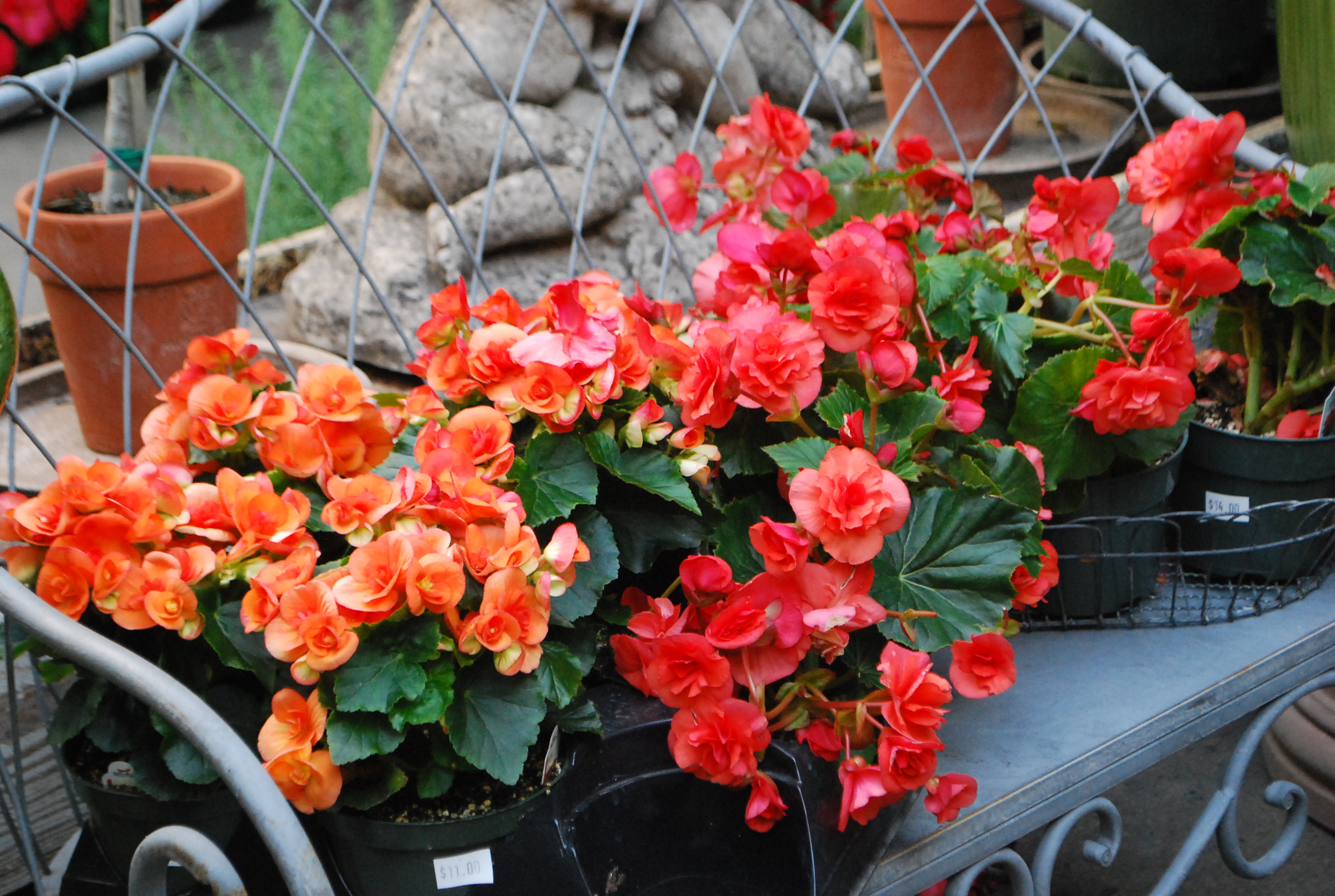 On the left in this picture-an orange begonia heavy on the yellow. On the right, an orange tipping towards blue. There is orange. There is another version of orange.
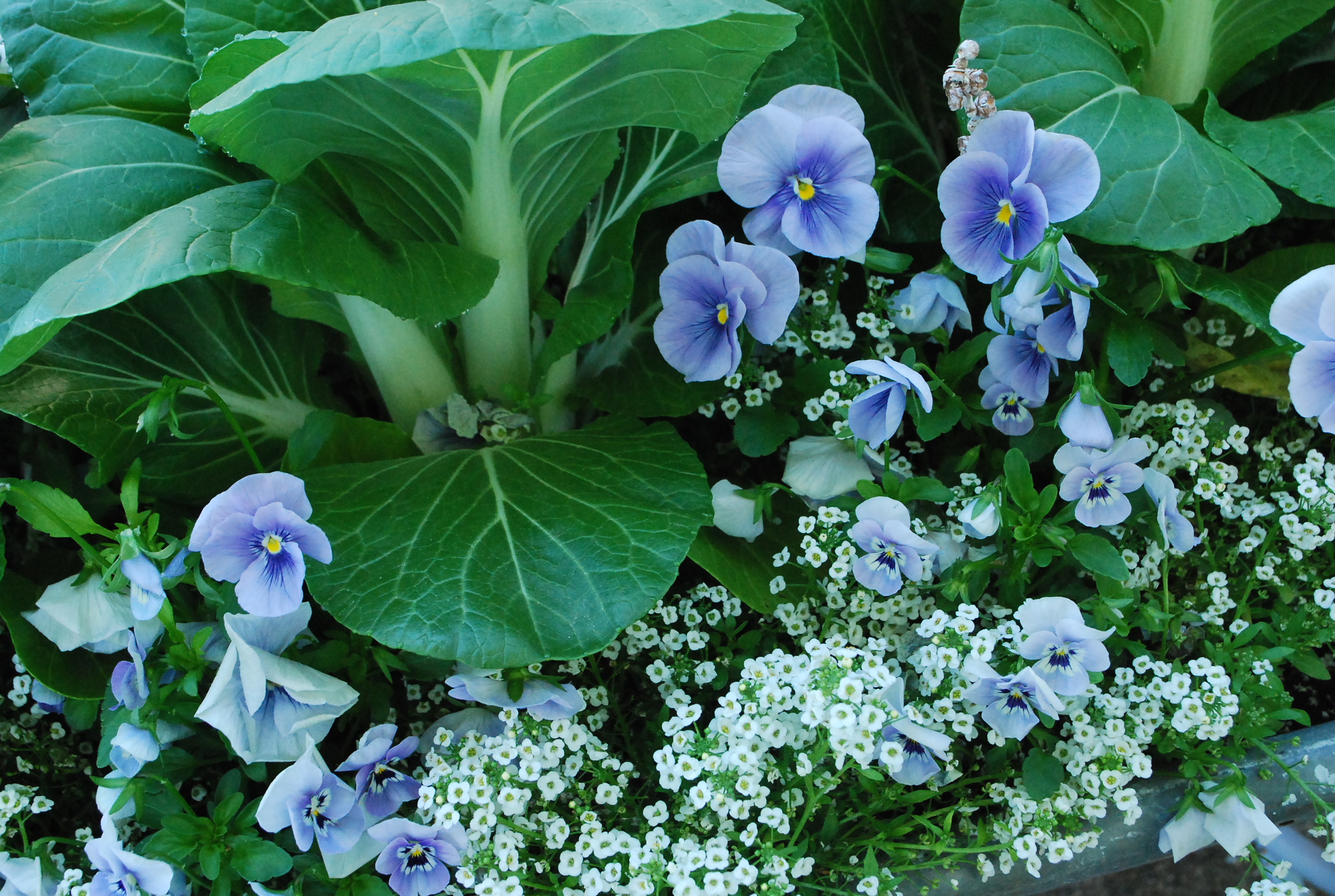 The blue green foliage of the bok choy clearly compliments the color of the blue violas.. The addition of white makes the scheme all the more crisp and fresh. Cool and clean-this scheme.
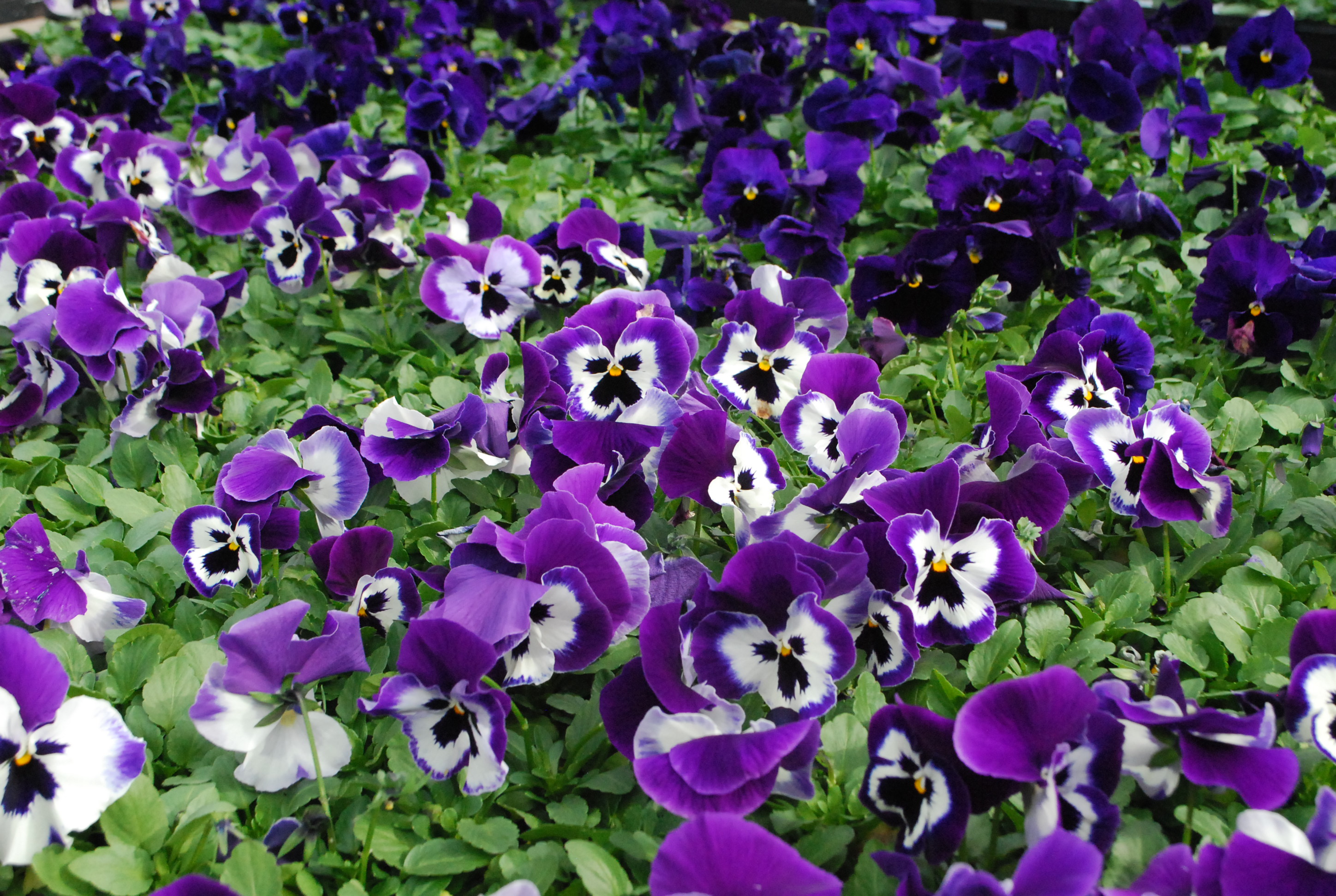
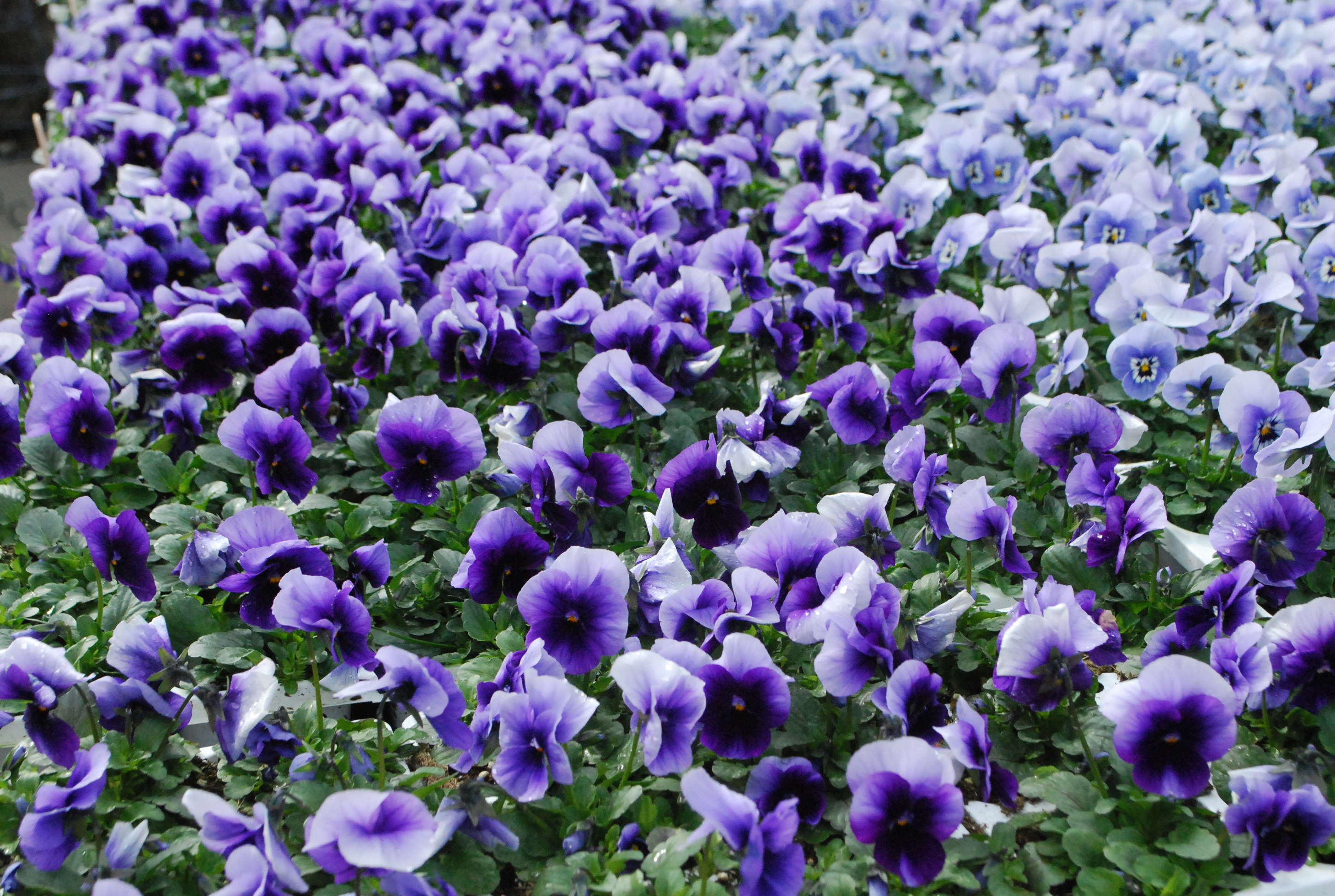
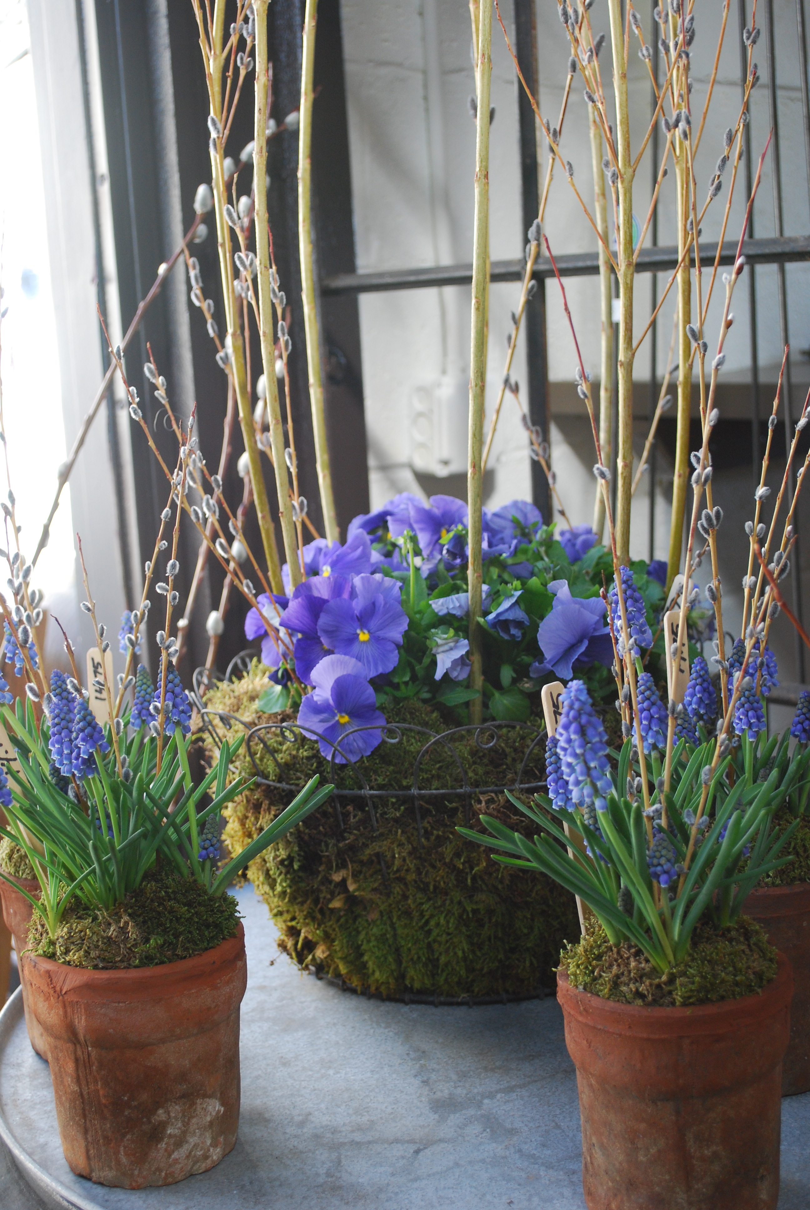
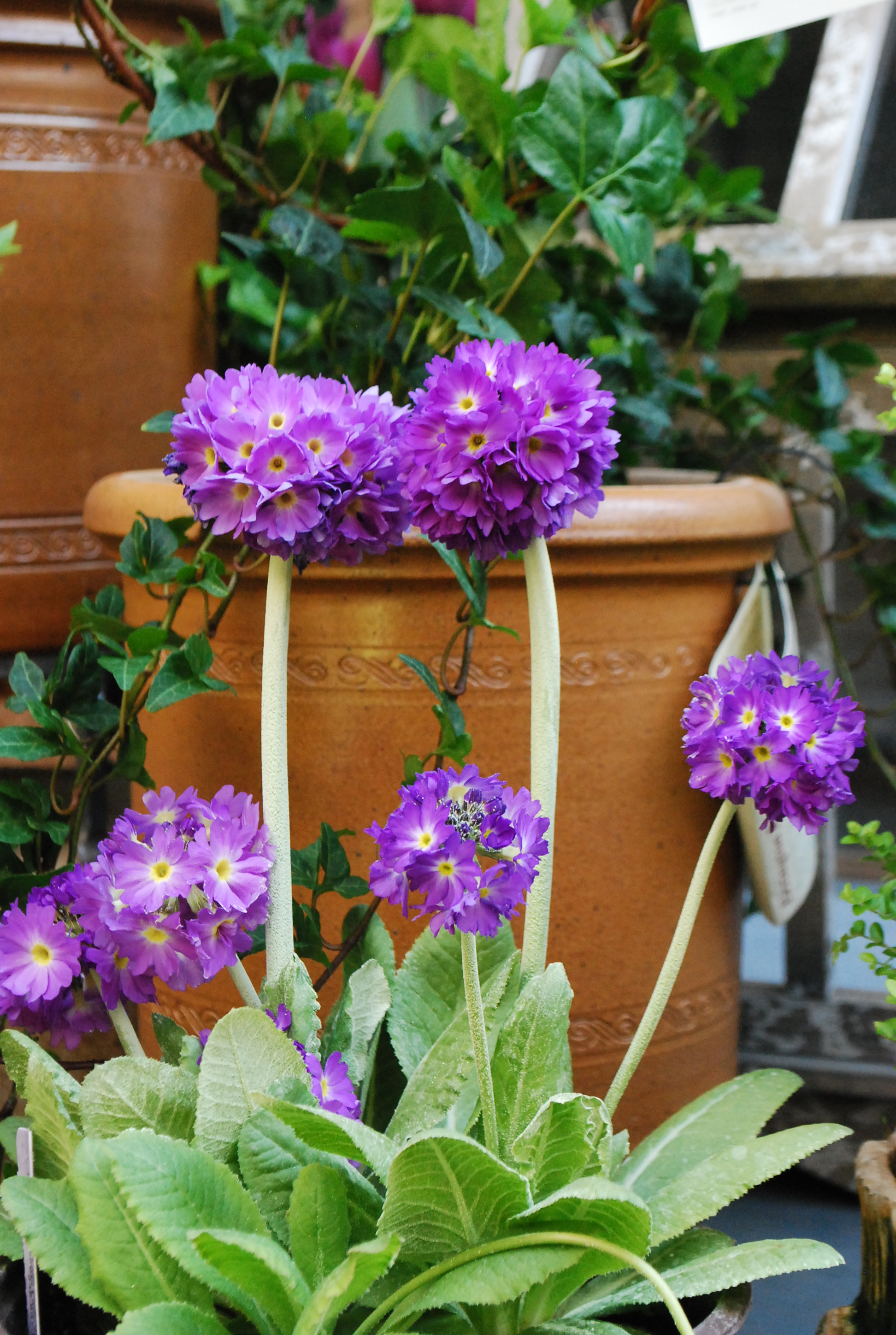
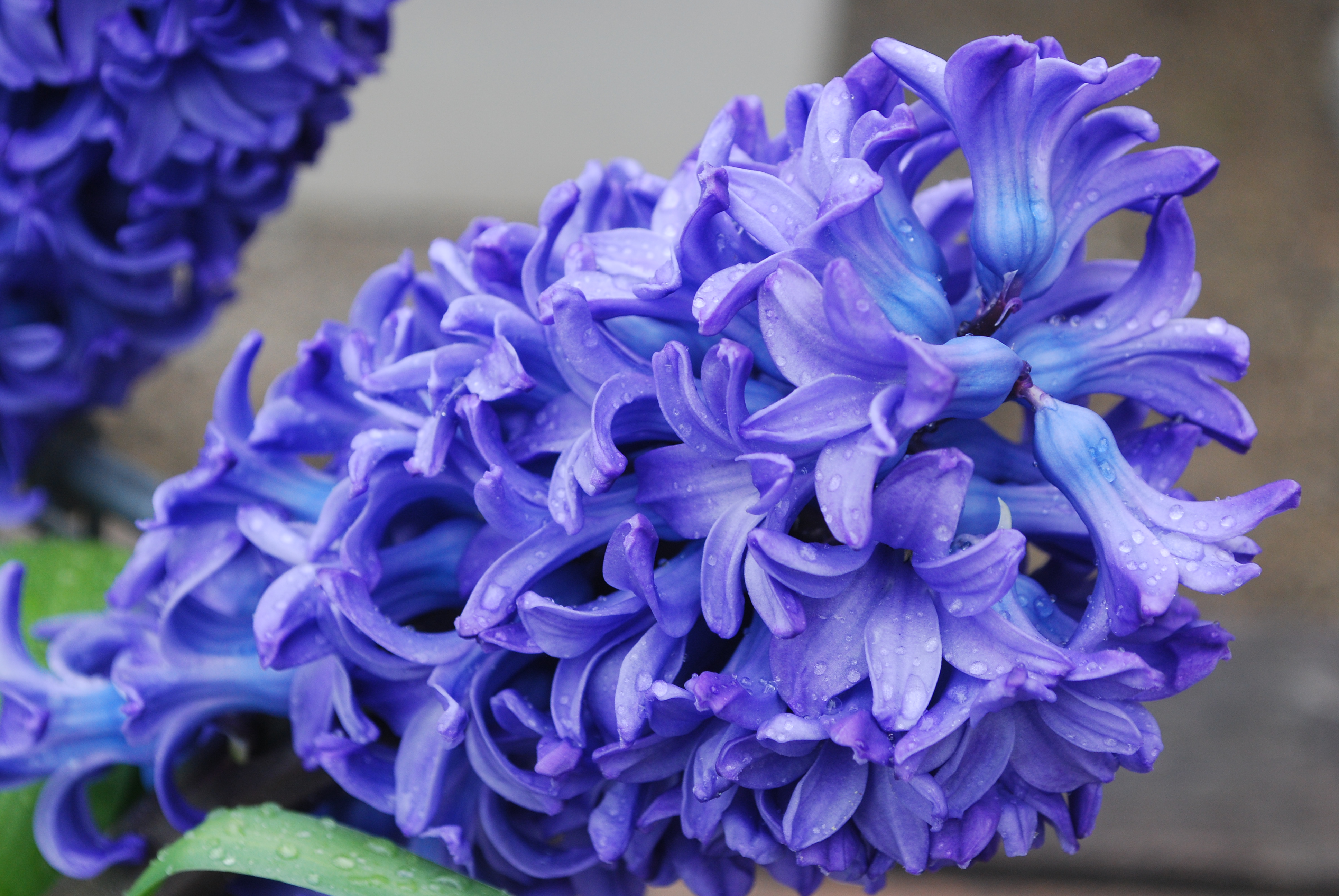
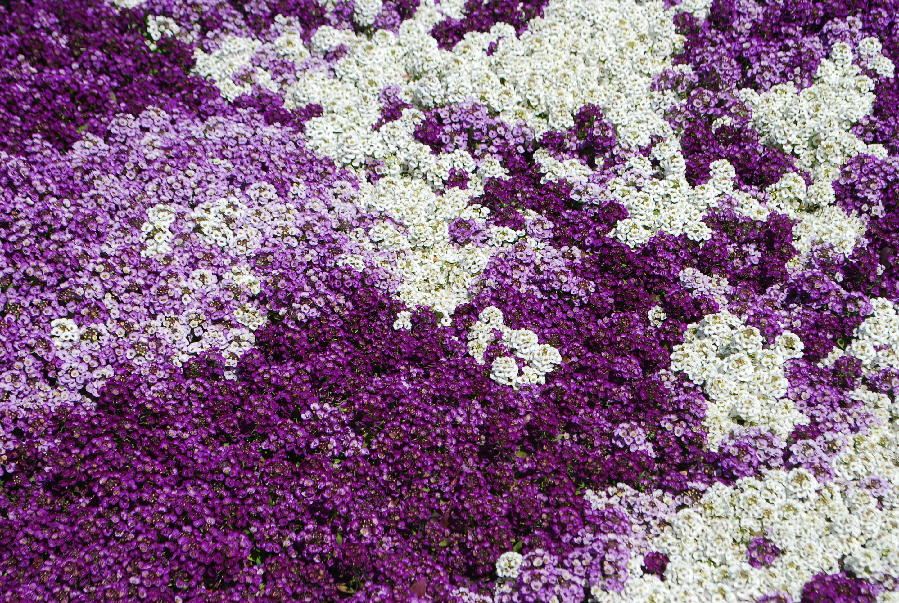
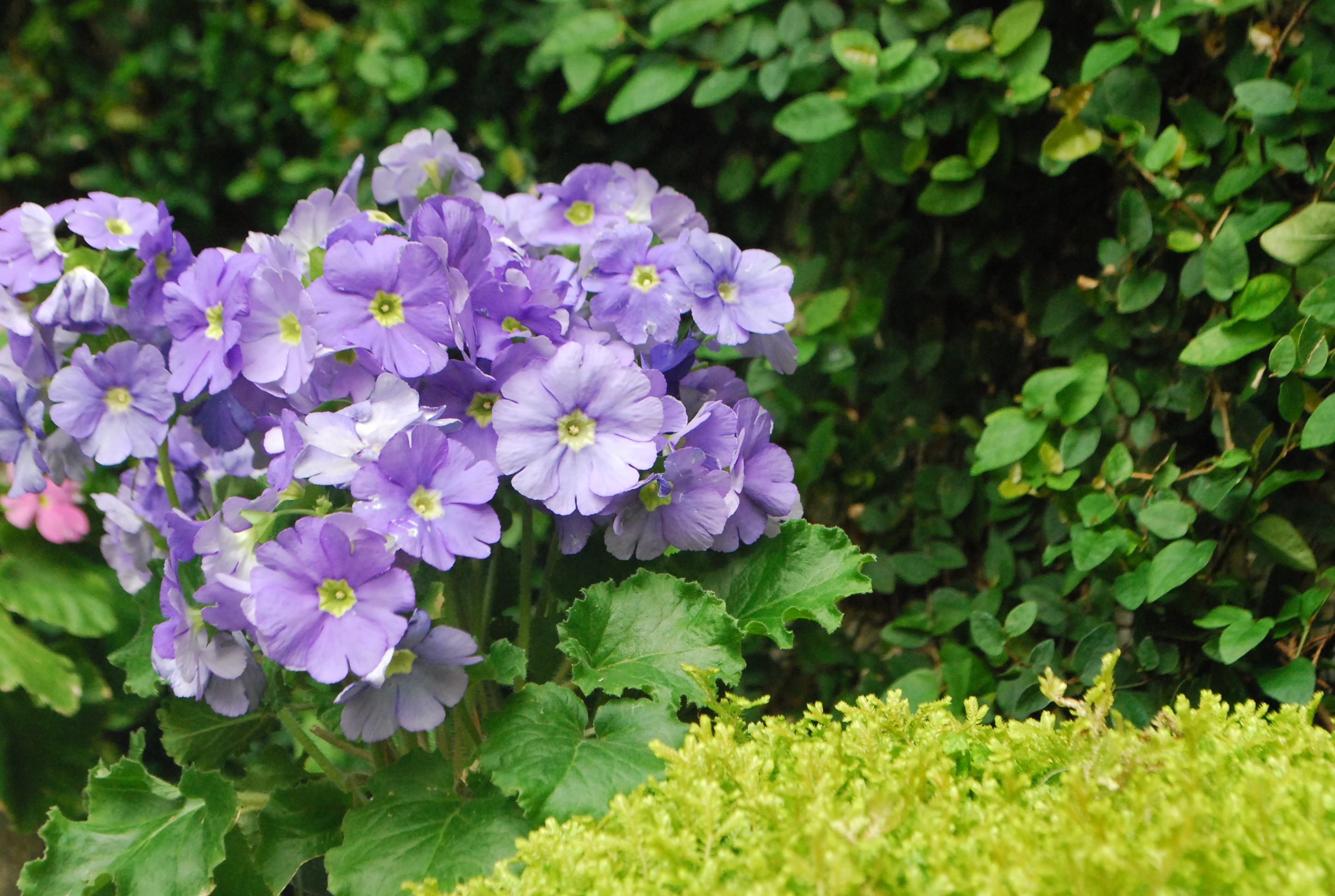
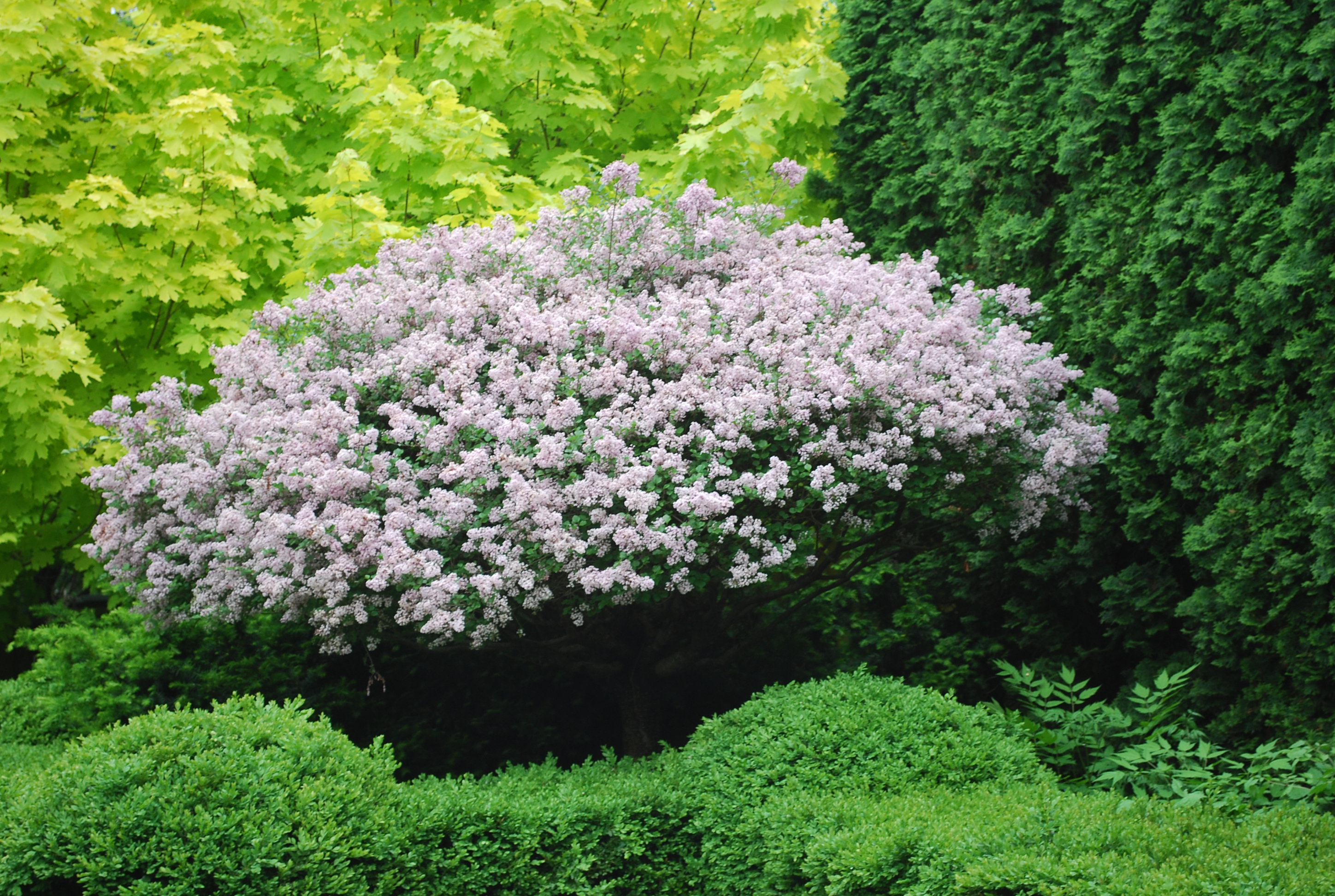
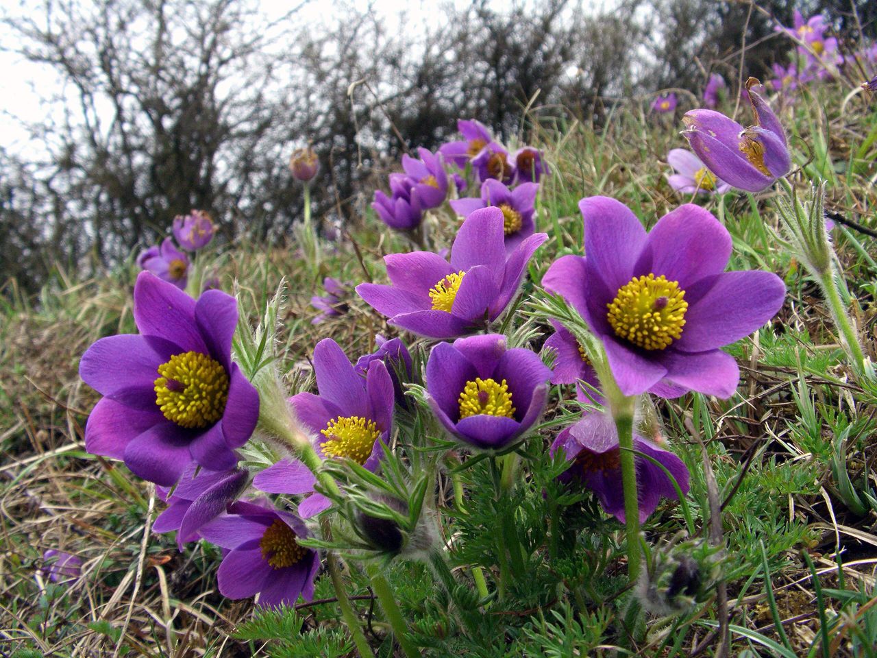
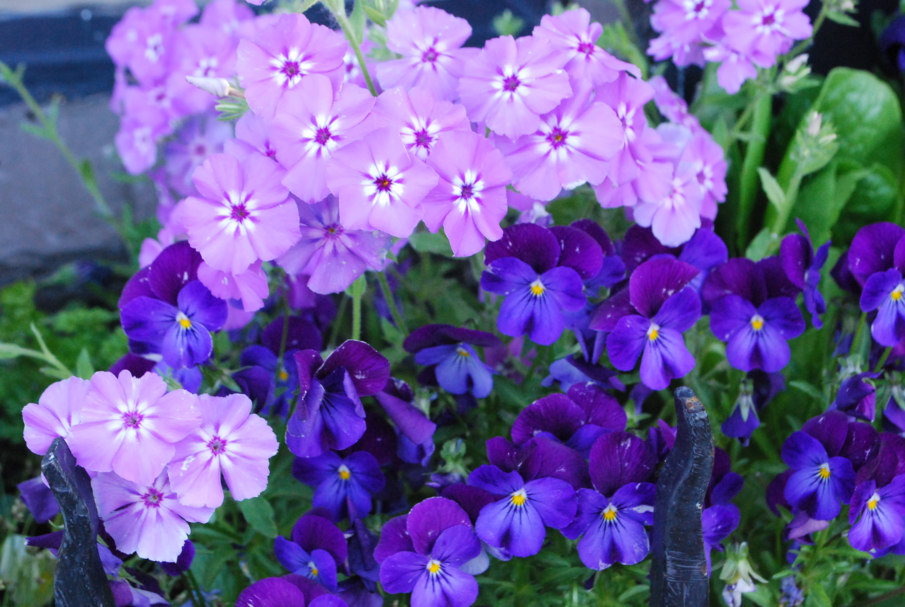
 Lavender and purple-you have choices. The sun will make its own statement about your choices. Light and dark purple both colors can be the star of the show. Both colors can be a supporting cast that makes your central idea shine. Purple is a color that fits into a lot of different color schemes.

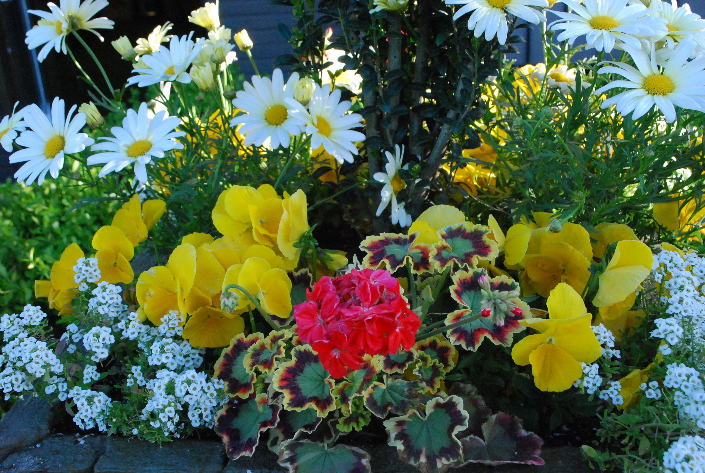
Sunny yellow-there is nothing quite like it. Yellow is the color of the light that every garden thrives in. Have a place for something yellow? I recommend this level of garden cheer. Your idea bout color is a good idea. Another good idea-follow through on your sense of color. Make the colors work just the way you want them to.