88 Degrees

DSC_2414
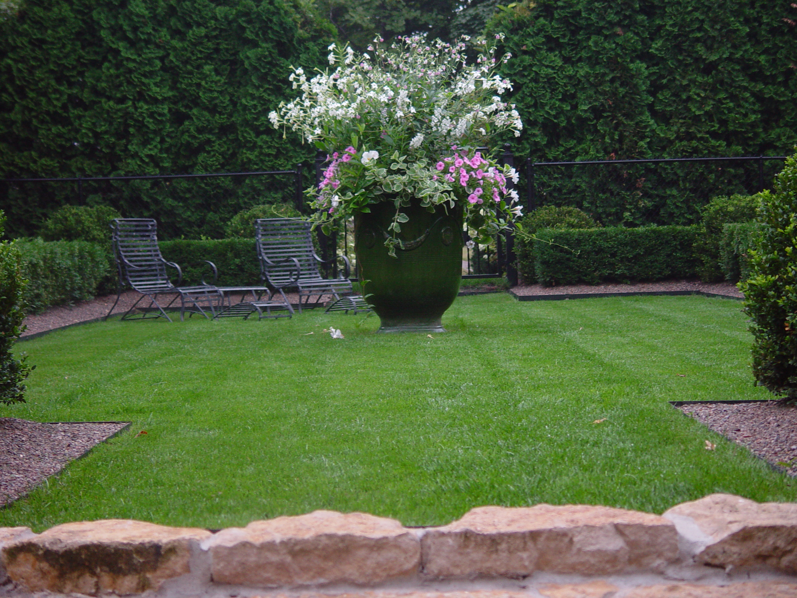
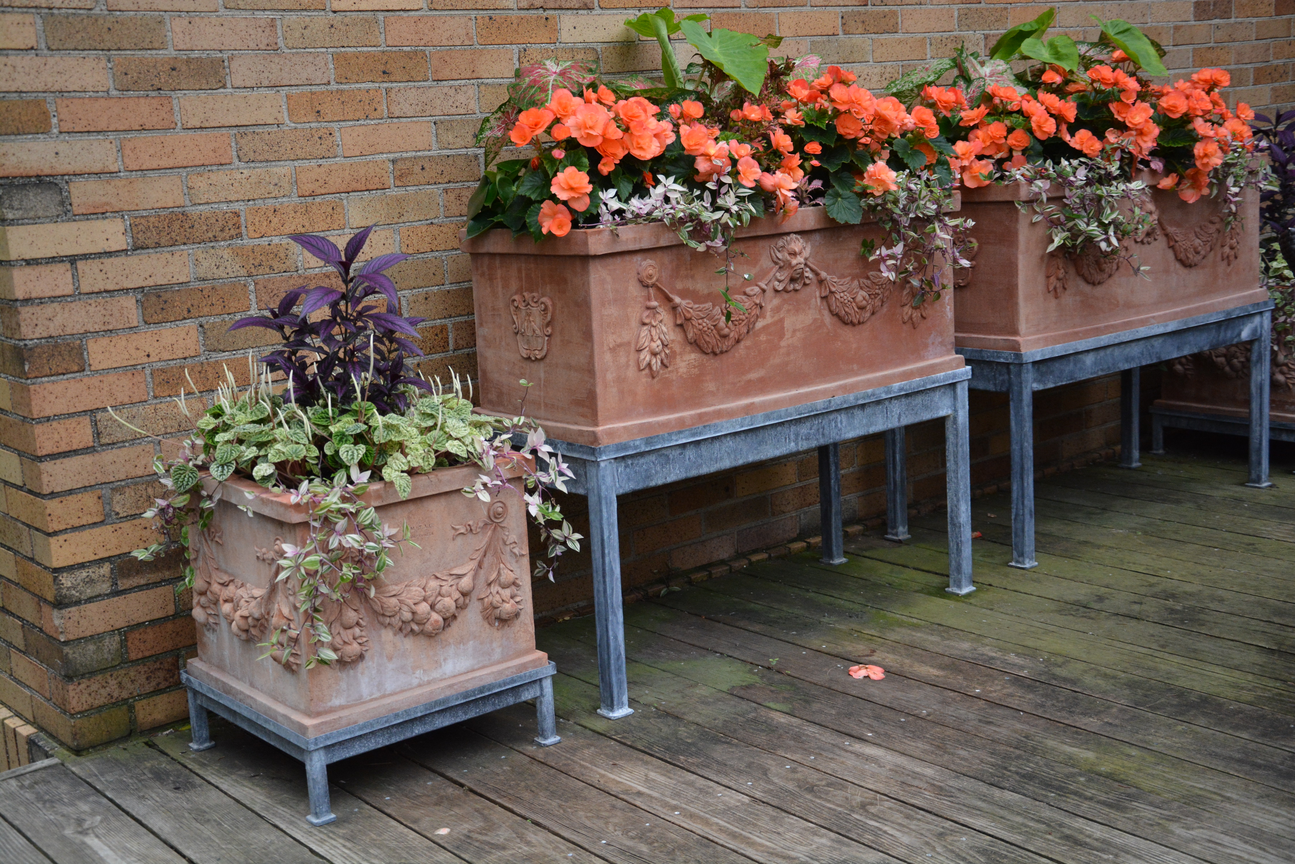
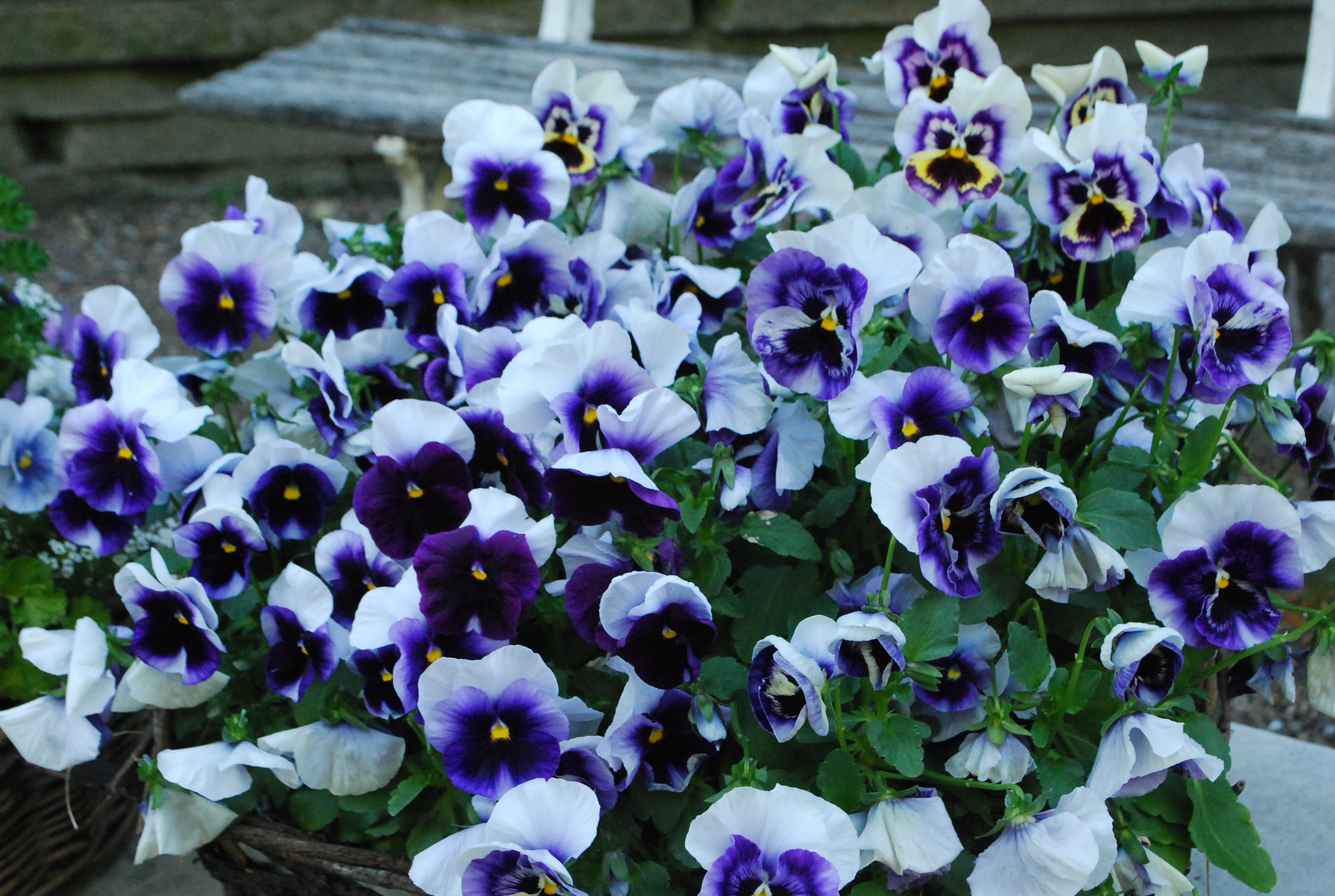
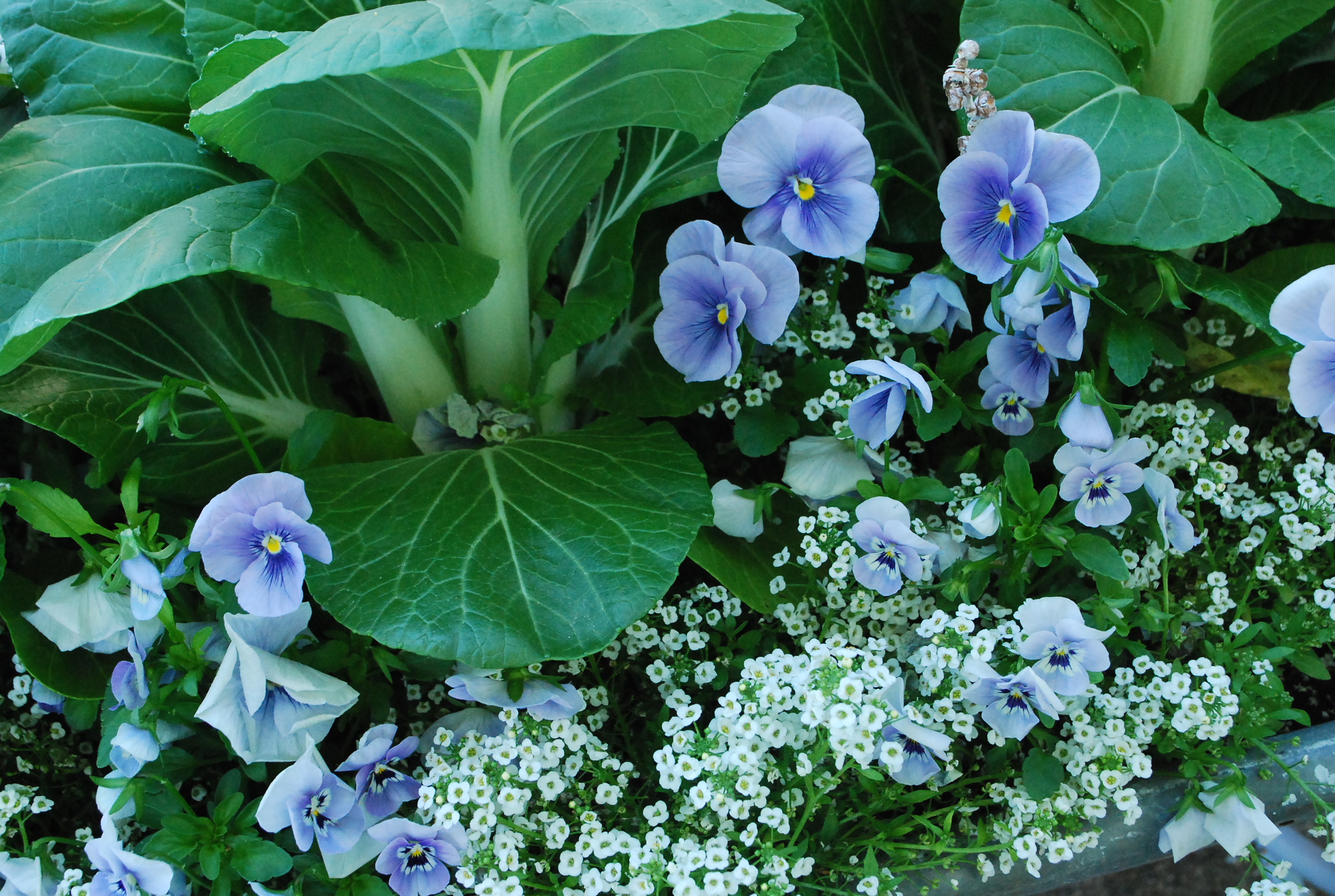
Though our summer has been mostly moderate and regularly rainy, we are in the throes of a hot spell. It is hot enough to make working in the garden a sweat fest. Oh yes, the hot days have gone on for a while.  If I can’t be outside at 6am, I would rather wait until 6pm. Do the tropical/seasonal plants in my pots mind an 88 degree day?  Not at all. Many of them originate in very hot climates.  They have been waiting for this heat since late May. It is important to differentiate between what you would like on a hot day, and what your container plants would like. I do not water my containers when it is hot. I might like a cool shower after a hot day outdoors, but tropical plants thrive in the hot heat. I only water them when they are dry, or in imminent danger of becoming dry. I water dry plants, not hot plants.

watering pots August 2015 (3)I have no scientific evidence to support the following-just my experience and instinct.  On an 88 degree sunny day, I do not water my pots from the top.  I would rather keep the foliage dry.  Wet and heat put together is a reliably good recipe for disease. Mildew in a container – what gardener needs that? I use one hand to raise up the trailing plants on the edge, and the other to direct water to the surface of the dirt. No matter the size of the pot, I move the wand to different locations on the edge of the pot, so I am sure all the soil gets watered evenly. All around. Watering in one spot will invariably leave some other spot dry. I water the soil, all around, in hot weather.

watering pots August 2015 (17)
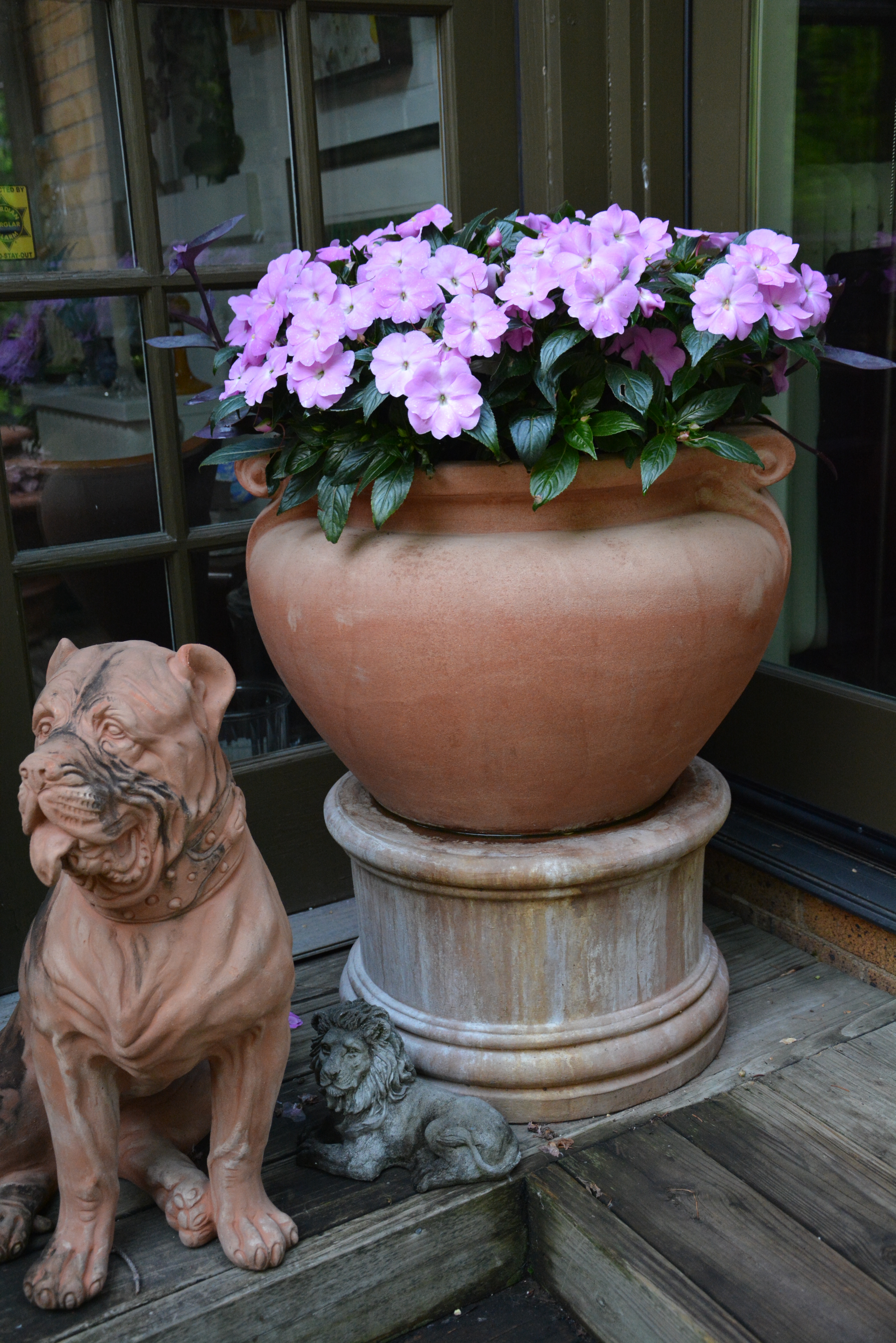
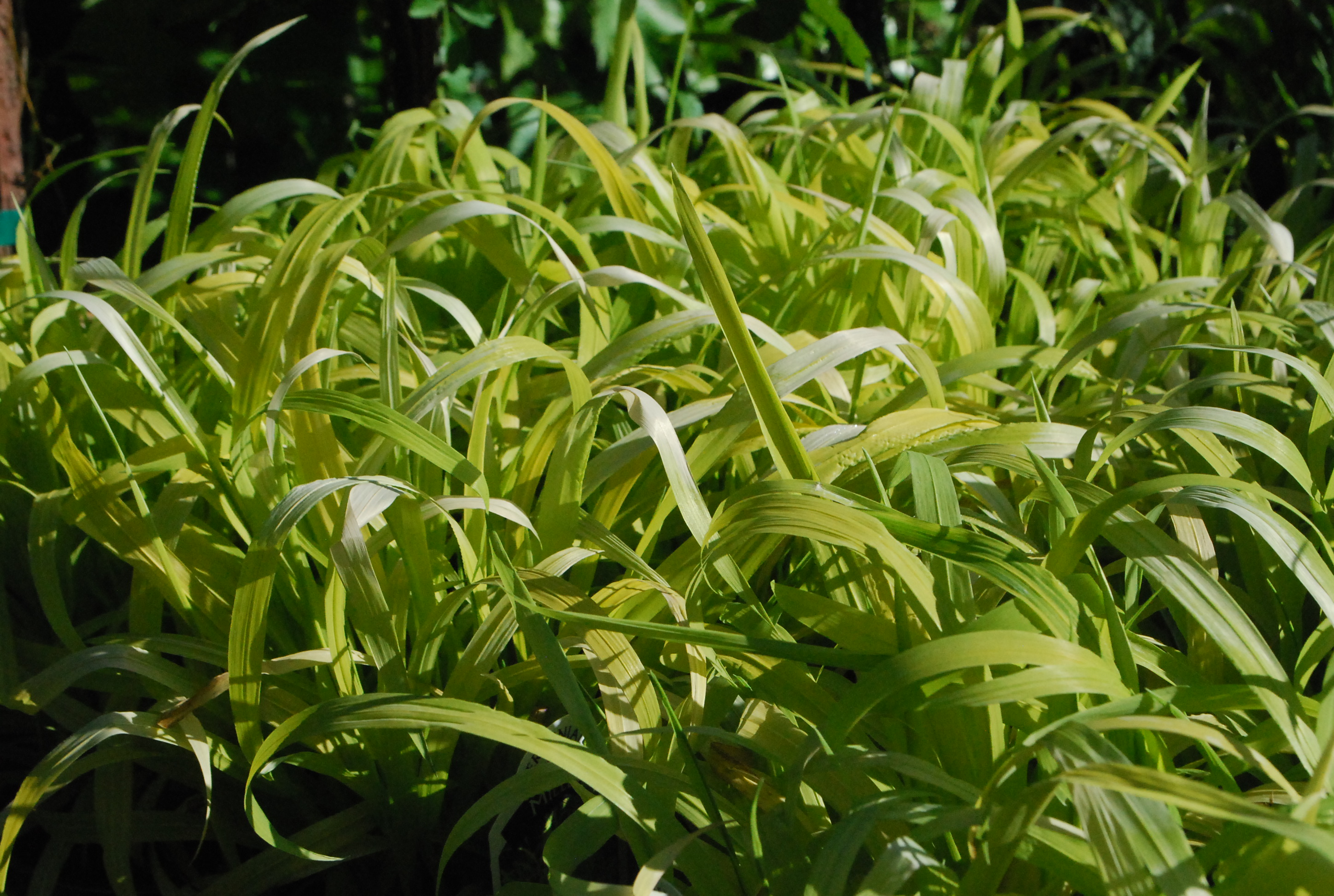
When plants get large, it is not always so easy to see where the interior of the pot actually is.  There’s no sense to watering outside the pot.

watering pots August 2015 (8)
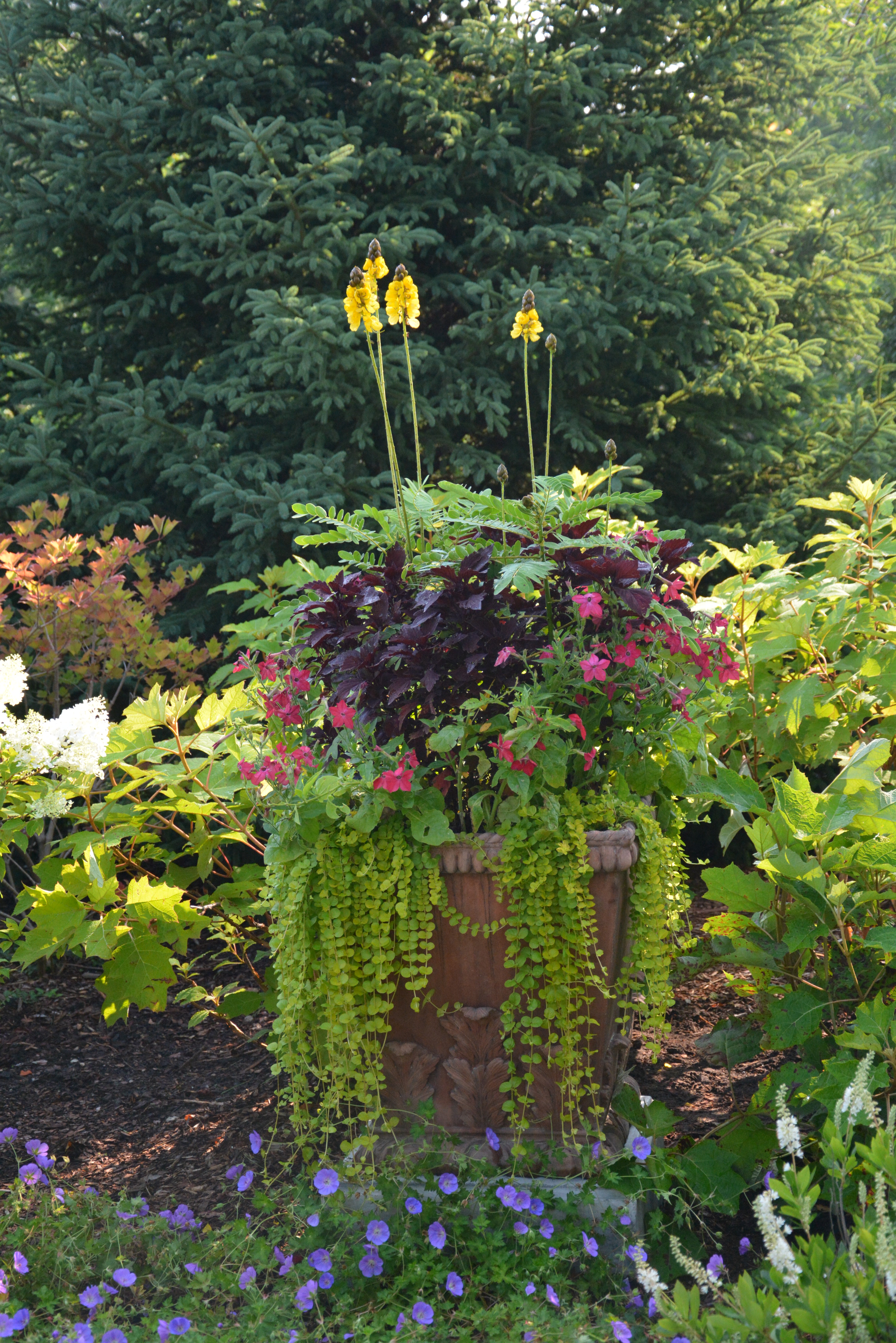
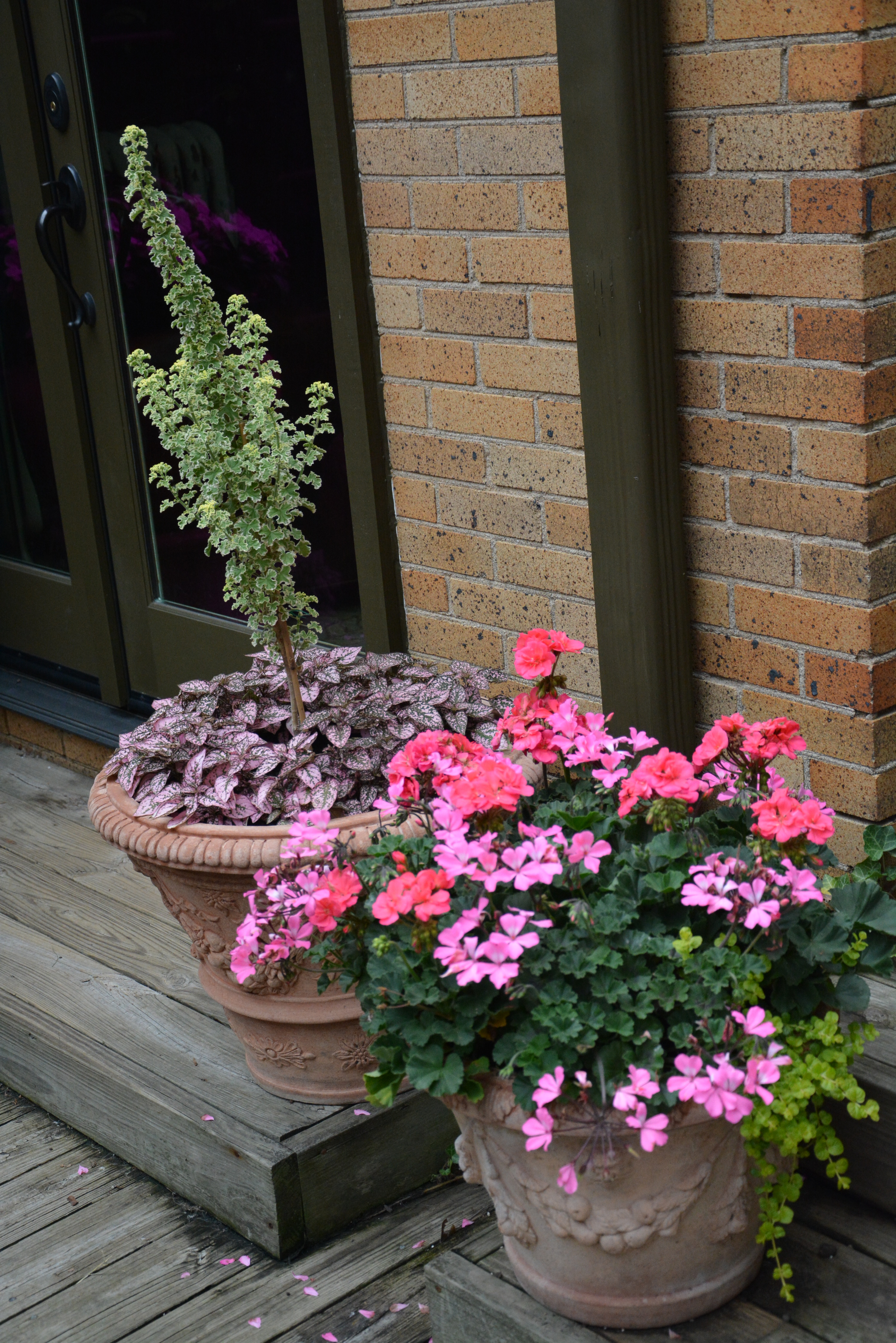
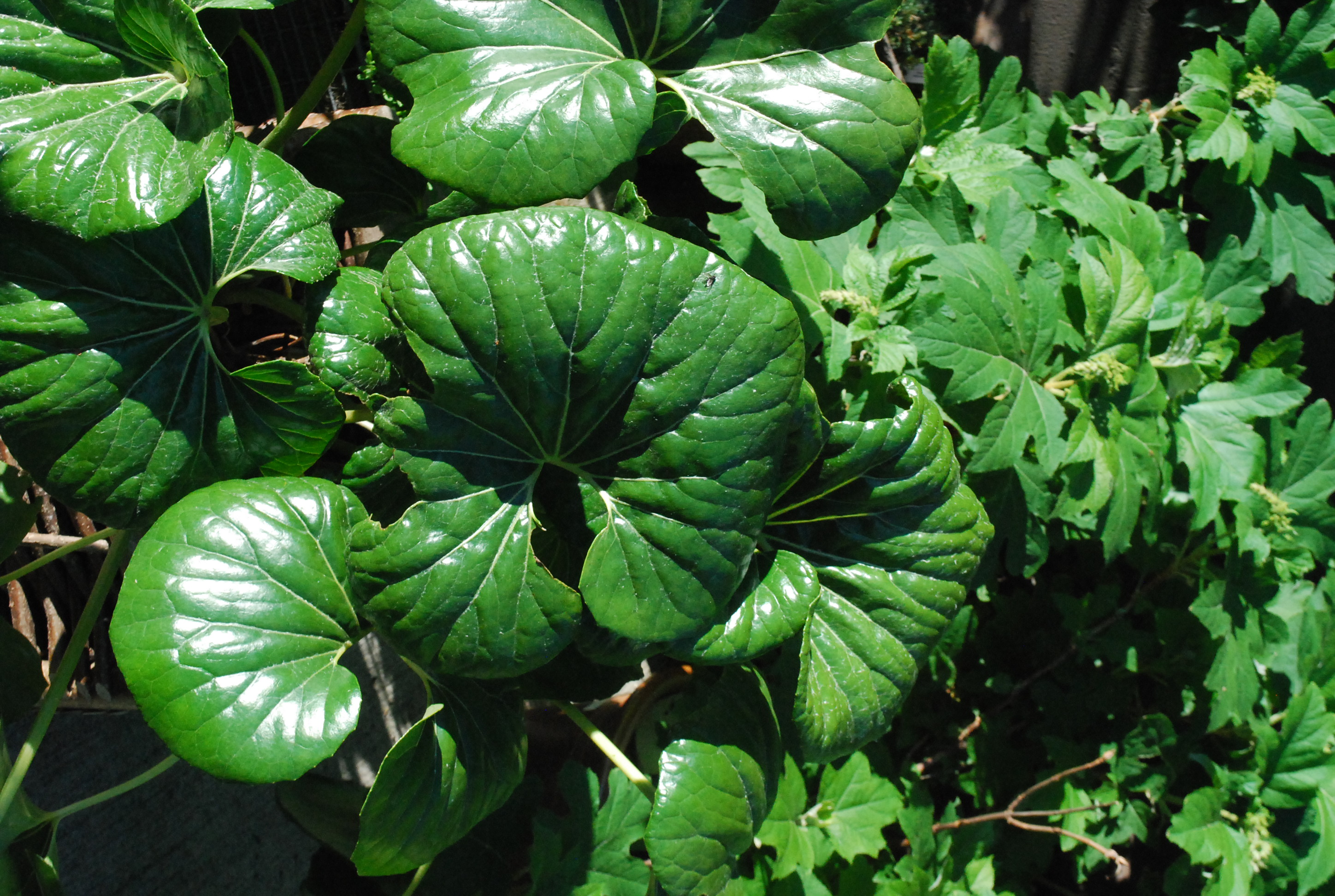
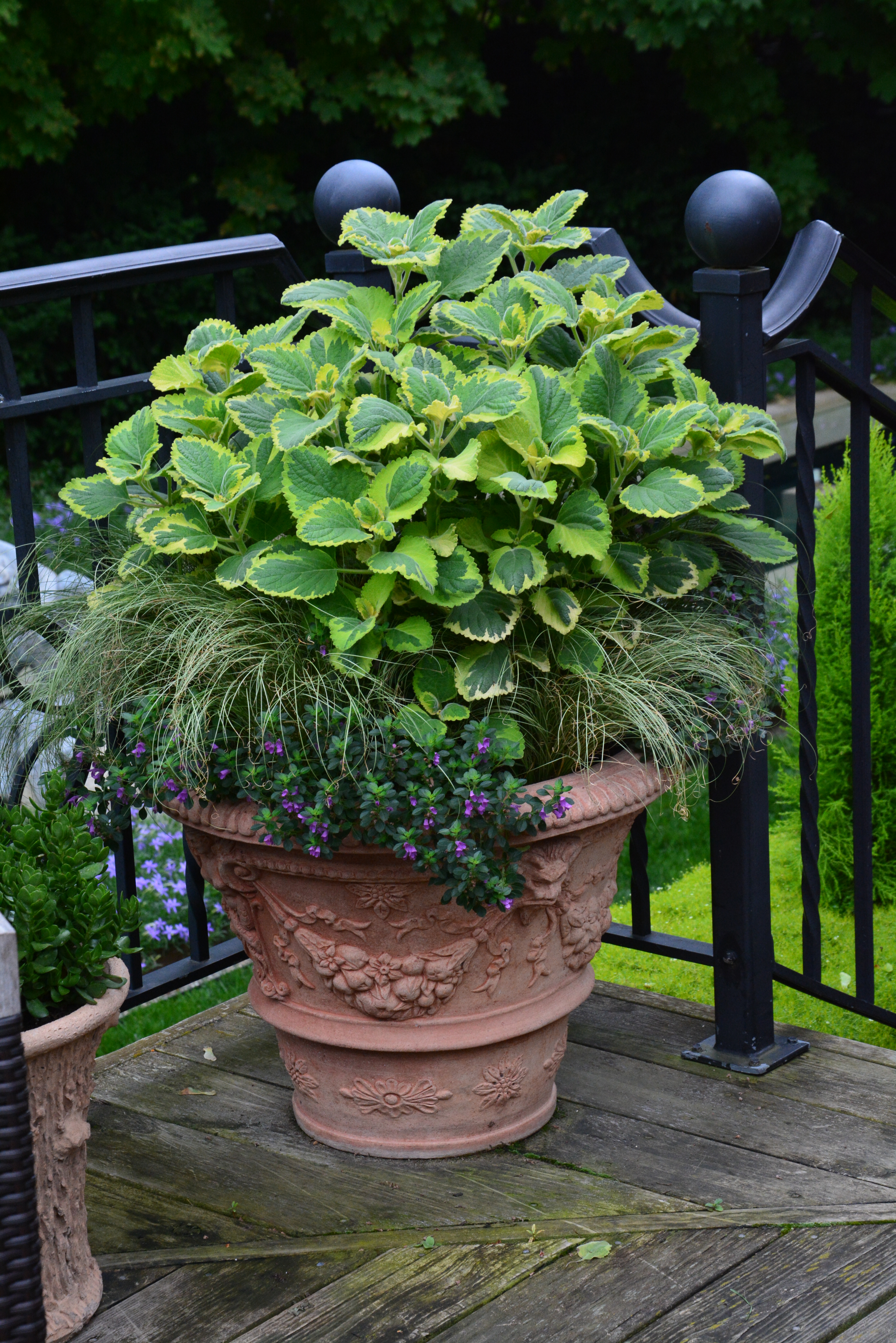
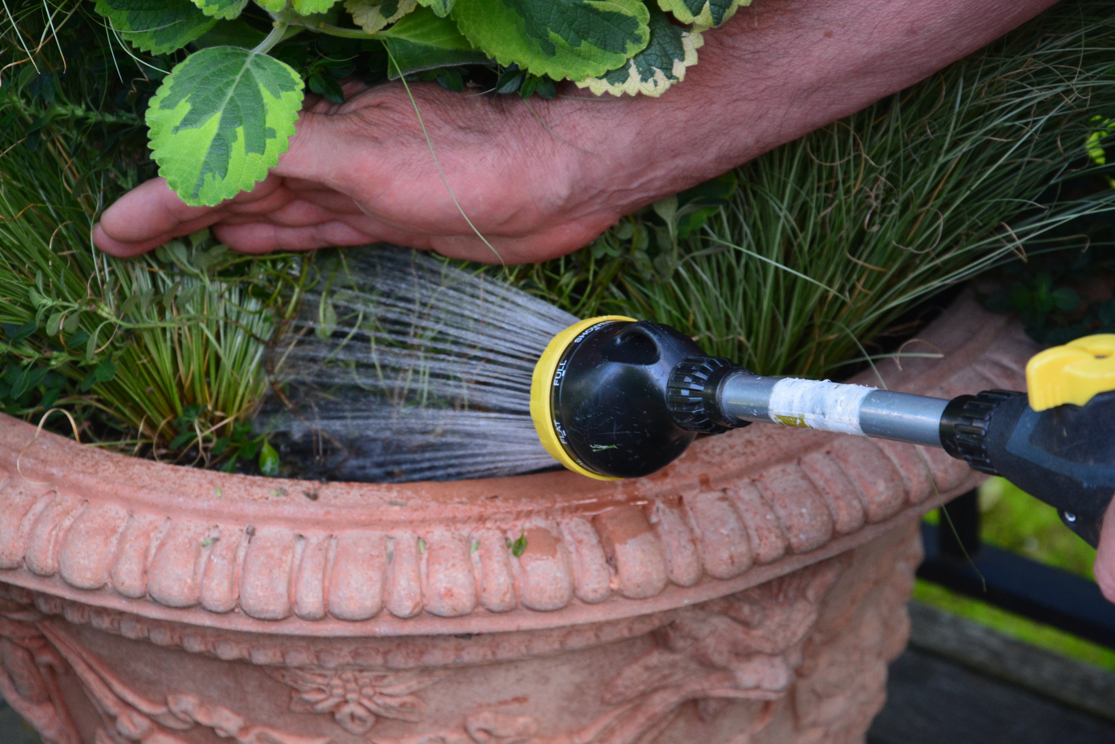
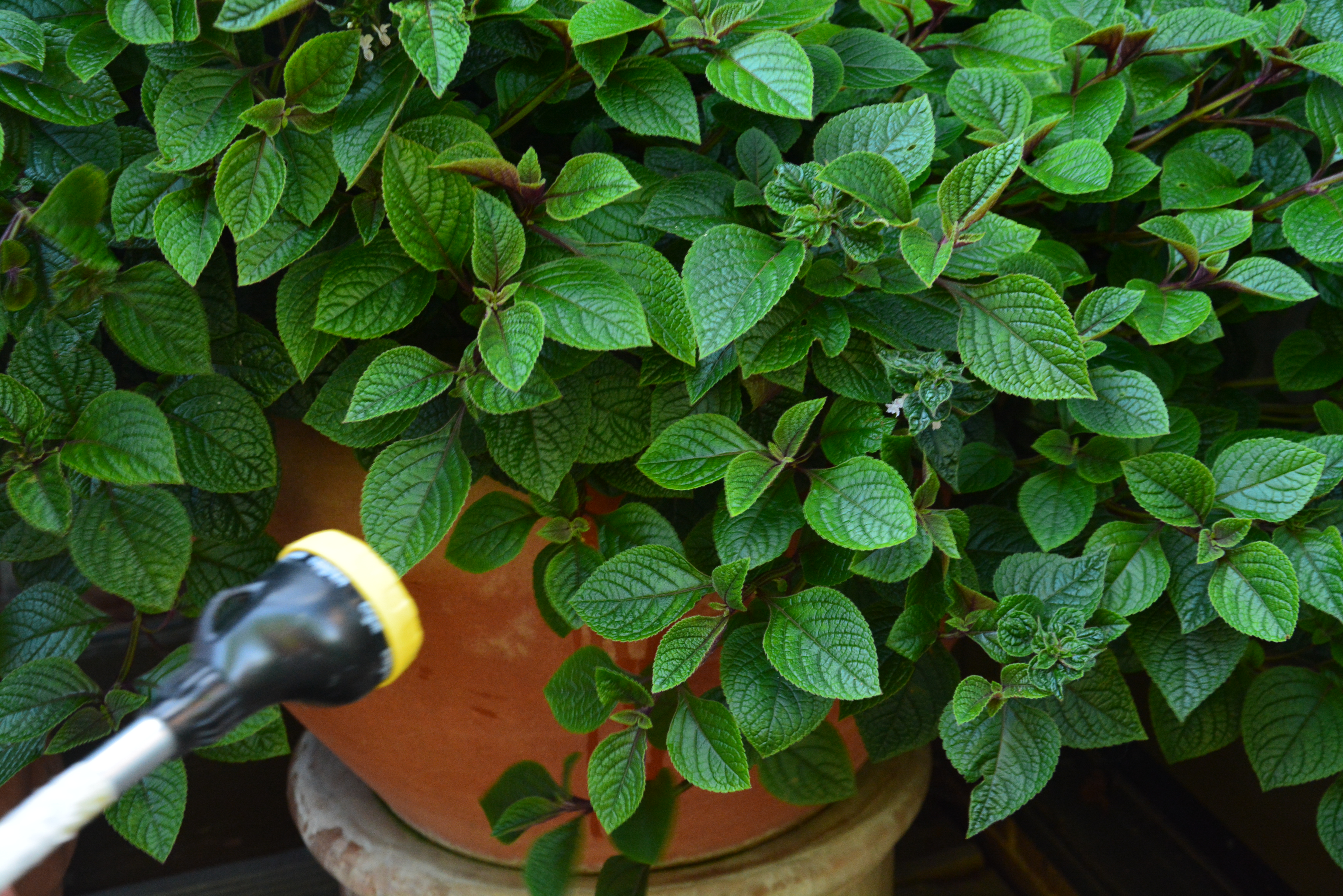
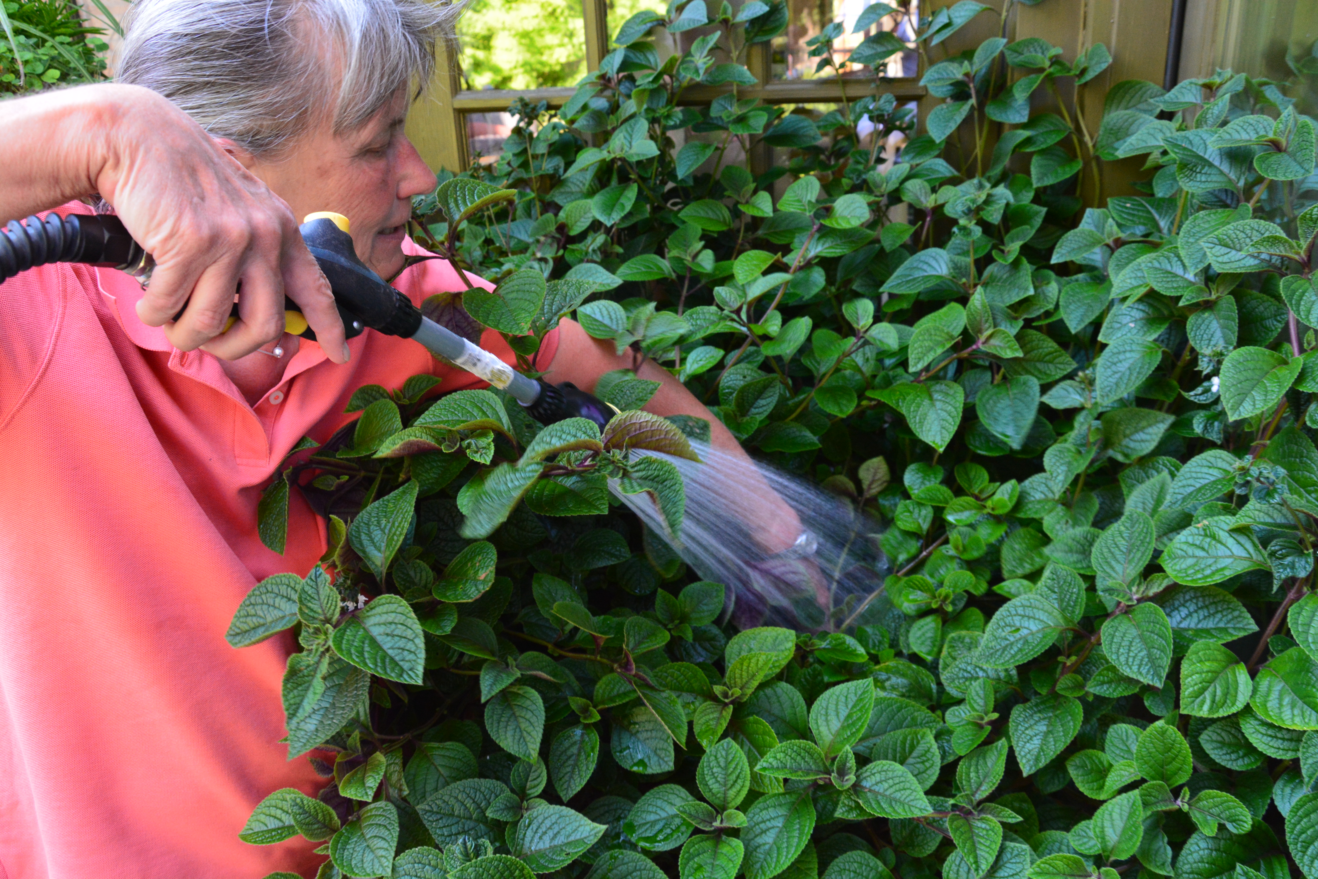
This chocolate soldier plectranthus has gotten so large that it takes my whole arm to to flip up the trailing portion, and direct water to the soil. As this pot is located in the corner of my deck, it isn’t feasible to go all the way around it with my wand. The best part for this plant – no water goes on the foliage.  The water need to go to the roots.

watering pots August 2015 (10)
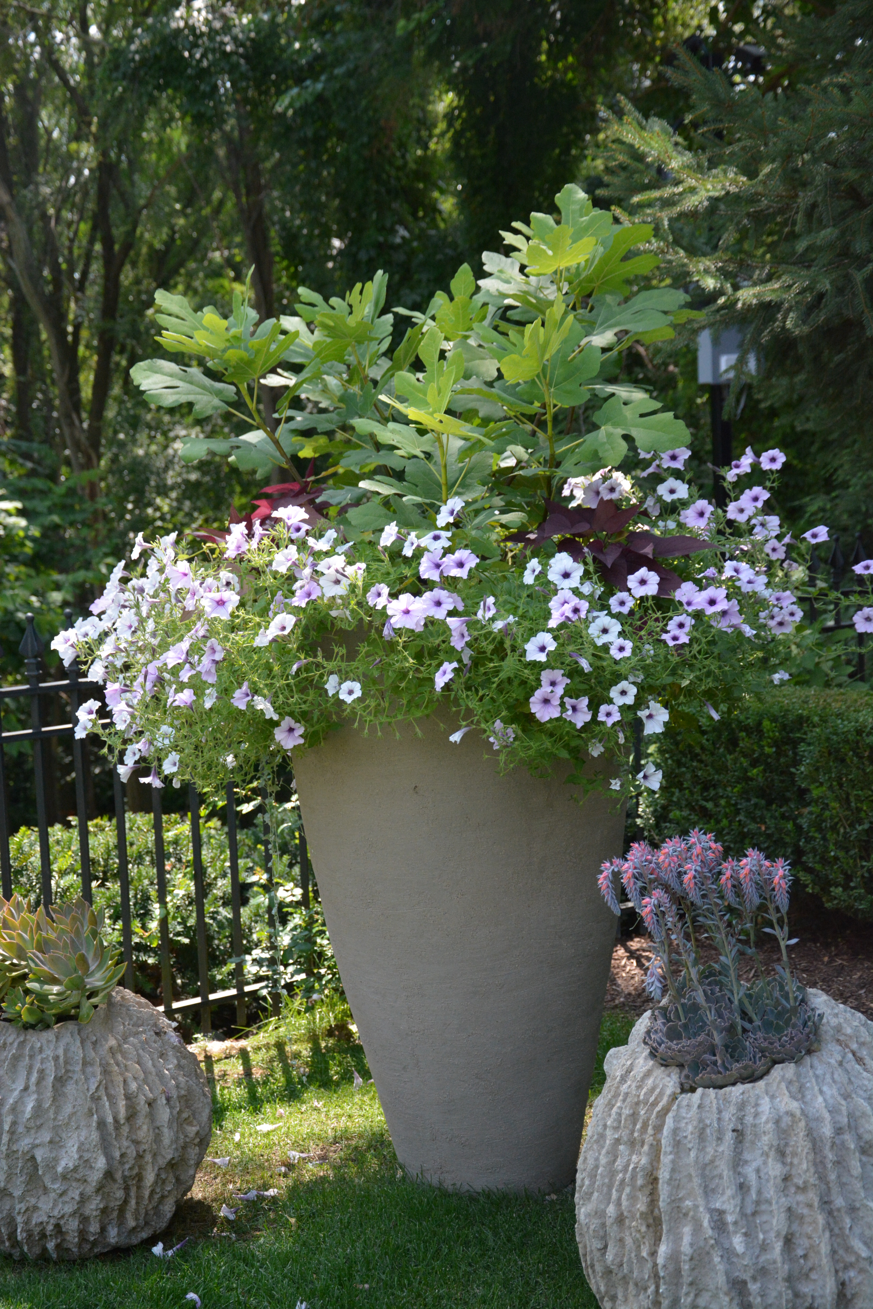
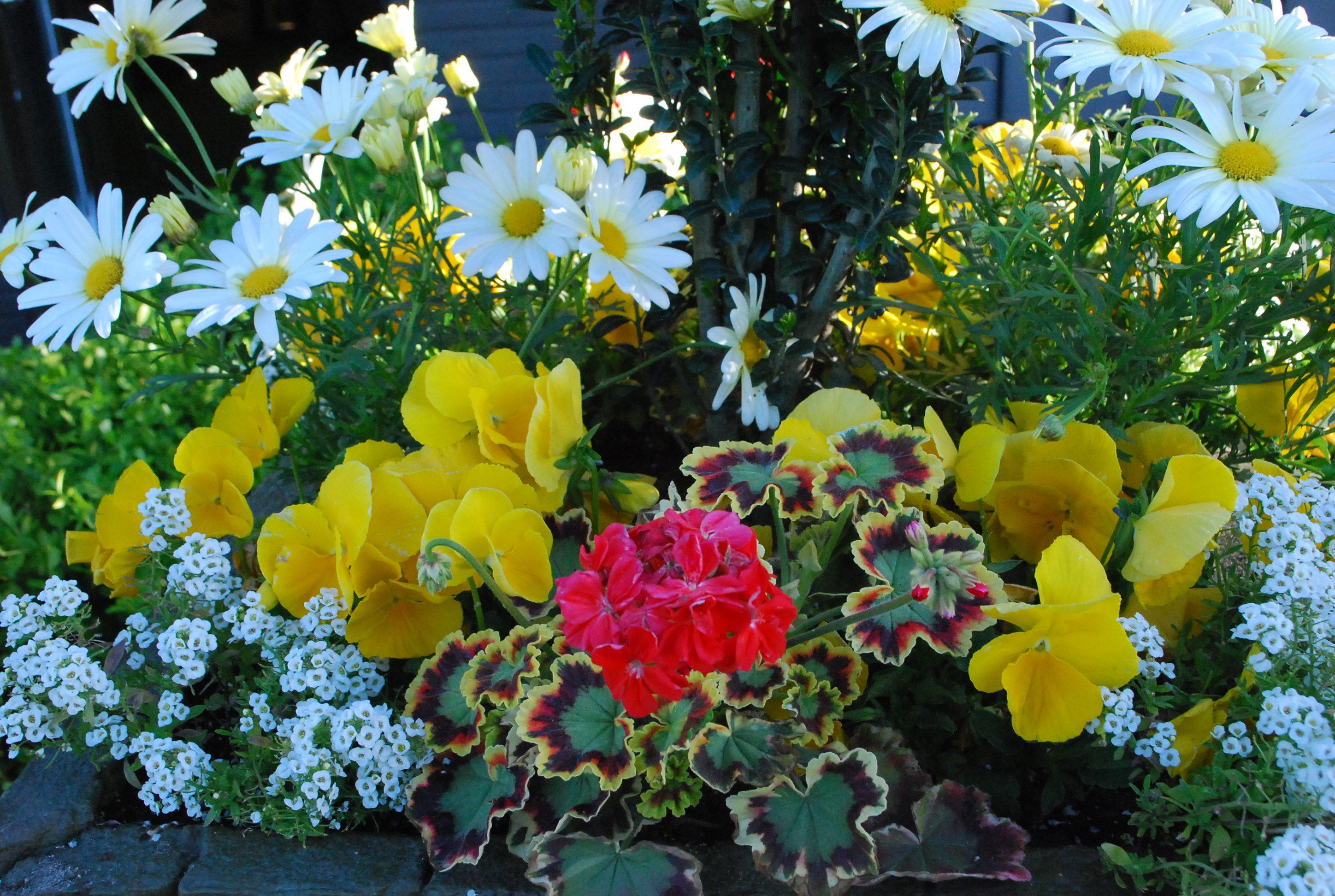
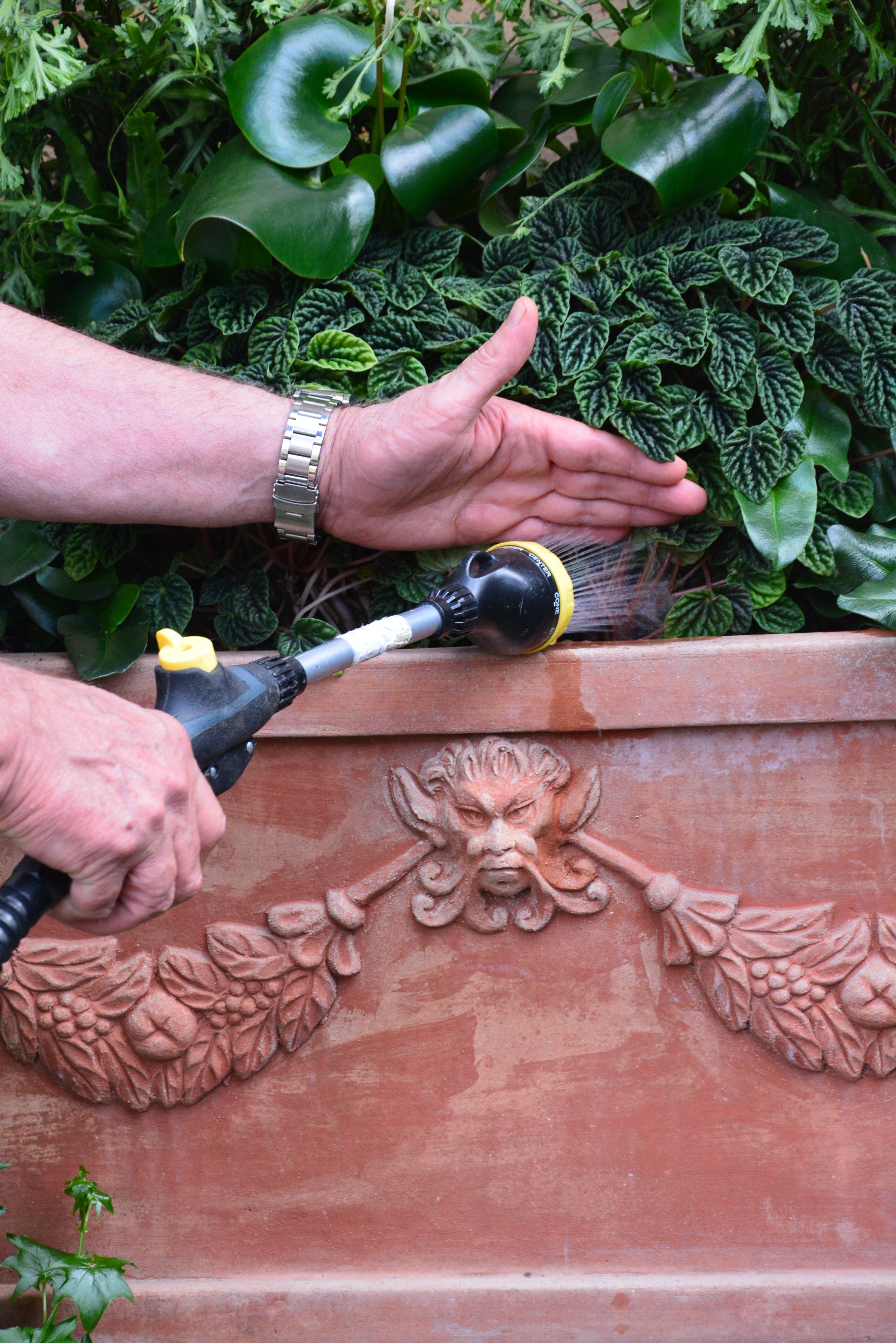
Watering a seasonal container properly takes a little finesse. This container needs water at the center.  A rim watering is not enough.  My left hand has located the surface of the soil in the middle, while my right hand delivers the water. How do I know how this pot needs water?  I touch the soil.  If it is hard and crusty,  (as soil tends to get towards the end of the growing season, when the plants are heavily rooted) I water until that soil softens, and feels spongy to the touch.  This pot I may need to water twice, to get it sufficiently soaked.  I will not water again until the soil has dried out.

watering pots August 2015 (14)
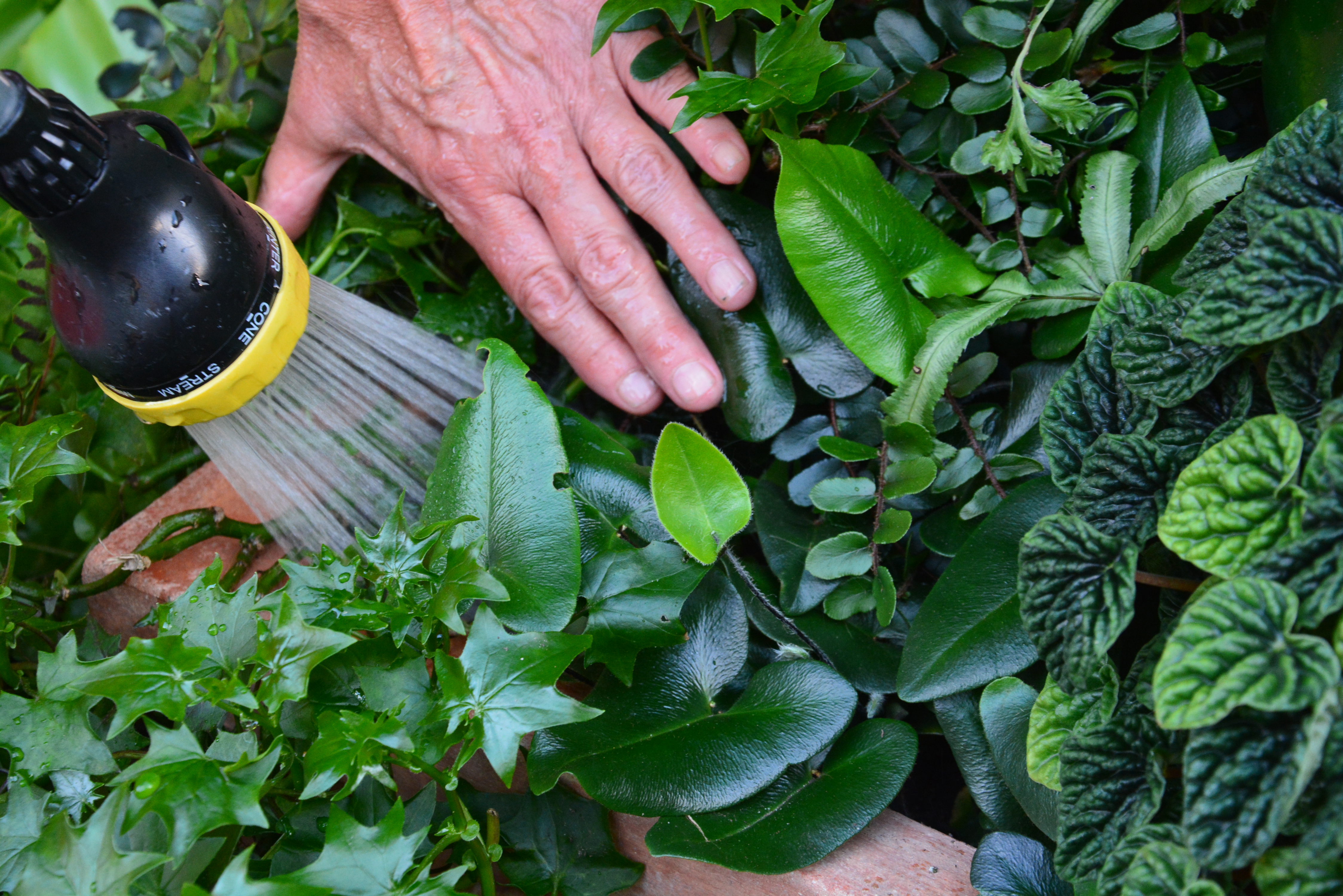
Flipping the leaves up in a container gives me a look at the soil below, and helps me to direct the water horizontally across the surface of the soil.  Plants are more forgiving of their leaves being handled as a group. Handling a single leaf can result in breakage. Water directed to the roots of plants in need is life giving.

watering pots August 2015 (11)
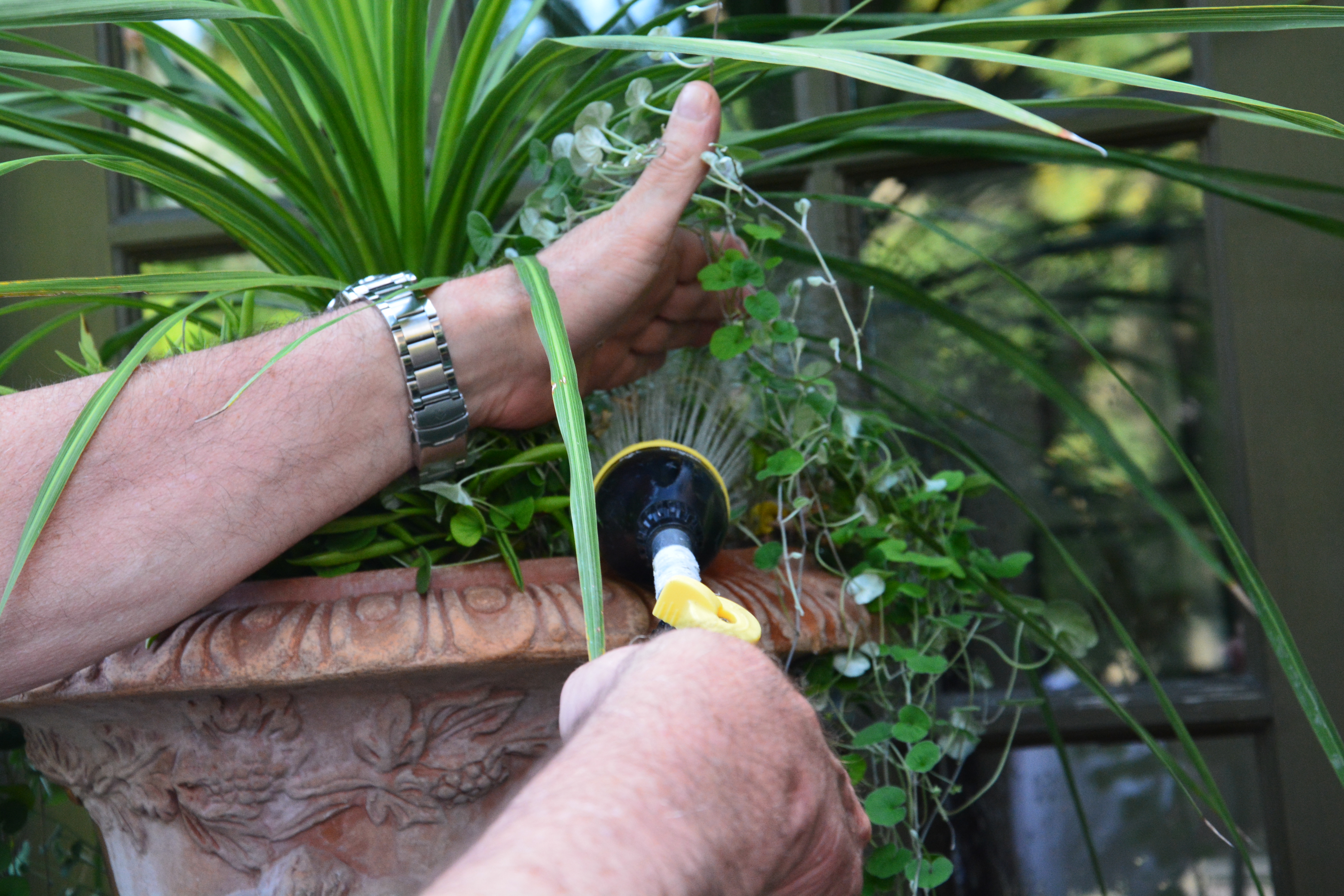
The German ivy at the lower left in this picture is trailing just about to the ground now. As the vines are very juicy, heavy, and brittle, I move the leaves just above the rootball as gently as possible, and water from the top. I wouldn’t want to risk breaking an entire branch.  I would not flip up German ivy trailers in search of the soil surface.  I shine that water down on its root ball, as best I can. Every plant in a container needs to be watered differently.

watering pots August 2015 (15)Dichondra, on the other hand, is a light weight and pliable vine.  The round leaves do a decent job of repelling water, should I water from the top. The best way to get the water to the roots of a dichondra is to get the leaves out of the way. Once I have watered those roots,  I set the vines back down.  Gently.

watering pots August 2015 (6)
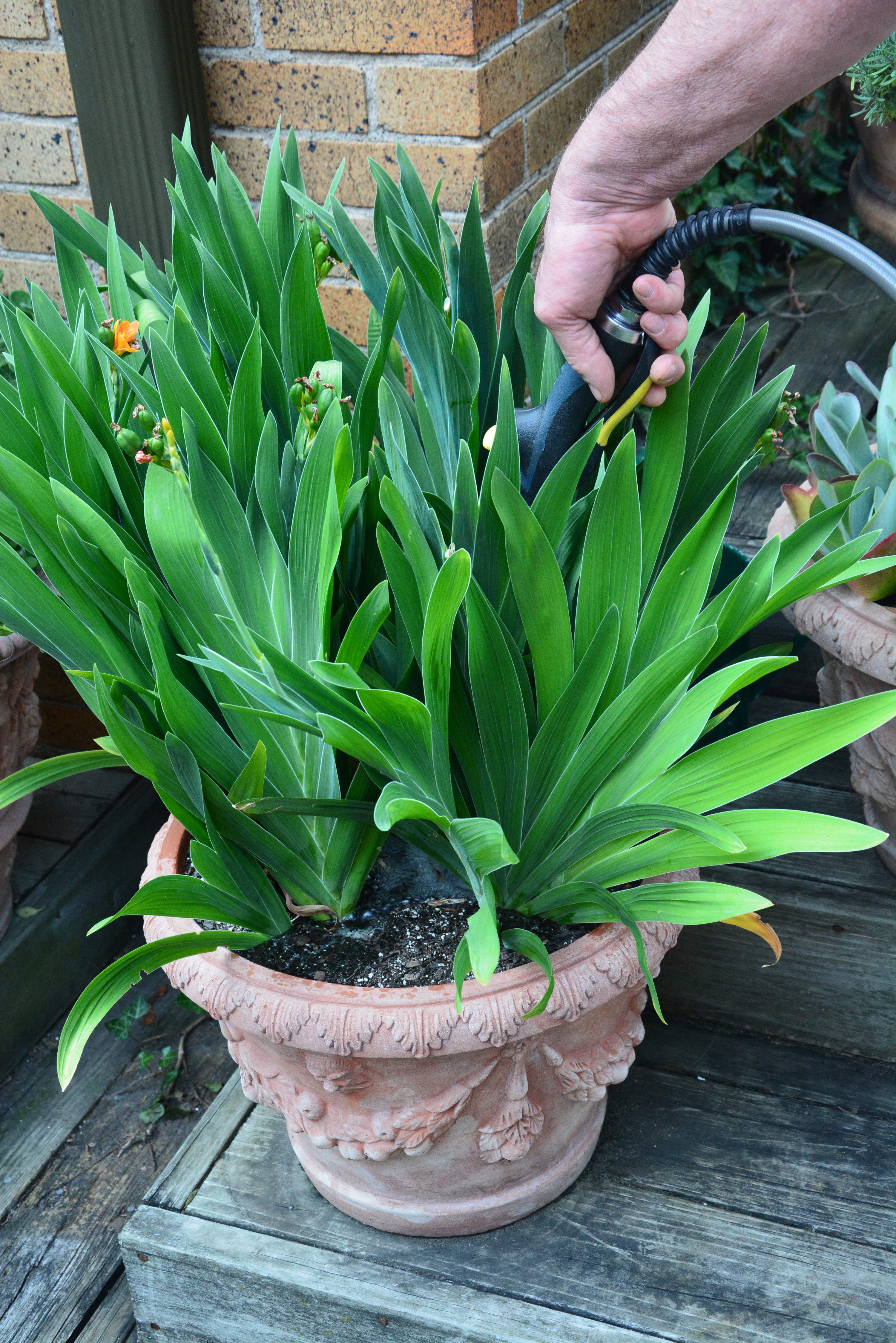
This pot full of belamcanda lilies is thoroughly rooted.  All of the growth is upright, so watering at the bottom is easy.  On an 88 degree day, I flood the soil until the water comes up to the rim. After the water drains,  I will refill the pot until I see evidence of water draining all of the way out the bottom.

watering pots August 2015 (1)
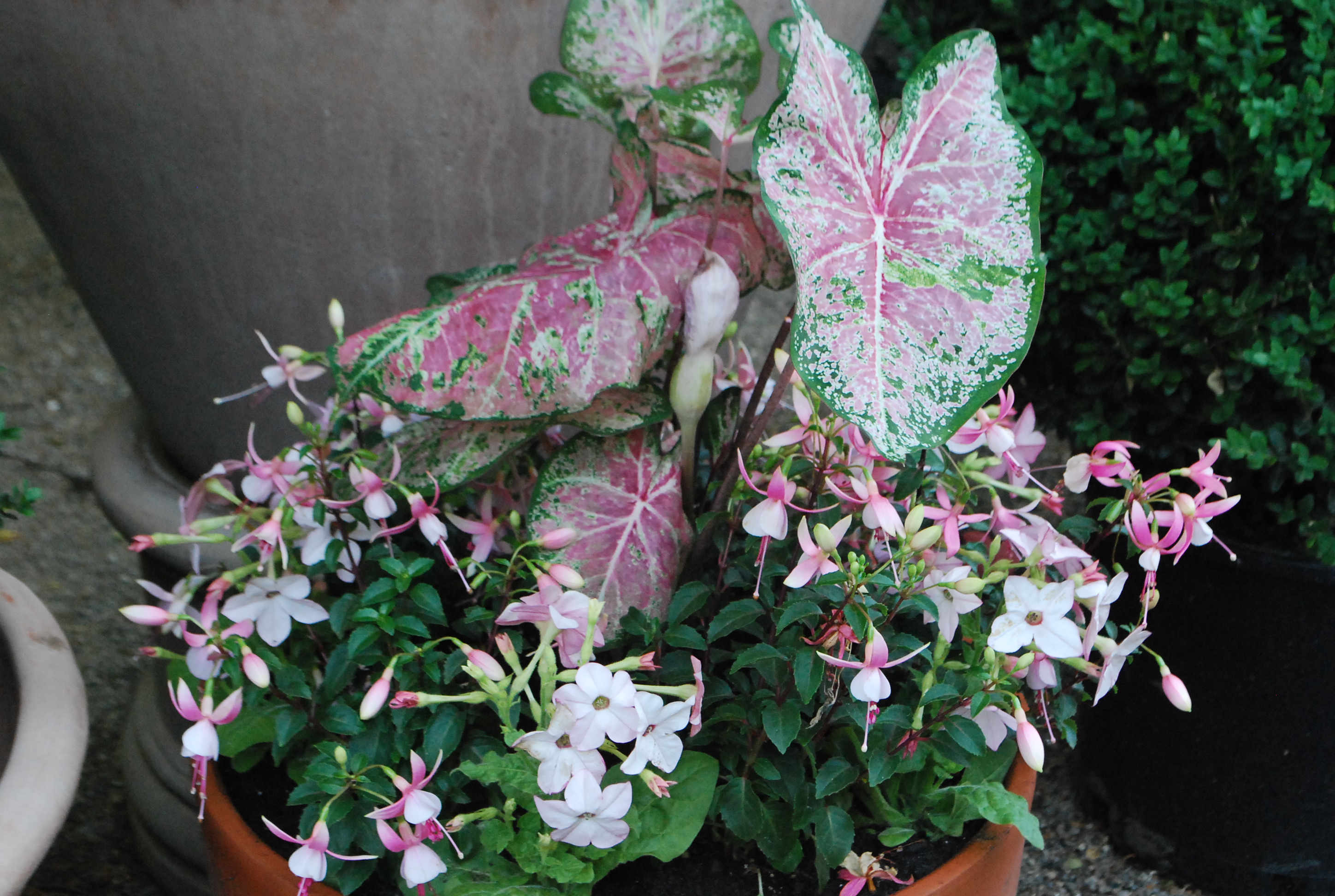
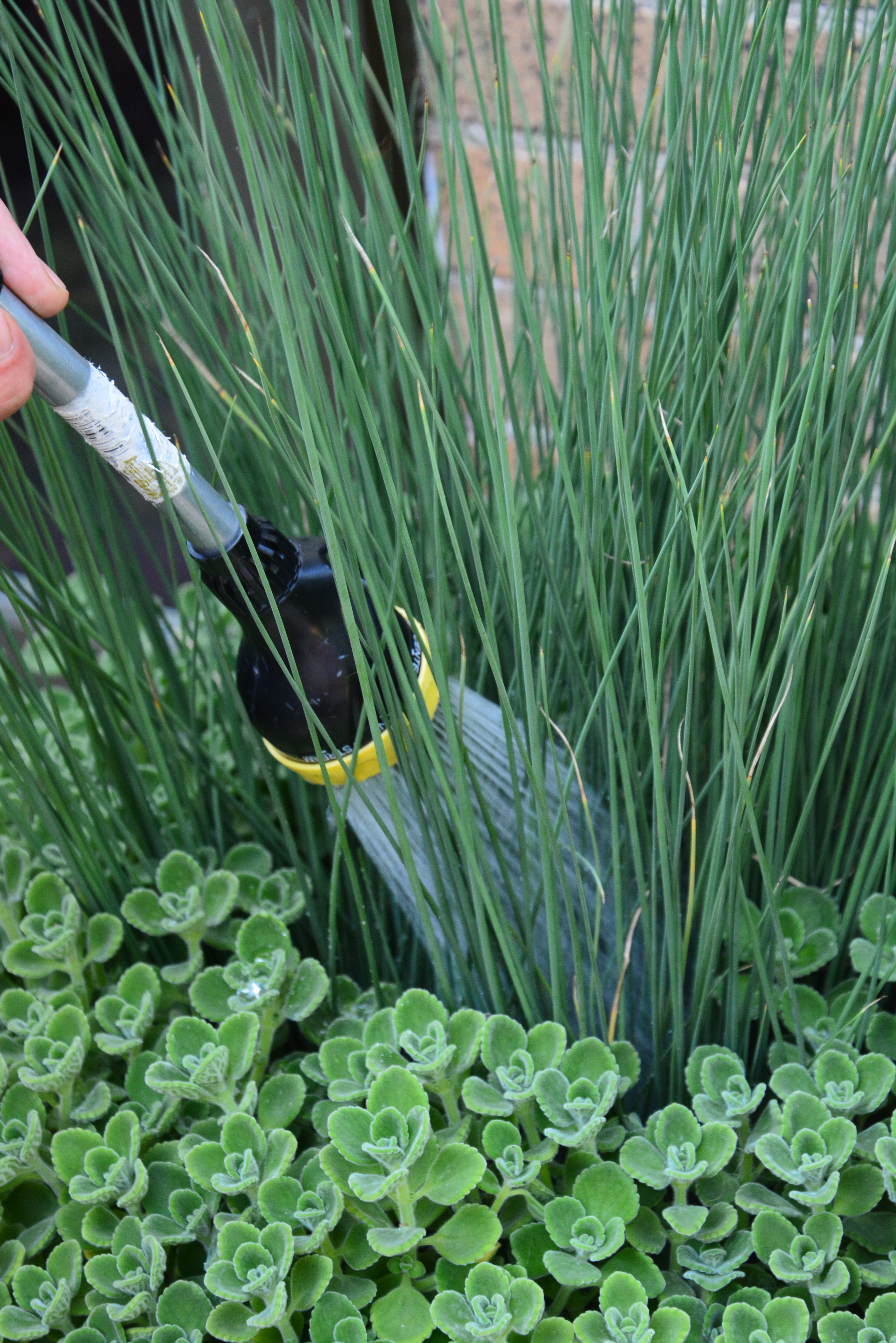
The rush in this pot is very fond of water. The Cuban oregano-it is happy to be dryer.  Some pots need selective watering.  I make the time to do this. I pour the water to the rush, and water the oregano every so often.

watering pots August 2015 (4)
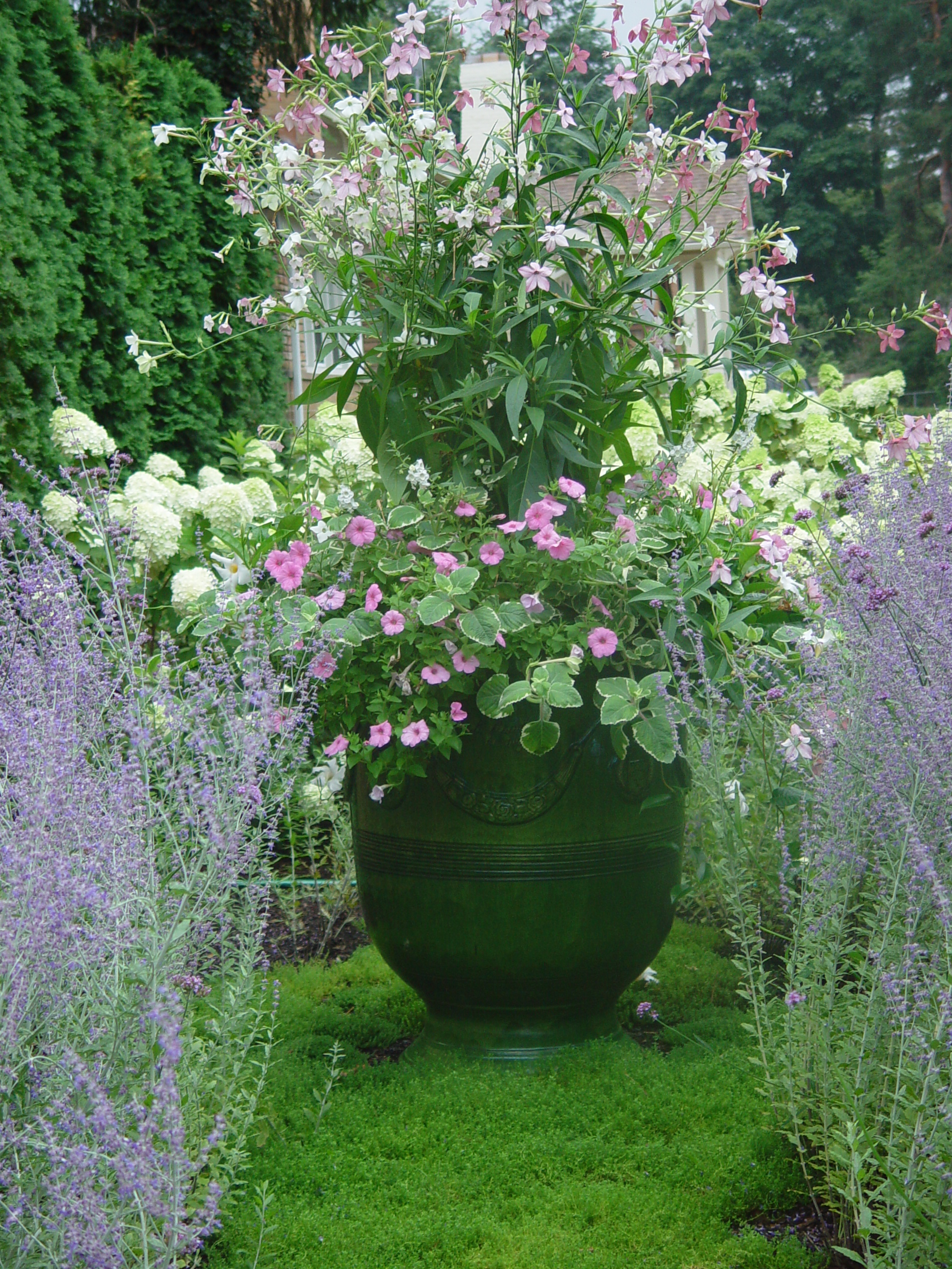
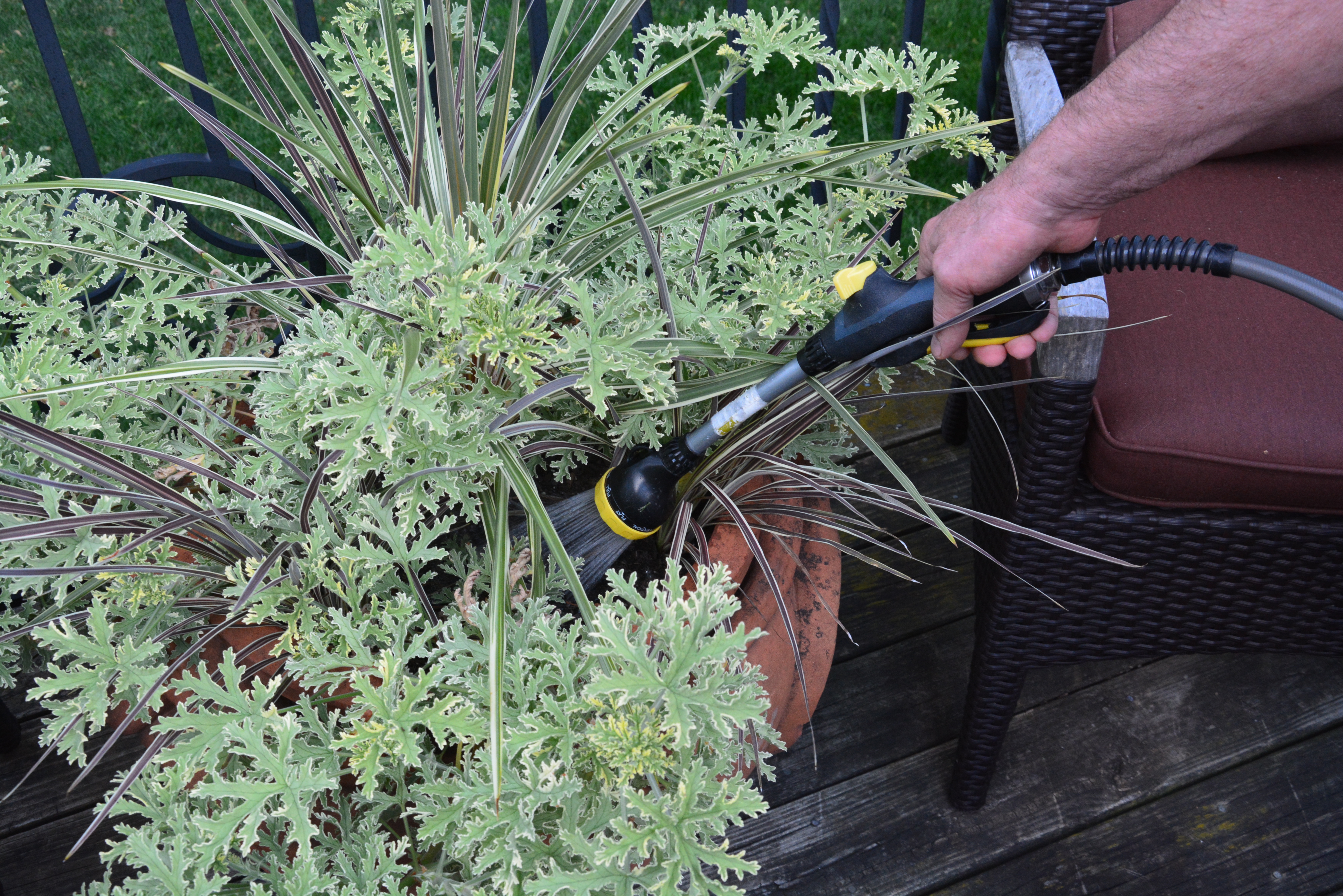
This pot planted with a rose scented geranium and a number of phormiums-I water it from the top. I cannot really explain why. The rose scented geranium does not bend much.  The phormium is vulnerable to breakage at the crown.  Why all this talk about watering?  Container plantings need regular and thoughtful watering.  People regularly ask me why my pots look good so late in the season, and during really hot weather. It’s the watering.


Off The Beaten Track

pot-in-the-lawn.jpgEvery gardener is used to seeing containers placed on hard surfaces.   On either side of a front porch.  On a set of steps or walkway.  On a terrace. But containers can fit right into a spot in the landscape.  We have worked in several places this week where containers were placed in the midst of the ongoing landscape. I like what I am seeing. Placing pots in the garden is an unusual placement, but unusual can be a good. The first rule of good design is to not take any rule as set in stone.  Some of the most beautiful landscape designs I have seen break every rule.  By this I mean, they break every rule, but do it convincingly.  A great heart, and sure hand always trumps following the rules. I worried myself for days, given the decision to place this pot in the middle of the lawn in the rose garden.  Once the deed was done, I wondered why. The placement seemed right.

pot-in-the-garden.jpgThis container is set in a landscape bed.  A clematis has climbed and wound itself around a tall steel container.  A bed of pachysandra, angelina and hens and chicks has been inter planted with with Persian Queen geraniums, euphorbia, and trailing annual verbena. The look of this garden is better than good. I like how the introduction of annual plants into the landscape, and the perennial clematis climbing the side of a container have created a look in which the container has become an integral part of the landscape. The annuals planted in ground-so charming, and so successful. This planting is not mine-it is all Jane’s.  Clients can be a great source of inspiration. They know their gardens backwards and forwards.  Their decisions are based on a daily exposure. This corner is invariably burned by salt in the winter, so a summer/seasonal planting helps keep this spot luxuriant.lemon-cypress.jpgA container set in a landscape bed is one way to create a focal point.  This tall concrete pot planted with a lemon cypress, euphorbia, and petunias gives meaning to a landscape comprised of arborvitae and pachysandra.  I like the ground cover growing up over the base of this planter. It looks as though the container has been there a while, and belongs there. in-the-garden.jpgA pot gracefully placed in a landscape can add another dimension to an outdoor space. Landscapes which offer many dimensions continue to interest the viewer.  A pot placed in the landscape is a mark made by a designer.  That said, I treasure the individual statement of a landscape above all. Some landscapes I see are all about a gardener in charge with a strong point of view.

Chicago-figs.jpgWe usually remove the grass underneath a container, excavate the soil, and replace that soil with gravel.  The insures that the container drains unimpeded. Trimming the grass around the container is an extra step, maybe even a nuisance.  But for the gardener that appreciates the small details, a placement like this is a pleasure. A pot placement in the landscape can be a temporary solution to a bigger problem.  In this case, a tree directly behind this group of containers died this past winter. The tree, and its stump was of a size that replacement will not be easy. The pots draw one’s eye away from the empty space. Given this placement of pots, a much smaller tree could be planted which would eventually fill that void.

shade-pot.jpgA container in the landscape takes on the same sculptural quality as a birdbath, armillary, or sundial.  The small footprint of any of these ornaments makes them easy to tuck into a small space that needs some visual interest.  This client has a particular fondness for pots in her borders. This pot is set on a short concrete plinth.  That small amount of additional height keeps the bottom of the pot in view, despite the ground covering geraniums.

in-the-landscape.jpgThis French glazed pot is of considerable size and stature.  It has been placed in a bed of myrtle facing down a stand of mature trees.  Pink and red mandevilleas growing on a simple trellis made of bamboo stakes makes a considerable statement by late summer. This spot, minus the pot, would be too sleepy looking for this client.  Every gardener wants something different from their garden.

herniaria.jpgThe landscape in the front of my house features two fairly large patches of herniaria.  This spot asked for something short that would require little maintenance-it has done very well there. Years ago I set a pair of French glazed pots at opposite ends. A garden ornament which represents the end, or boundary of a garden is called a Herm, 0r a term-as in terminus.  Though I have since moved the Russian sage in favor of a simpler arrangement, and switched out the French pot for a concrete pot with a yew topiary that can sit in this spot all year round, the idea is the same. The placement of containers can be anywhere there is a need.


The Deck Pots

June 25 2014 (1)Every year I think I will be able to finish planting annual containers for clients before the beginning of July.  Beginning of July? I do have clients who plant their pots for spring-they have no need of a summer planting until late June.  There are some clients who call the first week of June for pots.  It is late June until I can get to them.  I am hoping to finish all of my private clients this week, leaving a summer commercial installation for next week.  The container plantings I hope to have done by the 4th of July.   Given our cold and off putting spring, It is still taking all the time I have and then some to do the work I have booked. But no matter the work load, I make time to plant my pots at home.

June 25 2014 (3)I do plant lots of containers at home.  Coming home to planted pots is a good thing indeed.  Part of my end of the day routine is to tend to the watering  and maintenance of my pots. Just an hour ago I finished planting the last pot.  Given that I am planting into warm soil, that last pot should show signs of growth in just a few days. Looking at them and after them is relaxing for me.

June 25 2014 (4)I do plant my pots differently every year.  That is part of the challenge, and the anticipation of the summer season.  My trees are in the same place, doing the same thing, every year.  My perennials and roses and groundcover-I do not move these plants around, or change them regularly. Though I may waffle away the early spring planning for my containers, by the time that June comes, I have to commit.  I like that deadline.

June 25 2014 (5)I like that pressure. Too big a time frame gives me too much room to fret.  A short time frame encourages me to make decisions, and plant.  I am pleased with this year’s deck plantings.  Certain things influence my decisions. I have a 1930’s home with Arts and Crafts details that features a brick cladding that is a mix of yellow, cream, and pink.  White looks too chilly here. Silver foliage, as in gray, looks good here.  I will admit that after the consideration of scale and mass, I am very drawn to a discussion of color. Pink and orange, and all the versions thereof, may not interest you.  But those colors suit both me and my space.

June 25 2014 (11)I went on occasion far afield from a pink and orange scheme. The Persian Shield in my Italian terra cotta squares faced down with variegated pepperomia and variegated tradescantia seemed appropriate to the color of the brick, and the color of the Italian terra cotta pots.  I had no problem introducing some dark purple to my scheme.June 25 2014 (7)The pennisetum whose name I cannot remember,  and the orange coleus works with the color and the design of this pot.  I did entertain many other plantings for these terra cotta urns.  Pictured above-my decision. No one else has to be pleased about this decision but me.  That is half the fun of it.  I like this messy head of hair in contrast to the formal and classical style of the urn.  Once the coleus gets to growing, the look will change.

June 25 2014 (8)My terra cotta pots from Mital have  loads of detail.  I try to plant them with an eye to that detail. I try even harder to not to over think it.  I am a big fan of graceful. All the plants in this pot are quite ordinary-petunias, geraniums, lime licorice.  The terra cotta nicotiana is new to me-I like that brick orange color.

June 25 2014 (6)Pink and orange-I will admit my choices for my containers this summer were much about lively color.  The nicotiana “Blue Ice” is an interesting color variation I had not seen before.  I have planted this oval pot all green, with green nicotiana, for many years.  This year is different.

June 25 2014 (10)As for what I have planted in my deck pots this year, I like the relationships generated by color.  Not quite so obvious are my sun issues.  This space does not sit due east.  It sits southeast.  This particular spot gets incredibly hot and sunny for about 6 hours a day.  The brick, once it gets really hot, radiates more heat.  I have to pick plants that are happy in this environment.

June 24 2014 (42)This pot full of orchid pink new guinea impatiens looks swell.  Like the geraniums in the previous picture, this impatiens likes the heat, and a good amount of sun.  The pot is large enough that I am able to keep the soil at the proper moisture level.  Dry New Guineas will flop over dramatically.

June 25 2014 (9)The 1930’s English snake pot is a prized pot.  It does not need all that much in the way of dressing up.  The creme brulee heuchera leaves are big and simple, and compliment the shape of the pot. I can see over it into the garden beyond. The pot has a setting.

June 25 2014 (2)At the bottom of the stairs off the deck, one of the first boxes that my company Branch ever produced. I love this box every bit as much as my Italian terra cotta pots.  The color scheme is a mix of yellow, orange and brown. There is a lot going on, texture and color wise, as the pot sits in front of a big section of brick.

I would share anything I could about my process for planting containers with any gardener.  Why wouldn’t I?  That said, I did not think much about my process until the pots were done.  My container design has everything to do with the place- the architecture of that place.  Color.  Scale and proportion. Rhythm.  Texture, mass and line.  And of course, the maintenance. What can I plant that will be a pleasure to maintain?


A Few Thoughts About Color


red-nicotiana.jpg

Given that there are 3 primary colors, and three secondary colors, and infinite possible combinations and permutations of those 6 colors, makes the topic of color a big one.  Have you ever tried to pick a color for a room from 10,00 paint chips?  I will admit I buy a lot of quarts to try before I commit to gallons of a color.  Understanding and working with color is hard.  Annual and tropical plants provide a level and longevity of color I do not get from my trees, shrubs and perennials.  It could very well be that the reason that I so love container plantings is that they enable me to explore the element of color-over and over again. The relationship of one color to another, or a color scheme, is of interest to me as a garden designer.  Planting annuals is the best way to try a color scheme on-before you commit to it in the landscape.  Explaining why certain color combinations are attractive, interesting is not so easy.  Pictures make things easier.  This dark red nicotiana pops when it is paired with a contrasting color, and when it is placed so the light shines through the petals.  This scheme-electrically charged by the rays of the sun.

phlox-and-violas.jpgExplaining why certain color combinations work, and why some schemes are attractive and interesting to my eye-not so easy.  My approach to color is very personal and intuitive.  I am just like every other gardener.  Some schemes seem right-others seem off putting.  But there are some observations I can make about color that might abet your choices.  This picture makes it clear that pale colors appear to come forward, while dark colors appear to recede.  The idea here?  If I have a mind to plant dark colored flowers, I plant pale colored flowers behind them.  A light background helps a dark color to read.

yellow-orange-and-white.jpgHot colors-as in red, yellow, orange, and hot pink, light up a shadier spot.  Fancy leaved geraniums contribute to a color composition via their leaves.  The Skies of Italy geranium has leaves of red, burgundy, green and yellow.  The color of the leaves of this geranium can help knit a color composition together.

farfugium.jpgShiny green is a very different green than matte green. The surface of a color can influence how that color reads.  A dining room painted in red high gloss lacquer is a much different dining room than one painted in matte wine red paint.  Color provokes emotional and associative reactions.  The reaction that matters?  yours.  Look at  a lot of color combinations before you commit.  This makes good design sense. Emerald green is a combination of yellow and blue,  fairly evenly matched.  How does this emerald green look with the colors of the flowers you have chosen?  Choose your greens!

red-and-yellow.jpgRed can be dark and moody in the garden.  It can be royally rich-when paired with yellow.  Pale yellow with dark red is not quite the brass band that fire engine red and gold yellow makes.  Pasiring red and yellow has many possible interpretations.  A variation on a traditional color theme can be very striking.  My advice-if you are developing a color scheme, pick 3 colors.  Two colors is a story with not enough detail.  The third color facilitates the relationship between the first two.

a-shade-of-white.jpgHow many shades of white are there?  White white.  cream white.  blue white. rosy white.  Greenish white.  Even an all white color scheme asks for some attention to be paid to the particular shade of white that works.  Some white flowers have yellow centers.  This would suggest that a yellow green foliage would compliment that shade of white.  Blue-white flowers, such as this silverberry petunia-yellow flowers would contrast.  Dark purple flowers would harmonize.

millet-jester.jpgHarmonious colors tend to be quieter.  More serene.  Contrasting colors provide visual excitement.  Lime green foliage always looks fresh and spring like.  Red with lime-very pleasing.  Lime with white-fresh.  Lime and orange-provocative.  Lime and purple-don’t you like this?  Lime green in the sun?  oo la la.  Lime green in the shade-the lights are on in this garden.  Lime green and pink-so Coco Chanel or Lily Pulitzer.  Pale lime and pale pink-fragile, ephemeral-breathtaking.  Wildly lime-a light fantastic version of green.

the-blues.jpgI will admit I like planting containers with plants all of the same tone and color.  The exploration of a single color in a lot of different plants makes a strong visual statement.  It focuses the eye on texture-another important design element.   If you are a big fan of texture, stay steady as you go with the color.  Contrast the texture.

pink.jpgAre you a fan of pink?  Which pink?   Carmine pink.  blue pink.  coral pink?  pale pink?  Dark carmine pink?  Blue pink?  Not all pink flowers harmonize.  If you are hoping to stir things up, plant a variety of pinks, and let the chips fall where they may. More interested in a strong and harmonious statement about a blue pink-you eye will tell you when a yellow based pink is gumming up the works.  Put lots of plants in your cart.  Put back those plant whose flowers threaten to dilute your idea.  As for right and wrong-that applies only to moral questions.  This is gardening.  Enjoy it.  Just take the time to sort through the color relationships.

coral charm peonyI have had this photograph of a Coral Charm peony on my computer for a long time-I do not know the photographer. If this is your photograph, please write me. I am posting it, as the color of this peony is so striking and unique, that it surely would inspire a color scheme-a spring color scheme-that would pay tribute to such an extraordinary color.

light-and-dark.jpgLight and dark colors-the contrast is lively.

related-colors.jpgPale pinks with blue green foliage-a great scheme for semi shady places.

carmine.jpgThe carmine pink of this cosmos flower is all the more visually dramatic-given the yellow center, and the burgundy red corolla.  The contrast of the yellow and red center makes that carmine pink shine.

orange.jpgOn the left in this picture-an orange begonia heavy on the yellow.  On the right, an orange tipping towards blue.  There is orange.  There is another version of orange.

bok-choy.jpgThe blue green foliage of the bok choy clearly compliments the color of the blue violas..  The addition of white makes the scheme all the more crisp and fresh.  Cool and clean-this scheme.

purple.jpgLavender and purple-you have choices.  The sun will make its own statement about your choices.  Light and dark purple both colors can be the star of the show.  Both colors can be a supporting cast that makes your central idea shine.  Purple is a color that fits into a lot of different color schemes.

sunny-yellow.jpg

Sunny yellow-there is nothing quite like it.  Yellow is the color of the light that every garden thrives in.  Have a place for something yellow?  I recommend this level of garden cheer.  Your idea bout color is a good idea.  Another good idea-follow through on your sense of color.  Make the colors work just the way you want them to.