At A Glance: Cafe Au Lait Dahlia

cafe au lait
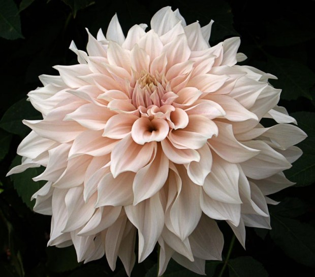
In early June, I published an essay about the garden to come in the front yard of Detroit Garden Works called “Color Scheming”.  A dahlia named cafe au lait I had read about on Gardenista had gotten my attention. It did not take long for me to decide to organize and design the entire garden around that coffee infused with cream colored dahlia.  My grower managed to obtain and grow on 30 of them for me.
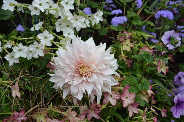
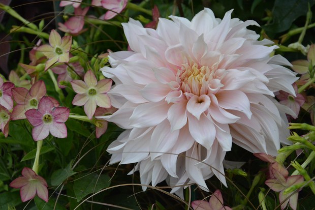
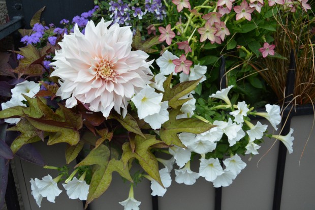
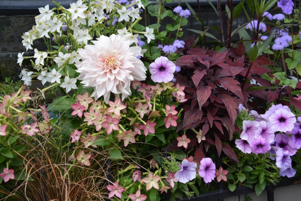
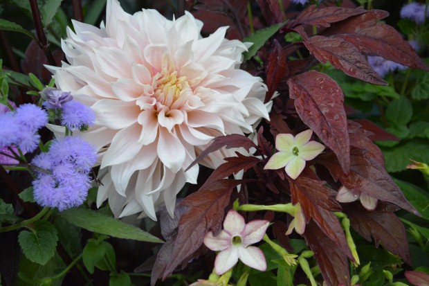
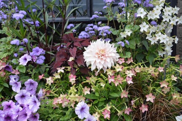
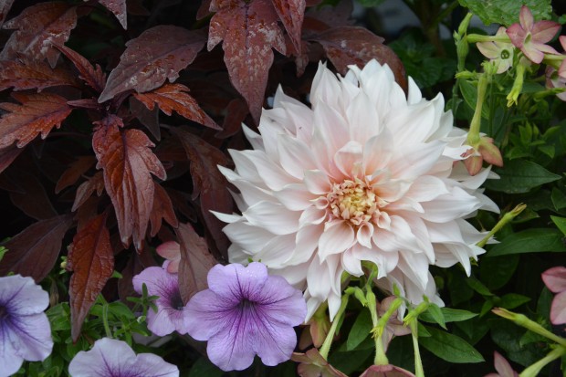
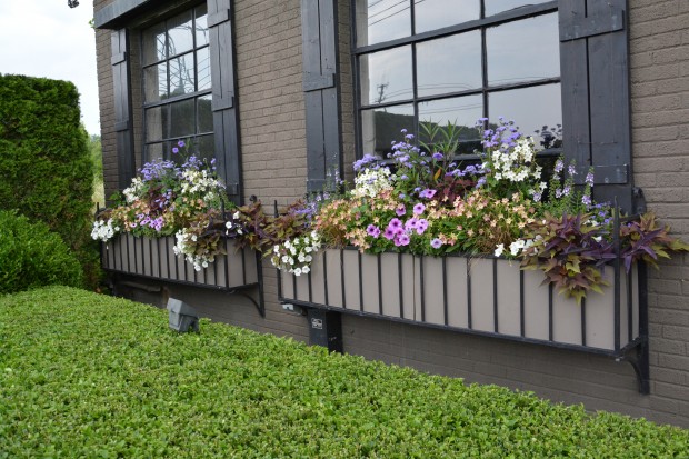
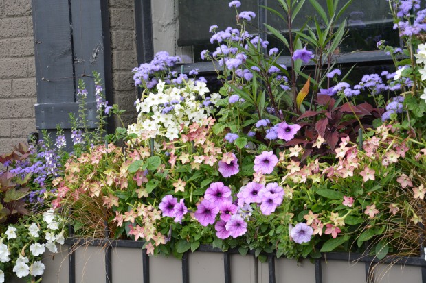
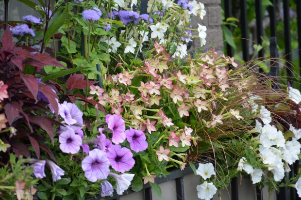
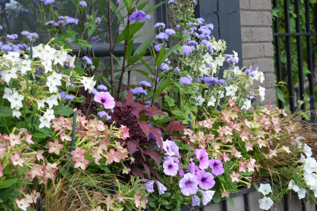
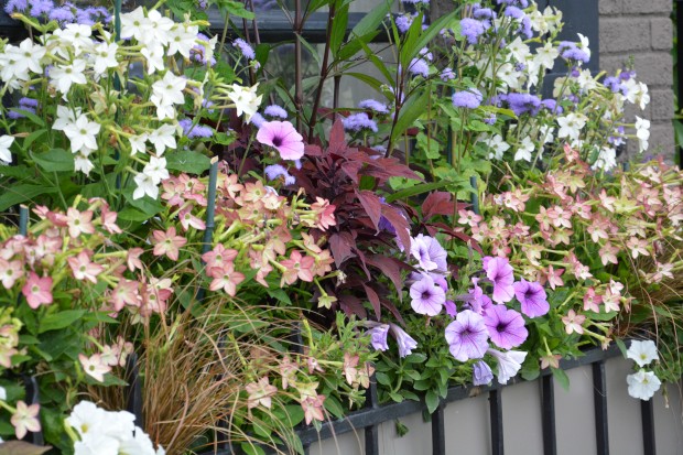
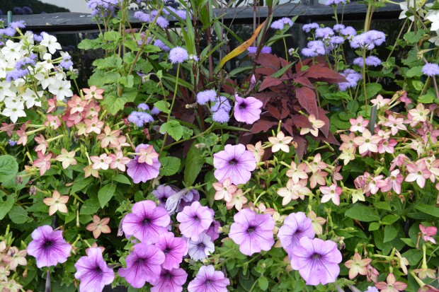
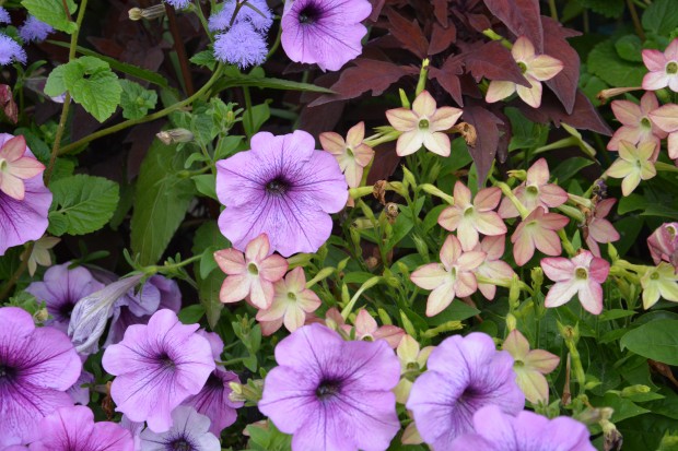
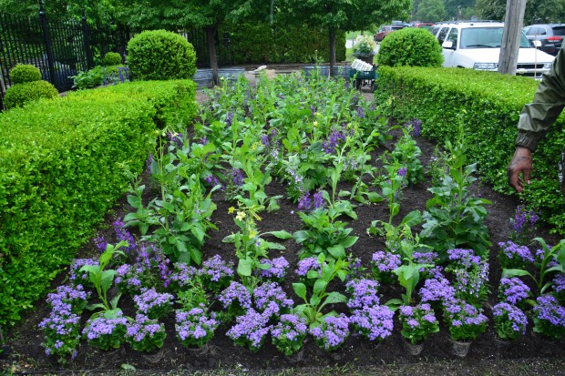
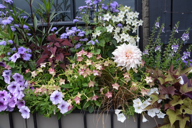
cafe au lait Dahlia (33)The dahlias got planted in the big garden beds in front of the shop, along with a white dinnerplate dahlia, white and lime nicotiana, and lots of purple and bicolor angelonia.  The window boxes were planted with lots of different flowers that I imagined would feature the color and form of that extraordinary dahlia. cafe au lait dahlia (16)The first cafe au lait bloomed today.  The color is everything I had imagined-smoky, creamy, a beige based utterly pale pink .  I cut that stem, and set it in lots of different places in the window boxes – just to see how and if the colors I had chosen for those boxes would compliment a dahlia that I had never seen before.  The following ridiculously large number of pictures is a sign of how pleased I was.
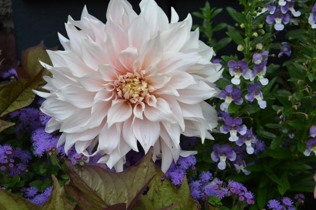
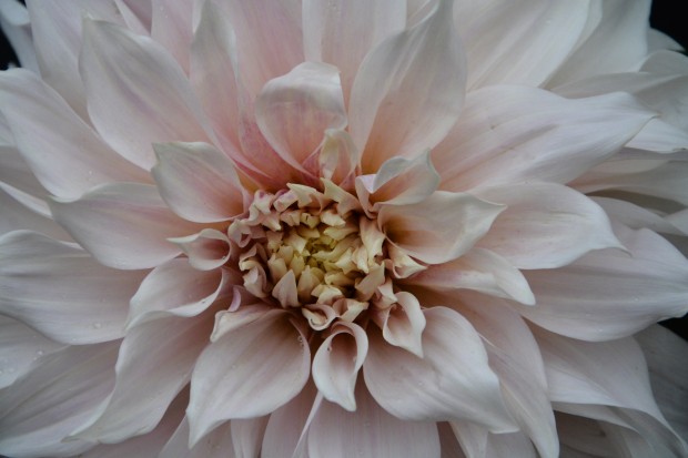
cafe au lait dahlia (17)The coffee and white dahlias are just coming on now-there are buds showing all over the big in ground planting. As I have said before, any response to color is a highly individual and emotional response.  I am delighted with what I am seeing. The excitement over the coming of the dahlias is one of many reasons why I enjoy gardening.  Some days, everything going on in the garden is all good.
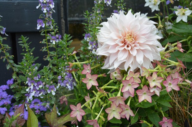
cafe au lait dahlia (6)
cafe au lait Dahlia (29)

cafe au lait dahlia (4)

DSC_2431

cafe au lait dahlia (26)

DSC_2429

cafe au lait dahlia (18)Today was a very good day to be a gardener.

Learning

July 14 2014 (11)Lots of people ask me about how I work with color in the garden.  How I decide on a color scheme for a container.  I have tried to write about my process, but I always have the nagging feeling that the discussion falls short.  Frustrating, this.  Though I know that any creative process cannot be quantified, or reduced to a step by step, I would teach, if I could.  I had occasion recently to view a video of a TED talk, thanks to Buck.  TED, if you are familiar, is a forum for presenting speakers who have something to say about ideas worth spreading.  Interested?  www.ted.com.   He keeps up better than I do-about what there is out there to learn.  Her had me listen to a talk given by Joi Ito.

July 14 2014 (12)In March of 2011 he was interviewing for the directorship of the MIT media lab. Late that night, a magnitude 9 earthquake struck off the coast of Japan, just several hundred kilometers from his wife, children and family.  In the terrifying hours that ensued, he discovered that he could not reach his family.  Nor was any government or news agency broadcasting any information about the damage to nuclear reactions by the earthquake. Frantic for information about his family, and for all the other families besieged by a disaster of this scale, he went to what he knew.  The internet.

July 14 2014 (5)In the following hours and days he contacted friends, hackers, scientists and families and put together a citizen science group he  called Safecast.  Over the next few months this group of amateurs with no scientific or governmental standing managed to invent a process by which to measure the radiation levels.  They put geiger counters on the ground; they measured the radiation.  They made available at no charge information that people could use.  Information for anyone for whom this earthquake had devastatingly personal consequences.

July 14 2014 (4)In his talk, he speaks eloquently of how his drive to get the information he wanted and needed was enabled by the internet.  The volume of information out there that can be accessed is limitless.  The internet allows people who have similar interests to meet digitally.  His discussion of how the internet makes it possible for citizens of certain groups to meet and solve problems which transcend any map or country interested me.  Most certainly passionate gardeners are citizens of a country all their own.

July 14 2014 (3)Joi Ito went on to discuss in simple terms the process of learning. What stood out to me the most?  “Education is something that someone else does to you.  Learning is something one does to/for oneself.”   I like this idea.  In fact, I like it a lot.  If anyone would ask me what was most valuable part of my college education, I would have to say that I learned how to learn about what interested me.  Of course the world has changed immeasurably since 1970.

July 14 2014 (14)One can access an seemingly limitless amount of information with a computer or a smart phone.  Anyone can learn whatever it is that they truly want to learn.  As far as developing a personal sense of how to user color in containers-I did not study this in school.  I was interested enough to learn. That learning process, which is still ongoing, and still of great interest to me, was all about the doing.  Plenty of color combinations did not work out so well. But their is as much to learn from those combinations that do not work out, as there is from those that do.

July 14 2014 (14)How people perceive color is very personal.  What appeals to my eye may not appeal to yours.  But that is not the point. Anything you see that interests or intrigues you may encourage you enough to learn what you need to know to express your own ideas. To understand what color relationships appeal to you as a gardener is all the fun of it.

July 14 2014 (15)Mr. Ito’s talk was very interesting.  Want to watch it for yourself?     http://www.wimp.com/wantinnovate/

Color Scheming

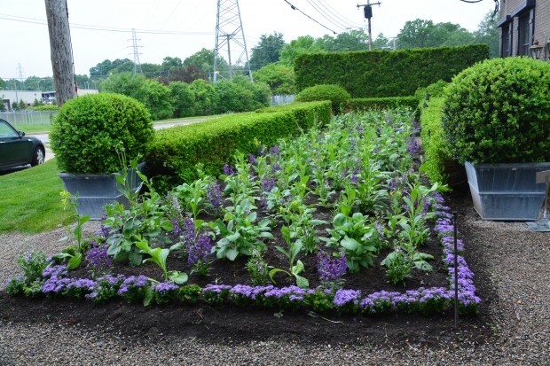
ageratum-artist.jpgSome gardeners come to a scheme for planting annuals based on favorite colors, or color combinations.  Others like a certain style of planting.  Others focus on the size of the flowers, or the color of the leaves.  The best plantings involve scheming on as many different levels as possible.  I plant the annuals in front of the shop in a different way every year.  That way, sooner or later, everyone will see something they like.  This is the best part of planting annuals.  Every year, there is a chance to try something new.

annual-planting.jpgLast year’s scheme was all green.  I planted panicum grass inside the boxwood.  More than a few customers said it looked like we were going out of business, as we had not cut the grass.   Like I say, everyone has a different idea of beautiful.  I knew I wanted to do something with purple. The color of this ageratum artist is so luscious.  It is a light blue/purple that I call heliotrope blue.  Lots of blue with a big dose of lavender.  Dark purple has a way of turning dull, if it does not have lively companions.  The blue salvia mystic spires has gorgeous blue/purple flowers that are so striking up close.  Plant it in a garden, and the color sinks into the background.  In the mid and background of this picture, you can barely make out the purple angelonia.
nicotiana.jpg
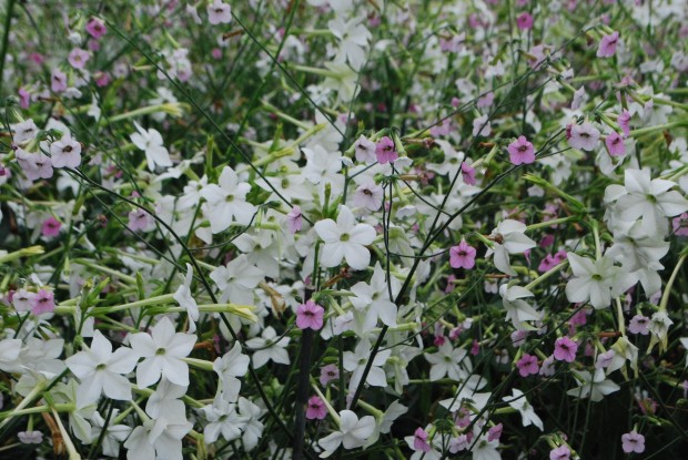
The planting needed some friends that would make that brooding dark purple more visually appealing.  We added both lime and white nicotiana to the purple angelonia.  This plant is airy growing, simple in flower, and sports big flat leaves.  This will contrast beautifully with the narrow leaves, smaller stature and flower spikes of the angelonia. So far, the planting has three colors in the mix.
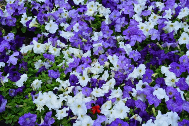
tricolor-petunias.jpgMixing colors adds depth to a planting. Pictured above is a bedding petunia called “Great Lakes Mix”. The mix of white, medium blue/purple and dark purple petunias is a lively way to visually represent the idea of purple. A mass of white, or another light color can be quite striking.  A mass of dark purple can look dull and flat.  The value of the color purple, meaning its lightness or darkness, is very similar to the value of many greens in the landscape.  Dark purple blends with green, rather than standing out from it.  Determined to have lots of dark purple?  Underplant it with lime or white.   I dropped a floret of a red geranium onto this mix. This is a scheme I have planned for a client. The red will be all the more brilliant, given the purple mix.  The purple mix is even more lively, given the red.  Color in a garden is never about a color.  It is about the relationships that define every individual color in a strong way.

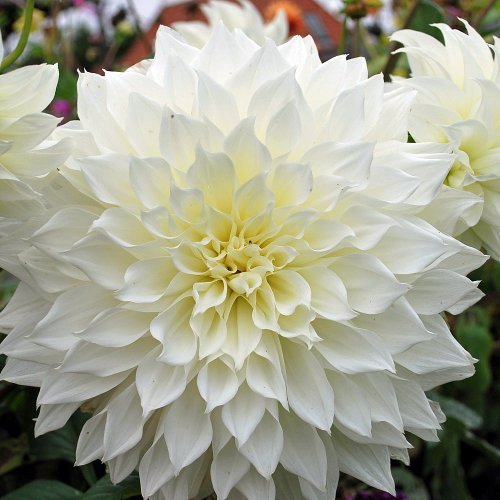
the dinnerplate dahlia fluerelSo far so good.  But this is a big planting bed, with boxwood that is over 3 feet tall.  The garden would need to be anchored by something.  A four foot tall dahlia would certainly provide a visual anchor to the garden.  This white dinnerplate dahlia called Fluerel has a pale yellow center, and pale yellow green buds.  This secondary color will relate to the lime nicotiana. The big flowers will be visible from a car driving by.  The nicotiana will soften the look of this stiffly growing upright plant. We will stake it securely, early on. We will do the same with the nicotiana.  The stakes are not the best look, but plants will completely disguise them in short order.  All there will be to do next is water and wait, and how the scheme is a good one. If the scheme is a good one, all the relationships will be both friendly and serious.   KONICA MINOLTA DIGITAL CAMERAI saved the beginning of the story about this garden for last. I read the garden blog Gardenista almost every day.  Last winter they put up a post about a dinnerplate dahlia called “Cafe Au Lait”.  The story came from a the blog of a florist who features home grown flowers.  www.floretflowers.com, if you are interested. This dahlia features flowers the color of cafe au lait, naturally.  Some flowers are more pink.  Some are more towards the cream side.  I have always been reluctant to grow these dahlias.  They can be too tall, too stiff, and too ungainly.  The blog post was very detailed in how and when to pinch them.  The pinching early on results in more flowers with long stems.  But it was the astonishing color that made me ask Mark from Bogie Lake Greenhouse to order 30 of them for me, and bring them on.  The entire rest of the garden is an effort to feature these dahlias.
annual-planting.jpg
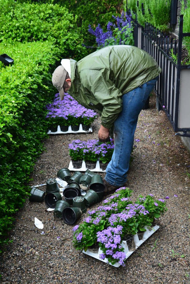
Tomorrow we will add more ageratum to the edge.  I am after an 18″ wide rounded band of this color rolling down to the gravel to border the garden.  That low carpet of ageratum may not be prominent for long, but when it does fill in, it will lighten the look of all of the other plants.  There is a good while before the dahlias will have much to say. The ageratum border might be the best part of the garden, for a moment.  I am still thinking about what will go in the window boxes. Having and taking the time to look at a garden before proceeding is part of the pleasure of the process.

A Few Thoughts About Color


red-nicotiana.jpg

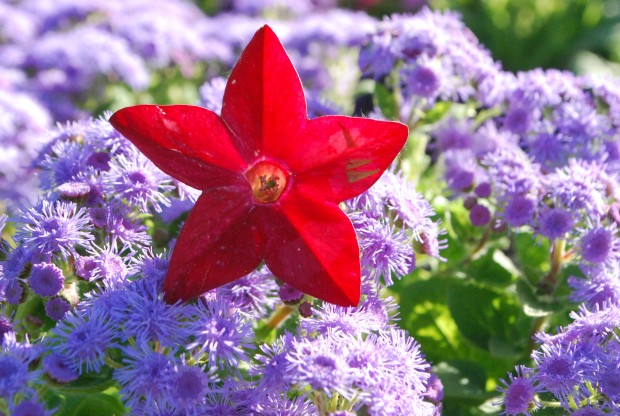
Given that there are 3 primary colors, and three secondary colors, and infinite possible combinations and permutations of those 6 colors, makes the topic of color a big one.  Have you ever tried to pick a color for a room from 10,00 paint chips?  I will admit I buy a lot of quarts to try before I commit to gallons of a color.  Understanding and working with color is hard.  Annual and tropical plants provide a level and longevity of color I do not get from my trees, shrubs and perennials.  It could very well be that the reason that I so love container plantings is that they enable me to explore the element of color-over and over again. The relationship of one color to another, or a color scheme, is of interest to me as a garden designer.  Planting annuals is the best way to try a color scheme on-before you commit to it in the landscape.  Explaining why certain color combinations are attractive, interesting is not so easy.  Pictures make things easier.  This dark red nicotiana pops when it is paired with a contrasting color, and when it is placed so the light shines through the petals.  This scheme-electrically charged by the rays of the sun.

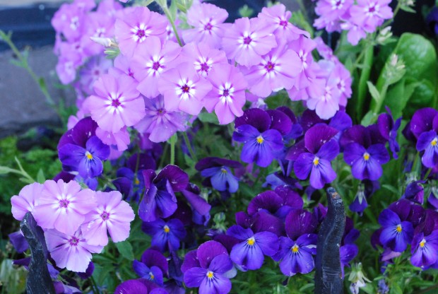
phlox-and-violas.jpgExplaining why certain color combinations work, and why some schemes are attractive and interesting to my eye-not so easy.  My approach to color is very personal and intuitive.  I am just like every other gardener.  Some schemes seem right-others seem off putting.  But there are some observations I can make about color that might abet your choices.  This picture makes it clear that pale colors appear to come forward, while dark colors appear to recede.  The idea here?  If I have a mind to plant dark colored flowers, I plant pale colored flowers behind them.  A light background helps a dark color to read.

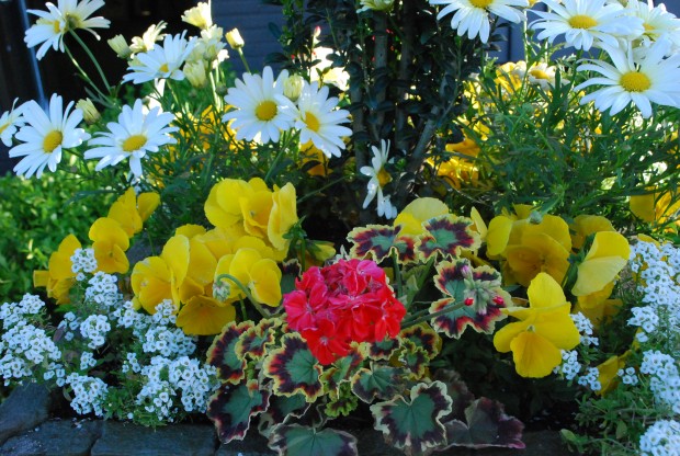
yellow-orange-and-white.jpgHot colors-as in red, yellow, orange, and hot pink, light up a shadier spot.  Fancy leaved geraniums contribute to a color composition via their leaves.  The Skies of Italy geranium has leaves of red, burgundy, green and yellow.  The color of the leaves of this geranium can help knit a color composition together.

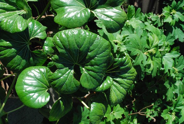
farfugium.jpgShiny green is a very different green than matte green. The surface of a color can influence how that color reads.  A dining room painted in red high gloss lacquer is a much different dining room than one painted in matte wine red paint.  Color provokes emotional and associative reactions.  The reaction that matters?  yours.  Look at  a lot of color combinations before you commit.  This makes good design sense. Emerald green is a combination of yellow and blue,  fairly evenly matched.  How does this emerald green look with the colors of the flowers you have chosen?  Choose your greens!

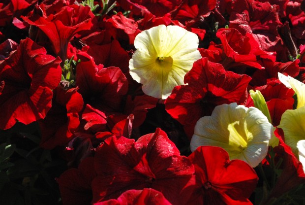
red-and-yellow.jpgRed can be dark and moody in the garden.  It can be royally rich-when paired with yellow.  Pale yellow with dark red is not quite the brass band that fire engine red and gold yellow makes.  Pasiring red and yellow has many possible interpretations.  A variation on a traditional color theme can be very striking.  My advice-if you are developing a color scheme, pick 3 colors.  Two colors is a story with not enough detail.  The third color facilitates the relationship between the first two.

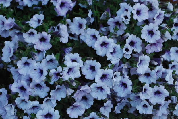
a-shade-of-white.jpgHow many shades of white are there?  White white.  cream white.  blue white. rosy white.  Greenish white.  Even an all white color scheme asks for some attention to be paid to the particular shade of white that works.  Some white flowers have yellow centers.  This would suggest that a yellow green foliage would compliment that shade of white.  Blue-white flowers, such as this silverberry petunia-yellow flowers would contrast.  Dark purple flowers would harmonize.

millet-jester.jpgHarmonious colors tend to be quieter.  More serene.  Contrasting colors provide visual excitement.  Lime green foliage always looks fresh and spring like.  Red with lime-very pleasing.  Lime with white-fresh.  Lime and orange-provocative.  Lime and purple-don’t you like this?  Lime green in the sun?  oo la la.  Lime green in the shade-the lights are on in this garden.  Lime green and pink-so Coco Chanel or Lily Pulitzer.  Pale lime and pale pink-fragile, ephemeral-breathtaking.  Wildly lime-a light fantastic version of green.

the-blues.jpgI will admit I like planting containers with plants all of the same tone and color.  The exploration of a single color in a lot of different plants makes a strong visual statement.  It focuses the eye on texture-another important design element.   If you are a big fan of texture, stay steady as you go with the color.  Contrast the texture.

pink.jpgAre you a fan of pink?  Which pink?   Carmine pink.  blue pink.  coral pink?  pale pink?  Dark carmine pink?  Blue pink?  Not all pink flowers harmonize.  If you are hoping to stir things up, plant a variety of pinks, and let the chips fall where they may. More interested in a strong and harmonious statement about a blue pink-you eye will tell you when a yellow based pink is gumming up the works.  Put lots of plants in your cart.  Put back those plant whose flowers threaten to dilute your idea.  As for right and wrong-that applies only to moral questions.  This is gardening.  Enjoy it.  Just take the time to sort through the color relationships.

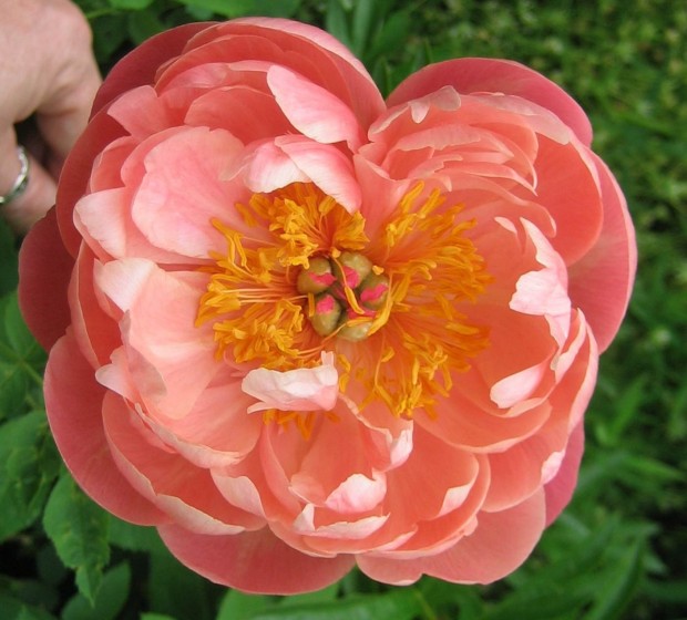
coral charm peonyI have had this photograph of a Coral Charm peony on my computer for a long time-I do not know the photographer. If this is your photograph, please write me. I am posting it, as the color of this peony is so striking and unique, that it surely would inspire a color scheme-a spring color scheme-that would pay tribute to such an extraordinary color.

light-and-dark.jpgLight and dark colors-the contrast is lively.

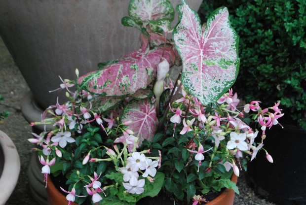
related-colors.jpgPale pinks with blue green foliage-a great scheme for semi shady places.

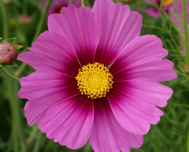
carmine.jpgThe carmine pink of this cosmos flower is all the more visually dramatic-given the yellow center, and the burgundy red corolla.  The contrast of the yellow and red center makes that carmine pink shine.

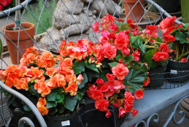
orange.jpgOn the left in this picture-an orange begonia heavy on the yellow.  On the right, an orange tipping towards blue.  There is orange.  There is another version of orange.

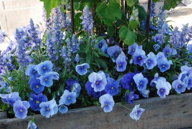
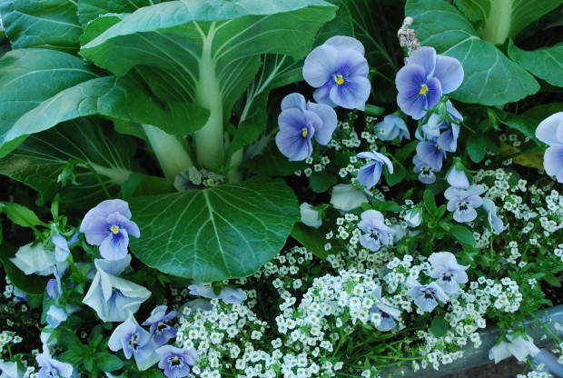
bok-choy.jpgThe blue green foliage of the bok choy clearly compliments the color of the blue violas..  The addition of white makes the scheme all the more crisp and fresh.  Cool and clean-this scheme.

purple.jpgLavender and purple-you have choices.  The sun will make its own statement about your choices.  Light and dark purple both colors can be the star of the show.  Both colors can be a supporting cast that makes your central idea shine.  Purple is a color that fits into a lot of different color schemes.

sunny-yellow.jpg

Sunny yellow-there is nothing quite like it.  Yellow is the color of the light that every garden thrives in.  Have a place for something yellow?  I recommend this level of garden cheer.  Your idea bout color is a good idea.  Another good idea-follow through on your sense of color.  Make the colors work just the way you want them to.