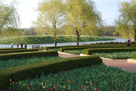
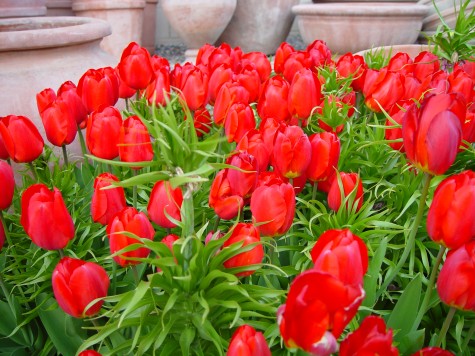
 A mass of red tulips in the spring is enough to get any gardener’s juices flowing again. That red is as densely saturated as a brand new lipstick. Lit from the front, these red tulips read vibrantly for another important reason-their companion color is green. The primary color red, and the secondary color green, are opposite each other on the color wheel. This opposition translates as maximum contrast. Red will never seem redder than when it is viewed next to green. Black/red and lime green-a great color combination.
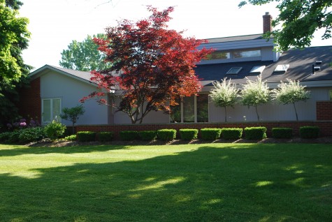
Red foliage in the landscape is an entirely different experience. The red pigment in leaves has green pigment underneath, or in conjunction with that red. Though contrasting red and green make for visual fireworks, mixing red and green makes at best dark red, and at worst mud. Though this landscape is in sore need of renovation, the placement of this standard size acer palmatum is better than most I see. The tree is placed with a white or sky background and in a fairly sunny area; the red leaves read red. Notice that the foliage in shade, or backed up by the grey roof has gone brown. Backlit locations where red and green foliage are mixed and overlaid also produces a muddy appearance.
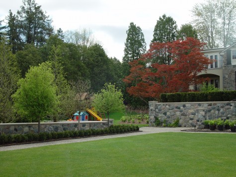 Not that muddy can’t be pleasing; the subdued red leaves of this very old Japanese maple make for an interesting variation in this landscape. The red is mixing and relating to other greens in the landscape in a subtle, not a jarring way. What is it about a dwarf red Japanese maple that makes it de rigueur in so many suburban landscapes? If it is the red color, then I see many plantings that do not present that red in a striking or thoughtful way.
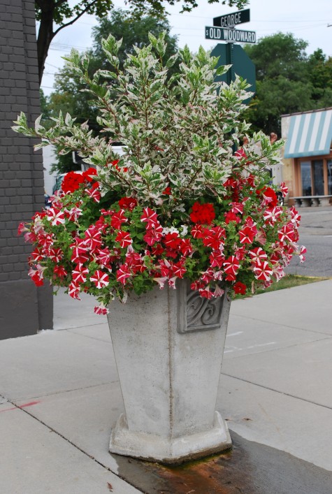 How red reads gets a big boost from white, or gray. Pale companionship or background helps red to hold its own. This green and white variegated hibiscus is grown primarily for its foliage. I used it as a centerpiece in this pot primarily to showcase the red. A thriving planting of petunias is much more about the flowers than the foliage-not much petunia foliage showing here. The white variegation on the hibiscus similarly reduces the amount of green. The red color is the star of the show. A red Japanese maple underplanted with Lamium “White Nancy”, or a dwarf low white variegated hosta might benefit in a likewise way.
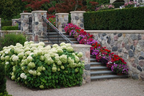 Mixing red with hot or magenta pink can add dimension, and sparkle, when the intent is to wow with red. The white of these Annabelle hydrangeas doesn’t hurt; the color all around seems lively.
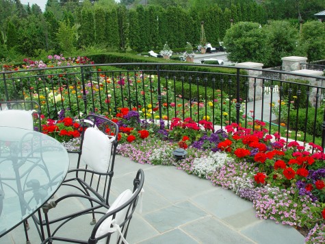 Intense or dark colors read best up close. To me, every composition has a foreground, a mid ground-and the background. These red geraniums are fiery, up close to the eye. The red dahlias in this mid ground-they seem much muted, even though they are the same red color as the geraniums. Lighting conditions and distance greatly influence the effect of color.
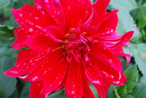 Dinner plate dahlias are something else-whether you love them or reach for your sunglasses, they are the most dramatic representation of red in the garden I can imagine. Were I interested in taking that red as red as I might manage, I would tuck them in between plants in a stand of arundo donax variegata. Red and white-so striking.
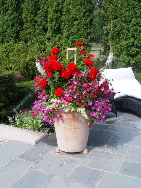 Some of my clients turn their noses up and roll their eyes should I use the word geranium. I look at them at the little black dress of the annual world; they can be stunning, in an expected way-but nonetheless, stunning. What you pair with red geraniums makes all the difference in the world. Whether by way of contrast, or by way of intensifying that fiery color, the idea here is to be purposeful. Whatever effect is in your heart or mind’s eye, understanding how color works will help make your idea visual.
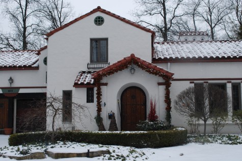
Not all the red in a landscape comes from plants. This red/orange clay tile roof makes a big statement about color off the bat. Some homes are red orange brick, or have wood trim which is mahogany red. Any element of design only works if you are looking and thinking it through. Dealing with red in the landscape can seem like a full time job some days-but who would want to do without red?
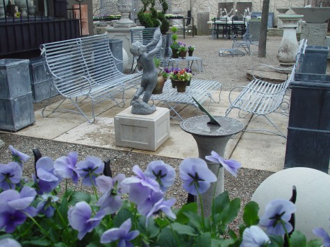 I might be making things up. I am so ready for a view like this out my office window that my reporting may simply be wishful thinking. But I do believe I heard birds singing this morning. It was thrilling just to be outside and not shudder. The sun was shining, the temperature well above freezing. Though the best thing about February 19th is that I will not have to deal with it for another whole year, I could sense some little signs of spring.
 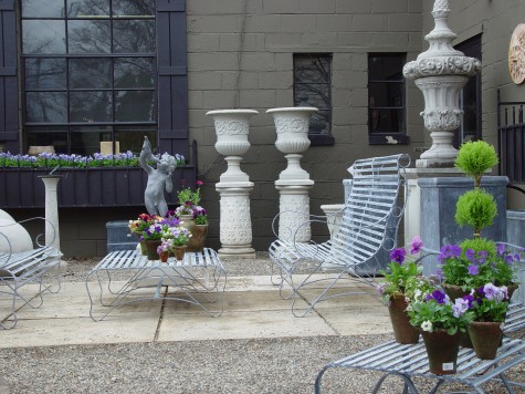 One definition of a Michigan spring is the day the snow is gone. It is gone from my roof, sidewalk and drive. My street was wet; the big piles of snow are a fraction of a bit smaller. The 39 degrees by 5 pm seemed like a heatwave. Perhaps more telling, the sun was still shining at 5pm; this is a sure sign that winter is loosening its grip. I am of course thinking already about planting. It will not be long before I have my hands back in the dirt.
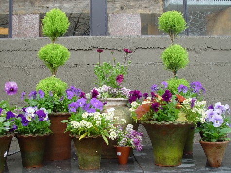
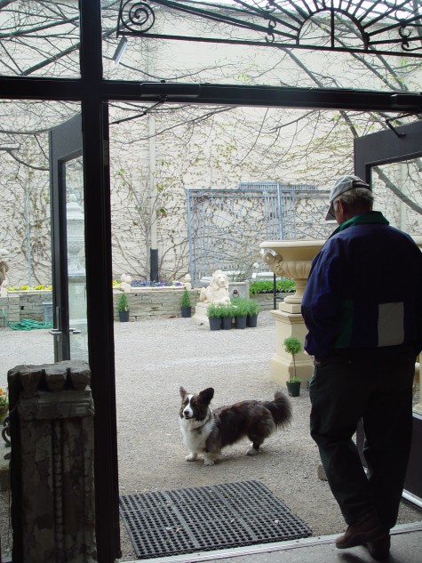
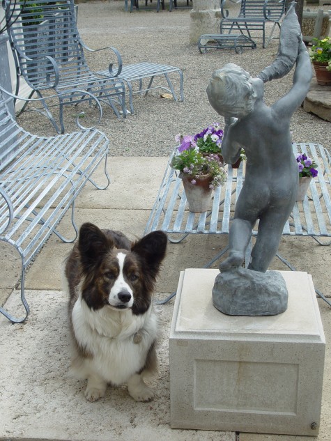
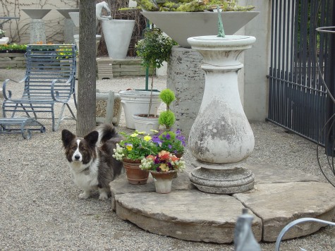
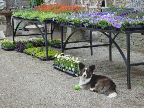 I have never seen Milo give any indication that he did not like any weather. He’s game, any day. But he seems more determined than ever to get out that door now. Once we reopen March 1, he will be outside as long as he can persuade someone to keep him company. I buy plants as I think they can tolerate the night temperatures. Diascia and angelina, osteospermum-even Moses in the Cradle- shake off the cold as well as the pansies.
 If the weather doesn’t break early in March, I will go to Bogie Lake and beg some greenhouse space to hold my spring pots. As tolerant as they are of cold, spring flowers only put on weight when there is heat. My spring pots get looking pretty good about June 1; some years, the spring pots last the entire summer. Every spring there are nights when everything has to be hauled in. Growing plants is such work-but there comes a time when I can’t do without them one more day.
 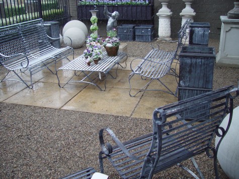 We will have snow on and off in March and April. I remember a whomping snowstorm some years ago on April 16; more than a few times have we had flurries on Mother’s Day. Late snow doesn’t bother me that much-it rarely stays. The snow we get in December I am still looking at now-that’s a big bother.
 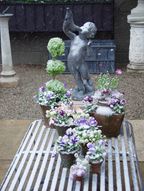 I do cringe seeing my beloved spring flowers disappear beneath the snow, but they seem not to be bothered, unless the temps go below 28 degrees. I have seen fierce frosts when the tulips were 4 inches out of the ground. It may damage the leaves, but the flowers come on fine. The species crocus are a favorite of mine; there are years when freezing weather reduces their fragile blooms to gray mush. But when they are good, they are spectacular.
 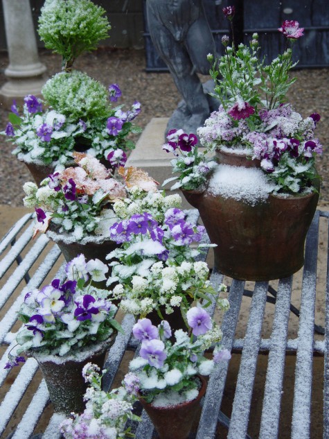 Our winter is all but gone. But March and April are neither winter nor spring. They are what I call the sprinter months. Move quickly towards spring, drop precipitously down and back into winter. We’ll have big wind soon-maybe ice. Our transition to spring can be a rocky one. It seems like we all are sprinting in one direction or another to keep up.