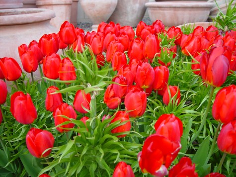
 A mass of red tulips in the spring is enough to get any gardener’s juices flowing again. That red is as densely saturated as a brand new lipstick. Lit from the front, these red tulips read vibrantly for another important reason-their companion color is green. The primary color red, and the secondary color green, are opposite each other on the color wheel. This opposition translates as maximum contrast. Red will never seem redder than when it is viewed next to green. Black/red and lime green-a great color combination.
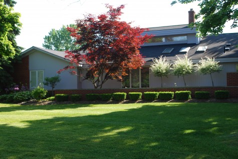
Red foliage in the landscape is an entirely different experience. The red pigment in leaves has green pigment underneath, or in conjunction with that red. Though contrasting red and green make for visual fireworks, mixing red and green makes at best dark red, and at worst mud. Though this landscape is in sore need of renovation, the placement of this standard size acer palmatum is better than most I see. The tree is placed with a white or sky background and in a fairly sunny area; the red leaves read red. Notice that the foliage in shade, or backed up by the grey roof has gone brown. Backlit locations where red and green foliage are mixed and overlaid also produces a muddy appearance.
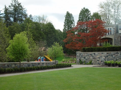 Not that muddy can’t be pleasing; the subdued red leaves of this very old Japanese maple make for an interesting variation in this landscape. The red is mixing and relating to other greens in the landscape in a subtle, not a jarring way. What is it about a dwarf red Japanese maple that makes it de rigueur in so many suburban landscapes? If it is the red color, then I see many plantings that do not present that red in a striking or thoughtful way.
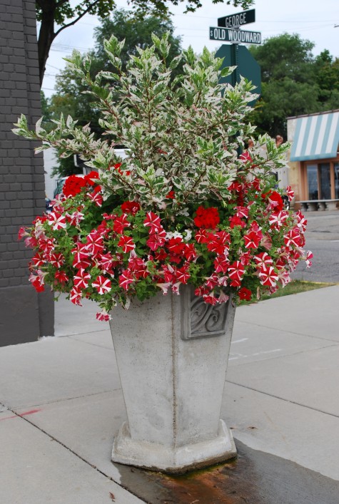 How red reads gets a big boost from white, or gray. Pale companionship or background helps red to hold its own. This green and white variegated hibiscus is grown primarily for its foliage. I used it as a centerpiece in this pot primarily to showcase the red. A thriving planting of petunias is much more about the flowers than the foliage-not much petunia foliage showing here. The white variegation on the hibiscus similarly reduces the amount of green. The red color is the star of the show. A red Japanese maple underplanted with Lamium “White Nancy”, or a dwarf low white variegated hosta might benefit in a likewise way.
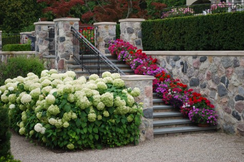 Mixing red with hot or magenta pink can add dimension, and sparkle, when the intent is to wow with red. The white of these Annabelle hydrangeas doesn’t hurt; the color all around seems lively.
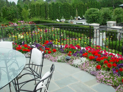 Intense or dark colors read best up close. To me, every composition has a foreground, a mid ground-and the background. These red geraniums are fiery, up close to the eye. The red dahlias in this mid ground-they seem much muted, even though they are the same red color as the geraniums. Lighting conditions and distance greatly influence the effect of color.
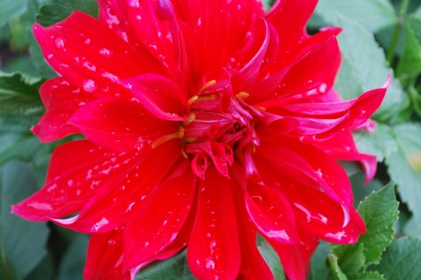 Dinner plate dahlias are something else-whether you love them or reach for your sunglasses, they are the most dramatic representation of red in the garden I can imagine. Were I interested in taking that red as red as I might manage, I would tuck them in between plants in a stand of arundo donax variegata. Red and white-so striking.
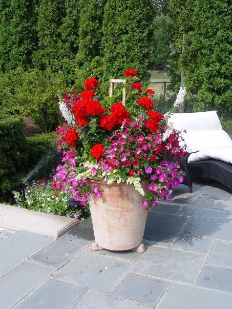 Some of my clients turn their noses up and roll their eyes should I use the word geranium. I look at them at the little black dress of the annual world; they can be stunning, in an expected way-but nonetheless, stunning. What you pair with red geraniums makes all the difference in the world. Whether by way of contrast, or by way of intensifying that fiery color, the idea here is to be purposeful. Whatever effect is in your heart or mind’s eye, understanding how color works will help make your idea visual.
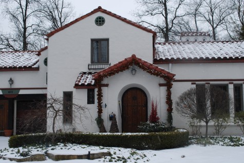
Not all the red in a landscape comes from plants. This red/orange clay tile roof makes a big statement about color off the bat. Some homes are red orange brick, or have wood trim which is mahogany red. Any element of design only works if you are looking and thinking it through. Dealing with red in the landscape can seem like a full time job some days-but who would want to do without red?
What great combinations you showed! I love geranium and love your comparison (black dresses), it sounds better than “working horses of the garden”!