I have been sorting through box after box of old 35mm photographs of gardens and landscapes-old projects both for clients, and for myself. I have always been a fairly decent record keeper. This extends to keeping old letters, cards and notes-any and all materials that might be relevant to what I might have been doing in a garden at the time. This includes garden journals, newspaper and magazine articles, tear sheets, plant tags, sketches, and the like. I especially treasure the notes and letters from clients. Even those letters that explain how I might have done a better job of helping them-of course I kept those. No one takes the trouble to explain how things might be done better unless they 1) think you are capable of better, and 2) believe that their effort to explain will be heard. These are good things, worth remembering. Unbelievably, I have file folders dating back to 1986-my very first year in business. I have every appointment book dating back to 1986 as well. Why I am I looking through all of this?
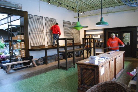
2011 is a year with multiple milestones for me, one of which is coming up quick. Detroit Garden Works will celebrate its 15th year in business on March 29. My design/build firm, Deborah Silver and Co, will celebrate its 25th year in business on July 1, 2011. Though I could write a novelette (OK- maybe a full length novel) about the failures, the things that didn’t work and the mistakes that were made, this is an accomplishment of which I am proud.
Beyond this, I am interested in how those earlier years get lumped together. Projects between 1986 and 1999 were all recorded with a 35 mm camera-pre my ability to use digitally based tools. Thus my ungainly and tough to share storage boxes of pictures-most of which have inexplicably become all mixed up and out of order over the years For all the world, the boxes look like the “Borrowers” have been in them, messing about. You know, from the book “The Borrowers”-those mythical little people that live in the floorboards, and wreak havoc in the lives of those human sized people they borrow from. Stacks of images that need resorting-this I have put off. The photo boxes take up a lot of space, so they have been piled high on the shelves nearest the ceiling – out of the way, out of mind, and off the top 10 list. What interests me about these pictures? Though the form in which the work was recorded may be outdated, some of the work I rather like. Some of the work-I rather like what it says about me. Though the digital pictures I take now are more detailed, clearer, sharper and can be viewed in a much larger and simpler format, I can tell the work belongs to me.
The most fun of all-pictures of my own first garden. I see not so much evidence of design-but I do see a person who loved plants. In spite of the fact that I had little money to put to it, I had a big garden. I was very big on the doing it myself part. Those pictures of me in my garden-I look happy. Standing next to a tree peony in full bloom at the corner of my house-easily 5 feet tall, and 5 feet wide-I look delighted. It’s clear what came first. I was a gardener first.
