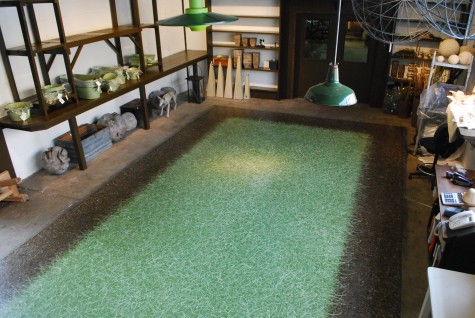
 I did truly believe I was done painting this floor late last week. I was ready to let go. Much to my chagrin, both Rob and Steve indicated they thought it was fine-but that they were surprised I was happy with it. I waved them both off, but when Saturday came, I took a good look. It was fine, but maybe it needed more contrast. Buck brought a new quart of very dark chocolate paint with lunch. When I opened the paint after lunch, I knew I had been Tom Sawyer-ed. Fine is fine, but this fine could definitely be better.
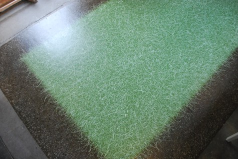 Over the weekend, lots of those very dark drops, along with a second round of dark olive green drops, went to establish a zone 3. That would be the transition space between the green zone, and the brown border. Transition spaces in any design are important. It takes time to leave a space and reflect, then anticipate and get ready, and be presented with the next. The transtion spaces in my garden are built in; staircases mark not only a change of level, but a transition from one “room” to the next. Gradeners without the luxury of built-in transition spaces manage a change of venue with arbors, groups of trees, or pots. A perennial border which is the same on both sides of a path creates the impression that the path was laid after the garden. Tall perennials on either side give the impression of walls, or a corridor.
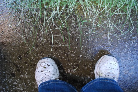 The dark drops went all over the brown border (and everything else within range) but were most frequent in that third zone. Creating a third color zone meant I had to redo the the swoops and swirls of green. It needed to look as though the gravelly drops came first, and the unmowed grass laying over came second. The border also got a drip coat lighter than the lightest color I had used. Thiese light drops helped to heighten the contrast as much as the dark ones.
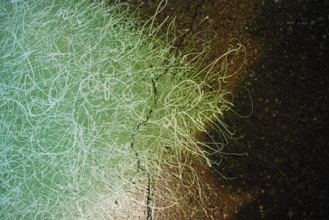 The darkest green and the lightest green was swirled over the edge. The light green reads especially well over that dark drip zone.
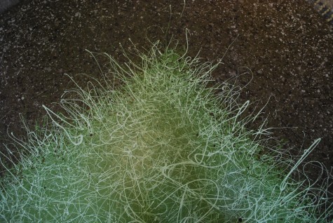 The green is a lot more active visually as a result. Light colors seem to come forward in a composition, and dark colors seem to recede. This isea can be very helpful in making decisions about color in a garden-whether it be leaf or flower color. My white anemones and lime green hostas read to my eye from a great distance, and in the evening when the light is low. Very dark colors can be better seen, if they have light colors behind them. I would always put yellow behind red, to better see the red. Tall yellow marigolds behind a slightly shorter red salvia makes that red glow. Short yellow marigolds in front of that same red salvia steal all of your attention; that red will visually recede.
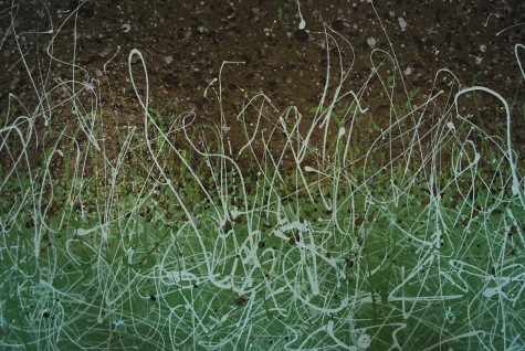
I appreciate your patience, plowing through this story a second time. But I am glad I took up the paint stick after I thought I was done. Sometimes a willingness to reconsider beyond the last drop can make a difference.
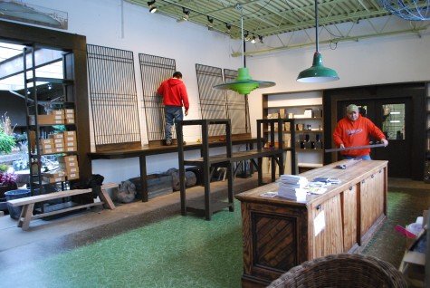 Today we are moving on to the main order of business-getting the shop in order for spring.
I love, love, love the floor and the history behind the multiple layers. Now I need to see it in person.
Don’t worry Deborah- you can plow through stories as many times as you want. We’ll still be here- reading and appreciating anything you share.
The floor looks awesome! It makes me want to stand on it with a sundress on and pluck flower petals! Looks like new tennis shoes are in order for you!
Amazing – luv it!
Best
R
you are an artist with a fine eye for detail.
nanne
Nanne, many thanks for this. Deborah
It really is beautiful. I love the contrast.
Very informative. Thanks for taking the time!
It’s still got the sing!
Very fun floor treatment.