Archives for January 2012

New Dirt

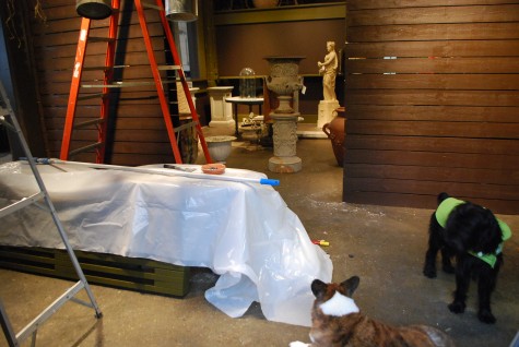
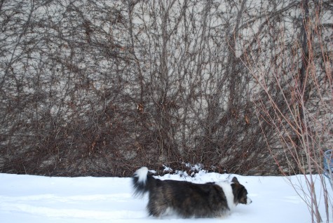
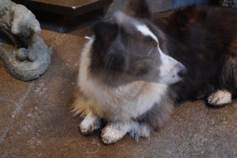
It is a much easier job to keep Milo clean than the shop.  Once he dries, the dirt falls off.  Once a month, he gets the works from Lexi from the Aussie Pet Mobile.   The shop, however, is 10,000 square feet that is likely to get very dirty-daunting, this.  My work life grew out of a love for dirt. The soil that comprises the earth beneath my feet-life giving.  The dirt that goes into any container sustains all manner of visual dialogue.  Who was it that said dirt is soil in the wrong place?  Though we spend lots of time sweeping, vacuuming and dusting, the end of a season means some part of a season’s worth of dirt has accumulated. 

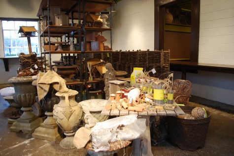
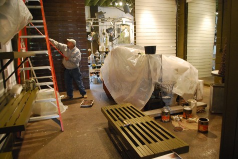
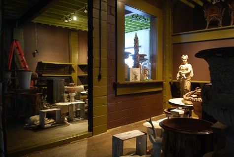
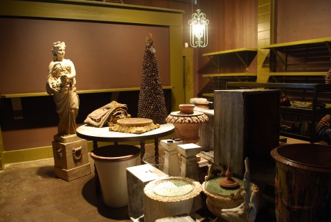
We close (but are open every day by chance or appointment) from January 15 until March 1st.  We move every object we own out of the way, in order to thoroughly clean the shop.  Once we have vacuumed and dusted and wiped every surface clean, we repaint.  Though we are about to enter our 16th year in business, there is nothing about Detroit Garden Works 2012 season opening that will prove dusty or thoughtless.  Just like every other new season, we will be ready and fresh.  My shop spring cleaning takes from mid-January until mid-February. In the same spirit as we imagine, acquire and assemble a new collection, we sweep out all of the dirt.  The fresh paint is a given.  How we choose to redecorate the six rooms of display space has everything to do with the spring collection on the way.  

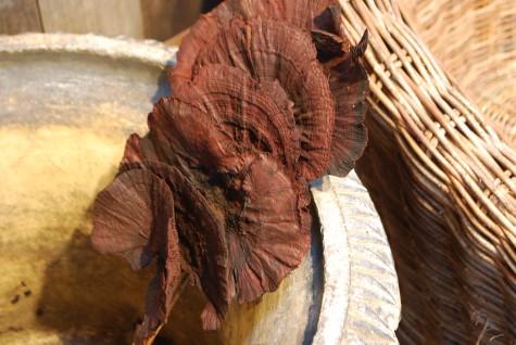
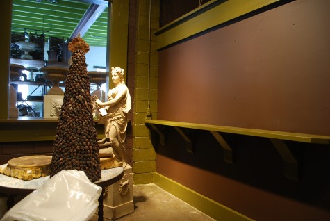
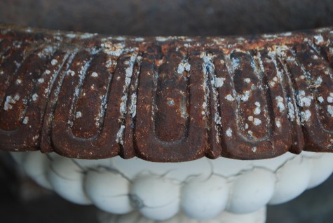
That chocolate color that reminds me of the darkest and richest compost-it was on my mind.  These bracket fungus engage my interest in beautifully natural textures, and my enchantment with that color I call dirt. That dark dirt color seems just right.    

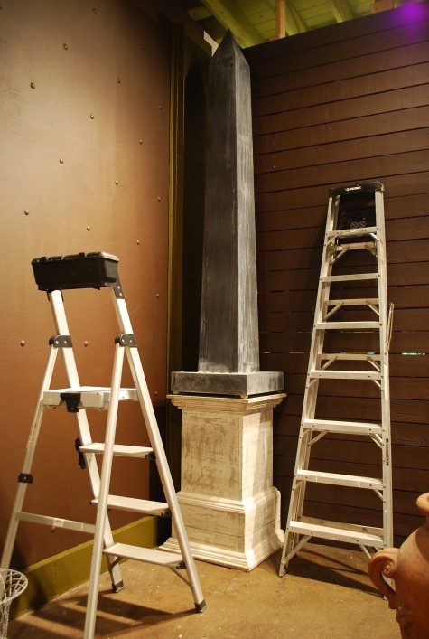
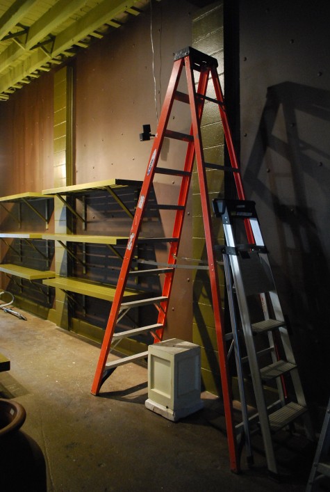
I will admit I own a fleet of ladders.  They enable me to clean and redo, to look at what I have done before from a different perspective.  I have been up and down the ladders for a week now.  I will admit committing to the intensity and saturation of this deep chocolate worried me some. But I am more than pleased with how it is shaping up.   

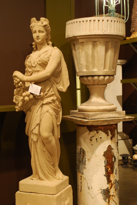
We have no end of antiques and great vintage ornament.  Great contemporary ornament.  We manufacture our own garden ornament, and represent many other fine makers.  I so enjoy this yearly ritual by which we integrate our existing garden ornament with all that comes new.  Each season has its own distinctive flavor and emphasis.   

I do have pictures of most everything on the way, whether it is coming from France, Belgium or Biloxi.  But photographs are a representation, not the real thing.  Everything that Rob has ordered will need an introduction to the shop.  Taking the time to completely redo every space is a considerable and satisfying undertaking.  Rob has spent over 2 of the past 16 years travelling and buying objects for gardens.  The presentation of that work of his takes time.  

We have a pair of containers from France due in a few days.  How long they will take to clear customs is anyone’s guess.  But that process will buy us a little more time to get ready.   
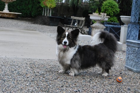
I should have named him Hoover, considering all the dirt he manages to pick up.  Hopefully we’ll make quick work of the shop dirt, and move on to making the shop an experience we’ve not yet had.      
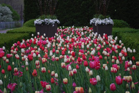

The shop front spring will not look like it did here in 2010. Something new and fresh will be coming from that dirt.
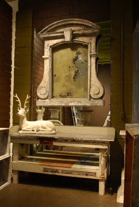


At A Glance: Brown

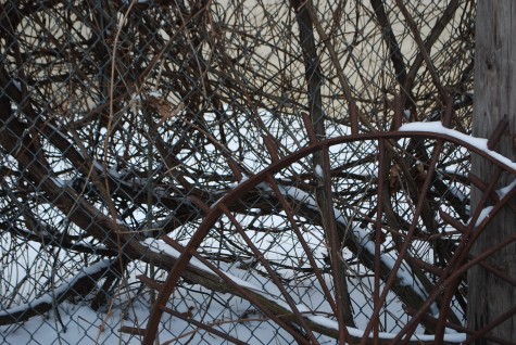
Boston ivy in January


repainting the shop

new paint

rim of 19th century antique English cast iron urn

new paint

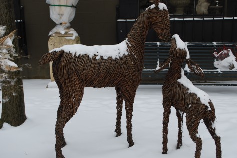
grapevine deer


shop wrecked

grapevines and wagon wheels

tall space

milkweed seed pods

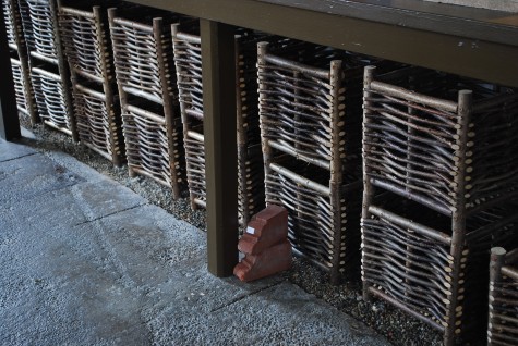
Belgian hazelwood twig planter boxes

Level

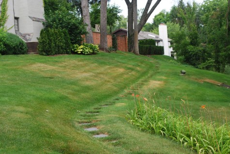
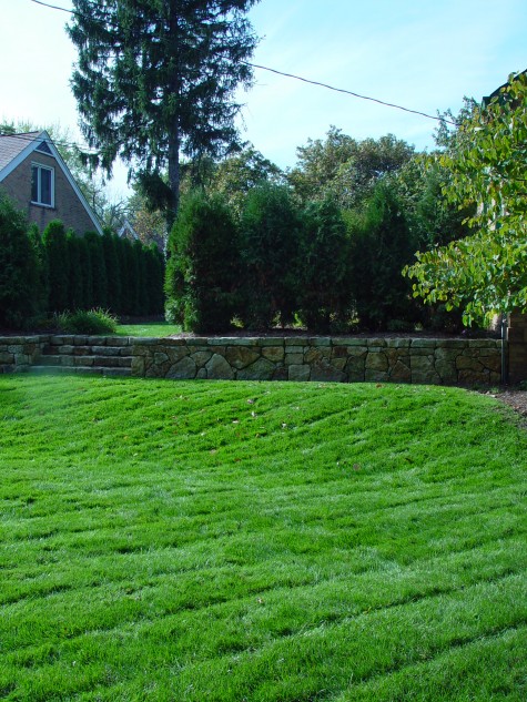
The winter is a perfect time to discuss what goes into a coherent landscape plan.  If you have a mind to make some changes, plan now.  Draw now.  Search for the right clematis now.  Read the seed catalogues now. Be ready, when the season turns. A hard and thoughtful look at a landscape now is perfect-most of all that is visible now are the bones.  A good landscape begins with great bones.  No matter what style of gardening appeals to you, the bones tell the entire story in a simple and spare way.  In a way, your landscape is a narrative you imagine, write, and bring to life.  My first look at a landscape design revolves around the shape of the land into and onto which that landscape will be built. Why this picture?  The path across a steep slope is set on a wee bit of level ground.  Getting from here to over there is easy.  That path leads the eye to believe there is something ahead worth visiting.

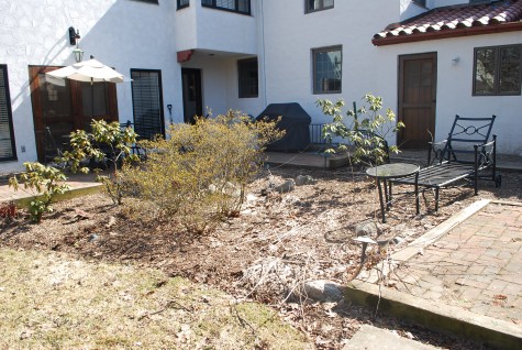
This house is set high off the existing ground.  Old brick walks contained by pressure treated lumber make the transition from the house to the yard in a very awkward and fussy way.  There are small bits of level-nothing of a size that would permit company.  The lounge is set in a barked bed, and slants down from head to toe.   

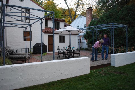
A new landscape sets the brick wings, and a gravel inner terrace at one step out of the back door. All three areas set at the same grade creates a flat surface large enough for people to congregate. This makes carrying a tray of burgers outside to the grill easy and manageable.  We prolonged the big step down into the yard until the last moment-post terrace. A riser of 1/4 inch thick steel retains the gravel, while a pair of stucco walls are set at a height convenient for sitting.    

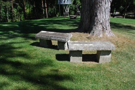
Level ground is friendly to people.  1 person, or a group of people makes no difference.  People are comfortable on the level ground in a landscape.  Would you choose to sit on this left bench, given the choice?  Looks dicey, doesn’t it?  It looks for all the world ready to pitch forward and fall over.  The right bench-solid, sturdy, and inviting.  It is set level with the horizon.  Worrying about one’s footing is not my choice for a garden activity.  

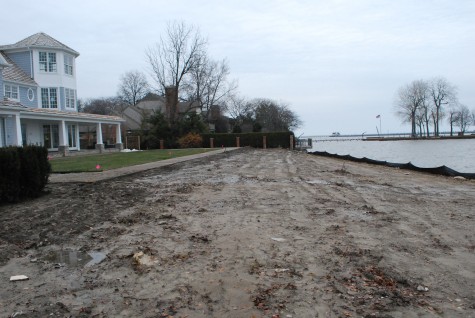
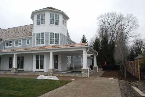
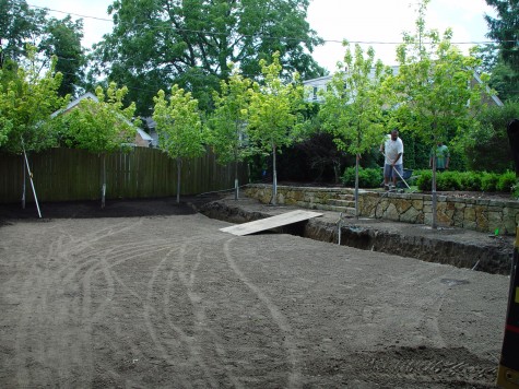
This new house and landscape has been in progress for about 6 months. The fall rain was relentless.  But this picture makes clear that the lawn panel framed with gravel is a level space.  Many of yards of soil were involved in creating this level place.   The land drops to the water’s edge past that panel. The level lawn panel-easy on the eyes and the legs.    The slope to the water-a journey.     

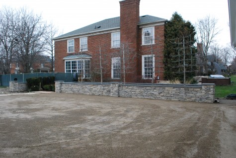
The level lawn panel  made for a drop off to the property line.  My idea here-every place that I would expect traffic, gathering, use and community needs to be level.  The lower slopes got drains, for the columnar maples.  My idea here-one step out of the house, and one step off of the house terrace to the yard makes for a simple experience of the landscape.

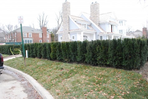
This level idea carried across the width of the back of the house meant a significant drop to the street.  Not all spaces need to be level, least of all this one.  The yew hedges set considerably above the street grade provide my client with lots of privacy.  The big idea here? The ground can be sculpted and shaped.  Up or down. Flat or hilly.  This property had been a field for 20 years, so the property could be graded all of a piece with relative ease.  

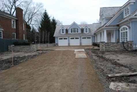
The decomposed granite drivecourt is level with the entrance to the garages.  Level to the eye, that is.  A drivecourt needs to drain, to the center of that court.    It furthermore needs to drain to the street.  Not everything is apparent to the eye-most landscape companies use transits to determine the rate and the extent of fall to make sure water does not collect.  Water sitting on a driveway or terrace is a nuisance in a rain storm, and can be treacherous if it freezes. 
This drivecourt looks flat.  The drop to a center drain is very subtle indeed. A slight drop to drain away water is about the science, not the view.   

 My property came with a giant drop in the side yard. One year I sprung for a single retaining wall to make that slope easier to negotiate.  

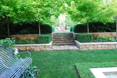
The next year, a reworking of the ground for a second level terrace. A generous landing and stairs with deep treads makes it easy for me to get from one place to the other.


Now I have a well defined lower level flat space, an upper level flat space, and a staircase that gets me from one place to the other.  Level I like.

Buck At Work

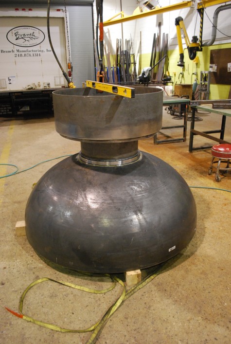
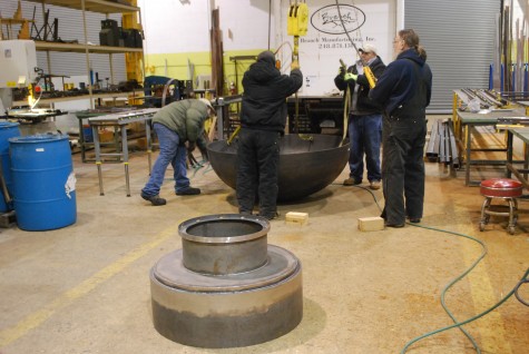
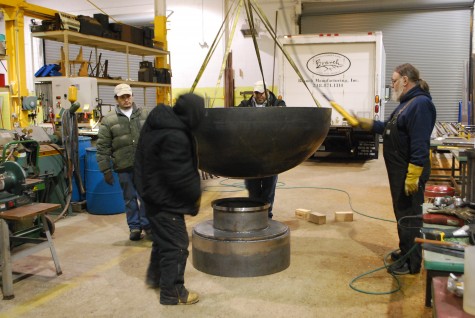
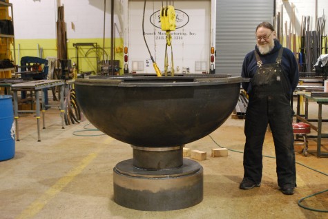
Buck has been plenty busy at Branch.  What exactly are you looking at here?  This is a fountain urn commissioned by a client in California for a project in Texas.  This fountain has a bowl assembly and a base, designed and specified by the landscape architect on the project.  Buck stacked the two pieces upside down, to check the level.  A level vessel is imperative with a fountain.  Water needs to fall over every edge equally.  Should your fountain bowl be out of level, the water falling unevenly will broadcast that your ornament is askew.  It pains me to see any garden ornament-whether it be a bench, an urn on a pedestal, sculpture, obelisk, pot centerpiece or terrace, out of level.     

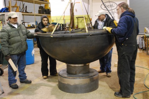
Newly back in town, I wanted to see the fountain assembly right side up-Buck was glad to oblige.  The fountain bowl is 5 feet in diameter-largish.  He welded loops inside the bowl so he could pick it up with his bridge crane.  The base is all of a piece.  The bowl will need a rim welded to it.  At this moment, the fountain urn is in three pieces. 

The center of the hemispherical steel bowl is marked in white paint on the underside.  This helps to  rough center the bowl on the base.  This will be plenty good enough to look at.  When the time comes to weld the bowl to the base, many more specific measurements will be taken.   

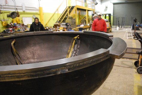
Once the bowl was set on the base, we were ready for the fountain bowl rim. The rim is comprised of two rings of 1 inch thick steel, welded together.  This ring is much heavier than it looks.  The rim contains water in four symmetrical spots.  The corresponding four rim spots are scuppers that facilitate falling water. 

This picture of the rim detail tells the story better than words do. 

This large urn will take its place in the center of a much larger fountain pool. 

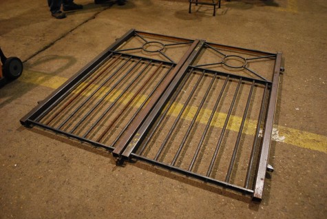
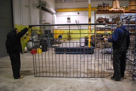
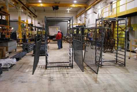
The fountain is not the only special order project under construction.  This pair of gates are part of an iron fence for a local client.  Informing the design-a discussion about coyotes, and how to keep them out of a dog run. 

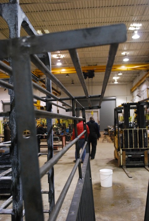
The fence panels are composed of a series of four foot tall vertical iron members that will be hidden by a yew hedge on both sides of the fence.  The top 24 inches of fence is constructed of steel vineyard bar in the horizontal dimension.  Why steel bar that looks like tree bark?  The perimeter fencing is our Belgian branch fencing.  This visible top two feet of dog run fence will repeat that horizontal branch motif.

My favorite part of this fence? A 16 inch wide steel shelf welded to the top of the fence.  I can see pots placed on that shelf 6 feet off of the ground, planted with trailing plants.  I can see all manner of tall garden findings and short bits having a home on this shelf.  No coyote will like the idea of scaling this.  A dog run that reads visually as a prison does not interest me.  A coyote proof fence with visual possibilities is much more to my liking.  


The Branch Studio is a big place. Just a shade over 13,000 square feet.  Buck occupies, fabricates, and directs in every square foot with what I would call thoughtful.  Amazingly precise.  Beautifully finished.  Though I was just away the better part of a week, Buck at work really describes a certain kind of kind of energy, motion and energy  that I truly admire.  Buck makes it easy to come home.