Time

dunlap3-3

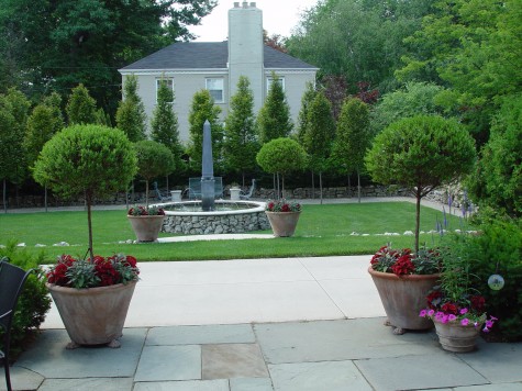
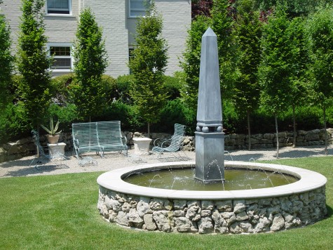
This Friday past I wrote some about a landscape renovation project I did in 2002. I planted a slew of carpinus fastigiata grown in 25 gallon pots for the bosquet pictured above.  The need for so many trees suggested trees of a reasonable price;  my clients understood that small trees would take hold fast and grow. No plant decision is ever easy; big trees that are transplanted at worst fail, and at best, take years to feel at home, root, and move in.  New landscapes are not hard to spot, even if large plant material is installed.  Most newly planted  plants have that distinctive look common to nursery grown plants.  Growers have different goals than gardeners.  But three years after the installation, these trees are starting to do what I knew they would, given time.
dunlap-2-9

Growers pay plenty in taxes for the land they own.  Their idea is to plant as many plants as they can,  per square foot.  A grower needs to plant closely, and harvest often.  So trees and shrubs are grown as closely together as good horticulture will allow.  These carpinus did have that skinny, grown in a row, look. Planting them too close together would have made for problems later, so there were some years my clients had to suffer the gaps in their screening.
dunlap-1-25

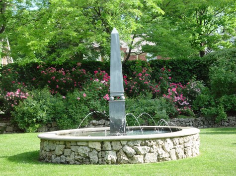
Perennials, including roses, are more quickly adaptable. A two gallon perennial is a big plant which will take hold in one season, given a serious gardener.  What you see here has everything to do with a gardener in charge. Though relatively easy to establish, perennials are plenty of work-deadheading, dividing and the like.  They also have a short lifespan, relative to trees and shrubs-unless we are talking peonies and asparagus.
dunlap-8-06-32

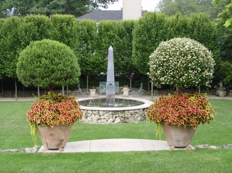
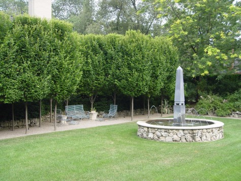
The small hornbeams took hold, rooted in,  and grew.  This photograph taken 5 years after the installation recorded a dramatic change; the view of the house next door is fading fast.  The bosquet is now a shady place to sit.
dunlap-8-06-35

What once was dirt-what once was a spare diagram for a space, is growing vigorously.  The day the installation was finished, these clients took ownership of the maintenance. It is a very good thing when a client picks up and carries on.   It did take some time to work out the irrigation issues, and there is a big pruning job to be done every spring.
dunlap-1-22

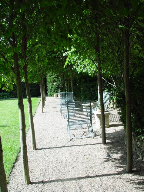
They have pruned the interior branches such that the trees provide a vaulted green ceiling.  A suite of iron furniture is complimented by a pair of antique English capitals.  The long view to a group of  agaves in stone pots, and a birdhouse, is a good one.  A garden needs time to establish a look like this.
dunlap-8-07-18
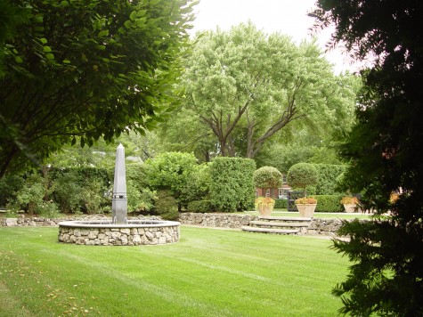
The landscape is beginning to look in proper proportion to the existing mature trees and yews on the property .  Proper scale and proportion is tough to plan for, as it has to be imagined.  With time, any mistakes is spacing or choice of plant material will become apparent.  I see landscapes only 5 years old that are overplanted, and consequently overgrown.   This landscape is just beginning to hit its stride.
2006-pots-139

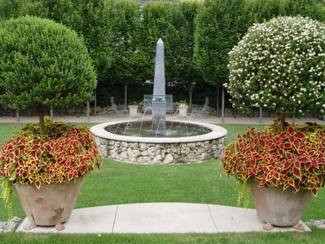
Even the topiary myrtles that go to the greenhouse for the winter have grown.  Their trunks have become substantial. Making something grow is no small accomplishment.  However, the patience to give a garden the time it needs is sometimes the best move you can make.
Renovation Phase II

renovation71

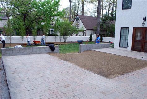
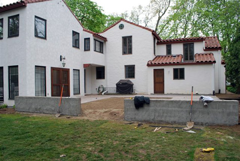
Plenty of work was involved in getting to this stage, but the main planes of both terrace and lawn have finally been established. Stripping off the existing struggling grass would be the last step, as soil was needed to flatten that space.  The length of time between adding dirt, and putting down sod needed to be minimal, given 2 dogs who love their yard. Edger strip was installed 8″ from the stucco wall the entire perimeter of the yard. It was my intent to feature that wall with a landscape planting that would not obscure it in any way.  It also makes mowing easy, and eliminates the need for a string trimmer.

renovation81We needed a riser for the one step down into the yard.  A 14″ wide by 9′ long piece of 1/4″ steel, buried, and snugged up against the new wall would do a clean and simple job of it.  Once that steel was installed, the decomposed granite would be leveled right to the edge of the terrace. We adjusted the grade as the base of that step to make the transition to the lower level an easy one.
reno1

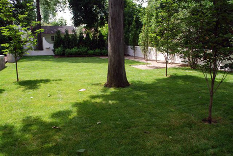
I planted a small grove of Venus dogwoods in the lawn.  The tree trunks have small and discreet circles of soil around them, to he[p avoid damage to the trunks from mowing the grass.  It interests me that trees with large circles of soil or bark or flowers around them look “landscaped”.  Trees planted in lawn look like a park.  A “park” has a very different feeling than a “landscape”; small details like this can have big visual impact. As  I hate being at the design mercy of a lawn mower or trimmer run amok,  I try to find solutions for practical issues that help make aesthetic decisions maintainable.

reno3

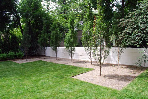
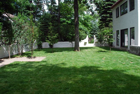
The finished landscape,, with new sod, is simple and very clean-lined.  The wall looks great. The columnar carpinus will grow together, and provide a dense green enclosure, perfect for celebrating something yet to come.  A sod topped bench?  A sculpture?

reno5

I like planting 25 gallon size columnar carpinus.  They seem to recover from transplant shock faster; they fill out quick.  Someday I do want to plant a hedge of them with the trunks impossibly close together, but in this case, the spacing is what it needs to be.

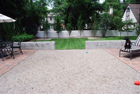
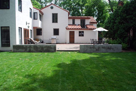
reno4This view from the new terrace is my favorite.  There is a simple overall shape, which unexpectedly drops down in the center to a lower plane. What is brick in the upper terrace reverses to granite in the lower; this is  a change in material that does not interrupt the big organizing idea, but makes it more interesting.
reno6

One more element is yet to come; I hope to install it next week.  Can you imagine what that might be?  For sure, I will keep you posted.

Under Renovation

This charming and architecturally distinctive house was in search of a landscape; this much my client knew.  A member of the design community herself, she had spent a lot of time renovating the interior. She was ready to renovate the outdoor spaces.   A designer always needs to pay careful attention to the architecture; this is a given.  But this house had certain unique and compelling features.

renovation3

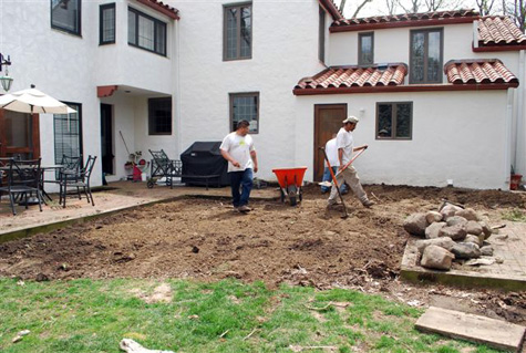
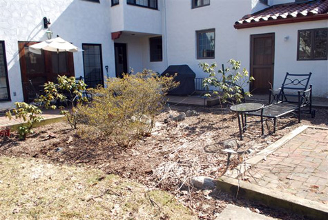
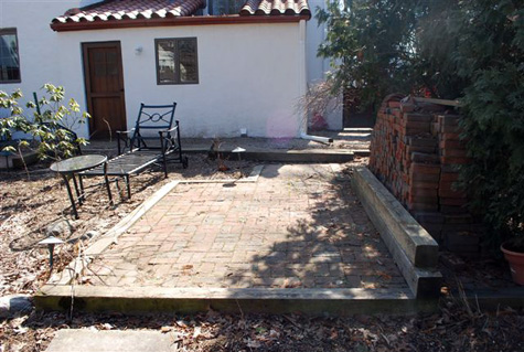
The Spanish style of this house came with a beautiful and intact tile roof, and old concrete stucco painted white. The brick terrace was in considerable disrepair, but the brick itself was old and good.  The remains of a previous landscape seemed neither here nor there. Some poorly performing rhododendrons and azaleas struggled in the blazing sun and no doubt highly alkaline soil.   Add to this a noticeable slope from the house to the center of the rear yard, and more importantly, my client’s interest in strong clean modern lines; I had plenty to think about.  Small urban properties make their own demands.  Not the least of these is that every gesture needs to be right.  Small spaces are unforgiving of mistakes, or leftover unresolved areas.  The mistakes made in small spaces seem to be so much larger than those made in big spaces.  No room for error, as they say.

renovation2
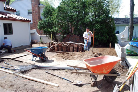
So we piled up the good brick, and ripped out all the ailing plants.  In the meantime I was looking for a graceful expression that also felt strong and simple.  I had my answer in the wall.

renovation1

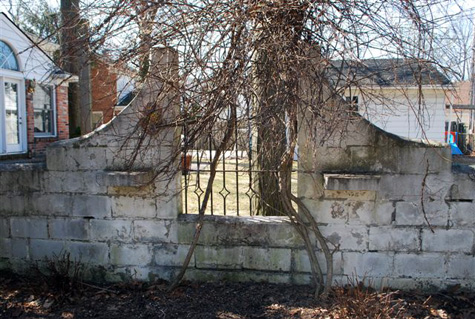
I was completely enamored of the white stucco wall that completely enclosed the rear yard. Completely overrun with trumpet vine, and various other weedy plants, that wall was still so architecturally strong and interesting I could not help but make it central to the design. My client carefully and completely repaired all the shaling stucco, and repainted it-the transformation to the entire space was striking.

This old wall was certainly deserving of attention.  Infilled in 2 spots with old iron grilles, it was completely unique and unusual in its design.  Surely the hand of a particular person, I have never seen a wall designed like this.  While walls make beautiful landscape features, whatever their height or material; I had considerable excitement about this wall.  Though quite old, it had strong and unusual lines that could be interpreted in a number of ways.

renovation4
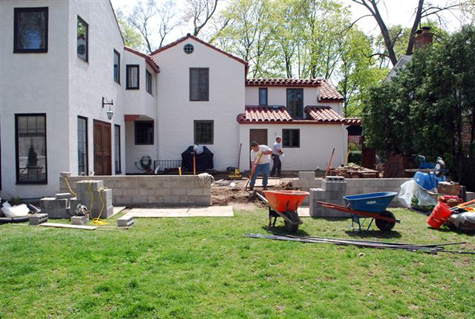
Cleaning out a space takes plenty of time, as does proper grading.  I planned to enlarge the existing terrace to fill the entire space off the rear door and French doors.  As the original U-shaped brick terrace had a unfriendly slope to it,  I decided to create a step off, into the yard.  The best move: a new stucco wall, built at seat height, to set the terrace apart from the rear yard space, that could also provide casual seating for guests. This new wall would integrate the new landscape into the old; it seemed  natural to repeat that stucco feature.

renovation5

The happy result are two distinct and level spaces.  The terrace and a rectangular grass space friendly to the dogs, and in distinct contrast to the terrace surfaces.

renovation6

To come, a U-shape of columnar carpinus, mulched in gravel, which would answer the brick shape on the terrace; the center of the terrace we did in gravel.

A terrace entirely of brick would have overwhelmed the space.  Sometimes switching materials can make a big space read read in a more friendly way.  No home needs a parking lot for a terrace, even though a big terrace is great for furniture, dining and entertaining. We are at a good stage here.  Two rectangles at right angles to each other are ready for the finishing touches.