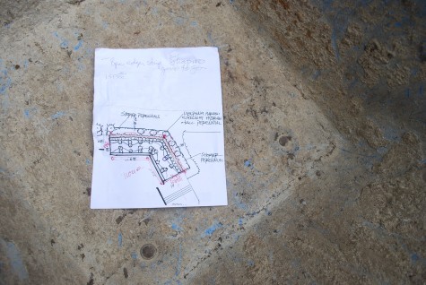
I am sure every city in every state in this nation has those larger than life, extraordinarily talented people who produced design that endures. My city has many examples of residences conceived and built by Harold Turner. This master builder, responsible for the construction of many buildings of Frank Lloyd Wright, went on to build a number of residences in my city whose beauty still shines so many decades later. I am not an architectural historian, nor am I well versed in the life of Harold Turner, but I knew my client had purchased a home of architectural and historical significance. My part of this-study that building, the grades, the views, the spaces-and make a move in concert.
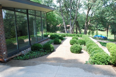
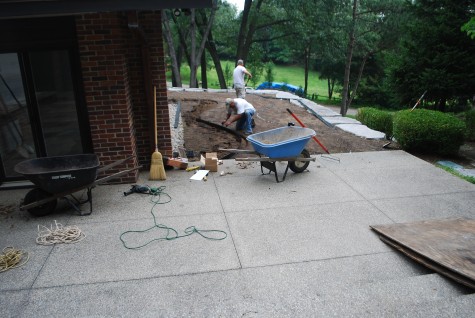 The living room of the house faces the rear of the property. Floor to ceiling windows ask for the outside to work seamlessly with the inside, and provide year round interesting views. A wide open L shape, each wing of which is some 30 feet by 14 feet, describes on the ground plane a pair intersecting glass walls. Terraces at either ends of the wings suggests a landscape which permits leisurely travel from one end to the other.
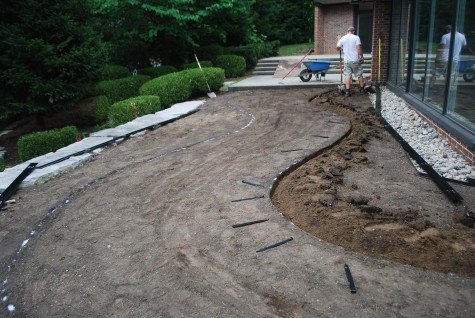 The strict geometry of this rear profile of this Turner house filled my head with curves. How so? The glass prow is so strong, why would I interpret or dilute that gesture? Repeating the geometry he established for the house-what need would there be? It seemed to me that a simple but sculptural landscape that made much of the view the design of the house made possible was in order.
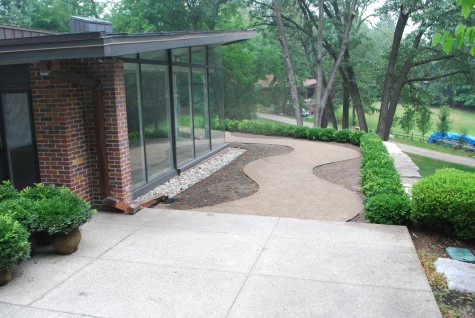 This landscape plane was entirely grass when I first came to visit. A default design. This space had no need of a mower-it had need of a landscape of interest that would look good in any given season. The journey from the library side of this house, to the master bedroom side of this house-it seemed to me that a path would figure large in the landscape design. The stone retaining wall casually stacked and irregular in shape seemed out of keeping with the palette of materials established by the house. An initial hedge of Green Velvet boxwood screens that stone from view, and encloses the space.
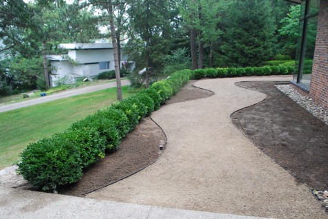 Decomposed granite is a favorite material of mine. I mulch plants, I build driveways, I compose entire landscapes around that material that brings the parks in Paris to mind. A walkway all about generous curves seemed a good companion for this house. My client does like to entertain; the wide walk makes for places for guests to visit, and good circulation. The granite is a quietly versatile material that echoes the surface of the existing concrete aggregate. Used in conjunction with steel or aluminum edging, it can cleanly outline interesting shapes.
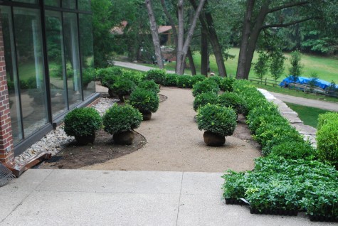
There is always the danger that a small space will become a corridor to somewhere else-a visual racetrack, if you will. Planting another series of boxwood, set perpendicular to the house and boxwood hedge, will slow down the traffic. Unlike the boxwood in the hedge, these plants are placed in the bed, and in the gravel individually. Individually placed plants read as individual sculptural elements.
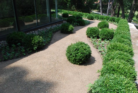 Seven sets of three plants each are placed such that the gravel walk space opens and closes. Pachysandra fills the empty spaces in the beds; when grown in, their mass will reinforce the pattern of the walk.
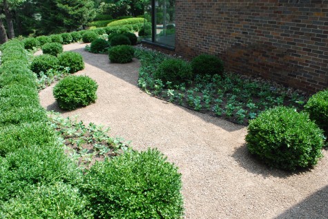 There will be decisions to be made about the pruning. The hedge could be boxed-the individual boxwoods pruned as spheres. Or vice versa. The boxwoods set in gravel could alternately be pruned as squares and spheres. The distinction that is drawn between the inidivdual plants and the hedging plants will be an important part of how the landscape reads visually. We will see what direction my client is inclined to take. Beyond this decision, the maintenance will be minimal.
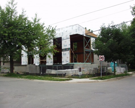
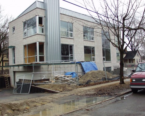 Luckily glass reflects light during the day. Her life would not be on visual review from all the neighboring properties-except at night. Given the very small size of the lot, the architect had designed a basement garage accessible from a sharply pitched drive. I did admire how he managed to exclude the garage from the visual presentation of the of the house. The garage is rarely the most beautiful feature of a home. It was necessary to retain the soil surrounding the house in order to permit a drive surface below grade. This was accomplished cleanly with corrugated steel capped in corten.
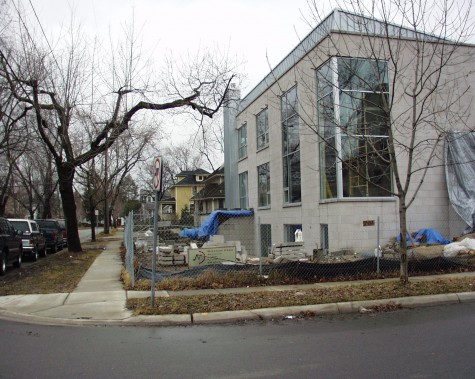 The house is very tall, and the stone and glass edifice is starkly contemporary. The land unoccupied by the house amounted to an L-shaped strip barely wider than the right of way between the street and the sidewalk. Some homes are architecturally demanding buildings. By this I mean their sculptural element dominates the space. My client has a big love for contemporary art and architecture-such that the prospect of living in a sculpture appealed to her. It was my job to design a landscape that would in no way interfere with the one thought-the sculpture that would also provide a home to her. This landscape would in no way be about plants; it needed to be about sculpture too.
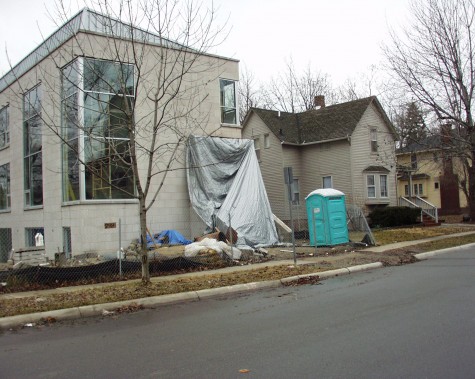 The slanted steel roof presented its own problem-how to handle rain water. A drainage system was designed, and approved by the city. It was very expensive, but it prevented water from flooding the neighboring property. The front porch under construction here would necessitate a big flight of steps, as the bottom of the glass panels matched the grade of the first floor living space.
 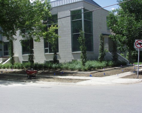 As with any contemporary landscape, a restricted palette of materials makes for a clean and strong statement. I planted a slew of Salix purpurea nana-commonly known as dwarf actic willow. Its gracefully meadow-like appearance sharply contrasted to the hard surfaces of the house, and softened them. The blocks of willows would be mulched in granite gravel. The columnar poplars would not obstruct the views of the house, but would slightly break up the stone and glass surface. The placement was dictated in part to provide good views from the inside of the trees outdoors.
 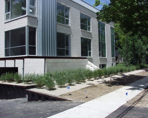 The transition from the willows to the walk would be handled by lawn. It was important for a house this size to visually include the right of way landscape, so more lawn was in order.
 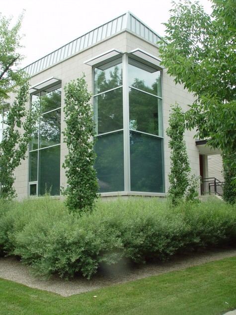 Given some time, the willows took hold. Their dense billowing appearance is simple and handsome. These densely twiggy shrubs are solid and graceful. Their mature height barely sweeps the bottom of the glass panels. Their slightly bluish cast repeated the blue-green color of the poplar leaves.
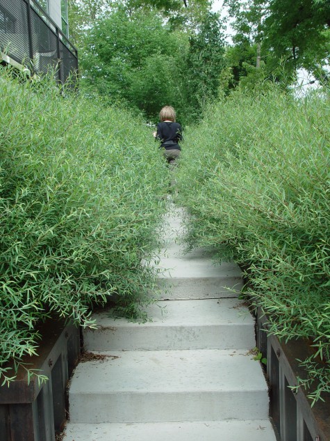
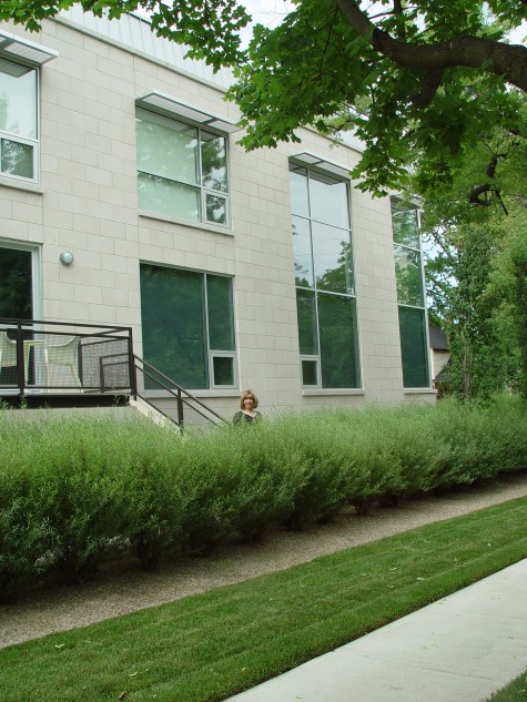 The walkway to the side door is embedded in this meadow as well. A retaining wall which permitted windows to be installed at the basement level is no longer visible-as the wall is strictly utilitarian, we screened it from view. The look of a shrubby willow reminds me of an ornamental grass. Ornamental grasses are difficult in the winter season. Leave them tall over the winter-heavy snow will knock them over, and spring winds will scatter their broken branches everywhere. Trimmed to the ground in the fall-that look is not so appealing either. Some prominent places in a landscape wanting grasses might benefit from being shrubbed up with dwarf willows.
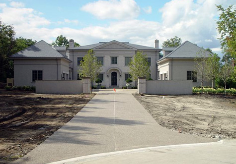
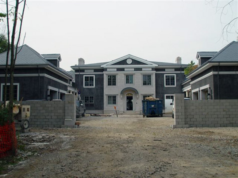 This contemporary American version of a classic French chateau includes garage wings on either side of the main house. What a beautiful architectural detail- visually treating the garages as living space. This gives the house a very European flavor. The design challenge was providing enough space to turn cars into the garages, and guest parking, without the landscape looking like a commercial parking lot.
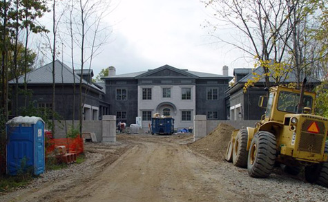 The wing walls, finished in large columns add another hard architectural feature to the mix. As there is no hiding so many hard surfaces of this size, why not celebrate them? Selecting a primary material for the drive and drive court came first. The clients decided they liked concrete aggregate as a surface. Though their first choice was gravel, they had legitimate concerns about snowplow damage. Good looking concrete aggregate requires a very skilled contractor; be sure you see samples of work before you sign up.
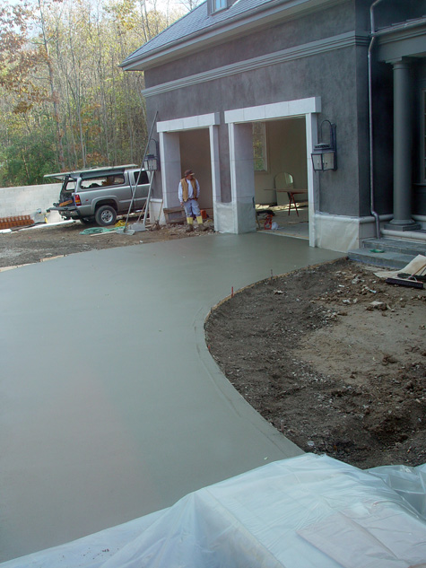 The concrete aggregate in the drive court was comprised of four sections, based on the turning radius into the garage, and the reverse radius corresponding to the surface needed to back out of the garage. This picture illustrates the aggregate surface I thought necessary to back out gracefully. Four quadrants made it easy to sawcut the aggregate every 100 square feet or so. Large surfaces of concrete require expansion joints, so if there is to be any cracking, the cracking occurs in these joints. The area immediately to the right of the freshly poured concrete in this picture was surfaced in decomposed granite. This change of material is a subtle one, in terms of its texture and color, but definitely a change. This created four curved shapes on the ground, in contrast to the rectilinear shapes of the house. They also repeat the curved roof over the front porch.
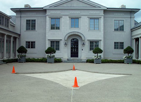
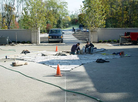 Each stone was individually set in mortar, as the thickness of each stone varied a good deal. Natural stone takes so much longer to set, as it is never completely or predictably the same thickness from stone to stone.
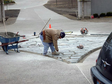 The roughness of this stone seemed to ask for a frame. To cut limestone to fit perfectly here would have been very problematic. So we poured a border of mortar, finished to resemble the limestone on the house.
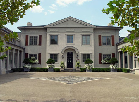 The finished drivecourt is an interested study in shapes and textures, as well as a utilitarian solution for parking.
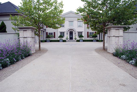 The decomposed granite was brought outside the wing walls, to better visually integrate the drive and drivecourt. I think the end result is not just austere, but beautifully austere.
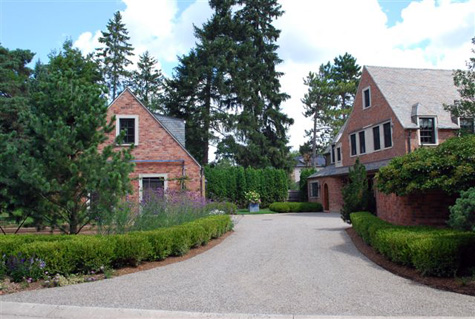 There are some landscape materials I cannot get enough of. Decomposed granite is a material comprised of pieces of granite 3/8ths of an inch across, and smaller. The smaller pieces are known as “fines”. The fines sift down in between the 3/8 inch pieces, and interlock the decomposed granite. This makes for a surface that delivers that beautiful sound with every step that says garden, dead ahead. Decomposed granite looks like sand when it is delivered. I have taken plenty of panic stricken phone calls from clients. But once it is laid down, graded, compacted and washed, it is a surface that won’t give no matter how high those heels are. I have no love for asphalt as a surface; does it not seem like a symbol of all those places we have paved over without cause? Concrete is a great material, as long as it is used with architecture that asks for it. Concrete aggregate is beautiful for modern or contemporary landscapes-I hate to see it used by a client who really wanted gravel, but was too afraid. My mentor and dear friend Al Goldner, told me once his only regret as a designer was that he was not bold enough; be bold!
 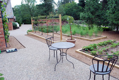 Decomposed granite, properly installed, makes for a driveway impervious to tire marks. In this landscape, the driveway flowed seamlessly into paths for a vegetable and cutting garden.
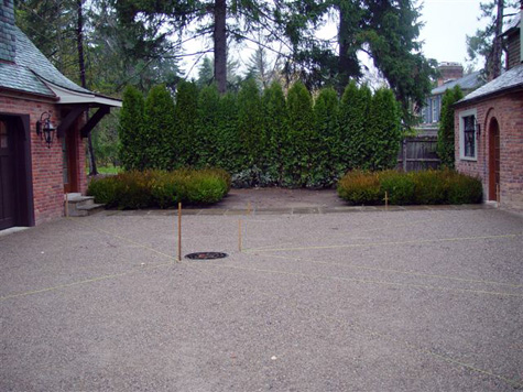 A driveway of decomposed granite requires an expert installation. GP Enterprises does these drives for me. They are so careful to install with a careful eye to grade and drainage. They compact the granite with the same machinery that compacts asphalt.
 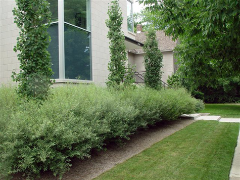 Decomposed granite makes a great mulch for comtemporary landscapes. This landscape did not ask for mulch-that granite completed a thought.
 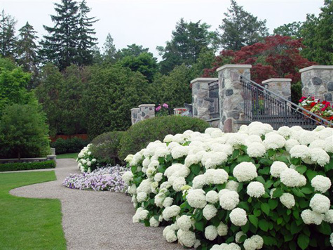 Decomposed granite can finish a formal planting, as well as a contemporary one. It is clean, fresh, and crisp. It is easy to make shapes, and moves; it does a great job of giving the eye a place to rest.
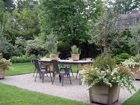 I have done many a terrace in decomposed granite. It is a clean surface, not so demanding of attention as stone. This garden makes much of the pots and the furniture-the granite is a quietly beautiful surface. It is the color of nature, a texture that celebrates all that is set on it.
 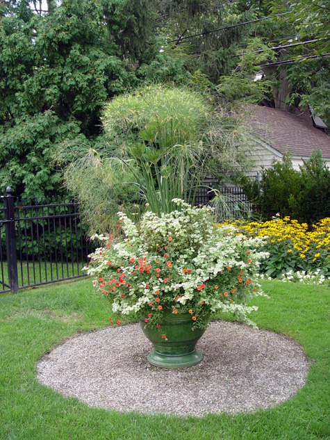 This material is useful for more than driveways and paths. Some plantings need a special space of their own.
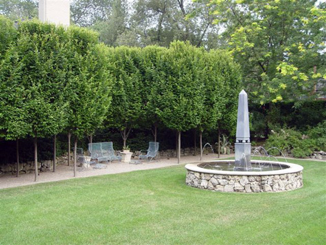 Wherever people may be in a landscape, I wonder if this surface will play a part. The granite did a great job of featuring the stone from the 1920’s original to this garden.