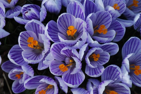
 The first color I want to feast my eyes on when spring comes is purple. It could not be any further from the light, medium and dark drab I have been looking at for months. Purple flowers have a luminosity and depth that no purple paint could come close to-just try to paint a room crocus purple. Watercolor pigments, thoroughly suspended in water, and applied transparently over a white sheet of paper, come close to luminous. The gold yellow of these stamens are by direct contrast sure to attract pollinators as much as they attract me. But no one does luminous better than nature.
 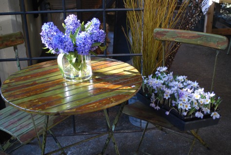 Though these lavender species crocus planted in a flat do not bloom for long, I pay my money, and go home happy. Sometimes I do the right thing, and plant tufts of them out in the garden. They rebound from the forcing amazingly well, and will take hold in the garden. The hyacinths are another story-these fabulous fakes fool the eye even up close. I have seen people touch them, to check if they are real. I think the fabric is dyed such that the color pools dark to light on each floret. The individual florets are thin enough to permit light to pass through-a more than decent try for luminosity.
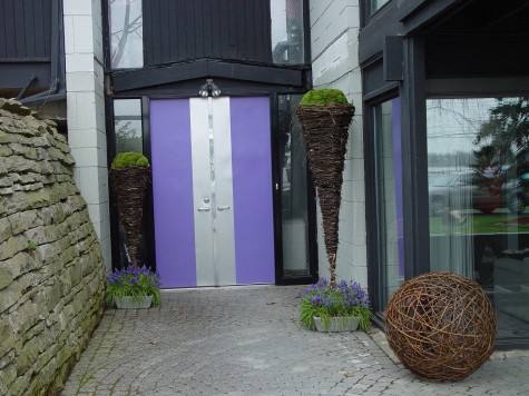 It is an unusual client who will commit to a purple door. I find this refreshing. The front door looks like a package ready to be opened, does it not? The grape hyacinths-who would not have them-all the species and every available hybrids-if they could?
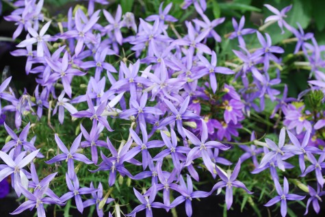 Laurentia is blue purple. Commonly known as heliotrope blue, the color startles me. In the smallest dose, it reads loud and clear. A small stand of this is as striking as an entire field of sunflowers, as it is so unexpected. An unexpected landscape element-what is yours?
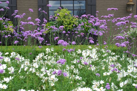 Verbena bonariensis is one of my favorite flowers. Endowed with all the airy grace of a meadow perennial, it is an annual in my zone. Drought tolerant, sturdily tall, a prolific seeder whose seedlings are easy to weed out-who could ask for more from a plant? These floating dots of red/lavender/purple are beautiful with just about every other color on the planet; this makes them friendly to just about any scheme you have in mind.
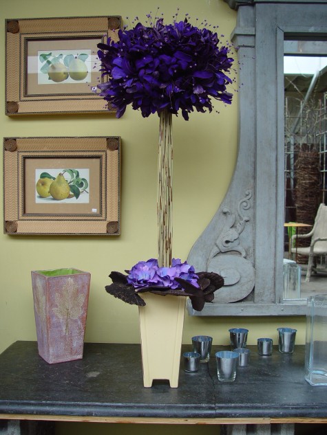 Integrifolia dyed purple is a rich royal purple. Placed in front of a pale greenish yellow wall, this complimentary color makes the purple glow. Though no light penetrates these leaves, pairing colors opposing each other on the color wheel is a reasonable approximation of luminosity.
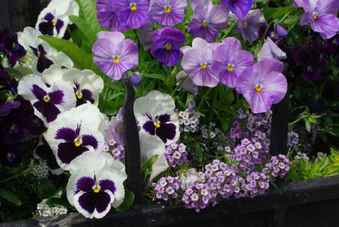 Pansy purple-everyone knows what that color is. I find it all the more precious as I have it in the spring and early summer-no other time. I call this alyssum the Easter mix-the mix of lavender and purple brings back memories of Easter Sunday hats. Those hats I only saw at Easter-never any other time of year. I am sure I had more than one Sunday dress in some variation of that purple.
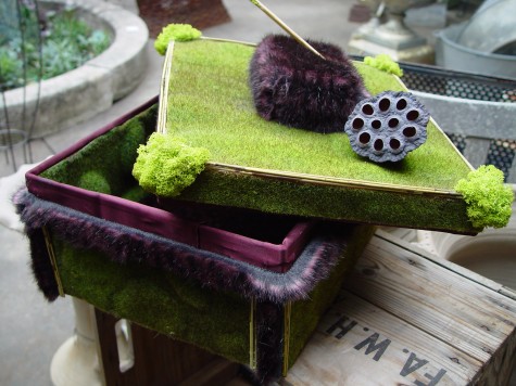 I call this a presentation boxes-don’t ask me what that means, exactly. Draw your own conclusions. This box I made from synthetic moss mats, lime green reindeer moss, natural reed, a particularly fine specimen of poppy pod-and purple fake fur. Purple and lime green-an inspired color combination.
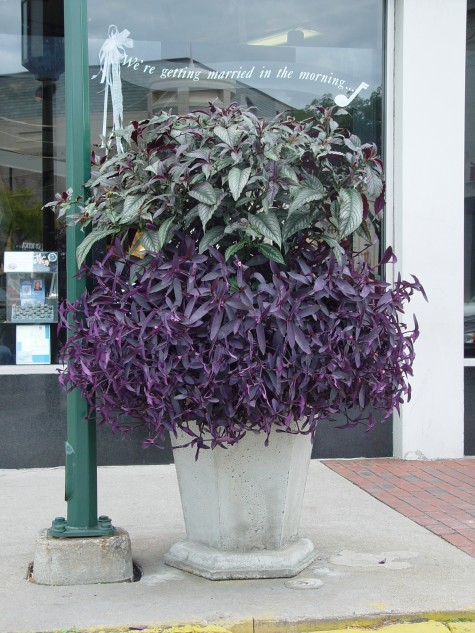 Purple can be moody, and fugue like. What I call Moses in the Cradle-this dark purple tradescantia, I plant liberally. It tolerates cold, heat, shade, sun and neglect. A new variety I tried this year has a white and cerise variegation; such a fancy outfit must be why it does not grow vigorously. But the ordinary Moses will make a stunning bouquet for you. Persian Shield is a moody mix of blue green and red violet in this more sunny location.
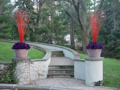
Designing landscapes is not a career for me-it is a life. Planting containers allows me to address lots of design issues I face designing landscapes, in a small space, for a short time. Color is a design element as important as any other. My containers are a momentary laboratory. I am able to experiment with color, mass, texture, pattern, value, rhythm, proportion, scale in a small space-all of what I see in these container plantings, I bring to work with me every day. When I go to design a landscape, everything I have learned from these container plantings comes with me.
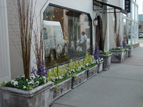 Tender is a very smart dress shop where they take their fashion seriously. As I take the landscape seriously, we relate just fine to one another. Commercial clients understand that the presentation of their business outdoors says a lot about what goes on inside. They want the outside of their store to look as fresh and newly conceived as what they carry inside. I am thinking about Tender today, as
 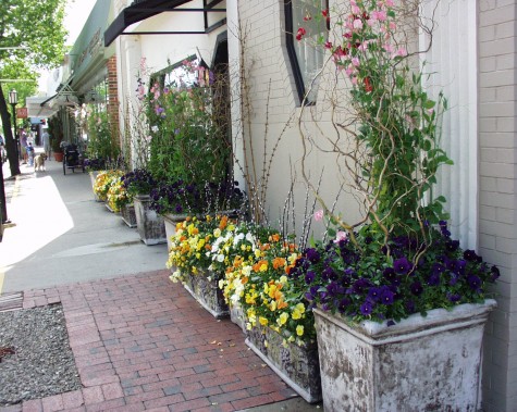 A container planting is a one-season committment. Unlike the landscape, the plants have to be replaced every year. The responsibility for a landscape can go on for many years. I sometimes don’t make changes that I should, out of sheer inertia. But my containers force change on me. I have no choice but to observe and learn how to do better, and redo them-or be stuck twiddling my thumbs from sheer boredom. A container planting is a miniature version of any landscape. I would much prefer growing up as a gardener over four square feet and some annuals, than 100 square feet and a truckload of shade perennials.
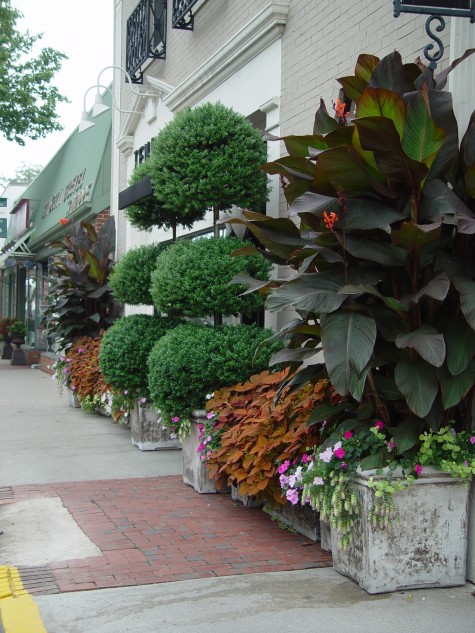
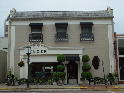
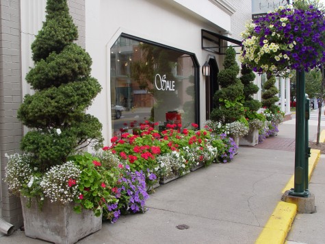
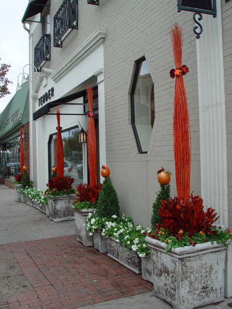 Pumpkin hats on the conical boxwood-this made me smile. The willow sticks dyed orange-I bought an entire container load of these some years ago from Spain- in lots of jewel like colors. Several hundred thousand sticks-no kidding. Getting a phytosanitary certificate sufficient to get them through customs was a headache that made me want to black out. Though looking at this picture makes me want them again in the worst way, I know something new is just ahead of me.
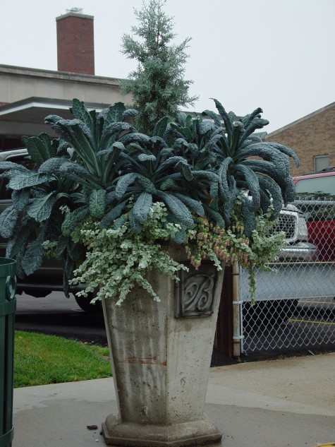
 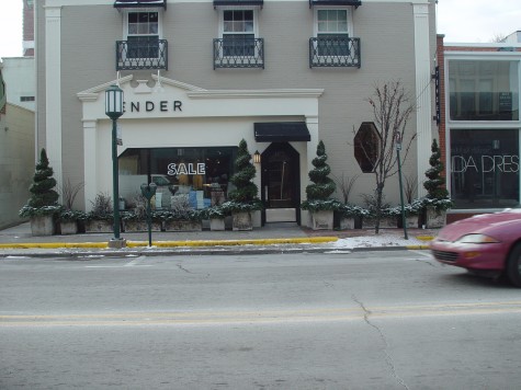 The winter is our quiet season. Our colors are subdued, but not our gardening spirit. But for these planters, with their Alberta spruce topiaries and their greens, this view would be more bleakly about concrete than need be.
 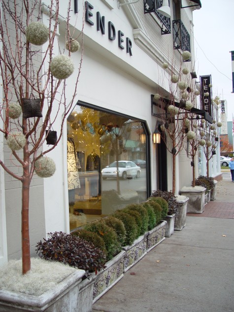 This year one gallon size PJM rhododendron and dwarf globe arborvitae filled the rectangular pots. I bought dead trees from my nursery supplier, and varnished the bark after dusting them with copper spray paint. Platinum ball ornaments and squares of tarred jute ornament the trees. Each tree had a bird’s nest of fine platinum colored wire at the base. A winter landscape.
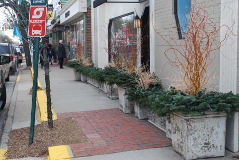
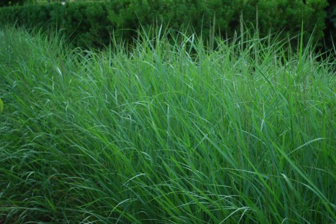
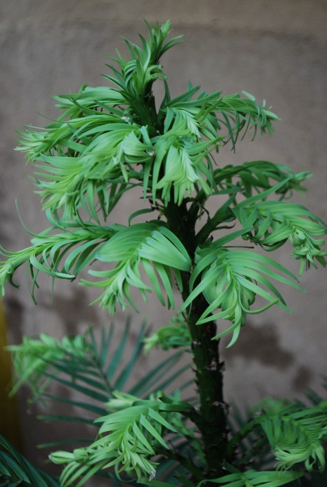
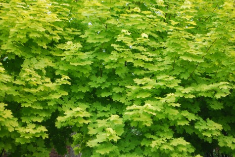
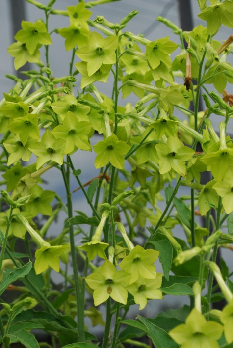
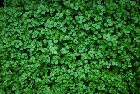 Judging from the numbers of people I try to help grow healthy yews who cannot spot that yellow/green yews indicate a water or drainage problem, I think green is so pervasive in a landscape, people stop seeing it. If you are not tuned in to green, you are missing a good portion of the pleasure and satisfaction of a landscape. Designing with green in mind-don’t miss this.
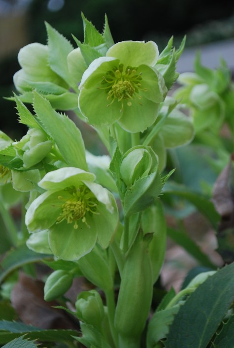
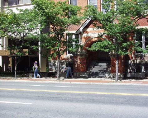 There are times when color is the most important element of a landscape design. This building, circa 1880, had become home to a well known and cutting edge advertising firm-Harris Marketing. Any commercial client in the design business is keen that the landscape reflect as much attention to design as possible. What you see outside is a visual reflection of what goes on inside. In this case, the architecture and materials of the building itself made the color issue a very important design issue.
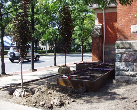 Though the building was large, and several stories high, there was very little land on which to landscape. The building facade was comprised of brick of an astonishingly bright orange color, and stone. In addition, the right of way space was paved in orange brick. Any successful landscape design would need to address that color in a thoughtful way, and then create visual interest in a very tight space. My first decision was to choose one plant element that would represent that brick color-a Crimson Sentry maple. Since the right of way locusts were planted at regular intervals, and framed in brick, I planted a row of these columnar red/orange/brown leaved maples in the spaces between the locusts-this visually added the right of way trees, and the land in which they were planted, to my landscape design.
 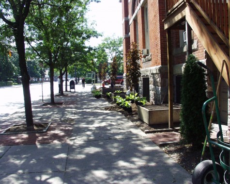 I rarely plant dark foliaged trees, as the color can be hard to work with, and muddy at any distance. This siting places these maples close to the viewers eye, backed up by that bright orange brick; the color of those leaves worked well. Large bottomless planter boxes made from corten steel served a dual purpose. The eventual orange brown of the steel would make my color references stronger. They also permitted me to make a grade change in a small space. They made a 3-D representation of the brick borders around the locust trees. This unexpected element catches the eye.
 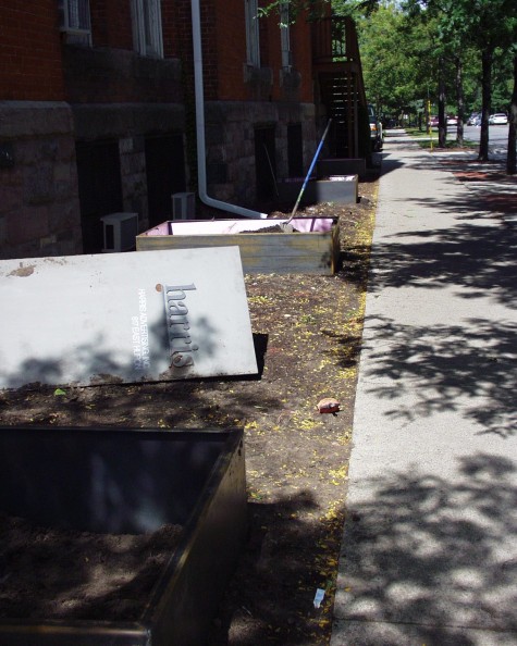 I planned to plant hydrangeas in the boxes, and Sum and Substance hostas in the ground. The greenish white flowers of the hydrangeas, and the lime green foliage of the hostas would contrast with those orange brown leaves in a sparkly way. We lined the planter boxes with sheet insulation; once the ground would freeze in the boxes, I wanted it to stay frozen. Too much freezing and thawing might hinder my chances for success with hydrangeas, whose roots would be above grade.
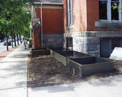 Making this long run in several boxes dramatically reduced the fabrication cost, and made transport much easier. The boxes and hydrangeas would also screen the basement level windows, and window air conditioners from view. Old buildings like this one a very difficult to adapt to modern air conditioning. This fact did not need to be part of the public presentation of the building.
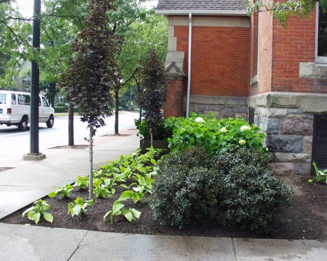 A stripe of PJM rhododendron unexpectedly repeats the maple leaf color. I think it is a good idea to be clear in executing what you are trying to achieve. There would be no opportunity to explain to passersby what I meant. If I need to explain the intent of a design, I need to rethink the design.
 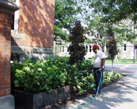 It would take some time for that corten steel to orange up. Corten steel only rusts to a certain point, and then becomes stable. Once the hydrangeas matured, they completely screened the lower floor windows. Though I would not ordinarily block light to the interior of a building, there were security issues that my client decided were more important.
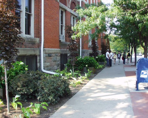 The finished landscape has a beat. A lively rhythm, and attention to the color relationships established by the building and environment attracts attention-any business hopes for this. I would have been happier for more evergreens given our climate, but my client reasoned that few people would be walking by in the winter. The orangy brown boxes would make a statement to people driving by. Any strong geometric statement would attract the kind of attention they were looking for.