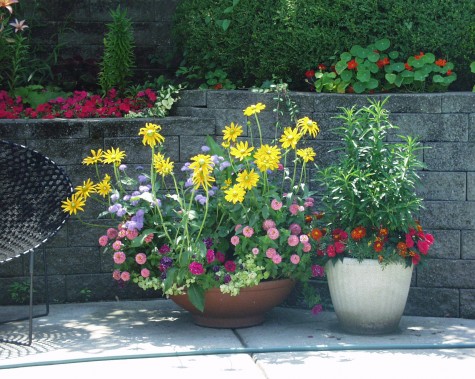
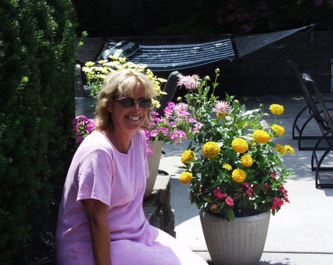
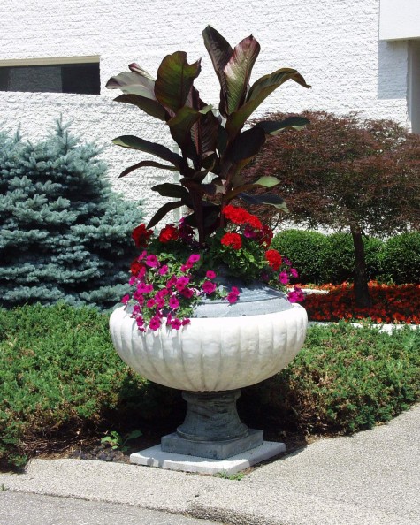
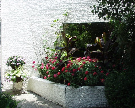
Every move you make in a garden has to start someplace. Some activities begin for everyone in the same place. Should you decide to run a marathon, there is a starting gate and a finish. If you are designing a container garden, it’s your choice where to begin, and where to end. The inspiration for a container can come from lots of places. A favorite flower, color, or texture. A favorite pot, a memory of a garden from another place or time can provide a place to start. For this container design, I started with my two Julias. Julia the Mom from whom I inherited a love for flowers, and Julia, my friend. Friend Julia is a plant afficianado-whether it be a dwarf evergreen, a flower, or a tree. She spent 20 minutes with me a few weeks ago, extolling the virtue of a new osteospermum called 3D.
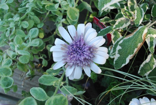
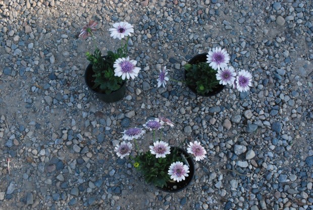
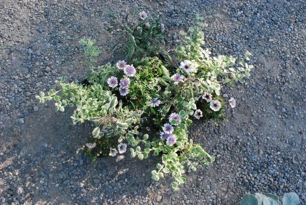
I decided to design a container around this particular plant. Her enthusiastic praise for its performance was compelling. The flowers stay open all day-a decided improvement over older varieties. They bloom strongly all season long; I like this too. But I was intrigued by the color-an icy white, and a purple that was decidedly on the red violet side. I laid a few plants out in the driveway, so I could take a closer look.
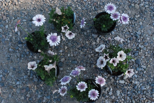
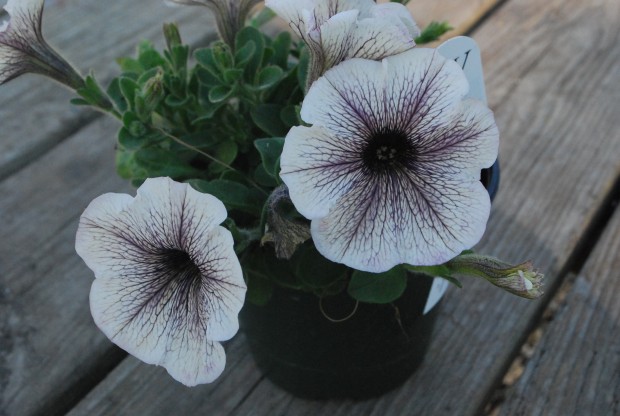
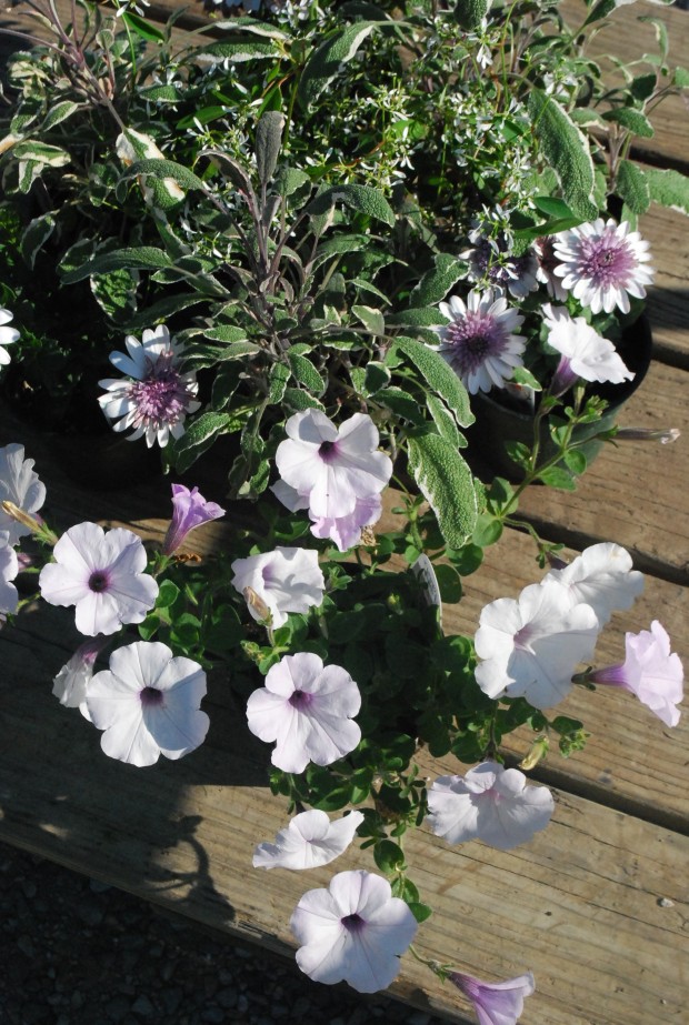
Julia was equally keen about a new petunia called White Russian. Why not see if both flowers would work in the same arrangement? After all, a pair of great plants might making for a smashing container. But right off the bat, there was trouble. Not all whites are created equal. Color in nature is infinitely varied. Some color combinations I find more appealing than others. These two whites together did nothing for each other.
The brilliant, almost luminescent white of the daisy looked wrong with the flat white of the White Russian petunia. The petunia took on a rather lifeless greyish look-to my eye. But until I had some more plant choices in place, I wouldn’t rule out the combination.
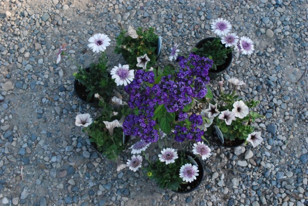
Adding heliotrope to the mix was jarring. The flower is a blue based purple-not at all like the carmine in the daisy. This was a combination that made everyone look bad. It looked bad to me-that is. Everyone sees color very differently. Whern in doubt-trust your own eye. It also seemed that having a fine floret sized texture would be better underneath the daisy, rather than on top. I eliminated the heliotrope.
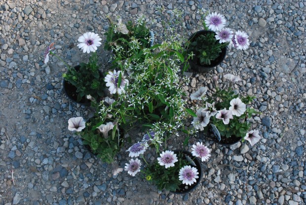
A pot of Euphorbia Diamond Frost moved the arrangement in a better direction. The bright white color was the right white. But even better is its contrasting texture. The daisy has a rather stiff habit in both leaf and flower. The euphorbia has a fluttery, sparkly texture that would loosen up the composition. As a centerpiece in a pot, the euphorbia would grow fairly tall and wide-as will this osteo. They would be fairly evenly matched.
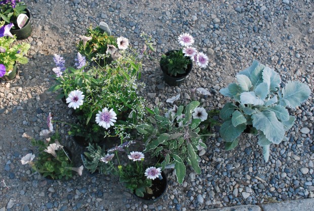
On a whim I tried adding Cirrus dusty miller to the mix, but the leaf size was overpowering. A tricolor saga had a little more grace, and that same blue green color that contrasts so well with red violet. A salvia Cathedral sky blue-the wrong color altogether flower wise, and the leaves were not blue enough. I thought briefly about some lavender, but if the 3D daisy was to be the star of the show, all of the other colors and textures should be chosen in visual deference to that idea.
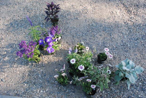
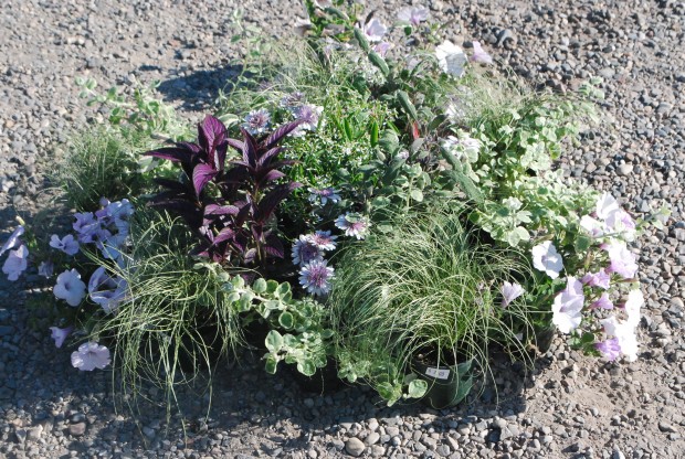
I have a small group of plants here, with a bigger collection of rejects. I see Rob do this all the time when he is trying to help someone design a container. He groups plants together. Then he adds this, and subtracts that until he gets a composition that looks right.
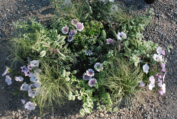
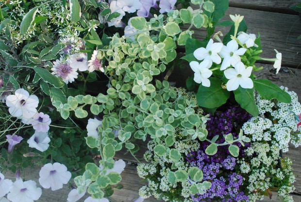
After putting away all of the flowers that were not going to work, I added some variegated licorice to my group. That cool green looked good with the sage, and the cool whites.
Carex comans Frosted Curls is a very similar color to the licorice, but an entirely different texture. The delicate blades of grass would be in concert with the habit of the euphorbia. At this point the arrangement has a subtle and delicate coloration, and just enough contrast to have visual interest. Subtle does not mean sleepy.
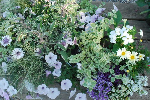
The White Russian petunias proved to be too sleepy. I switched them out for the supertunia mini silver. It is a small flowered petunia that grows vigorously. Those sturdy stems and that vigorous blooming would be a great contrast to the euphorbia. It would also add a lot of color to the sage/licorice/grass mix. In a container, I would alternate the petunia with the licorice, and then the grass. A mix of 3 plants is much more lively and interesting than a mix of 2.
Were I to plant a large container with this scheme, I would want to introduce a plant that would grow larger. A Persian Shield would grow very large, so there would need to be multiple plants of the Diamond frost and 3D daisy. The numbers of this plant versus that is about balancing the composition. Little plants may need a bigger voice via greater numbers.
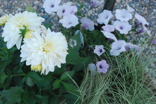
I could also add a white dahlia to the mix, meaning my daisy would have to become part of the supporting cast. What I like about the dahlia idea is the yellow derived from the bud color, and center of the flower. It would bring out the red-violet in the other flowers, and contrast with the cool greens in the foliage plants.
I still liked the idea of the floret sized flower in this container. Alyssum, whether it was white, citron, or red violet, would do a great job of that. Even a mix of all of the colors would work well.
I could revisit the pale yellow idea with a flower that was smaller and less overbearing than a dahlia. The butterflies boston daisy has a habit and size more in keeping with all of the other plant choices.
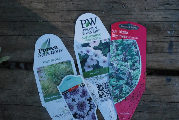
The nursery industry has gone to great trouble and expense to include tags in their plant pots. These tags will give you a brief overview of the eventual size of the plant, and the light and water it will require. Taking advantage of this information means you will avoid making cultural mistakes. Making sure you have the right neighborhood in mind for all of your residents will help your container to prosper. I do think I am ready to plant up this pot.
