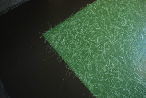
Repainting this concrete floor has gone on for over a week now. I am hoping to finish up quick. A container from England is sitting in customs; we need to be ready for that delivery. The four color green ground of this painted rug needed a border. The base color is a dark chocolate. Though I knew where I wanted to go color wise, I needed a texture that was unlike the texture of the ground. Contrast is not strictly confined to color. Though I had the best time signing the floor with loops of paint in a steady stream from my stir stick, I wanted a different texture for the border. A clear definition of the edge.
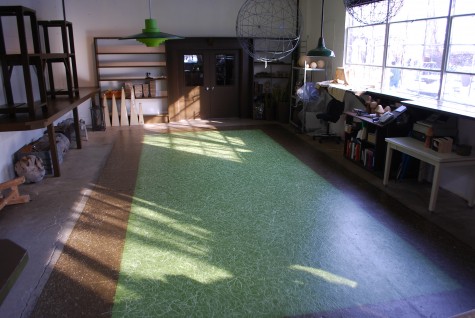 The border is entirely painted with drips. Those of you who read this blog regularly know dirt follows me around. It is always under my fingernails, and in my sock tops. As a painter, I know anything I wear will sooner or later show evidence of the painting process. I am likely to have paint on my shoes, my hands my face, and my hair. It is a life condition-I have no other explanation. Paint drips usually land on me. My plan-the paint would drip on the floor, and not so much on me.
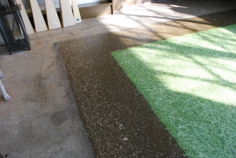 I was after a gravelly texture. It seems like it ought to be the simplest thing in the world to get paint to drip-it happens unbidden all the time. But regular drips, not too fast drips, not too big drips-this involves paint at a perfect consistency. Thick enough to permit multiple drops, but thin enough to deposit small and civilized gravel-like shapes. This part was work. It will be a good thing when this floor is covered with the great things we have coming for spring. My globs, lines and blips tell the tale. 3/8 inch and down decomposed granite is remarkably uniform. My painting is anything but.
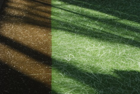 But a paint card laid is a paint card played-there is no mopping up. I could work another two weeks to erase any evidence of my hand, but why would I want to? My approach to landscape design is formal-whether the result is traditional or contemporary. I favor landscape design that emphasizes structure and utility. Distilled design that makes a clear statement. But I do understand that the most formal design on paper is subject to wind, weather, grade, hardiness, and all manner of unforseen caprice.
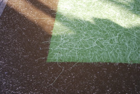 It may be what I like the best about this painting are those capricious places. A loop of green paint might find its way out there, should the muscles fueling my hand unexpectedly flex. An inadvertent flex might end up being my favorite part. My advice? If you want to paint a floor, make a plan, lay it out, prepare for any eventuality, and then go for broke. The same applies to a garden. Plan your heart out. Then go for broke.
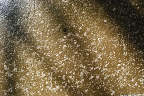
Those irrepressible blips are a personal signature. When I sign a check, or a document, or a letter; when I design a landscape, I sign my name on the dotted line. My signature on the dotted line is not a guarantee of perfection-it is a vote of my confidence in my work. What I do confidently is anything but perfect. But it might be interesting.
