A House On A Hill

It’s a rather quick and showy matter – to discuss container planting design, planting, and the eventual, and hopefully lush outcome. The satisfaction planting and growing them on is a pleasure of a single summer season. But landscape projects can consume months of work, and the progress can be slow. Any large landscape project that involves a number of contractors requires loads of patience. I am in year two of this particular project. I will admit that the first time I drove up to the house, and looked back down the driveway, I was rattled. A large piece of land featured a house built on top of a hill in the far rear corner of the property. That hill dropped away dramatically in every direction.  Substantial portions of the land were below the grade of the adjacent roads. Knowing as I do that human interaction with the landscape depends on some flat ground on which to stand, I was discouraged. I would go so far as to say it is an alarmingly difficult site. My clients were not the least bit concerned. They were in it for the long haul. They loved the house, and they were interested in making a home for themselves-inside and out. My first visit to the property was not their first. They were already well on their way to making their presence known, cutting down dead trees and shrubs, and hauling away debris. They had planted some white pines.

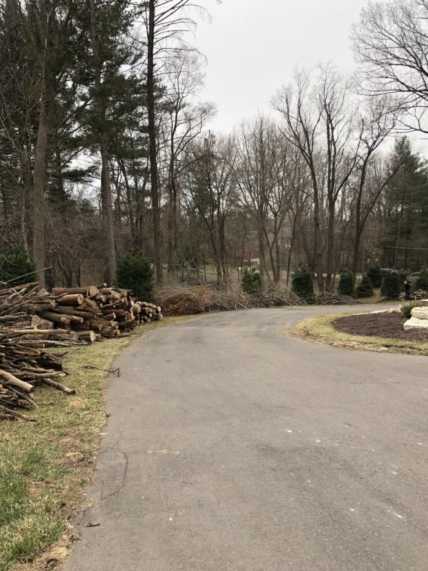
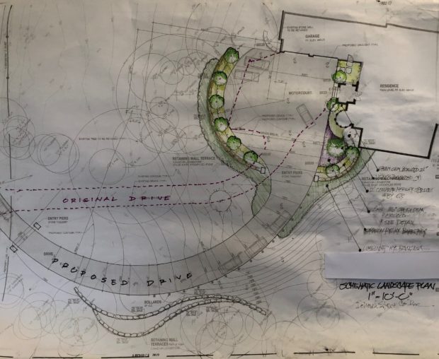
The driveway was in rather poor condition, and would have to be redone.  But to my mind, the location of the drive was a bigger problem than the condition of the surface. It was not particularly functional, as it came up to the house at a very steep and awkward angle. Keeping it ice free in the winter would be necessary for both vehicular and pedestrian traffic. But even in good weather, it was a nerve wracking haul going up, and a nerve wracking brake fest on the way down. The distance from the road was considerable, so adequate parking near the house was a must. The existing drive court was too shallow to permit parked vehicles and access to the garage at the same time. The drive was too narrow to permit 2 cars to pass on the drive. Lastly but not least, it did not provide a beautiful and unfolding presentation of the house on the trip up. I proposed moving the driveway altogether, to a location that was less steep. The sweeping curve would provide views of the property. And it would be wide enough for 2 cars to use the long drive at the same time.

See what I mean? A good bit of the property is covered in trees.  That wooded look was entirely appropriate, and with some pruning and care would thrive. There was very little in the way of designed landscape near the house, as the opportunities to plant were few. My clients decided they wanted to proceed with the driveway renovation, and the creation of a larger drive court at the top. The driveway contractor saw to having the plan engineered and permitted. That was not the most simple or speedy process.  The grades were extreme such that several retaining walls would need to be built to hold up that drive.

An enlarged drive court and a place to plant on the street side of it would require a third retaining wall. The amount of natural flat space all around the house was minimal.  The drive court was up there in the tree canopy.  A landscape buffer would keep a vehicle away from the drop off point. Fortunately, the soil was on the sandy side, making the earthwork fairly easy to do. Another advantage was that work was not held up by rain, and water drained off quickly. Working a site with heavy clay soil can be set back a week or better after a drenching rain. There would be a terrific amount of work to be done before there would be any talk of a landscape installation.

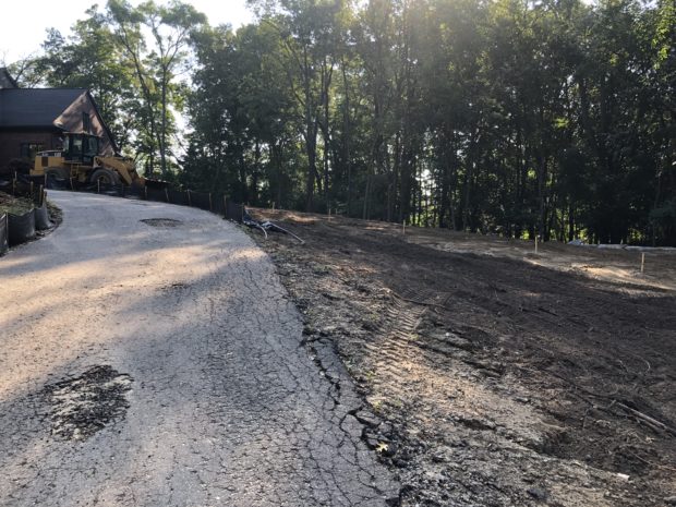
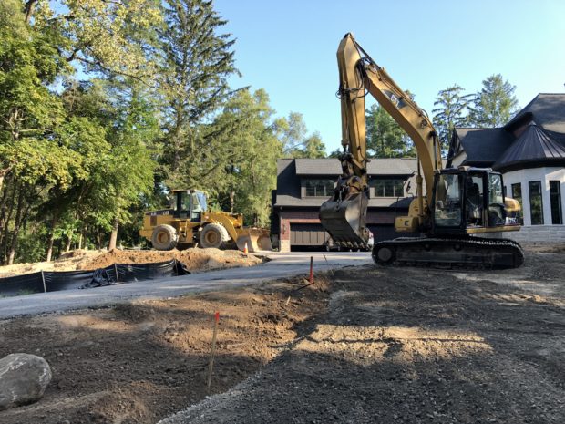
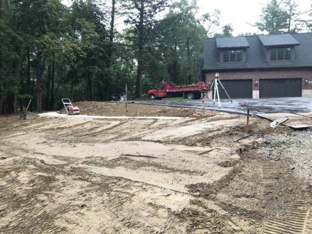
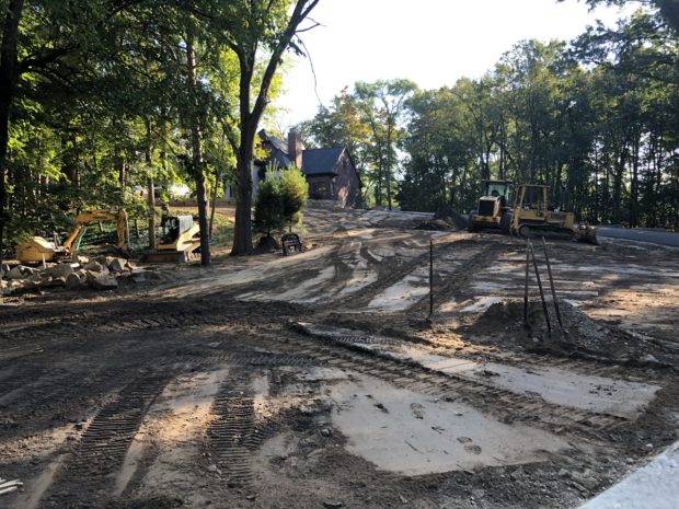
The actual construction was quite interesting. The new drive was completely staked out, top to bottom. Once laid out, my clients could walk it, and see how they liked it. The layout was extremely close to the drawn plan, as the permit was issued for a specific location and configuration. All the while that this work was going on, my clients were still able to use the old driveway for their comings and goings. It is easy to tell from the picture above that the slope of the new drive would be considerably less steep than the original.

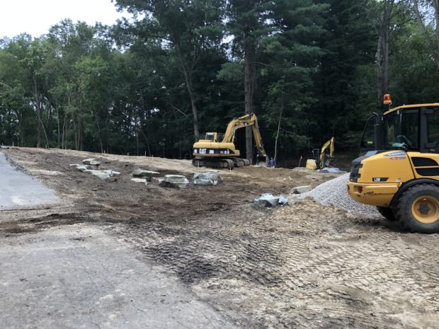
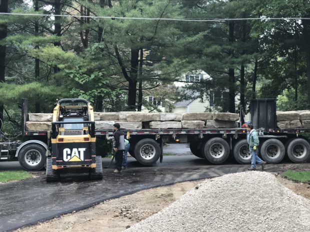
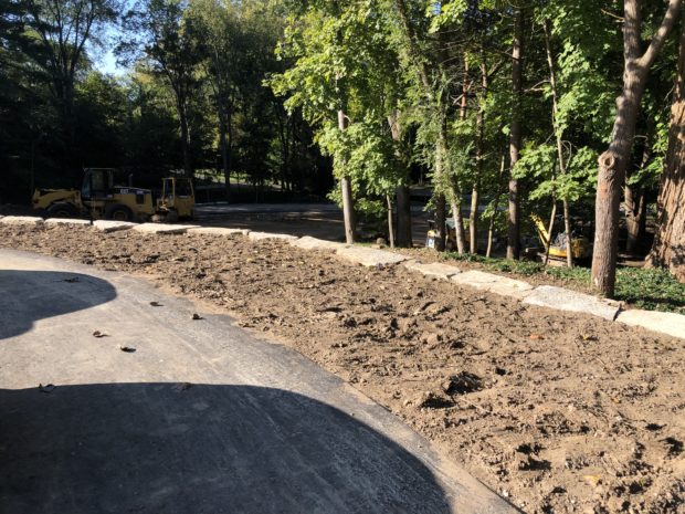
Once laid out, the retaining walls that would shore up the driveway were constructed from giant blocks of ledge rock, set with the help of an excavator. It’s obvious in the above picture that that the driveway grade is considerably higher than the grade of the land where the trees in the background are planted.


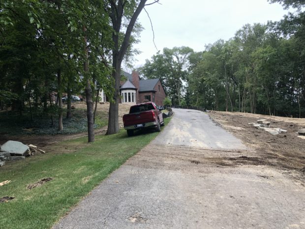
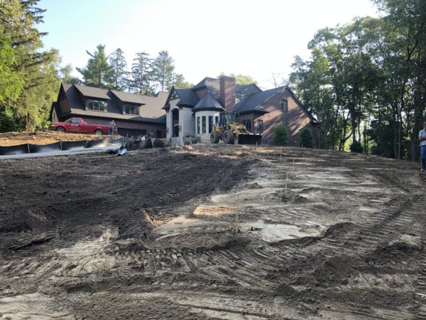
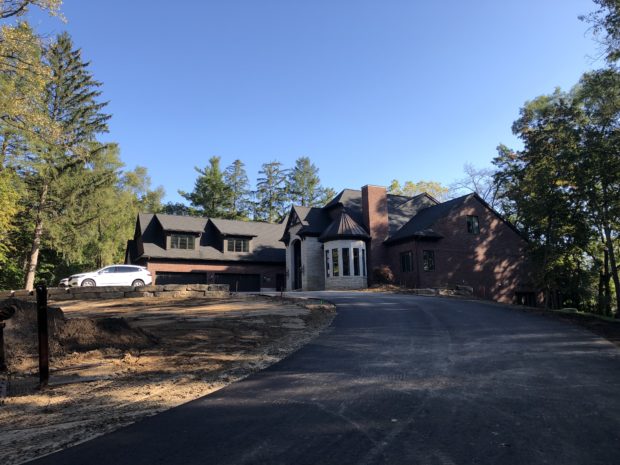
This picture reveals how the house will come in to view half way up the drive. This is the welcome home, and the welcome to our home moment. It is tough to spot the old driveway off to the left, but it is still there.

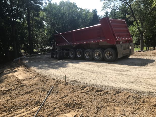
Once the grade was satisfactory, truckload after truckload of gravel was delivered and dumped on the site of the new drive.

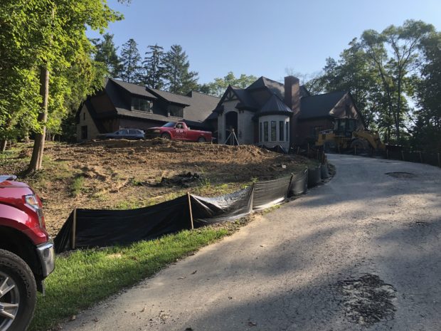
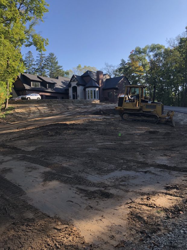
The heavy equipment up at the top of the drive signals that the last of the gravel has been laid. That gravel would be thoroughly compacted. Very shortly thereafter, the first 2 inch thick layer of asphalt was put down. The final two inches will not be installed until the landscape front and back is completed. The weight of heavy equipment can damage a drive. Once the new drive was drive able, the old drive could be removed.

A gravel base had been installed, and tamped for the drive court retaining wall. This is a great view of the level of the new drive court, set at the grade of the base of the house. The slope away from that drive court is not sustainable without some retention.

Slabs of ledge rock would be set in place one at a time to shore up the soil adjacent to the drive court, and create an 11 foot deep planting bed.

Once the wall was in place, the bed was back filled with soil. There would be room for a landscape to soften the size of the drive court.

Once the old driveway was removed, all of the open ground needed regrading. In the first picture in this post, it is easy to see that the old drive was installed on on a hill of its own.  Much of that soil under the drive was graded towards the new drive, and smoothed out. This is a very large area – thus the bulldozer doing the rough grade.

There are situations when starting over, and balancing the land forms will make all the difference in the world to the landscape outcome. I was actually thrilled to see the progress at this point. This was an enormous change, but all for the much better. The driveway contractor, Ralph Plummer, who owns and operates GP Enterprises, sent me the following statistics on the driveway installation.

– Removed 6,100 sq. ft. of asphalt.  Stripped 200 yards of top soil and re-installed it in low area along drive. Installed 400 yards of sand.-Added 500 tons of 21AA crushed stone and compacted in place. Installed 10,000 Sq. Ft. of asphalt on the first base layer. The new walls along drive took 184 tons of stone, in addition to 84 tons of existing stone that were relocated.  Whew.

Late last summer, we were ready to begin the landscape.

Some Thoughts On Places and Spaces

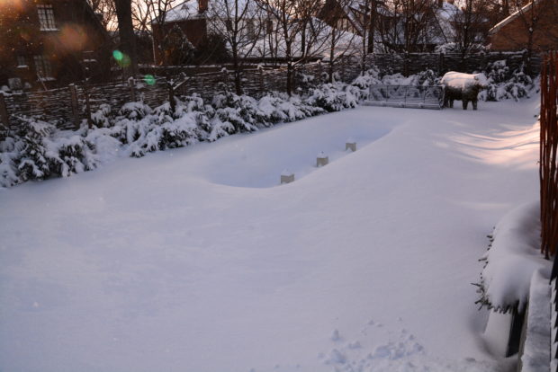
What are we looking at here? Lacking any recognizable objects or context, it is tough to tell. As this is not a quiz, I will identify it. A 10 foot tall concrete block wall behind Detroit Garden Works, covered with the skeletal branches of Boston Ivy, has a hat of windswept snow. Behind and above it is a typically and uniformly gray Michigan winter sky. This is a verbal explanation. But the story told by the photo is not about what it is, or where it might be. It is about how colors, shapes, textures and volumes compare, contrast and relate to one another. The color of the sky is so uniform that it appears flat. The snow roll looks volumetric and sculptural, courtesy of a variety of colors in tones of gray and white. The fanciful story is how that substantial shape of gray space is weighty as there is so much of it, and in the process of bearing down on the wall, it is squeezing a textured and frozen bead of snow over the leading edge of that wall. Another rhythmic interpretation might be that the dark textured shape is rising to meet the light shape, and what oozes out once the two shapes meet appears to have depth and volume. Freed from a discussion of what we are looking at means there is an opportunity to see relationships in a composition on an abstract level. What role does seeing abstract shapes have to do with landscape design? Great landscape design begins with the bones.  And the bare bones can readily and most easily seen in the winter. Looking at a landscape critically in the summer season is difficult. It is easy to get distracted by the flowers, weeds, leaves, scents, sounds, the neighbor mowing his lawn, and all of what else goes on outdoors in the summer.      The winter is very quiet. I am a solitary visitor to my garden. I am not distracted by weeding, watering, dead heading, smelling the roses, serving dinner or working out issues from my client’s gardens. My mind can be as blank as the winter sky, should I tune in to the landscape around me, and let it speak. The winter season is the perfect time to be receptive to the landscape speaking back. It is a time to rest, reflect, reminisce, and reconsider. It is a time when there is enough time to think. It is also a time to take advantage of how winter weather recasts a landscape in a simple and abstract way. The above photograph is nature’s snowy rendering of my fountain garden. All of the textural details of the landscape have disappeared. The snow has recreated the flat land in this garden in an intriguing and sculptural way. What will I conclude from what I see? That large undulating space that ramps up at the fountain’s edge that occupies most of this garden place is intriguing. Actually grading the ground around my fountain in this way would be difficult and certainly contrived. But I certainly could test that theory on a small scale in the spring. Strongly sculpted soil would not necessarily be compatible with the other landscape elements already existing. There is no harm in passing by what a snowstorm suggests. However, it is striking that there is no landscape element in the foreground framing or defining that view out. The bottom edge of this two dimensional photographic rendering of my landscape has nothing to say. I see that now. What would it be like to look through the branches of some trees to the fountain? Large tree branches in the immediate foreground, and the background tree branches that look smaller as they are a distance away, would provide a visual description of the depth from near to far. A landscape design that creates visual depth from a view can be a very successful landscape indeed. The winter is making me rethink this portion of my landscape.

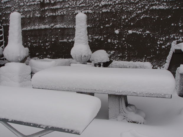
The winter reduces a landscape to its simplest iteration.  All that remains are the big gestures. A heavy snow amplifies those bones and makes obvious the relationships between the occupied places, and the empty spaces. This photograph after a heavy snow storm at the shop is a landscape of a different sort. How we arrange garden ornament is suggestive of the possibilities to gardeners who shop our place.

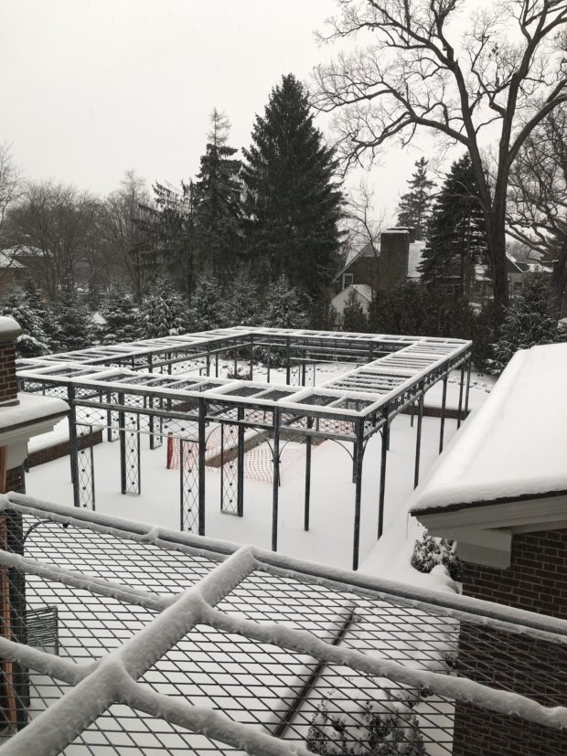
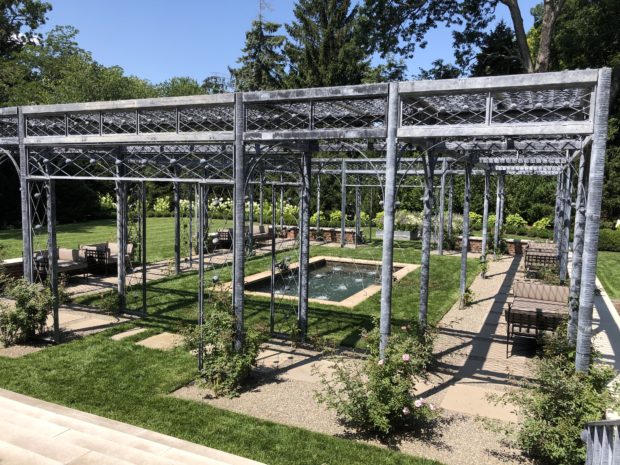
The place occupied by a pergola in this landscape is both a place to be, and a place to see. What permits a clear description of the place is the empty spaces all around it. The snow strongly describes that emptiness. There is a balance between that richly layered structure, and its minimal environment. That will change some, when the climbing roses grow. But their footprint on the ground plane will be vastly less complex than the expanse of roses up towards the roof. In the summer, that ground plane will include grass, gravel, limestone stepping stones, and a fountain surround. In the winter, all of the detail washes away, leaving only an abstract description of a strongly uniformly flat plane. That plane is a place for that pergola to be.

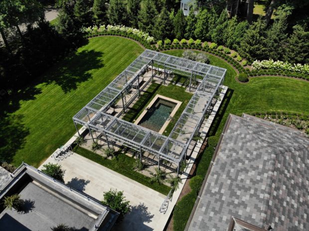
This drone photograph is courtesy of the Sterling Development Co. This bird’s eye view reveals the relationships forged between densely populated places, and empty spaces. I will confess that I was pleased to see this photograph. The drawing of this landscape is quite similar to this photograph. I was happy to see that the plain spaces-the roof of the house, the grass and the terrace – feature the pergola and the property border landscape. There is a balance struck between places and spaces. There is a tension created by that contrast that is interesting and satisfying. To my mind, anyway. I am a designer with a certain point of view.  You may have other ideas.

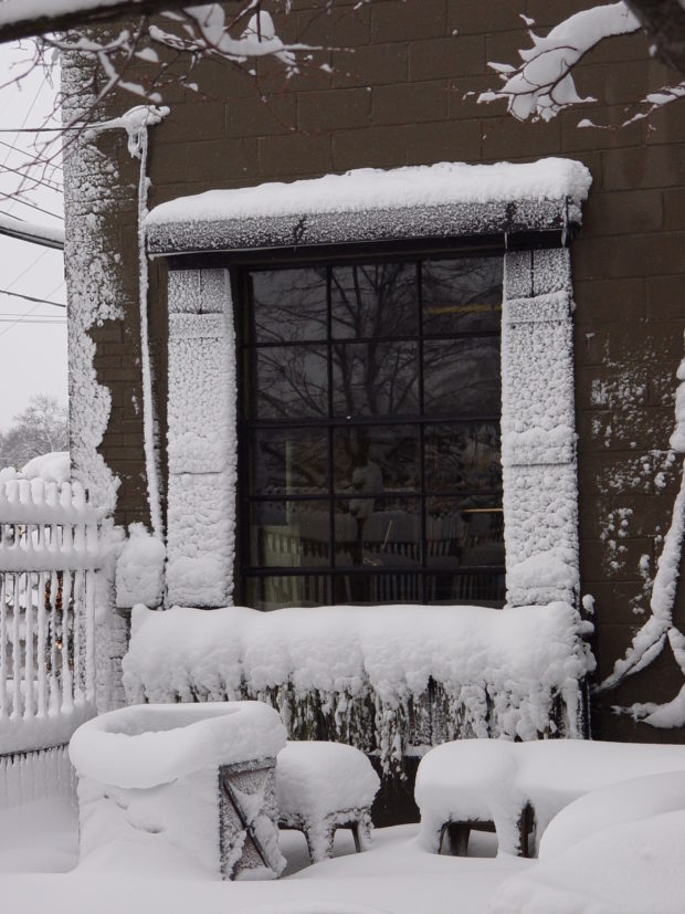
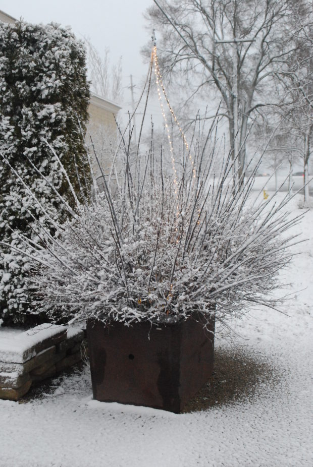
A wet, windy and heavy snow storm describes a window captured all around by a galvanized metal hat, a window box below, and a pair of shutters on each side. This stripped down winter version of the landscape scene describes the window in a way that challenges and informs my decisions about how to plant those boxes.

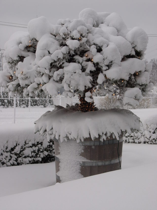
Years ago I planted some scotch pines on standard in giant casks Rob bought in Belgium. This winter version of that planting is a study in scale and proportion. The contrast of empty and active spaces. The heavy snow on the boxwood and scotch pine, and the windswept snow coating the north side of this cask made me realize that our winter weather distills the relationships between places and spaces in a way I never could. The winter season can be observed, and much can be learned from it.

The snow hat on this finial, and the simple heft of the column supporting it are all the more beautiful for the snow covered branches surrounding them.

The snow is not always a blanket that obliterates every detail. Some times it describes the most ethereal of gestures.

If you are a designer for yourself or others, I would take advantage of the what the winter season has to offer.Truth be told, it is not an off season.

The Landscape Finish

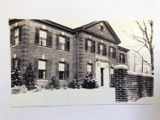
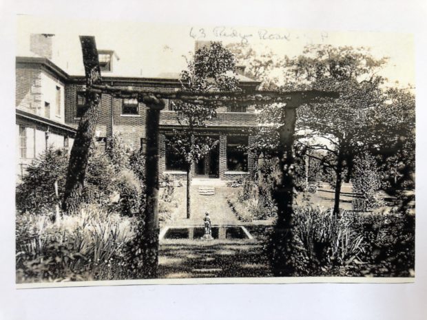
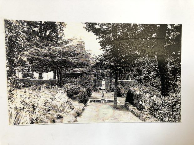
I have written a number of posts about this very special project that has taken better than a year to complete. I have saved the landscape finish for last, as that part had to wait for the walls, terraces, stairs, driveway and pergolas to at least be underway before we could begin. A close friend suggested that I post before and after pictures. When designing a landscape for a period home such as this, the outcome needs to be convincingly tuned in to the aura created by the architecture. Meaning it should be tough to differentiate between what was, and what is new. So before and after pictures can help illustrate that process. My client discovered a stack of old photographs in the basement after she purchased the home. The above picture she dates around 1925.

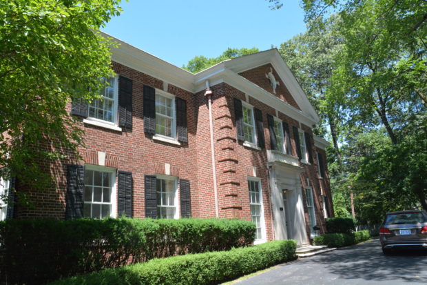
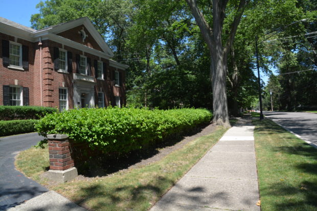
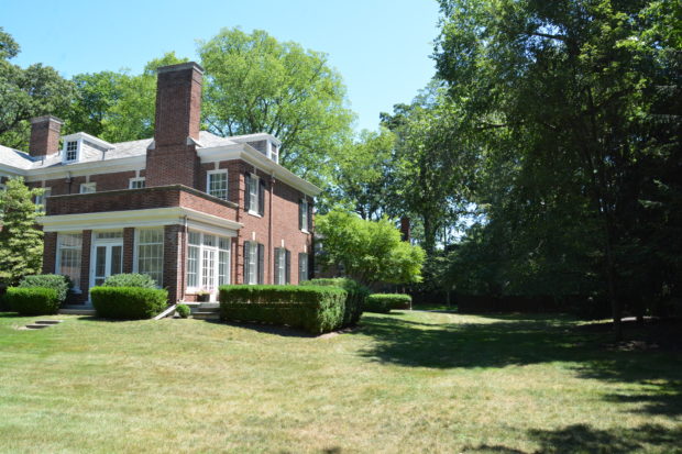
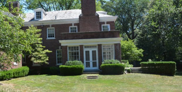
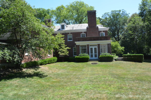
My first visit to her new house revealed a stately old home with an aging landscape. The driveway was very close to the front door. A limited planting space in front of the house years after planting produced a hedge of yews well over the bottom of the ground floor windows.
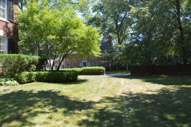
A brick wall between the sidewalk and the drive was covered with euonymus sarcoxie. Planted between the driveway and the walk, an ailing maple whose girdling roots had heaved itself and the sidewalk out of level.

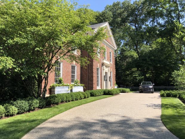
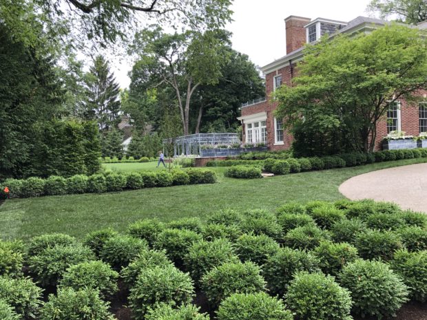
A new drive positioned a more generous distance from the front door enabled room for planter boxes under the windows, and some breathing room for landscape and lawn. The house has become the focal point of the landscape, and there is sun at the front door given the removal of the maple. A lovely and existing multi stemmed serviceberry at the corner was preserved, and integrated into the new landscape.

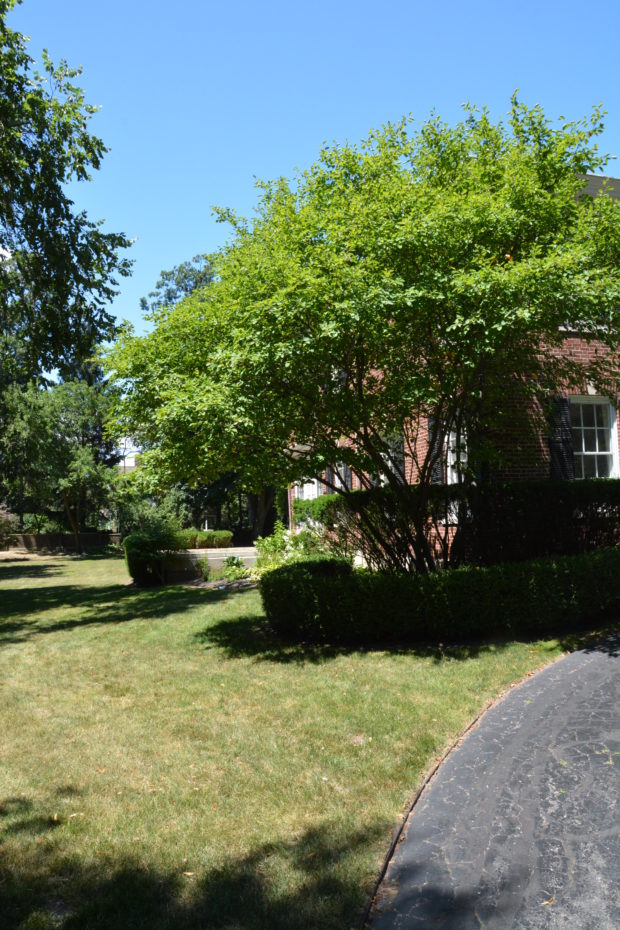
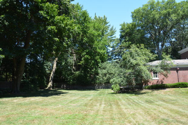
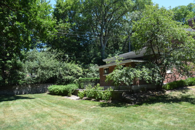
The view into the side yard was typical of an old landscape. More than likely some plants had died over the years, and not been replaced. As the trees grew, the advancing shade proved difficult for plants in their vicinity to thrive. The ground sloped dramatically away from the house.

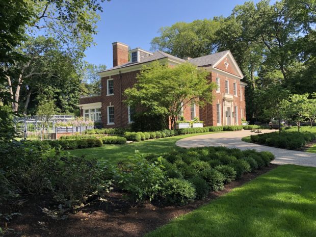
The finished front yard landscape renovation features that serviceberry tree. And a reconfigured grade. The replacement of the existing driveway meant its location could be changed, and the abrupt change of grade from the house to the property line could be softened. The boxwood planted across the front of the house was extended all the way across to the lot line. That placement visually extends the front yard landscape. In the center, a large break in the boxwood signaled the entry into the side garden. That side garden would become its own room with a view from a restored terrace off the sun porch. It would also serve as a transition space from the front to the back yard. The house sits on a corner, which present both problems and opportunities.
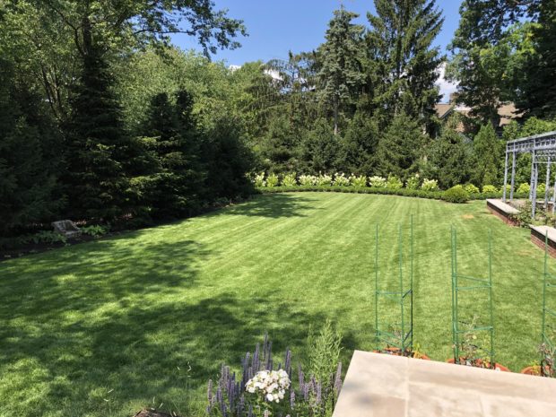
The idea was to respect the period, age and architecture of the house in such a way that it also reflected my client’s somewhat more modern aesthetic. A restricted palette of plants, and a massed planting can be both both classical and contemporary in feeling.
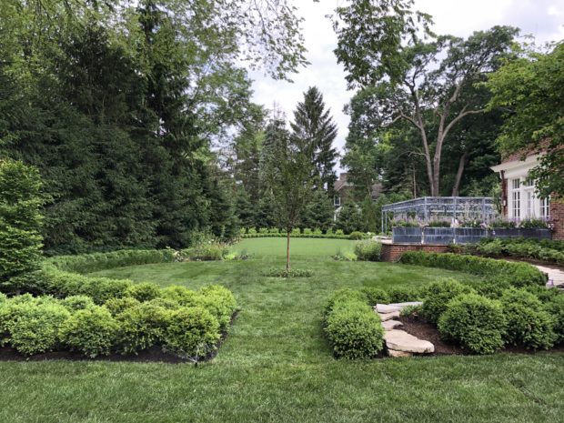
The side yard finish reveals the concession made to the original grade at the house.  A flagstone retaining wall 20″ high allowed for a flat surface on which to walk. I do not know how many yards of sand and soil were added to create the flat lawn areas you see in the above picture, but it was a huge number.

restored version of original side yard terrace off the sun porch

This side yard photo from my first visit dramatically illustrates the sloping grade.

detail  of that area 2017

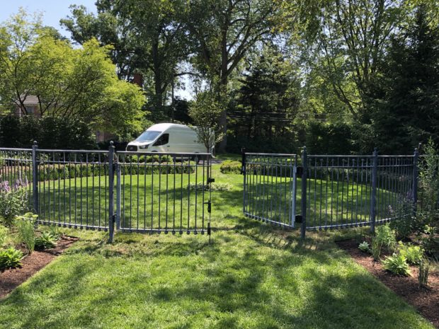
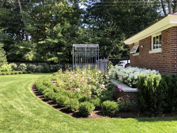
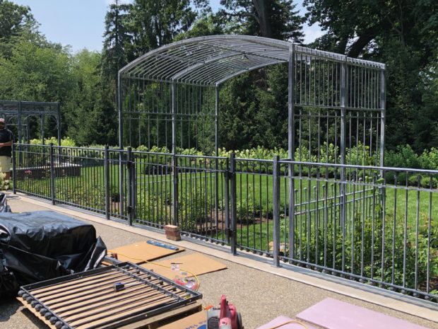
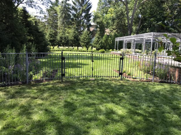
This recent picture of the side garden was taken just after the installation of the fence and gates.The curved sections of fencing repeat the circular shape of the lawn panel, and then proceed straight to a terminus at the house, and the brick wall on the property line.

2019

2019

2017

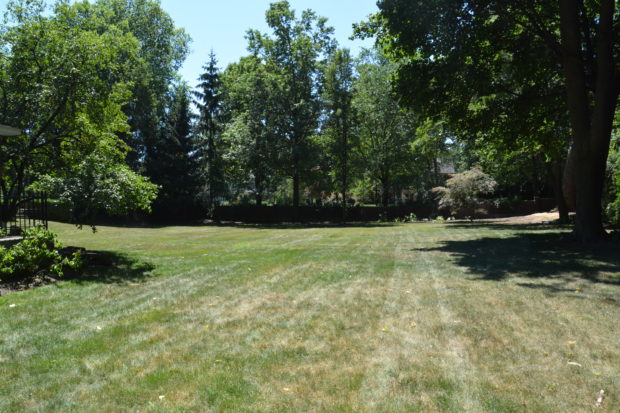
lawn panel rear yard, 2019

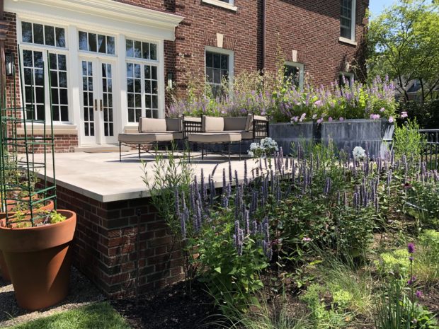
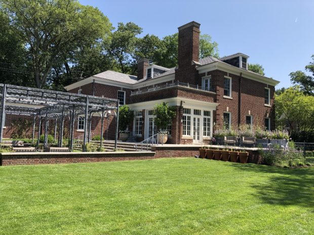
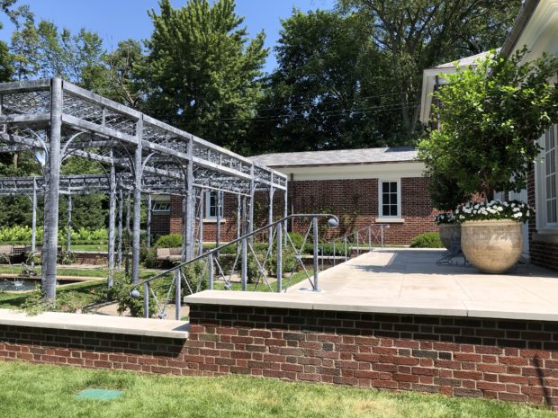
This photo illustrates how the original terrace on the right side of this picture was enlarged to encompass all three sides of the sun porch. A wide flight of limestone stairs down to the fountain garden and cloister deals with the abrupt change of grade in a graceful way.  The seat height brick walls with limestone caps repeats and mirrors the exterior details of the house. This new part of the landscape looks as though it had always been there.

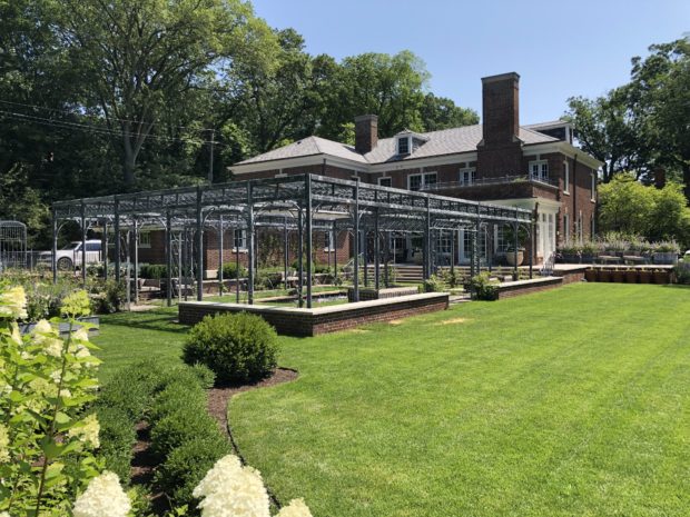
The cloister style pergola has been planted with John Davis and Jeanne LeJoie roses, and Guernsey Cream clematis.

2017

2019

2019

2017

2019

rose garden arbor, fence and gates at the end of the driveway.

2017

2019

2019

2019

After I had made my presentation to my client about a plan for her landscape, she shared several photographs with me. In the 1920’s, the landscape off the rear yard sun porch featured a fountain with a pergola overhead. I was shocked to see that the original landscape in 1920 was a close and original version of the landscape I proposed to my client. That shock gave way to a thought on my part that the design properly respected the history of this property.

2017 sun porch landscape

the view to the house, 2017

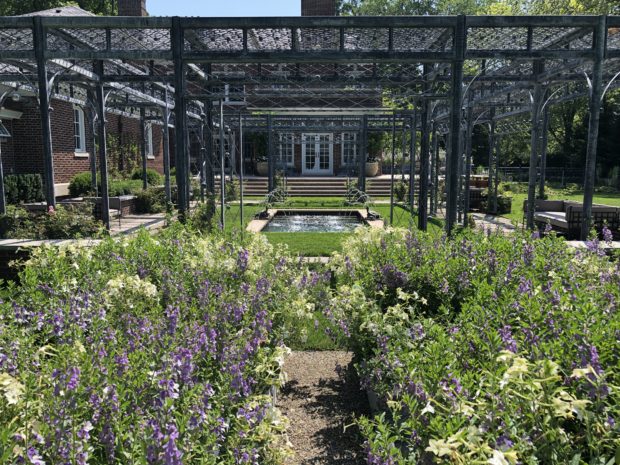
the view into the house, 2019.

2019

the view out and away from the house, 1920.

the view out, 2019

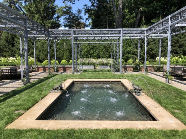
the reflecting pool

I am so pleased with the outcome of this project, and even more grateful for that once in a blue moon client that was on board for each and every detail.


The 2019 Garden Cruise

On Sunday July 21, Detroit Garden Works will host its 12th Garden Cruise to benefit the Greening of Detroit.  If you have never taken or heard of our tour, it began in 2009 when I became a member of their board of governors. Not being one to happily participate in meetings and such, I decided to put my effort into raising money for them. Since 2009, the tour of gardens and landscapes of my design or influence has raised close to 156,000.00. I could not be happier about this. Both Detroit Garden Works and Deborah Silver and Co pitch in to make the cruise and reception a reality. 100% of the proceeds of the ticket sales goes to the Greening. We pick up all of the expenses. And the project pictured above? It has been under construction since July of 2018, and yes, it will be on this year’s tour.

Nothing helps to to bring a landscape project to a close faster than a deadline.  I like deadlines, actually. They provide a framework around which to work. All of the contractors involved, myself included, have a personal interest in seeing this particular project come together. The client has everything to do with that. GP Enterprises handled the planting of all of the large trees, and an extensive drainage system and grading project. Ian Edmunds Irrigation is responsible for a very thoughtful watering system largely based on a network of drip zones. Mountain Pavers Construction, owned and operated by Mike Newman, built all of the terraces, retaining walls and steps and steppers, and a beautiful exposed aggregate driveway. The Branch Studio built a number of structures, containers, fencing and rails especially designed by me for this project. The landscape design was the first in, and the close of the installation of that landscape will be the last out.

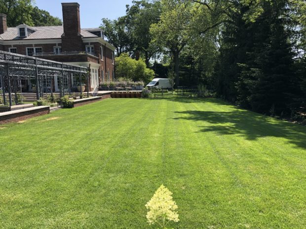
We are in the process of sodding all of the grass areas.  That dirt you see in the above picture has a drain field and irrigation system underneath it. Countless yards of soil were added to make the grade flat. All of the landscaped portions of the yard are enclosed with aluminum edger strip. Over the course of several very hot days, all of the annual weeds have been scraped off, and the ground raked. My crew comes in at 7am when we lay sod. As much as can be done before the heat of the day sets in means the work of it is a little easier. I would think it would take every bit of the next three days to finish laying in all of the grass.  We will have it down in enough time for it to root in before the tour.

Much of the landscape was installed late last summer, and throughout the fall.  A collection of roses was custom grown for this project at Wiegand’s Nursery farm, and delivered 6 months before the installation date. A rose arbor from the Branch Studio will provide support for four Canadian Explorer roses known as John Cabot.  This very long lived and heavy blooming climber will give this arbor a run for its money. All of these other roses are fairly large growing shrub roses, thus the double wide border of Green Gem boxwood. Green Gem is incredible hardy in my zone. It will eventually be box pruned in a traditional and formal shape.

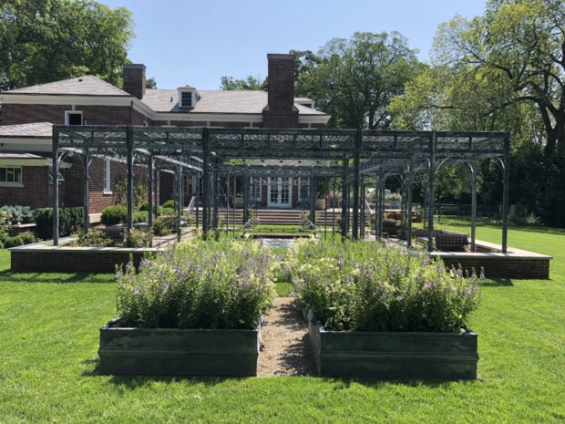
A quartet of steel boxes from Branch will hold flowers for cutting. That plant palette may change every year, depending on my client. This year’s plants were my choice. A new tall angelonia cultivar called Steel Blue is accompanied by the bicolor angelface angelonia and perfume white nicotiana.

What is my superintendent Dan S. doing here? He is digging over a drain line so he can cover it with landscape fabric, so the drain never clogs up with soil, and quits working. A landscape plan that includes a long range plan for watering and maintenance is a good plan. I always give my clients the option to prepare today for the future of the landscape. I know from my own experience that it will not get easier to tinker with my landscape as I get older. Planning for its care means I will always be able to enjoy it.

This mass of flowers will thrive in these raised beds. What gets cut for a vase in the house will hardly be noticed. The 5′ by 5′ boxes were set in a graveled spot to make cutting the grass around them a breeze.

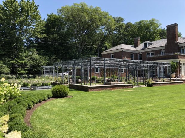
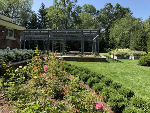
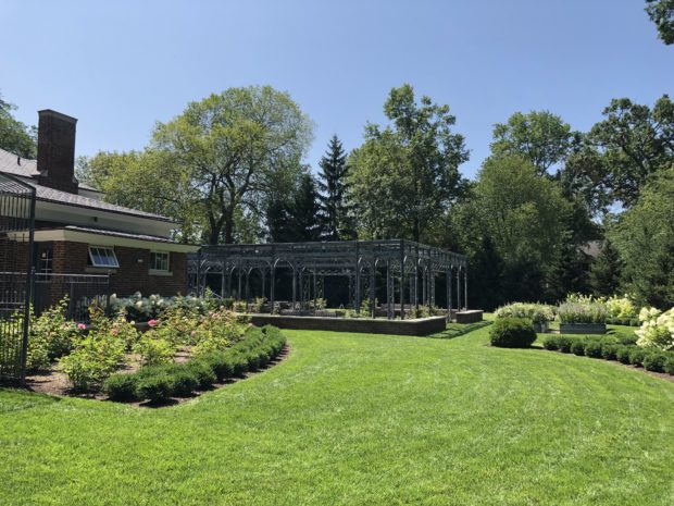
The first round of grass transforms the look all of the work we have done on this landscape since last August.  This curving grass swath is a very wide path from the driveway, through the rose arbor, and over to the cloister pergola fabricated by the Branch Studio. Anyone who is interested in what the studio is capable of should take the tour, and see for themselves. This very large and complex structure is an incredibly beautiful anchor to the landscape.

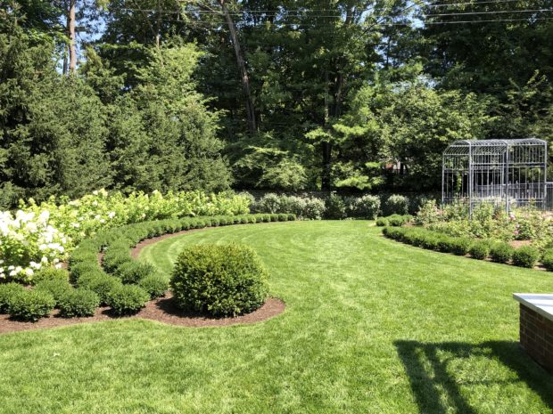
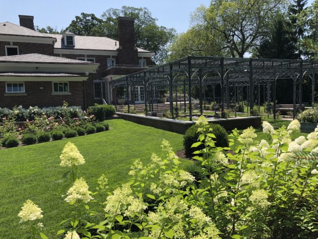
The circle is a dominant theme in the landscape. The major landscape bed lines in the rear yard are portions of circles.  Those three radiused curves contrast and complement the rectilinear shapes of the cloister and raised planters. The center curve ends in spherical Green Gem boxwood of considerable size. A boxwood dot. Behind the boxwood? Limelight hydrangeas on the side curves, and Oakleaf hydrangeas in the center curve. The rear yard landscape is in large part evergreen, with a nod to a summer garden. Roses, hydrangeas, and more roses. The shadier parts of the garden feature perennials, dwarf shrubs and groundcover. Fragrance played a prime role in the selection of all of the plants. Roses, Peonies and phlox will perfume the garden. Even the pink snakeroot has a distinct fragrance, as does the sweet woodruff.  Dwarf button bush, lilacs, Viburnum Juddii and mock orange will add scent to the air one season after another.

That wood structure in the middle of the cloister? A fountain pool lies at the center of the cloister. The wood structure is overlaid with a tarp when there is a threat of rain. My client brought photographs of this house for me to see, after I designed the pergola and fountain. The original house had a reflecting pool, and wooden arbor in this location. In 1920. What a pleasure to see that what was on my mind had been expressed on this property close to 100 years ago.

This area was a grassed ditch when I first saw the property. The ground sloped down sharply from the foundation of the house and garage. This area now has two levels, both of which are flat and usable. Though I have previously posted about the fabrication and installation of the cloister,this picture provides a glimpse of how that structure will be integrated into the overall landscape. It also illustrates how the double walled structure with a roof overhead with create shade on the perimeter. Though the structure is comprised of many tons of steel anchored to 32 individual footings, and shadows cast are delicate and airy.

The fountain is tiled in its entirety.  The walls, steps, the bench, and the floor. The color variations are reminiscent of fountain tile of this era. The top 3 courses of tile have a strong geometric raised profile. I could not imagine this fountain coated on the interior with pebble tec, a common to swimming pools. This tile respects the architecture and era of the house. Gillette Pools has done an incredible job of installing a state of the art fountain/spa with the craftsmanship required to echo a previous era. My client and I fussed and fumed over the tile selection. What I see here seems just right.

The John Davis climbing roses are small yet, but they obligingly bloomed.  Each John Davis has a Guernsey Cream clematis to go with.

Yes, the tour is less than a month away, but this new project will be ready. I think the newness of it will enchant visitors in much the same way as I am enchanted. The beauty of the moment, and the hope for the future-every gardener knows about this. This is by far one one of the most exciting and rewarding landscape projects it has ever been my privilege to design and install. Thank you, H.

French pots on the upper terrace planted with braided ficus and white New Guinea impatiens

side yard curving landscape

Branch Studio planter boxes on a terrace

the front door

garden cruise 2019My photographs of this project do not do it justice. It will look very different on the 21st.  As in finished and ready for company. If you are interested and intrigued, buy a ticket, and see it for yourself in person. It will be worth the effort, and the Greening of Detroit will appreciate your support. The 2019 Garden Cruise has 5 other really terrific landscapes and gardens to visit as well. Hope to see you on the 21st.