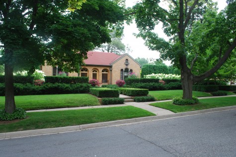
As much as my age can be irritating and inconvenient to me, the age of my landscape is suiting me just fine. I do think it is as good looking as it has ever been. Even better, no one could possibly be enjoying it as much as I do. We have had a cool summer; even my lawn looks like a lawn, and not field grass. Buck obligingly hauled the ladder out into the middle of the road, so I could take this picture; I am sure my neighbors were amused.
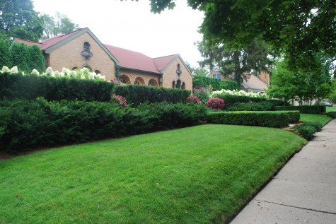 For the better part of six years I did nothing to this yard except bark the existing perennial beds, and mow the grass. It took all my energy to handle my work-or so it seemed. I am embarrassed to say that somewhere along the line I got an anonymous postcard in the mail: “It is hard to believe that a person whose career is landscape would have weeds six feet tall in her front yard”. No matter the delivery, the person had a point.
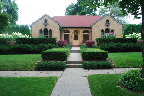 But perhaps even more importantly, I was ignoring the fact that whatever I did at home would need time to come of age-and that perhaps I would want to still be around to see that. Planning my own landscape was agonizingly slow. I had no problem designing for others; I was a wreck designing for myself. Slow turned out to be fine; who can do everything at once anyway? Getting started-that was the key.
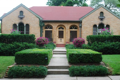 The one hundred Hicks yews across the west and down the north side came first. Given the slope of my property from the south to the north, time would prove to be an essential element. The hedge is 4 feet tall on the south side, and nine feet tall on the north side-but every one of them is level with the horizon. This hedge took eight years to grow in.
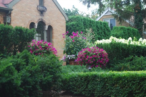 The boxwood was even slower growing; the 18″-24″ plants I put in the ground were already seven years old when I planted them. The shaggy densiformis yews are the newest evergreen addition; they have only been in four years. I like all this evergreen; I can successfully maintain it. I knew I could never devote the time needed to a big perennial garden-why come home and be frustrated about what isn’t done? Two giant blocks of Limelight hydrangeas, and 6 pots of flowers give me perennial garden pleasure, in a manageable form.
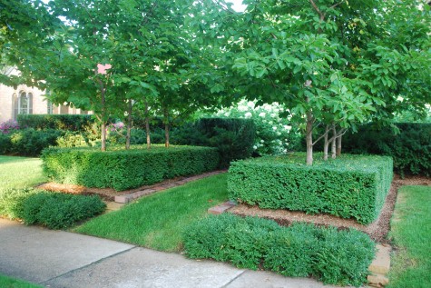 I planted this city-mini allee of Yellow Butterflies magnolias for Buck-he loves yellow. The boxwood is a big evergreen groundcover. The petals falling on this boxwood is one of my garden’s best spring moments. The mini-boxwood strips in the foreground-this year’s landscape project. The slope of the ground here made it difficult to mow the grass. The magnolias have grown considerably, and the shade they cast was not optimal for lawn. Wall stone behind them retains the soil, and in a few years, will be invisible.
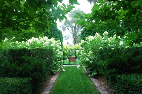 The magnolias were planted to frame the view to the side yard. It is hard arrange a long view on a city lot, making visual use of the neighbor’s mature elm adds much to the illusion of distance.
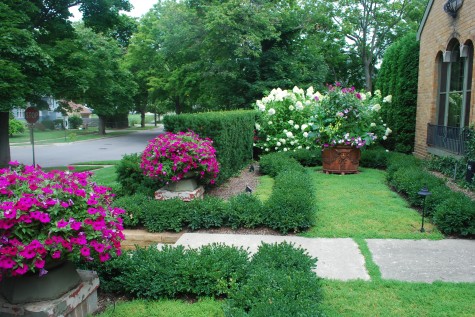 The big Yew hedge divides my public landscape, from the house landscape. The big pots are centered in front of big panels of windows; I have good views from inside. The ground is carpeted with herniaria glabra-rupturewort. This plant grows like thyme, but is much more water tolerant.
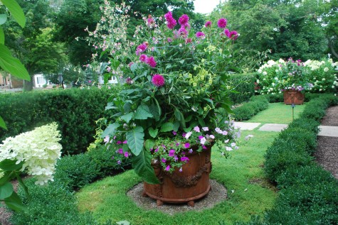
The herniaria has no need for as much water as the flowers in my pots; the granite gravel handles that problem for me. This garden is in progress. I haven’t a clue about how to finish it, I do have the patience to wait until something suggests itself.
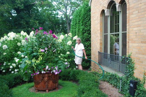
Fifteen years into this landscape project, I realize inertia is the most difficult problem I ever have with it. Once I put a burst of energy to my doing nothing state, and get going, things happen. Once in motion, I tend to stay in motion. Though I once thought it would be forever to see what I had in my mind’s eye come alive, it didn’t. Best of all, it has been worth the wait.
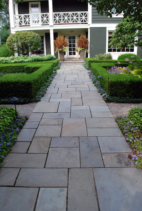
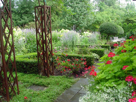 Another long bluestone walk set parallel to the house runs almost the entire length of the rear yard. The boxwood you see in this picture had been planted parallel to the walk. I dug every last one of them up, and replanted them in runs perpendicular to the walk. Why? The walkway strongly makes a description of that north/south direction and dimension-planting boxwood next to it doen’t make it stronger, or more interesting. Replanting the boxwood perpendicular to the house, encourages visitors to the garden to slow down, and view the gardens. The boxwood is associated with the gardens now, and makes those areas stronger visually. The walk needed no such help.
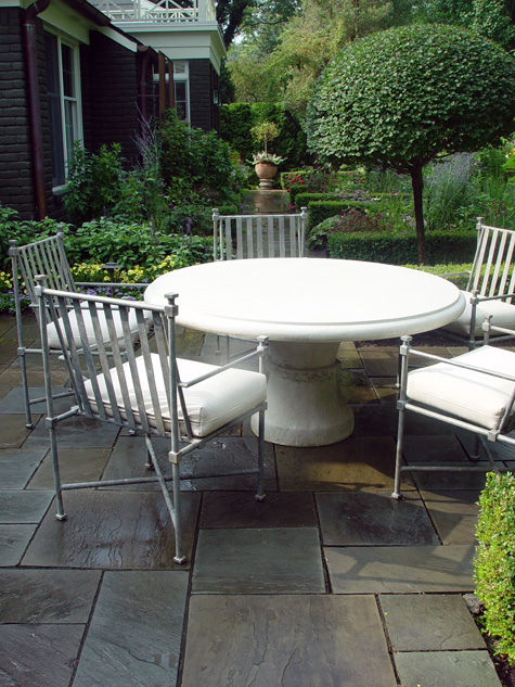 Each end of that walk has its center of interest. A beautiful hand made Italian terra cotta pot on a pedestal can be viewed from the dining table at the other end. Guests entering the garden from the south see the dining table centered in their view. This announces the location of the terrace, and presents that table as a sculptural element, in addition to its function.
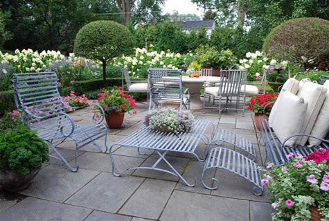 The terrace furniture is kept company by a number of planted pots. These pots help make the larger garden an integral part of the terrace. The Palabin lilacs on standard are a crisp contrast to the profusion of the garden and pots.
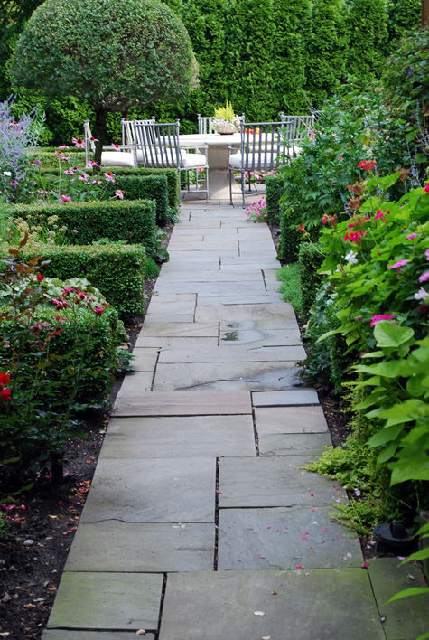 This long view is inviting; the boxwood placement invites lingering. This is much the same idea as a wedding coordinator instructing the bridal party how to take their time getting down the aisle. There is no need to rush.
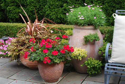 I have talked plenty about how much presence and personality great pots can add to a landscape. They help to create a sense of intimacy on a terrace. They are just plain good to look at.
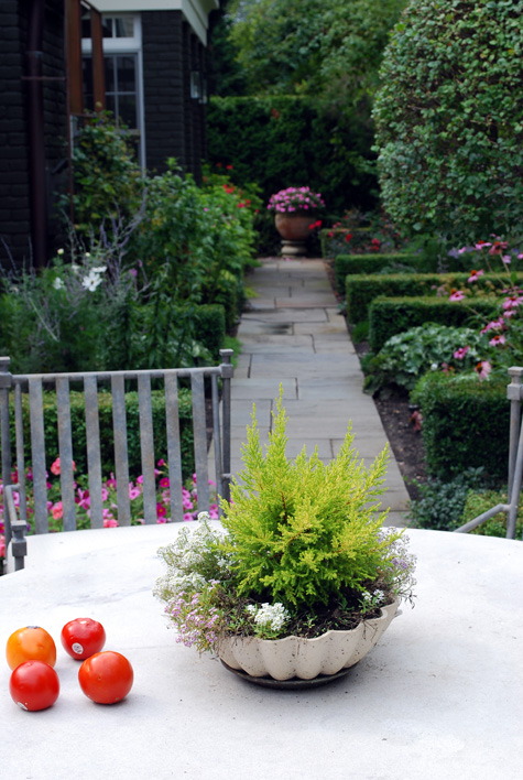 The bones of a garden are so important. This arborvitae screen at the end of this walk, and the walk itself ,are always there, functional and well-designed. This structure will be transformed by weather, season and light; there is interest there. In this landscape, the supporting cast members along the way make this garden much more than just about getting from one place to another.
 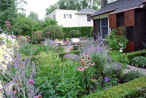 It’s impossible to tell that I am standing in the soccer lawn, taking this picture. This small property has spaces for a whole family. Limelight hydrangeas back up the garden, and help keep the soccer ball on the lawn field, and out of the garden.
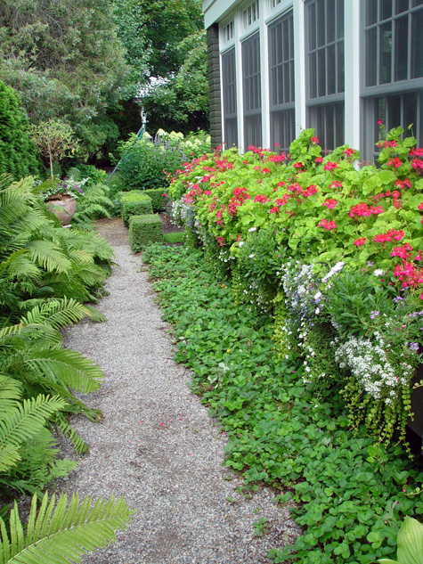 The short south side walk is decomposed granite. Window boxes of painted galvanized sheet metal run the entire length of what is a sun porch. This part of the garden is viewed primarily from inside; the flowers in the window bring a whole other dimension to the interior space. These Persian Queen geraniums bloom profusely in this sunny protected spot. Fragaria “Lipstick” carpets the ground under the boxes.
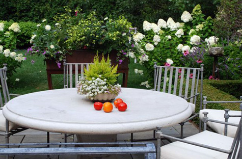 For anyone who might love flowers and lots of them,, this garden is a delight.
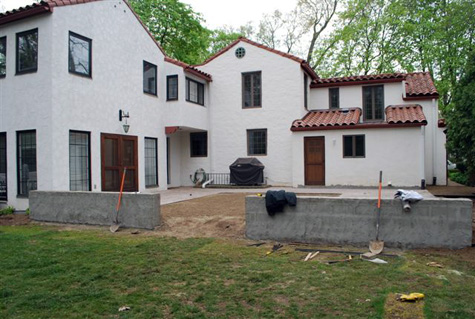
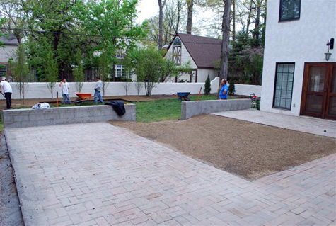 We needed a riser for the one step down into the yard. A 14″ wide by 9′ long piece of 1/4″ steel, buried, and snugged up against the new wall would do a clean and simple job of it. Once that steel was installed, the decomposed granite would be leveled right to the edge of the terrace. We adjusted the grade as the base of that step to make the transition to the lower level an easy one.
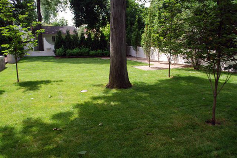
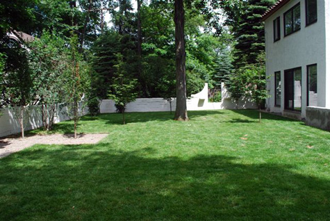
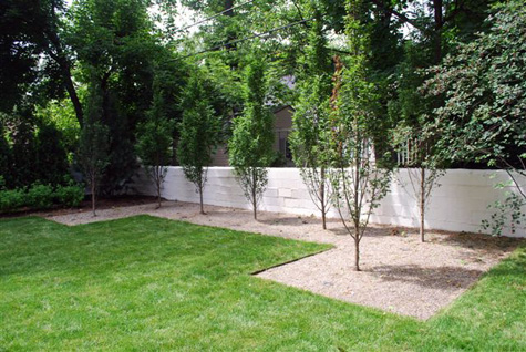
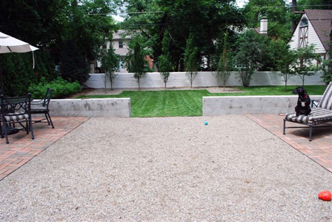 This view from the new terrace is my favorite. There is a simple overall shape, which unexpectedly drops down in the center to a lower plane. What is brick in the upper terrace reverses to granite in the lower; this is a change in material that does not interrupt the big organizing idea, but makes it more interesting.