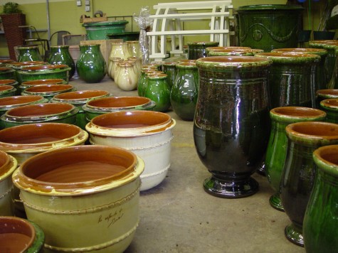
 I reluctantly agreed to play ball with those dogs of mine yesterday-in spite of the 9 degree temperature. We were not outside for long, but long enough for me to see the color of my yews had gone so dark they almost looked black. This cold color could not be further from how those yews look dressed in their spring green foliage. This set me to thinking about color as a design element. The glazed terra cotta pots manufactured in France for hundreds of years make a big color statement. Their strong color has a very Mediterranean feeling to me; the color seems very much a product of the climate in which they are made. When I see a pink stucco house, I immediately think warm climate; no doubt I react to color with an entire set of pre-conceived notions hovering nearby.
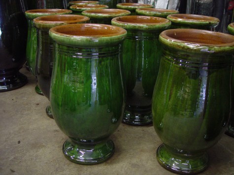 Though green is the dominant color of any landscape, this shiny green glaze is a color experience of a different kind. These pots have a much more formal appearance than a natural clay pot-whose natural and from the earth color is vastly more subdued than this. As glazed pots do not absorb water from the outside, the finish and color is as fresh in their tenth year as their first, provided none of the glaze has chipped. The vibrant color of these pots will strongly figure in how I would place and plant them.
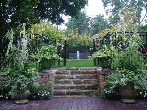 The color of these pots will always be a significant part of the planting composition. Unlike natural clay pots whose importance in the composition may be secondary or slight, the color of these pots attracts visual attention, and sets off the planting in a formal way. A green and white color scheme seems restrained and serene. Do these pots look out of their Mediterranean element? I think not. This leads me to think that before deciding a color won’t work, I should try it.
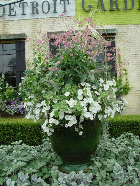 This color scheme branches out a bit into the pinks and greys. The pot is elevated on a concrete base, so the foot of the pot still reads even though the ground planting has grown in. The shiny green mass of the pot is a beautiful foil for the tiny naturally green leaves of the boxwood. Monochromatic, or one color schemes are quietly formal and restful in their simplicity.
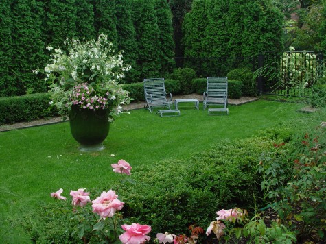 This pot is 12 years old. Mineral deposits from the water had dulled the shine of the glaze. It is remarkable how close the color is to the color of the existing evergreens and grass. This composition is more about texture, and mass, than color.
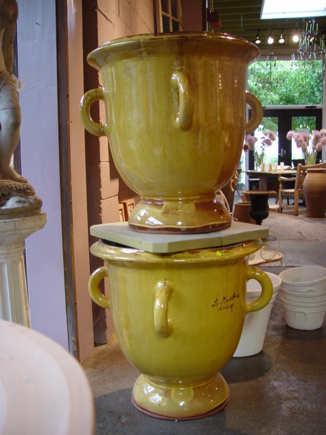 Yellow glazed French pots are perfect for places where any thing but neutral seems like a good idea. Shady gardens, or nondescript locations asking for a strong center of interest can get that from a splash of unexpected color.
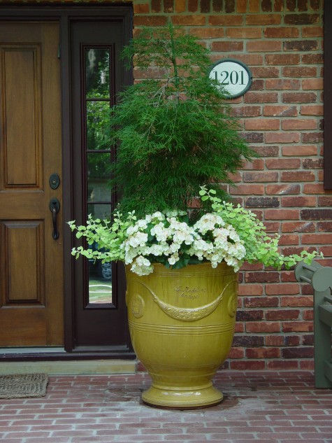 This pot is full of surprises; the yellow of the pot is just the beginning. A threadleaf Japanese maple makes an unusual centerpiece for the surrounding white begonias and lime licorice. The brick front porch, tough completely shaded by a second story balcony, has a fresh and striking appearance. Though delicate in color, these French pots are incredibly strong and durable. The clay of the large pots can be 3/8 of an inch thick or better, and they are high fired for extended periods of time.
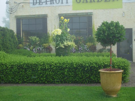 Some potteries have added more contemporary designs to their collections. This pot, known as a strie, refers to the striations formed from the pattern generated by the fingers of the potter; each pot is unique to the fingertips of the person who made it. The color of the pot helps to make it central to the entire composition of the garden. Simple color relationships read more clearly and strongly than mixed color compositions. Strong color relationships paired with more subtle color relationships is what creates rhythm in a composition.
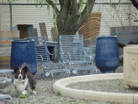 Blue glazed pots in the landscape can be tough to place. Though bluestone, acid washed steel, lead, water and sky all represent blue in one form or another, planting blue pots requires some thought. That glazed blue will be very influential in the look of the whole. Yellow flowers in a blue pot can look like a band uniform, or worse. Some shades of purple are deadly dull and irritating with this shade of blue; lavender and silver can be great.
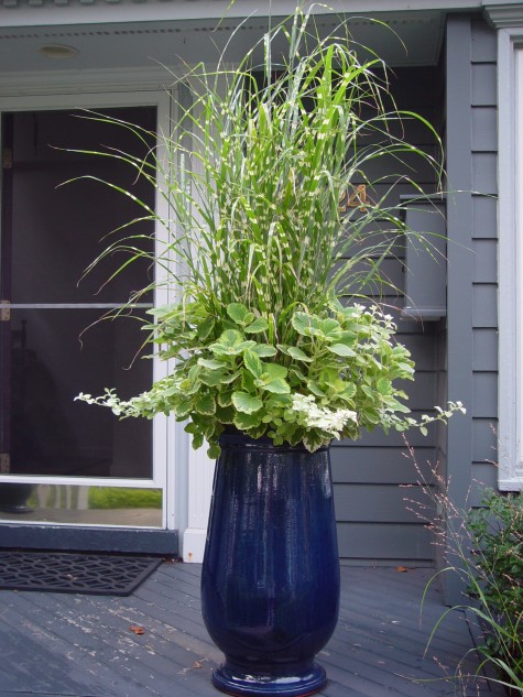
A greenish yellow and white, on the other hand, can be lovely in a blue pot. The important thing to remember with color is that no color is an island unto itself. Putting colors together that create interesting visual relationships-that’s part of what makes for good design.