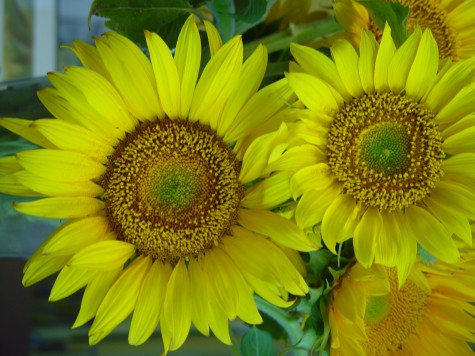
 Amazingly enough, it was my fifth grade science teacher that taught me the color basics. I remember that she covered individual panes of some of the classroom windows with sheets of red, yellow and blue acetate. Her explanation of the term “primary colors” was simple-these three colors come standard issue in nature-they cannot be made from any other colors. She had a stack of giant acetate rectangles every color imaginable, and we did spend a lot of time trying to overlay sheets in some form that would produce yellow. We never made any yellow, but we did make lots of other colors-the secondary colors. Secondary, meaning the result of the mix of any two primary colors. Then we made tertiary colors-any mix of three colors.
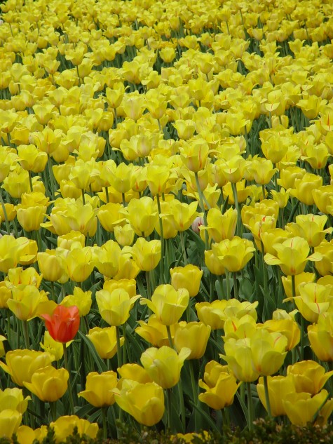 This may have been science, but it was pure fun. Once we had green from mixing blue and yellow, and orange from yellow and red, and purple from blue and red, we pasted these combos on the windows. Over a period of days, every window in the room had a distinctly different color. In the center, the single sheets of the primary colors. At the edges, stacks of acetate sheets that looked like the color of mud. I remember how enchanted I was with all that color; to this day a set of pastels, markers, yarn samples,colored pencils, paints and the like interest me. I did not so much grasp the relationship of color to light, but I could see it. The quality of light greatly influences the appearance of color-anyone who has loved a paint chip at the store, and put it on a wall at home to disastrous effect understands this.
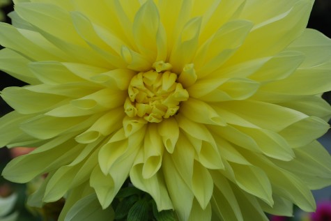 Color in the landscape functions the same way. The primary colors have an electricity that comes with the territory, but where and how color gets placed determines how it looks. Yellow reads brilliantly at a distance; use it in places far away from your eye, or to back up other darker or more subtle colors that would otherwise fade from view. The transparency of yellow makes it a perfect choice for areas in the landscape that are back lit-it will look like the lights are on. The edges of these dahlias petals have gone green; they are too thick to transmit light well. The dark behind the dahlia turns the yellow dirty yellow-green.
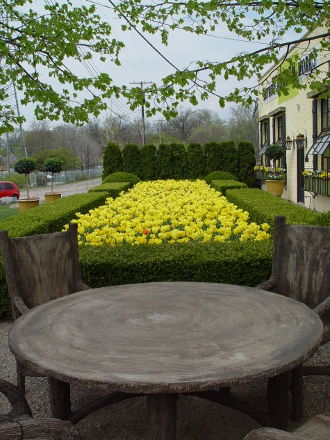 This composition is first and foremost about yellow. It draws your eye, and keeps your visual attention. It is secondarily about tulips, yews, boxwood, geometry-and so on. Notice how the color far away in this photo are subdued, muddy, and indistinct-but for the green of the emerging leaves. New leaf green has a lot of yellow in it-that yellow reads at a distance.
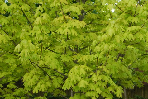 Princeton gold maple leaves are really yellow with a green cast when they first emerge.
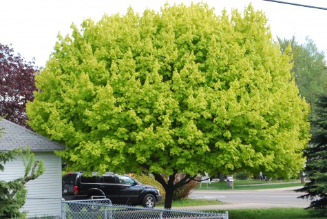 In a sunny spot, the leaves read yellow to the eye at the top, where they get the most light. As your eye looks at this tree from top to bottom, the color changes. The leaves with least exposure to light are the darkest. The change in value-or relative lightness or darkness-from the top of this tree to the bottom is considerable. The trunk of the tree looks black, given all the light behind it.
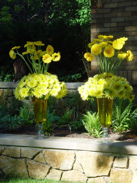 Yellow has the ability to light up a shady area. The gerberas at the top glow in front of the yews whose color almost appears black. Densely shady gardens can die visually if some effort is not made to introduce contrast. One landscape project involved a densely wooded area; cutting out the brush and sapling trees in a few selected areas created pools of light. The contrast of light and dark added visual interest, but also made it possible to see the more subtle colors of the plants in the ground.
 Likewise, painting the concrete floor of one room in the shop these grassy-shaped variations of chartreuse and yellow green made it easier to see everything that would be placed in the room. Milo’s coat color is known as “dark brindle”. All the individual colors present in his coat read much more clearly than they would should I have photographed him with a dark background.
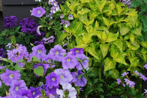
Yellow may or may not be a favorite color, but how it makes other colors look makes it useful. The color of these blue petunias, heliotrope and angelonia appears clear and striking, given the contrasting companionship of the yellow coleus. These same flowers, planted with brown sweet potato vine? fugue-like. How you use color helps insure that what you design reads just how you intended.
Thank you for your wonderful posts…I learn so much from them. You teach my eyes new ways to see.
Milo would look good photographed in any back ground….so would Howard.