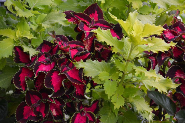
 Leaves other than the the color green can be cause for excitement. The vast majority of garden plants in my zone are green, as in garden variety green. Not that I object to that. Green leaves are not simply green. They have size, mass, texture, contrast, surface, shape and form. An all green scheme explores all of these design issues. But leaves other than green are a magnet for the eye, and the gardener. My knowledge of how certain leaves are other than green is very sketchy. Some color seems like it is laid over green. The leaves of this shocking pink and carmine coleus seem clear, and not at all muddied by a green layer underneath. Wasabi coleus is a lime version of green. Somewhere in the color mix of this leaf is lots of yellow.
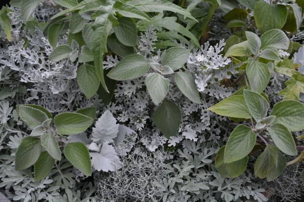 Some gray leaves have a green base to them-as in this Silver Shield plectranthus. Other gray leaves, as pictured above, show no hint of green. Where am I going with this? Color as a container, garden, or landscape design element is as personal as it is complicated.
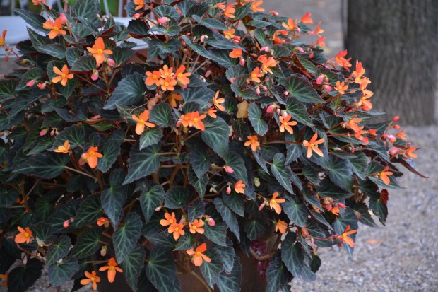 I find that everyone sees color differently. The perception of color is much about the science of vision, but it is equally about perception. I like every color. I respond to the absence of color, and the combination of all colors. I respond to certain color combinations more strongly than others. The orange flowers of this begonia, by contrast, bring the black green leaves to life.
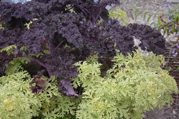 The color of Red Bor kale is black, under laid by carmine pink. Dusky purple in color, if you will. This dark gray purple asks for a companion that will play off of, or feature that color. The yellow green scented geranium is a perfect companion. Chocolate sweet potato vine would be an interesting combination. A garden variety green leaf would be neither here nor there.
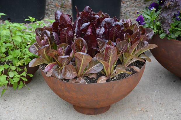 I have a very tough time designing with red foliage. Red leaved Japanese maples are gorgeous on their own, but I do not see them integrated into a color whole successfully very often. I find the landscape with blue spruce, red Japanese maples, and burning bush (a very dull medium green) jarring, and unsatisfying. Blue in the landscape looks good far away from the eye. Red in the landscape looks good up close. Dull gray green-where does that color belong?
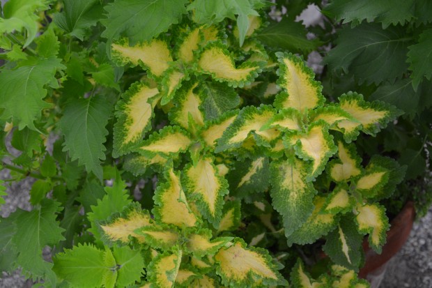 The coleus that are available now have strikingly beautiful other than green color. Wild lime coleus permits the placement of the color yellow in the shade. Sum and Substance hosta, and creeping jenny are lime green. Wild Lime has a yellow center. This plant has great color potential for a seasonal planting.
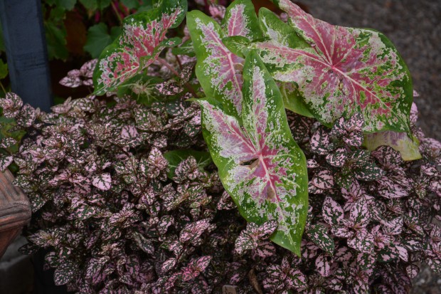 Some leaves are not completely other than green. They are mixed. This mixed pink and green color caladium is good with the mixed color polka dot plant. How so? The caladium has green in its leaf, as does the polka dot plant. There is common ground.
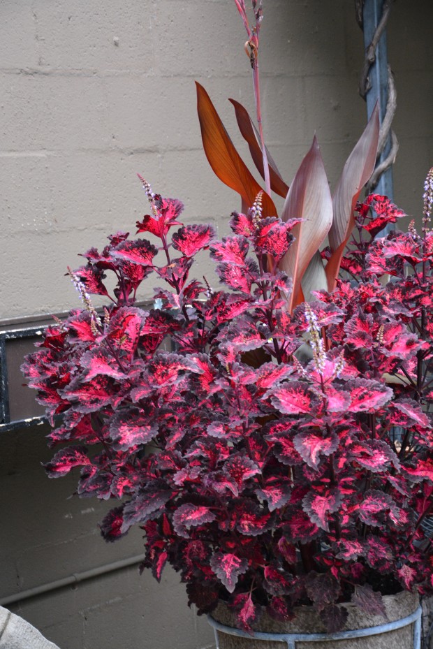 This black edged pink/red coleus is a striking color. I could see planting it with a companionable other than green leaf. As in black oxalis. Or red alteranthera.
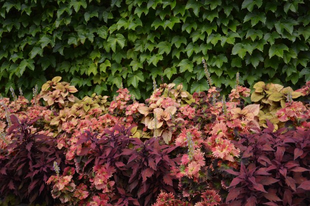 Leaves other than green are not so color friendly to green leaves. Do I like this combination? Not so much. I like color relationships that provoke or relate. Color relationships that are standoffish make me uneasy.
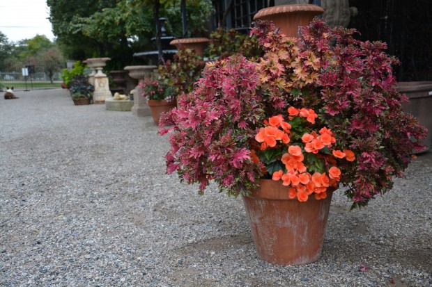 There are those green leaved plants that bloom so generously that their green leaves are not a color issue. The begonia leaves in this pot are a secondary visual issue. This container combination takes nothing for granted. The coleus in this pot is edged with green. The green leaves of the begonia, and the green edges of the coleus are in partnership. The orange flowers, and those leaves other than green make a partnership of another kind. The terra cotta pot-there is another color adding to the whole. A visual discussion of color in the garden-interesting.
Deborah, I so enjoy your posts. Your writing is as beautiful as your designs and equally thought provoking.
Thanks for your letter Amy. I appreciate it! Deborah
I am erythrophobic when it come to the garden…literally meaning “afraid of red or redness.”
I don’t know why. Any thoughts?
Dear Michael, I am not afraid of red leaves in the garden, I just do not like it much. I think the red in the leaf is a layer over a green layer, so the cold tends to be muddy. I call Crimson King maples “Darth Vadar” trees! I would think a landscape with all red leaves might be dramatic, but I would not want to own it. I do like red and lime together. “Cardinal” redtwig dogwood has clear bright red bark, which is beautiful in the winter. Maybe it’s just a matter of taste. Deborah
Oh le begonia !!!! magnifique !!! beautiful, as always.
Thank you, my friend!
Deborah! I totally see the “Red” problems! But what does one do when their favorite colors all lean towards the red side of the color wheel? I love Red and Burgundy and always have, but when I use it in my gardens, it sticks out like a sore thumb screaming “Look at my Red Color.” I’ve used it in my home too only to have friends and family say what were you thinking. I usually end up agreeing with them. Red is just Red, but not very well read! Any other suggestions for the best color in the Rainbow?
Thanks Deborah,
I too am an fan of foliage colors. Flowers can be overrated. Love your combinations.
You have a great eye for color…enjoy your blog- Jim
You have a great eye for color… enjoy your work- Jim
I just love your blog so much, I can’t tell you how much you’ve inspired me. I agree with you on the difficulty of blue spruce. I think it’s to do with blue spruce against the sky. I love blue spruce in the winter against grey skies. Blue spruce against saturated, warm, blue skies of spring and summer are an unpleasant combination to me.
Dear Stephen, thanks for your take on that blue-I hadn’t thought of that before. to me it has to do with all evergreens having a blue cast when they are far away. Blue evergreens in the foreground of a landscape seem out of place. Thanks Deborah
Well now! Ya had to know this post would get me! 🙂 Great work, as usual!