As much as a landscape and garden evolves over time, the same could be said for a gardener. Those of us who garden probably don’t give much time to that thought, as the process can take years and really never ends. No one becomes a gardener overnight. Just like a landscape does not come in to its own for years. I was in my twenties when I first started gardening seriously, so my process was governed by an intense curiosity tempered by ignorance. Trial by error – and more error than not. And then there was the issue of restricted funds. A sympathetic Mom bought loads of plants for me. She was never critical of my failures. Like most Mom’s, she was generous with her knowledge and support. She only wanted me to keep gardening. I had so much more energy than experience. So I threw myself at all of it like I had 10 minutes to live.
I would move plants around 3 or 4 times until I was sure they were in the right place. And maybe again for good measure. Even then, I fretted. I watered, all the while worrying that I hadn’t watered correctly. I would quit with the water for a while and then start up again. I poured over catalogues of companies that sold seeds and starts – and then agonized over which and what to buy. I bought too much. I visited every nursery I could within hundreds of miles. I could barely keep my eyes on the road for looking at the trees. I pulled the weeds and turned the soil. There were soil tests, amendments and additives to be considered. There was mulching and feeding. I edged, dead headed, divided, pruned and paced from one end of the landscape to the other. Had my plants been able to talk they surely would have protested. I never let or left them alone. I told myself that all that tinkering was a way of learning. Luckily, plants are very tolerant of glad handling, and can survive all but the most egregious missteps. I killed plenty of plants, and continue to do so to this day. But I garden differently now.
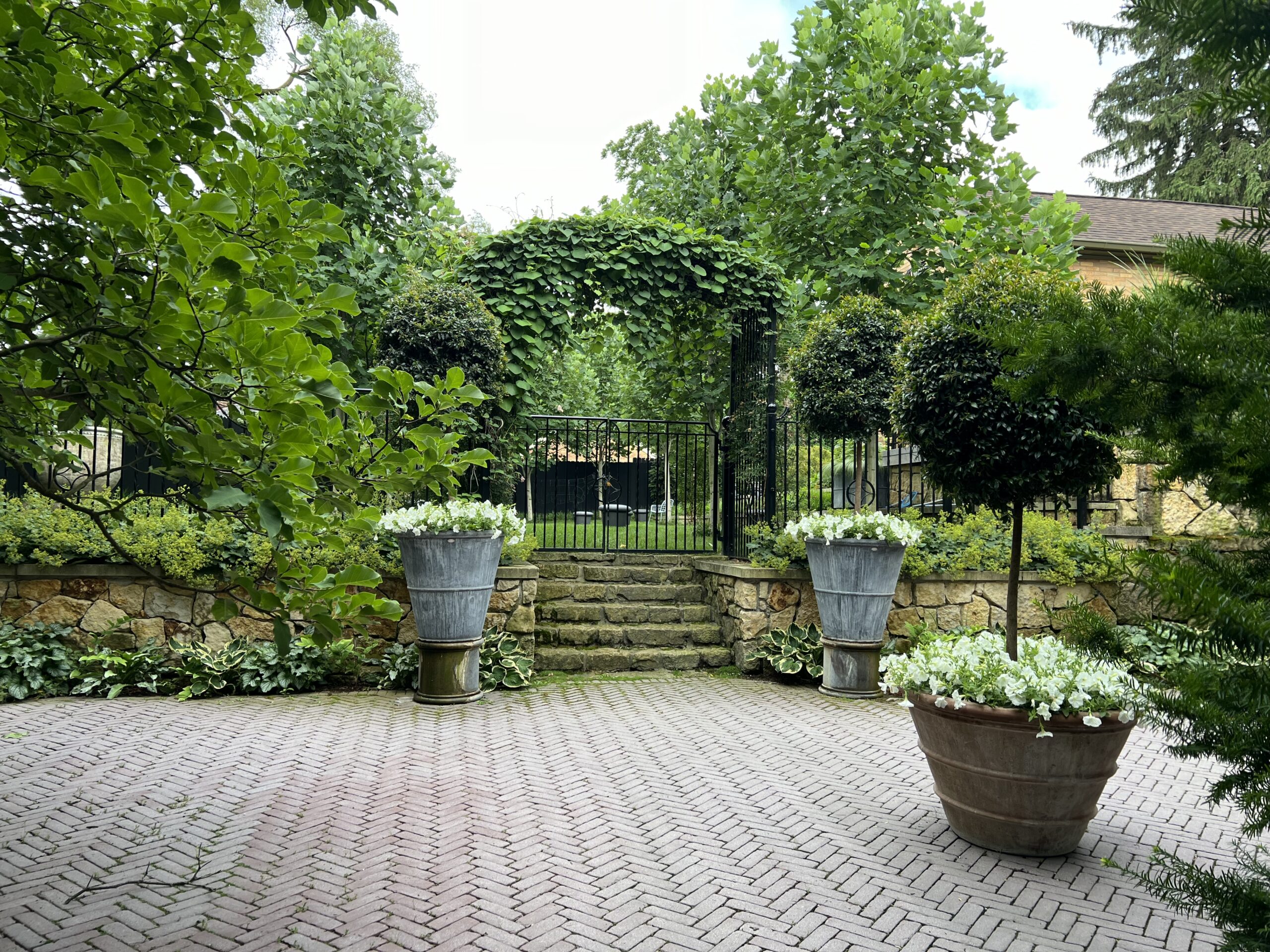
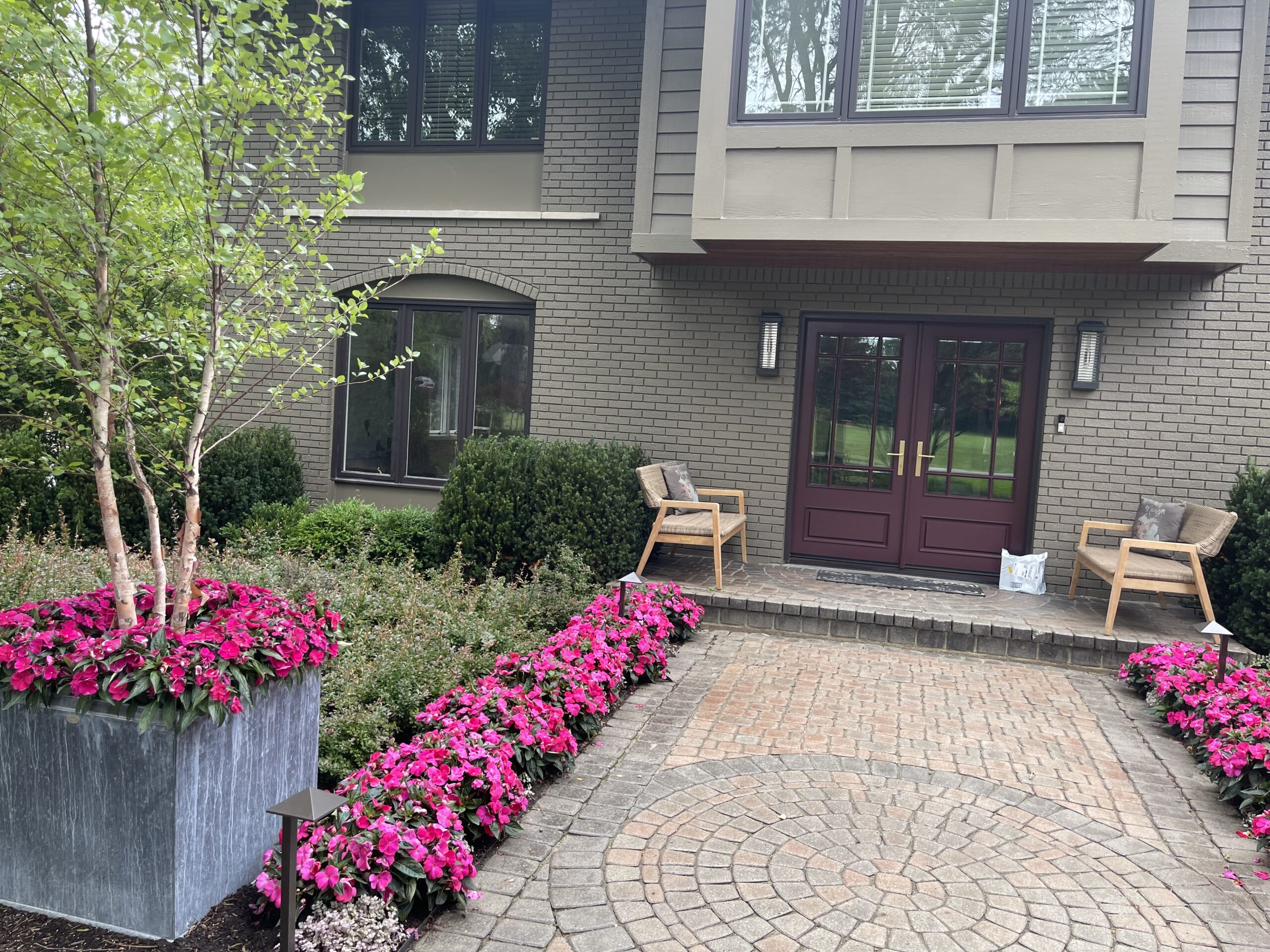
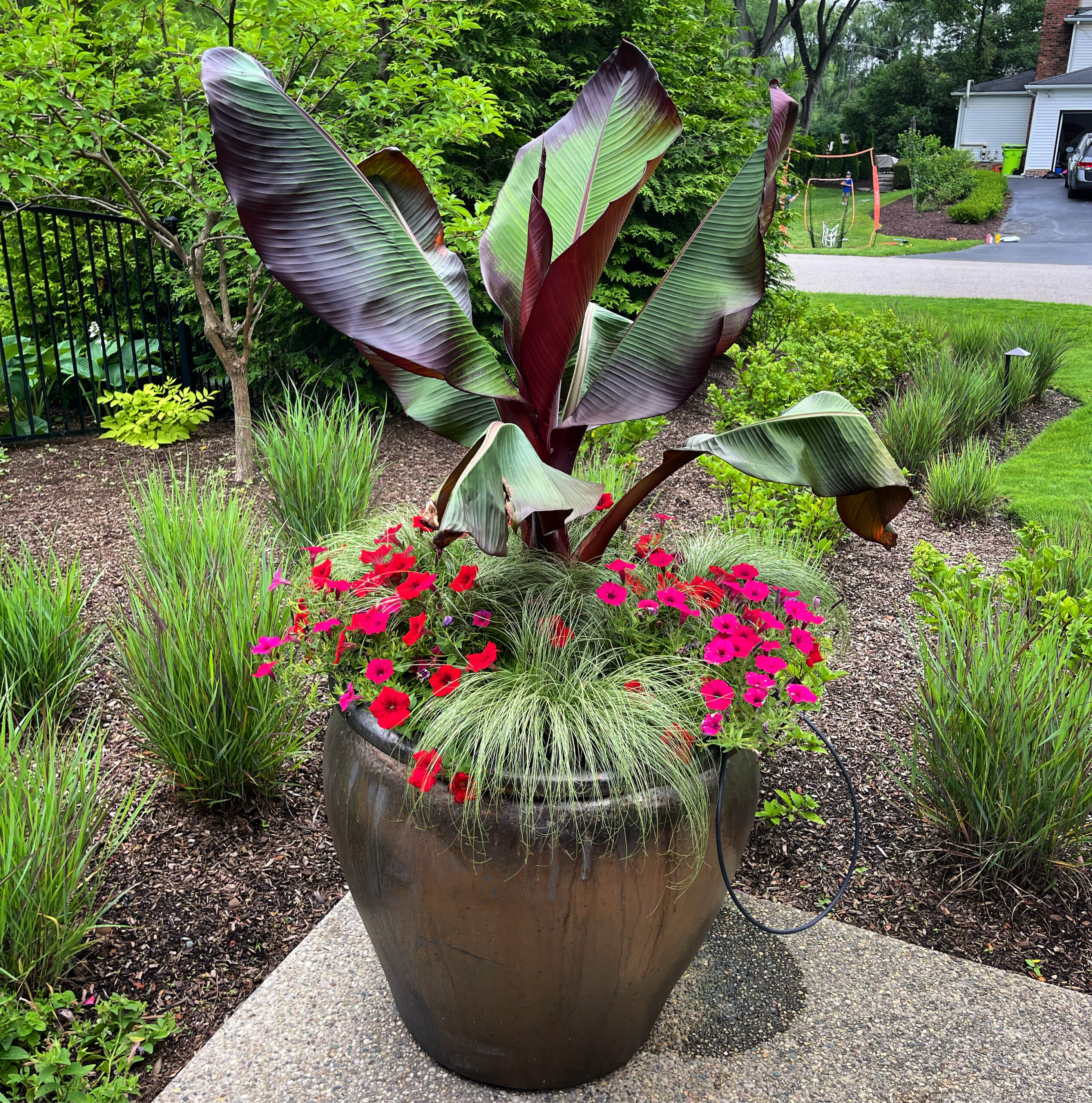
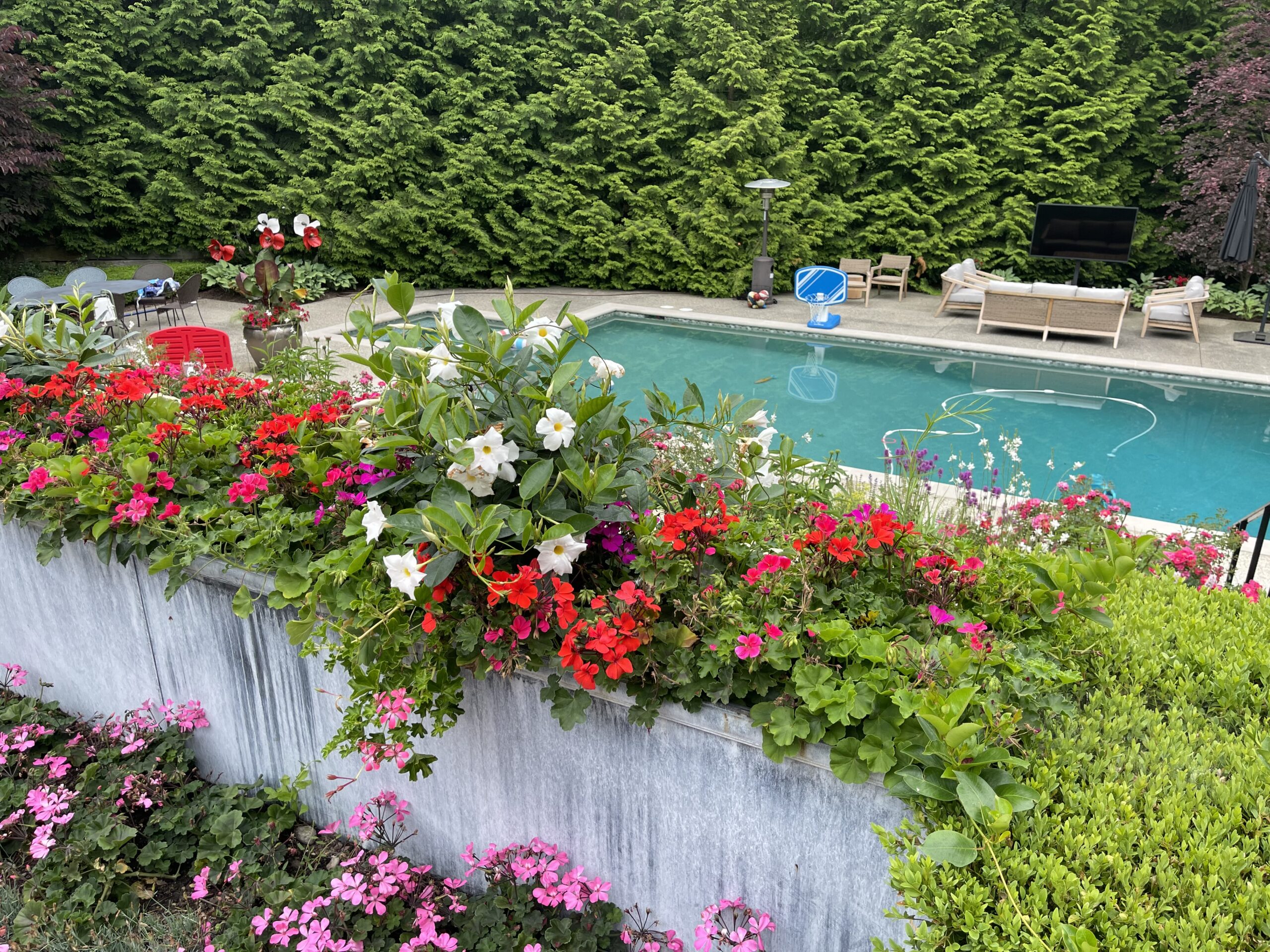
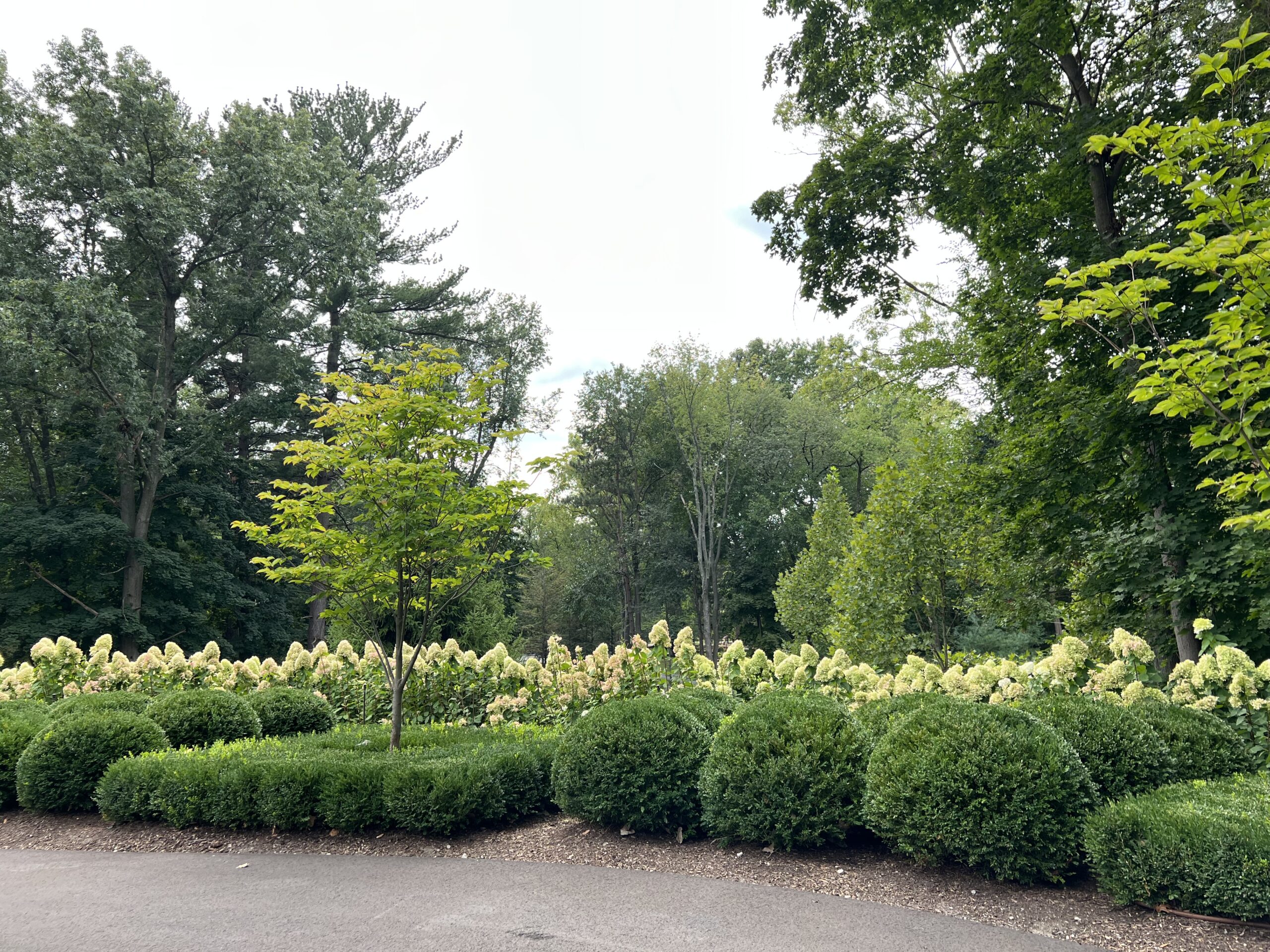
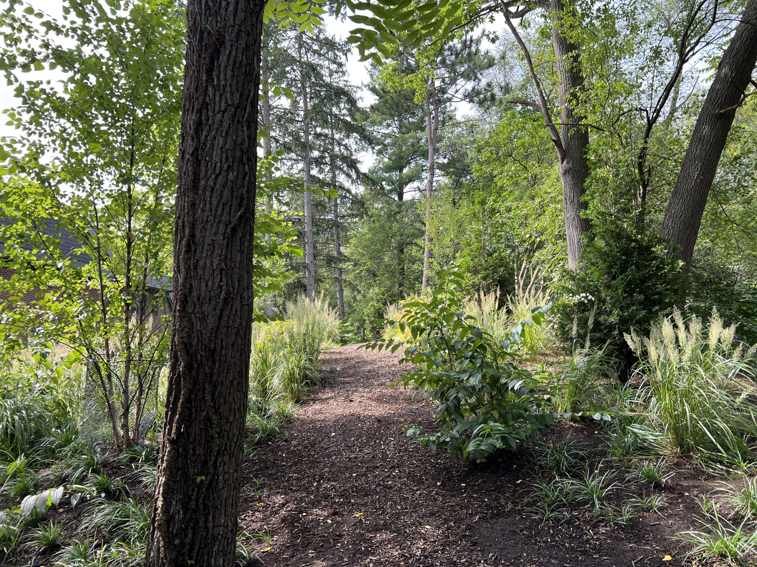
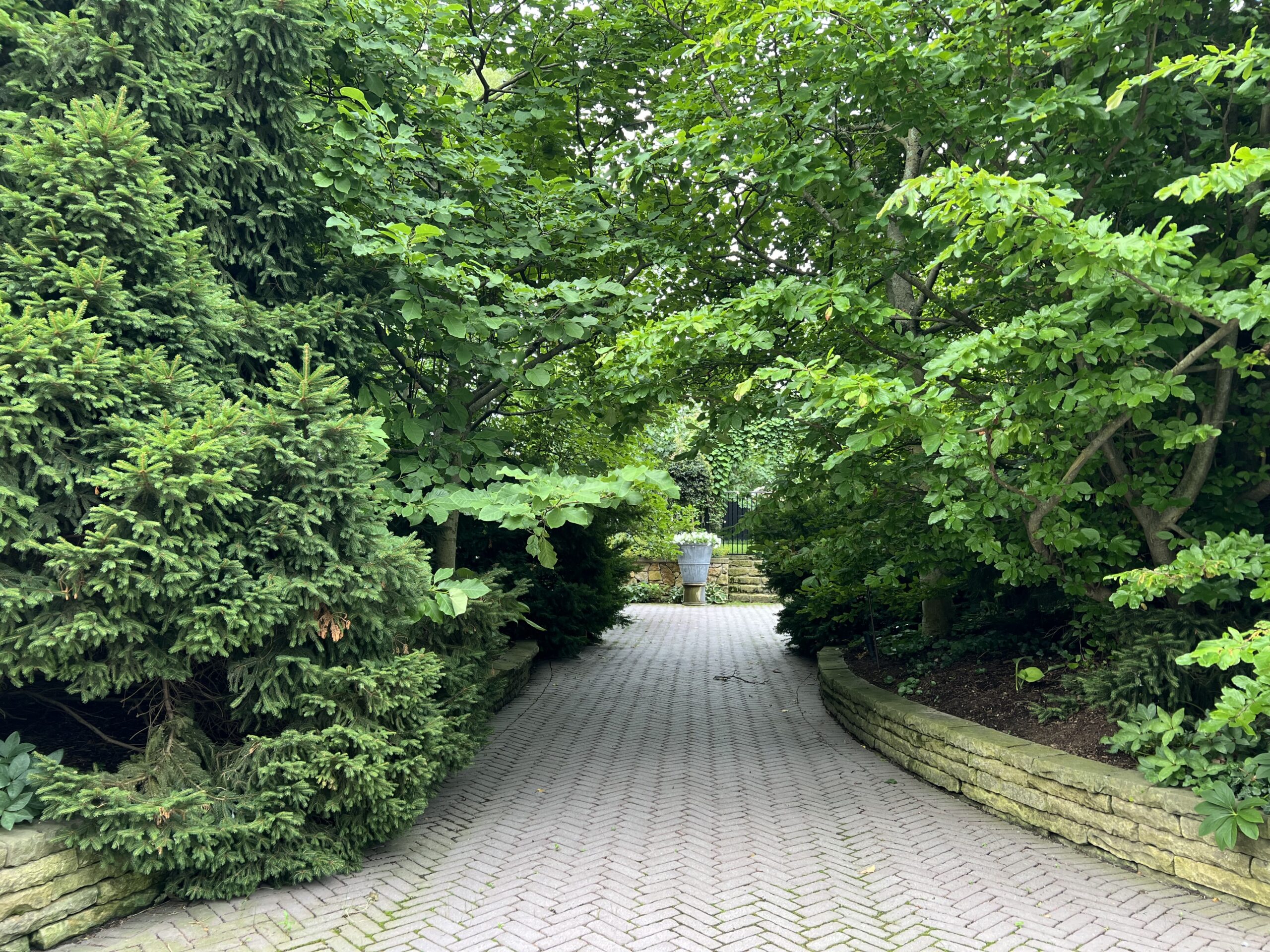
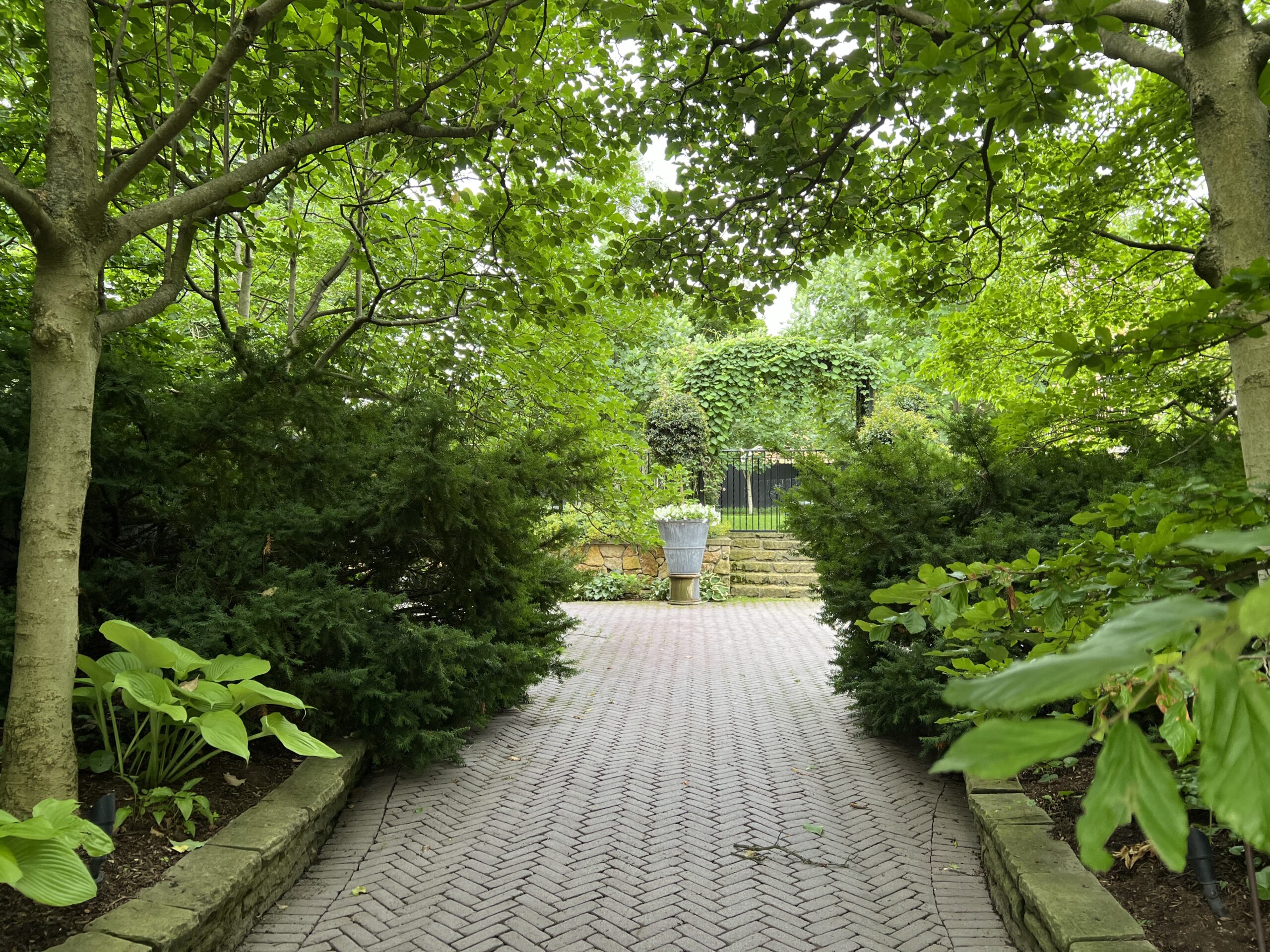
These photographs depict my driveway, and the landscape that has grown up around it. 25 years ago, the drive was surrounded by grass. I like grass, but I better liked looking at plants going and coming home from work. A driveway garden is an important garden, as the gardener is there almost every day. And sometimes multiple times a day. So I planted and maintained every bit of it for years. The pruning and was important, as the drive had to accommodate a vehicle coming in and going out. It would not do to have a magnolia branch scraping across the windshield. The drive surface has to be shoveled and the sticks picked up.
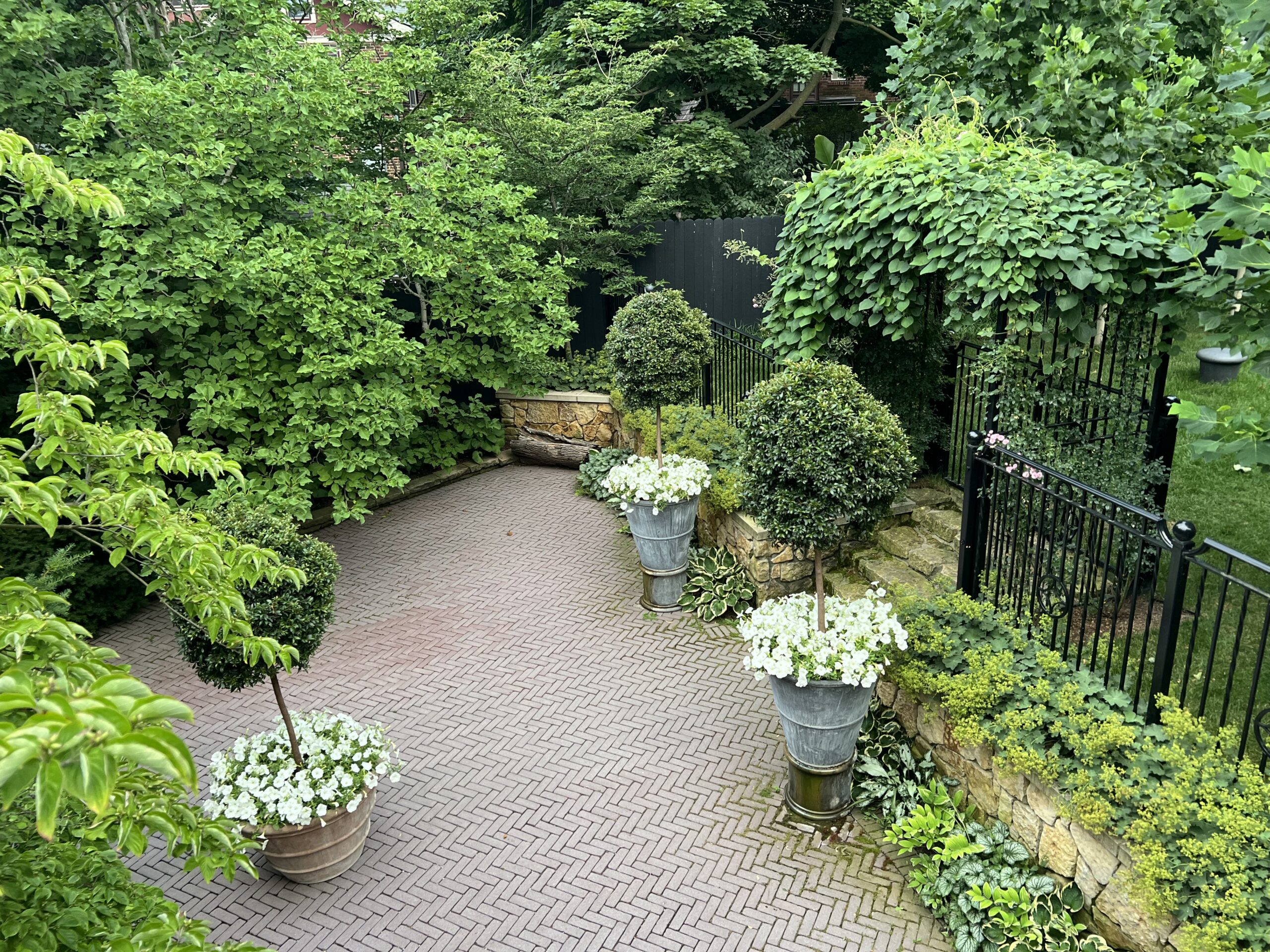
This small drive court was too prominent a spot to not plant up, so I did. As much as I dared. I did on occasion get called out for letting things get out of bounds. Heaven forbid any dirt or dead leaves would stick to his car. He was not a gardener. I kept the landscape on the perimeters. This was Buck’s driveway and parking place, and I respected that. He passed on five years ago, so there was no longer any need to prune, trim, rake, shovel, dead head and spit polish. So I have let it be. I let it all be what it wants to be now. I have not and do not intervene or maintain unless there is a dead branch or leaves to sweep up. I don’t inspect it anymore. I glance at it. Or make a trip down the driveway which is now a walking path. I don’t shovel the snow here.
See what I mean?
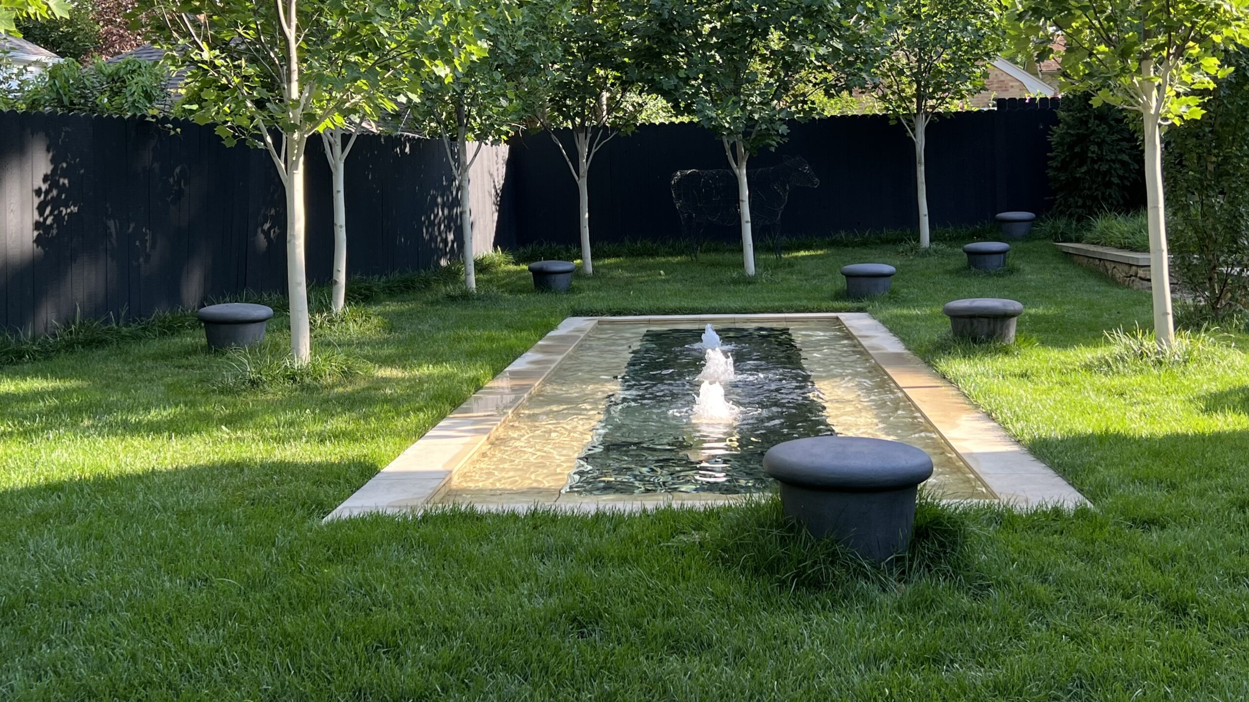
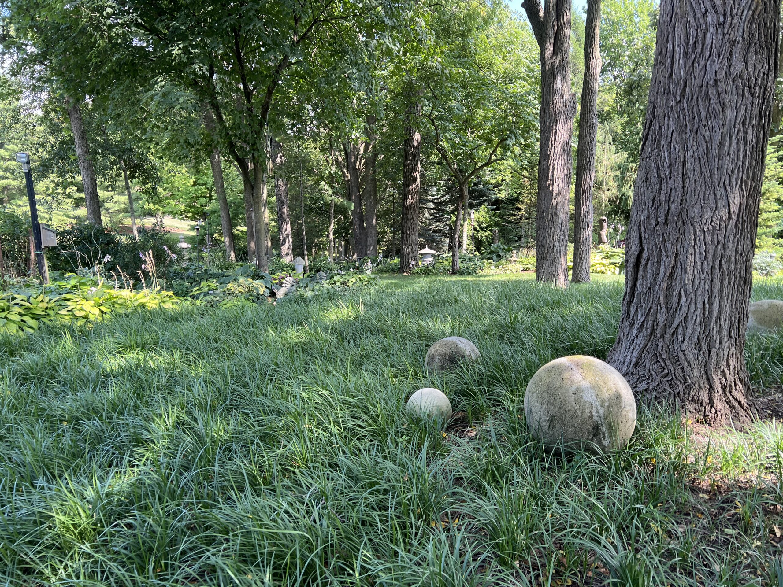
The fountain landscape and garden had been planted every bit as densely as the driveway, but the time came when it had to be redone. The new group of trees – a vase shaped cultivar of tulip tree called “Emerald City” – was planted as a grove, and not in a row on the property perimeter. The sunny spots left over were carpeted in grass. The shady spots were planted with a grassy and vigorously growing perennial liriope spicata. A collection of black Belgian stoneware stools are sprinkled throughout the space. The cedar fence was stained black, and the tree trunks were whitewashed with watered down latex house paint.

The liriope protects the tree bark from the mower. That protection does not require any maintenance. Should the liriope spread into the surrounding grass, the mower will slow it down. Grass invaded by liriope is fine by me. I am willing to let it happen, and give the natural course of events a chance. I have not decided yet what will happen as the trees grow and cast more shade. More liriope? Take note that this plant will spread with abandon, so if you have to have your hands on your garden, this plant is not for you.
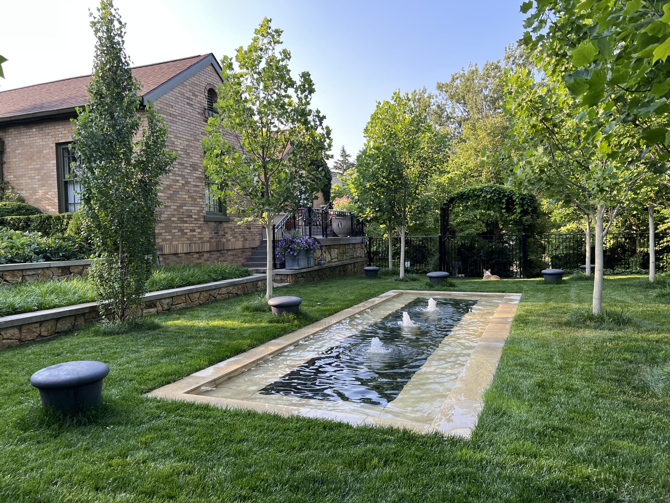
The grass and liriope mix around the tree trunks-and the stools. Though there is not much too this, I find it supplies what I need from my garden now. It could be it is my most favorite garden ever. I am always glad to get home from work and go here. I pick a spot to sit.
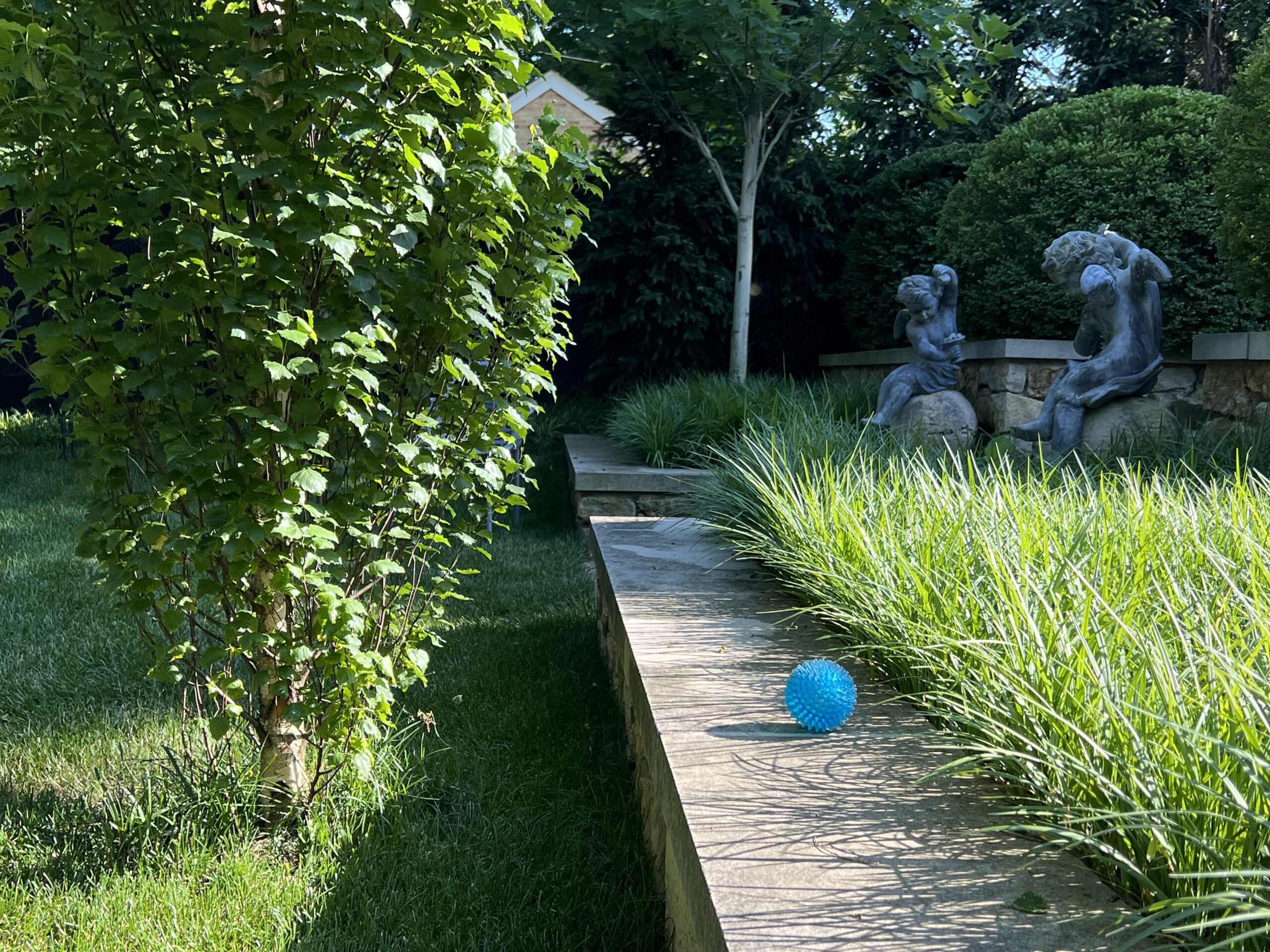
This raised bed dating back decades is all liriope now. The stone captures it, and keeps it from spreading. I would not at all be surprised one day to see it growing through the stone. That will be fine too.
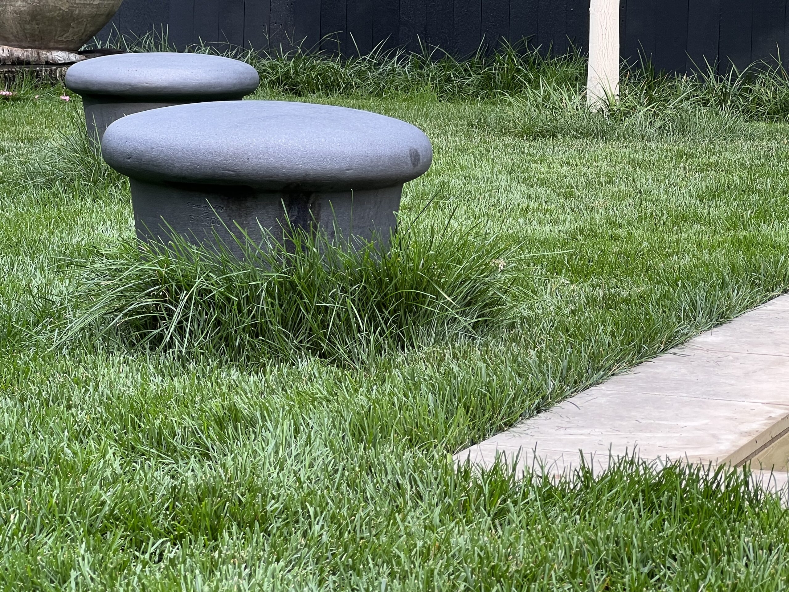
It was not easy to get my crew to do a casually messy job of mowing the grass. They wanted it mowed shorter. And edged. I said no. I don’t garden like that anymore.
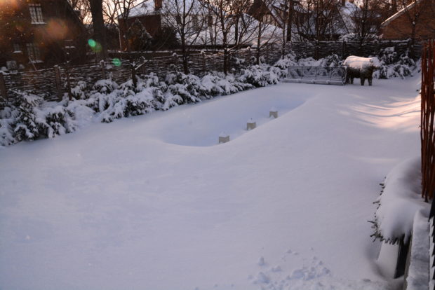
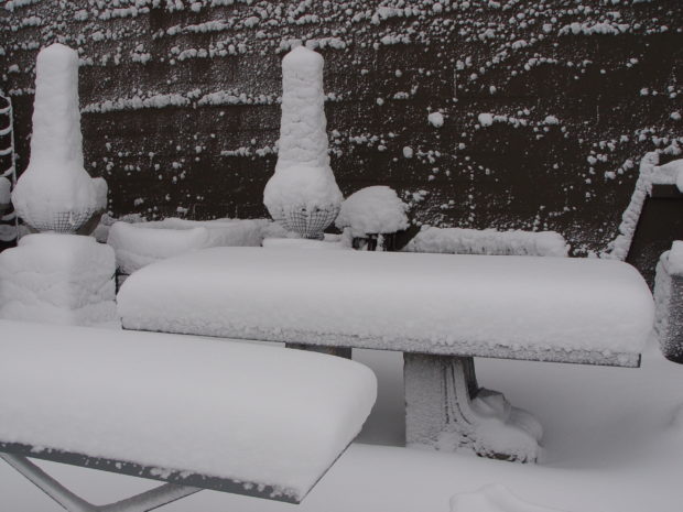
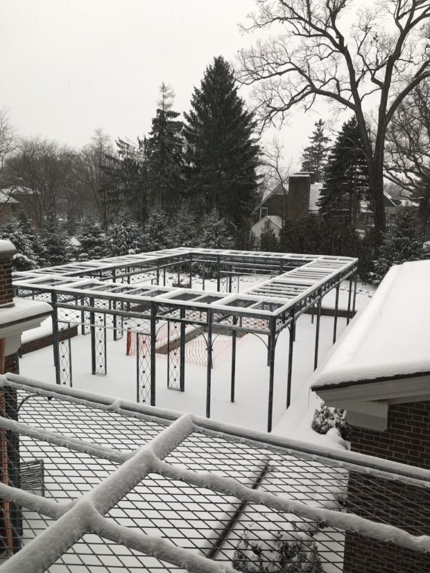
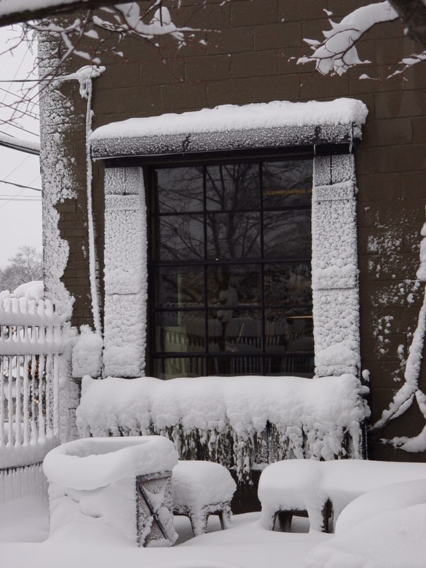
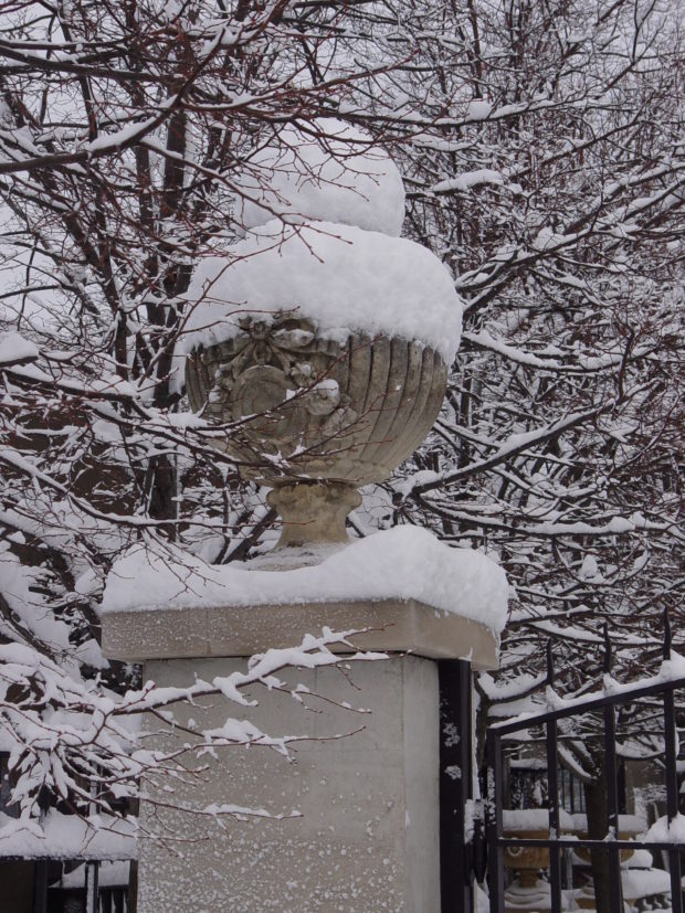
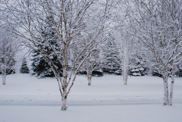
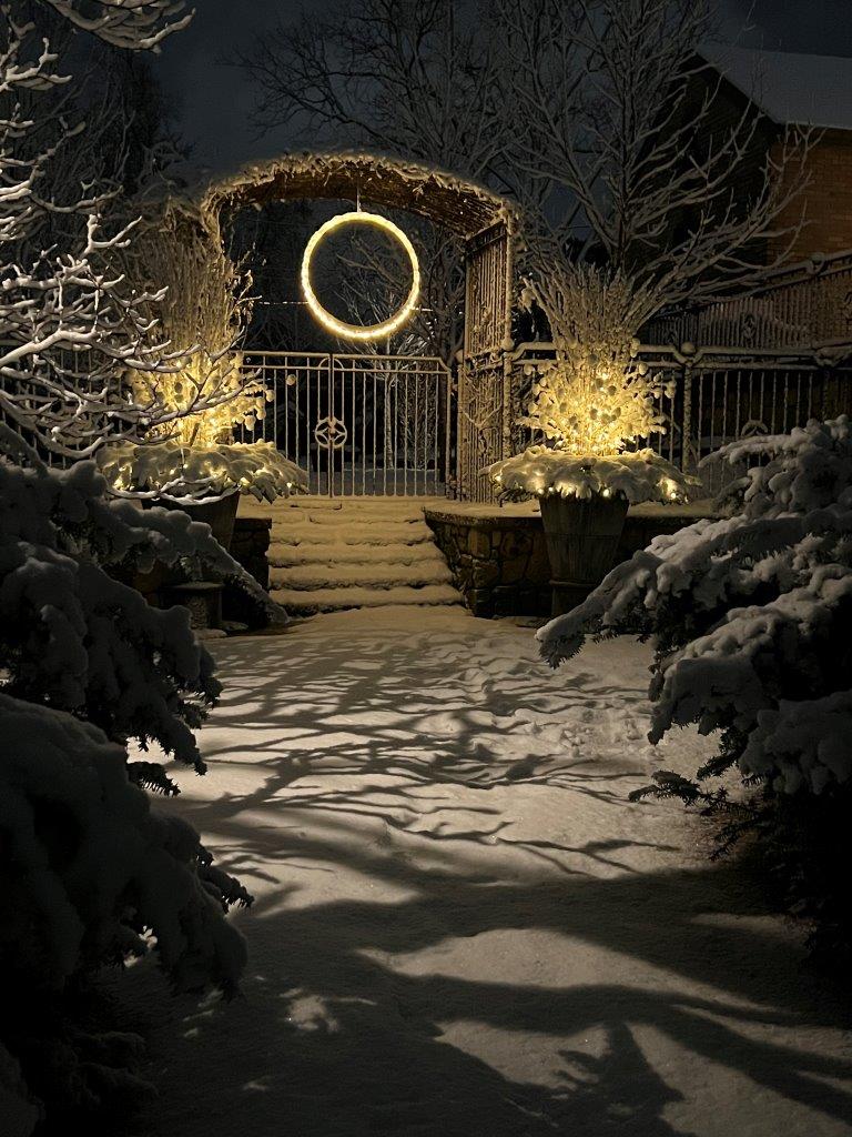
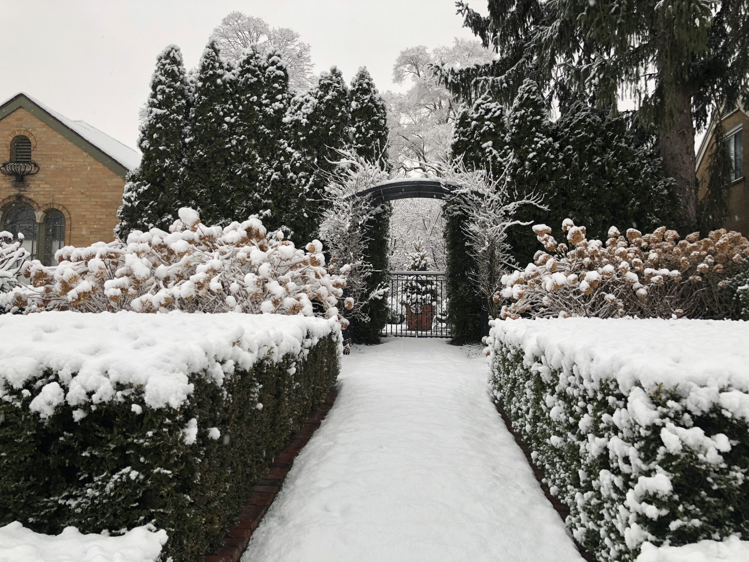 The picture above was taken in the early morning of Jan 3, 2021. I remember waking up well before dawn to a landscape whose every surface was transformed by mounds of snow. Giant snowflakes floated downward on the still air like feathers, and stuck to whatever surface they touched first. The quiet was disconcerting. My yard was truly a fairyland – the first time ever quite like this. Every shape in the landscape was faithfully described and added to by this extraordinary snow. Within minutes of opening my eyes, I was dressed, out the door, and marveling. I took photographs for several hours, and several hours after that the snow had completely melted and was gone. This was an incredible weather event of breathtakingly striking and shocking beauty, the likes of which I had never seen before.
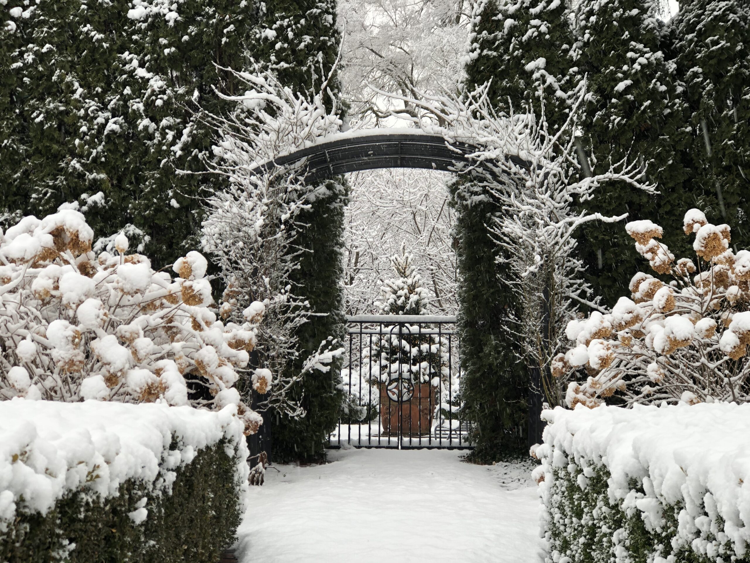 That snow dispassionately described the landscape design. I was happy about what that revealed. A good landscape composition celebrates the depth of a space by beautifully revealing its background, mid ground and foreground. Of course a landscape is a sculpture – a three-dimensional object, if you will. Great landscape design explores that uniquely spatial quality created by land and sky-and edges. I can’t really explain what I mean by edges, except to say that everything and everyone has them. Expressing depth in a composition fuels the means by which a landscape space can be wrought and experienced. A design. Depth in a landscape composition creates mystery, and reveals surprising outcomes at unexpected or opportune moments. Some designers describe this as flow. Others describe this as rooms with transitions in between. The background space above is a thicket of tree branches indicating trees that are a ways away. The focal point of that background space is a a centrally located container with a cut evergreen tree inside. That planter box is in the front of the back – ha. The mid ground space is defined by the hedge of arborvitae that is open in the center to permit travel and views through. The gate marking that entrance and exit is overseen by a steel arbor wreathed in a pair of John Davis roses. That gate explains how the end of the mid ground space becomes the beginning of the foreground space. That arbor is centered in the transition between the front and the back. It also separates the public space from the private. The structure of those climbing roses in the snow is every bit as beautiful here as they are in bloom in June. I mean this. The foreground space features Limelight hydrangeas, faced down by hedges of clipped boxwood, and opens up to a widening path of snow covered grass. This composition features layer after layer of plants from front to back. What is it that makes the relationships established by this design so dramatic and clear? The weather.
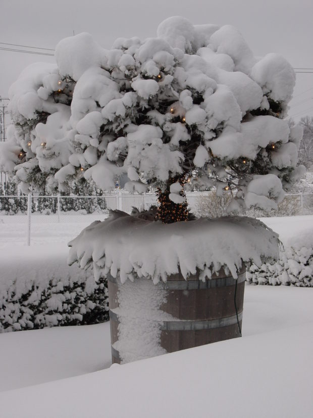
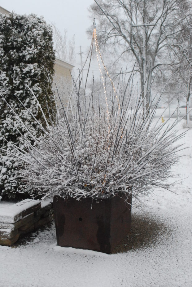
 Our most recent snow was not nearly as spectacular as the 2021 storm, but it was good nonetheless. The skirt of this container is set with cut evergreen boughs that radiate out from the center. A second set of evergreen boughs are set on end against the centerpiece. Separating the vertical fir from the horizontal is a loosely defined ring of green and white pine cones in a nest of lights. A single evergreen material has special visual interest given its multi-dimensional placement. This simple arrangement with only a few elements is all the more striking given the landscape around it. The snow tells that story.
 A different year in this location, the container sparkled with an abundance of lights. An unusually textural snow cover produced yet another visual version of this landscape. Over the course of a year or a gardening season, the weather should play a major role in the landscape design. I am an advocate of landscape design which takes a sweeping bow to that element we call nature.
 That same night, the snow illustrated the transition between the driveway and the fountain garden. The pots, arbor and fence occupy that mid ground. That middle ground space can be the most difficult to define and develop in a landscape. It sometimes involves putting an idea or an object or a plant out there in the middle and building from there. Starting a design at the front or the leading edge or the beginning is not necessarily the best or only way forward. A landscape will speak back, if you give it sufficient time. This mid ground space took many years to establish. There is no substitute for age on a landscape.
 This is as close as I have been to that extraordinary snow in 2021. I am happy for it. Beautiful snow is a hallmark of our winter. Having a well designed landscape on which beautiful snow can act makes the winter season welcome, yes. The fence pictured above, punctuated by a gated arbor and flanking pots, is not that unusual a treatment of an outdoor space – but the considerable change of level does give pause. But the simple arrangement of bold and thoughtful forms emphasizes the main idea. The legibility of intent is key to good landscape design.
 Most of my landscape is going on 28 years old. That age has enriched design decisions made decades ago. Sometimes it is good to stay the course, and see what grows.
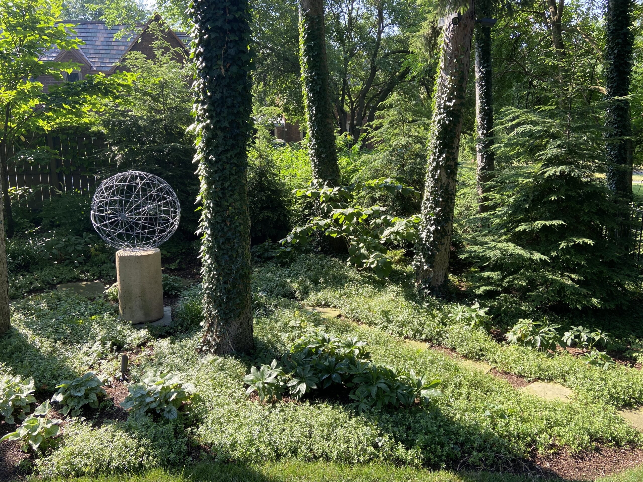
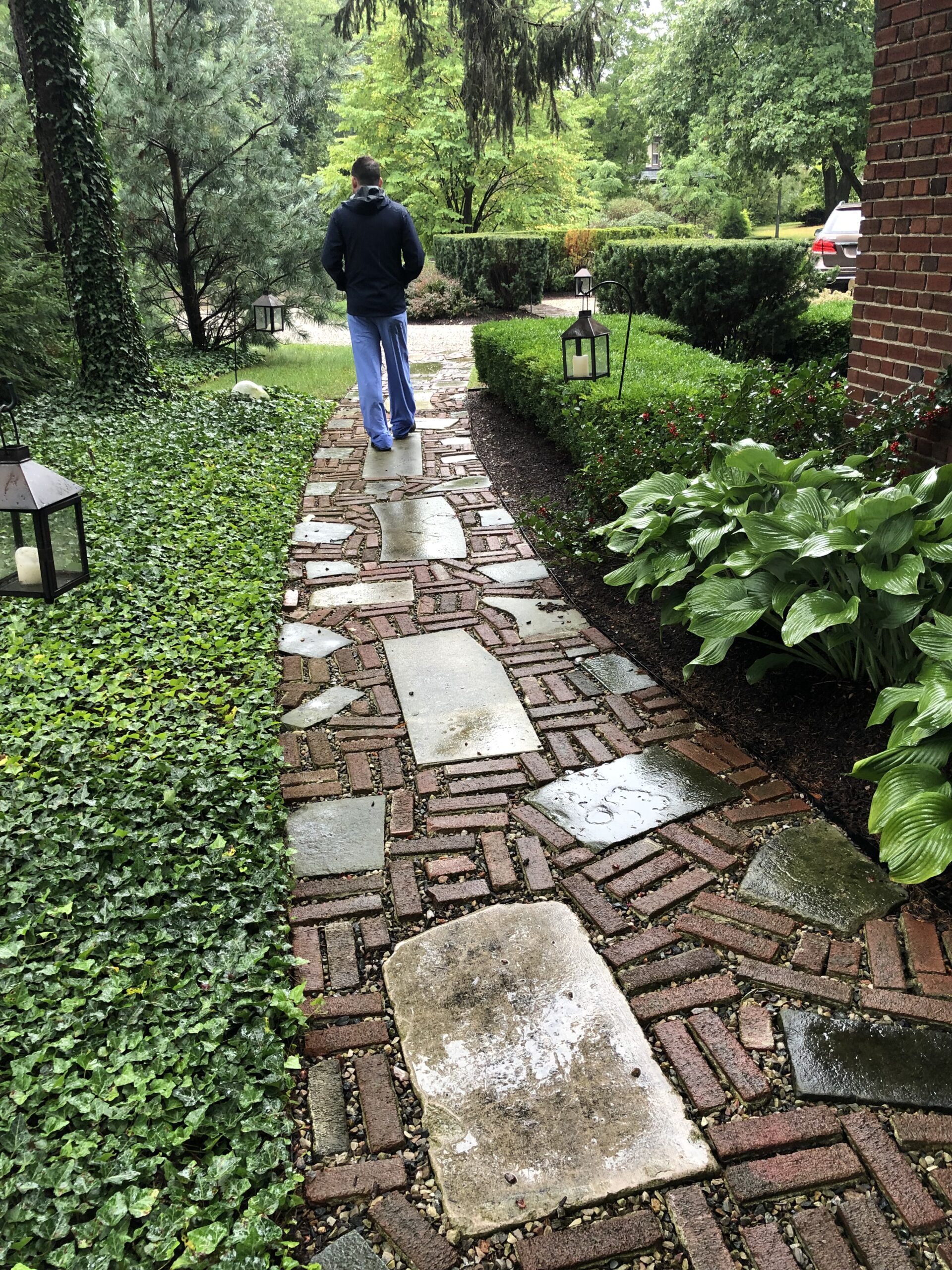
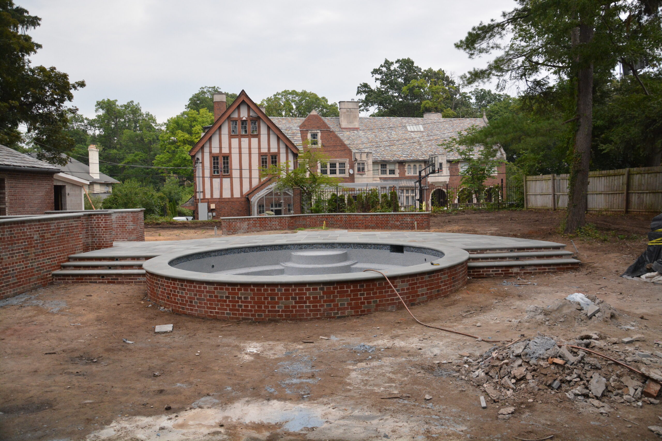
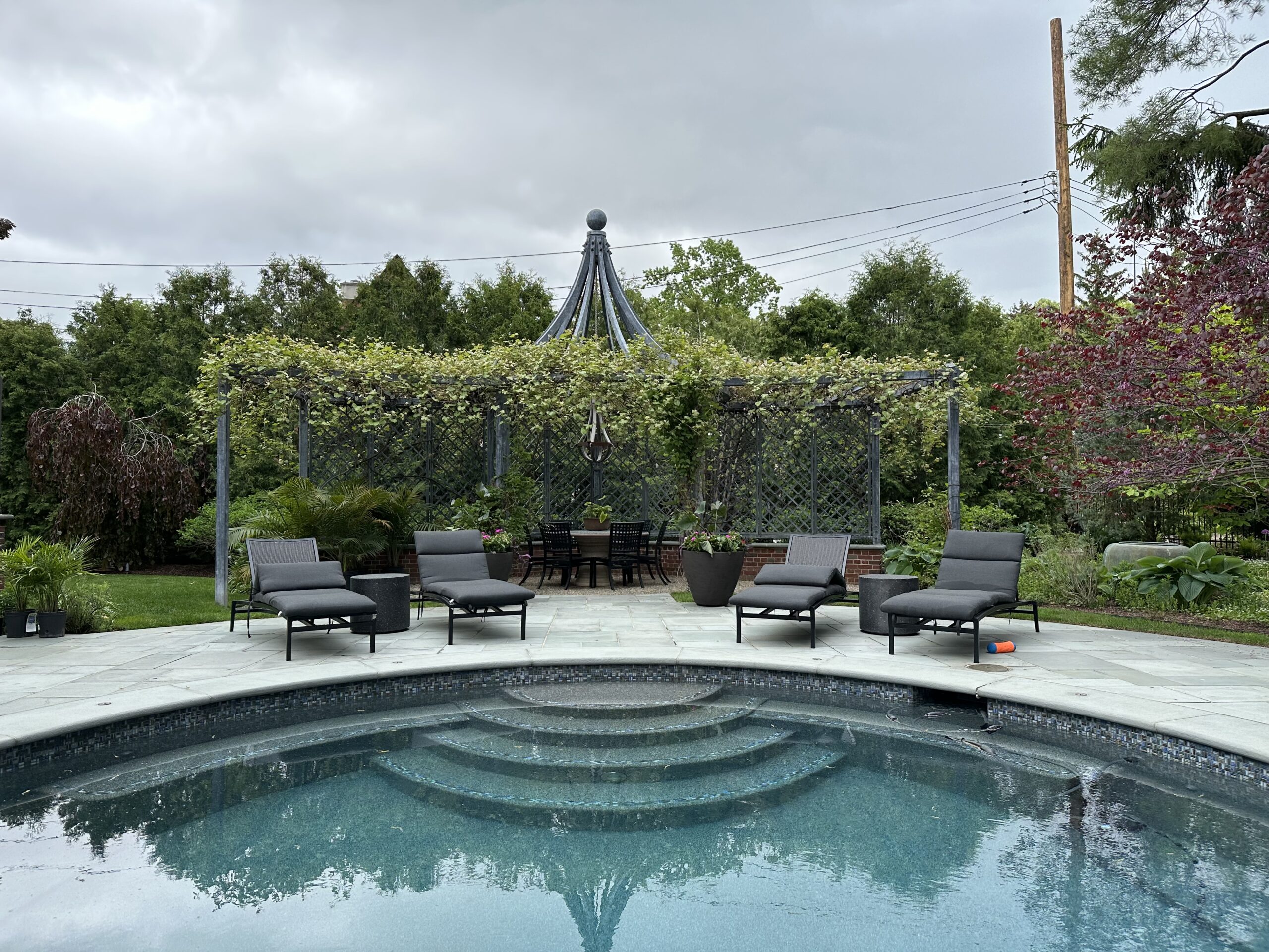
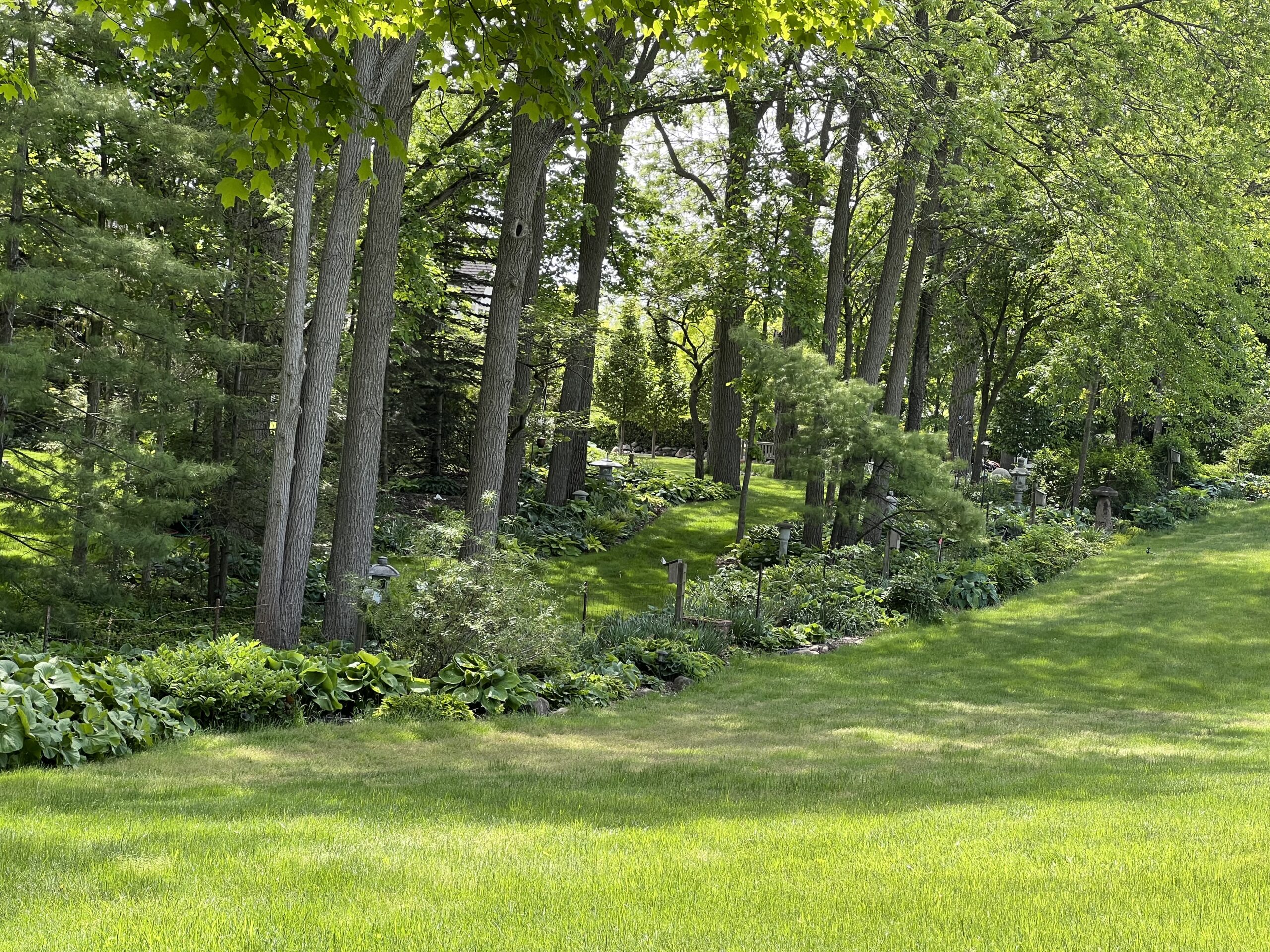
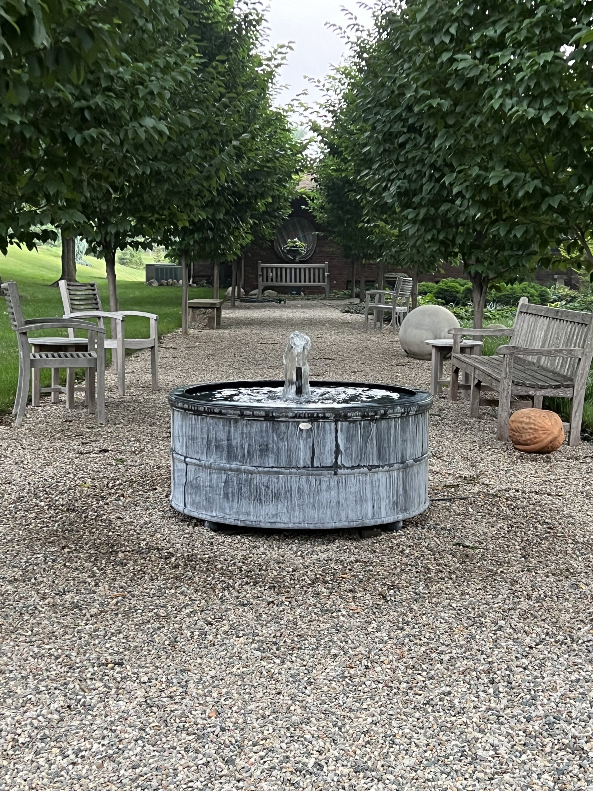
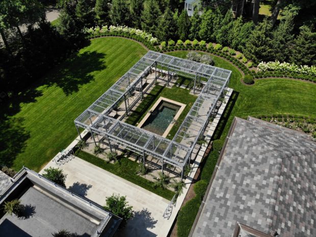
 I am not posting any pictures of the fountain garden. Better that you see it in person. It is completely and shockingly different than it once was. Everything has a life span, including a landscape and garden. This part of my landscape has only been in 2 years.