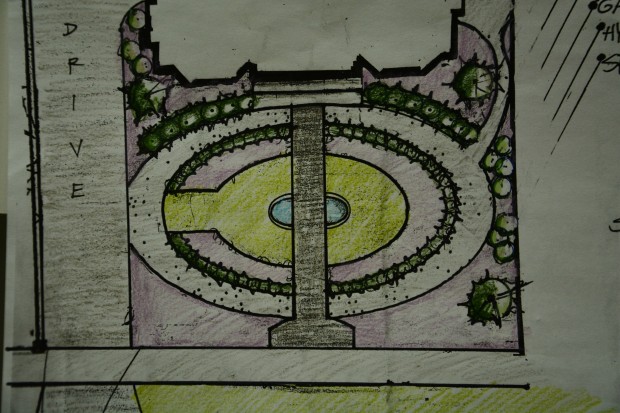
 As Susan Cohan, a very talented and skilled American landscape designer would say, a great landscape design is about making a space work. It works for the client. It works for the plants selected. And it solves problems. No where is that more evident than designing for a very small space. A very small property means every square inch needs to work. This very small front yard needed a decently sized driveway, and a graceful way to get to the front door from both the sidewalk, and the drive. It needed to ground a house that was very tall. It needed to provide a place to watch young children playing on the drive. It needed to provide ongoing visual interest – every bit of which was exposed to the street. It needed to accommodate a client’s interest in a fountain in the front yard.
 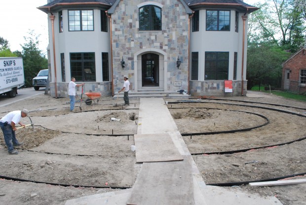 I thought there needed to be a single strong shape which would organize every other element in the landscape. An ellipse seemed a natural choice. The shape of the front yard was a very shallow rectangle. An ellipse would make the most of that natural shape in a more interesting way. An elliptical shape that touched the north side of the driveway, and reached across to the south side would provide a means to reach the front door. It would also permit a way to walk the garden that had no beginning and no end.
  From the driveway, one ring of the ellipse would be a gravel path that would lead to the front door. That path would also encourage walking through the space. The gravel ellipse was wide enough to accommodate a bench, wherever the client might want one. An interior ellipse of grass would make it possible to view the garden, and the fountains from a number of different vantage points.
 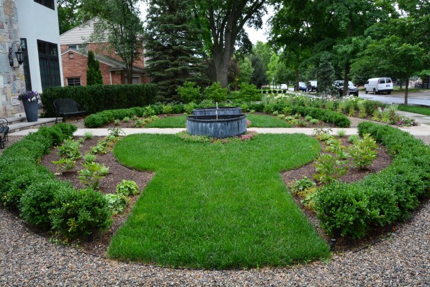 The fountain Buck built was actually a pair of fountains. Each was fabricated as a half-ellipse. Anyone approaching the front door would walk through the fountains. Anyone coming to the front door from the driveway could follow the gravel path, or take the fountain view route. Rows of boxwood and yews matching the curve of the ellipse would give the garden some winter interest. As for the perennial garden, there are but a few plants. The inner ring is a collection of peonies, faced down with alchemilla mollis. Once the peonies mature, they will form a lustrous large leaved interior hedge taller than the boxwood.
 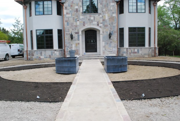 The fountains are the center of interest to the design, and they are front and center. We did eventually move them back off of the sidewalk a bit, just so the space would breathe better. The interior garden would mature at the same height as the fountains. This height was a direct response to the height of the house. I planted yews in the ellipse closest to the house-who would want to block the views from inside out with anything taller? Eventually we would plant a DeGroot Spire arborvitae on either side of the from facade of the house.
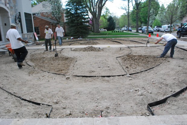
 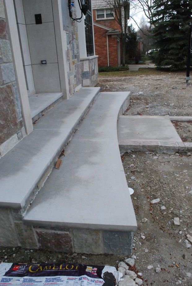 The lower step to the front door needed to describe that ellipse that governed the shape every other landscape element. Scott Albaugh from Albaugh Masonry did a great job of this. In a very small space, the details matter so much. Our shapes were by no means perfect. But they were accurate enough to be convincing. At this stage in the installation, the ellipses read in a graphically strong way. Once the landscape was planted, that shape became much more subtle.
 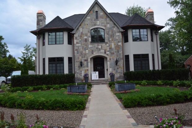 The day a landscape is installed is just that-the first day. Given some time for the plants to mature, that ellipse describing the horizontal ground plane will be softened by the height and the sprawl of the plants.
 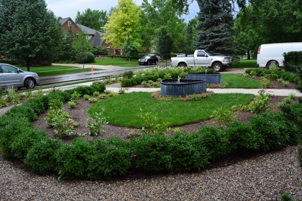 This design looks different from different vantage points. Changing the visual channel is easy; there is a path.
 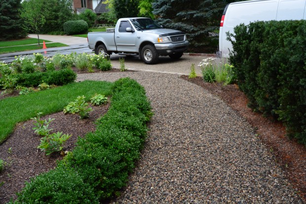 Any guest getting out of the car in the driveway could find their way to the front door. They might take the long way-or the short way, in bad weather. This design is intended to make the garden accessible and friendly to people. Though just about every idea can be seen from the drive or the street, the elliptical path invites a stroll through.
 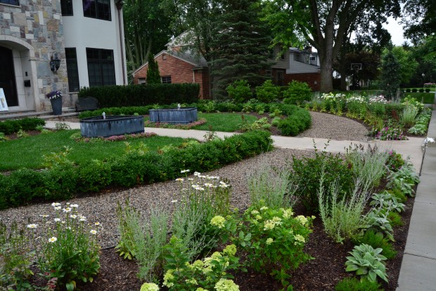 What can readily be seen now will not always be the case. The outer ring of this garden will mature at a height of 4 to 5 feet. Roses, shasta daisies, Russian sage, Little Lime hydrangeas-the height of these plants will provide a little mystery and privacy to the inner ellipse. The border on the sidewalk-moss phlox and lamb’s ear.
 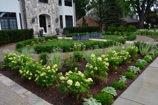 I will be very interested to see this garden when it has a few more years on it. Hopefully it will be a small space that has something interesting going on.
So beautiful! Those Little Lime’s are going to fill in fast.
Fabulous!
Gréât design solution.
This is very inspirational, but I have an impression that I have seen these pictures somewhere before. Did you post them on your FaceBook page perhaps, a while ago? In any event, very impressivel! Small gardens are so much harder to do. My favorite small garden is Russell Page’s side garden (on E 70th) at the Frick in New York. I read in his book that it may have taken him 10 years to do it … but the result is there!
Dear Antoine, I actually posted about this project 6 months ago, in a post entitled “The Roundabout”. Some of the pictures are the same, but the two essays are different. I just thought the project was pertinent to my current discussion of forms and proportion. I will have to look up the Page garden-I am not familiar with it. Thanks, Deborah
I thought so, the elliptical path and the fountains made me remember your previous post. Very well done! I don’t want to distract from your original post, but here is a link to a virtual tour of Russell Page’s E 70th street garden at the Frick in New York (http://www.frick.org/collection/gardens/seventieth_street_garden). He also wrote extensively about the complexities of designing this small city garden in his book, ‘The Education of a Gardener’. Next time you are in NY, I suggest you visit it, it’s a real jewel of a garden in any season.
Dear Antoine, I did take the virtual tour on your link. It looks really lovely. I will have to visit some time. Thanks for the link, Deborah
What I am deeply drawn to about this design is how all the elements of the landscape design resonate with the architecture and create a unified space. The garden doesn’t compete with the building and vice versa and I feel a sense of harmony the more I look at it. I admire designers who design for the whole and not the parts. Every time I see this kind of work I find myself studying it to see what inspired its creation and learn something new when I do. Thank you and Congratulations!
Dear Virginia, thank you so much for your letter! Best, Deborah
It’s wonderful how you took the curve over the front door and laid it down into the garden, marrying house with garden. An excellent solution to a small front garden!
Dear Vanessa, the arch over the door is an arch with a fixed radius that emanates from one point. I have always called the curve that is over that door a “Monet arch”. An ellipse has a major axis for the long curve, and and a minor axis for the short side curve- 2 fixed points. This may just be a fancy excuse for the fact that the curve over the door never entered my mind during the design process! Thanks for writing, Deborah
This posting was so helpful.
I’m in the throes of staring at a big empty circular spot in my back yard, once planted with a shaggy looking grass (buffalo, I think it’s called). It didn’t work out so I let the grass die and now am trying to re-think the space.
Looking at an empty space can be terrifying, especially when the solutions feel costly when they’re done incorrectly.
These photos are beautiful and making my brain go into overdrive for what I can do in an empty space.
Thanks for sharing!
I am dizzy with delight imagining walking the circle again and again when the peonies come into their own. Your design adds beauty to a house that had little before you arrived.
I think it’s wonderful brilliant I want to keep watching Janet
This is absolutely lovely. What a terrific solution for this house and yard. I love it!
This is so beautiful,innovative, responsive to the challenges of the site and inspiring that I nearly cried when I read it. Your blog is truly a life-enhancer. Thank you, Deborah.
Dear Linda, thank you so much for your letter. I will admit the project had me wringing my hands for quite a while. The best part? A client that was willing. Best, Deborah
Talk about making a space work – fantastic design, great work!
Spectacular design! As usual from Deborah and her amazing team.