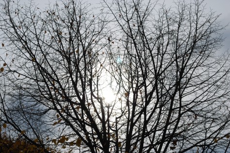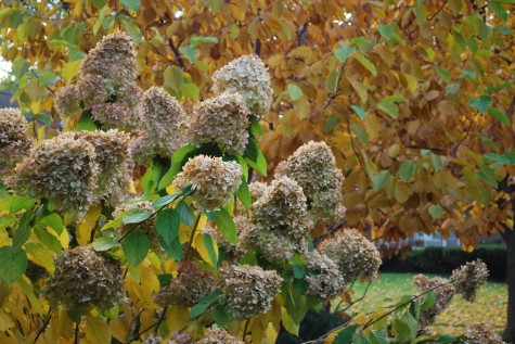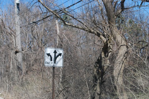
Our spring is taking her own sweet time turning on the lights and opening the door. Was it not amazing to be outside in the 77 degree weather on Sunday without so much as a bud showing green on any woody plant? A hoticultural twilight zone is what we have going on now. That day, my tulips at home breached the surface of the ground, and went on to grow up 4 inches. They are ready to get going-just like every gardener I know. If you have issues with your landscape, I am sure you are wringing your hands over which way to go. What lane will you choose?
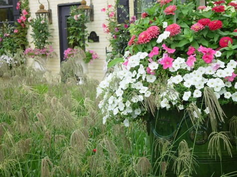 The very first order of business is to think long and hard about what you want your landscape to do for you. There are lots of choices. It could provide refuge from a frenetic world or a stressful job. It could provide an environment for your kids to play. It could be a laboratory for your tinkering; growing this plant from seed or nurturing that 3″ hellebore seedling can be incredibly rewarding. Teaching your kids how to grow beans and potatoes-this has to be equally rewarding. It could provide your family with home grown food. It could satisfy your longing for roses, or your lust for geometry. It could enclose you, provoke you, challenge you, amuse you, or knock you over. How do you know what you want, and what you need? Make a list, and edit. Throw out all the 3 rated wants, and focus on the 8, 9, and 10 rated wants. This essay intends to address only one want-an inviting landscape. The soft, fluid, and colorful landscape pictured above-inviting.
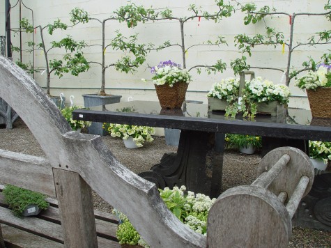 Landscapes that invite provide places to be, and places to sit. Places to linger, places to talk. Engaging places. Inviting landscapes accomodate company. Though this picture says much about structure-a table, a bench, the geometry implied in a series of espaliers in lead pots, what engages the eye the most are the flowers. Flowers soften structures in friendly way.
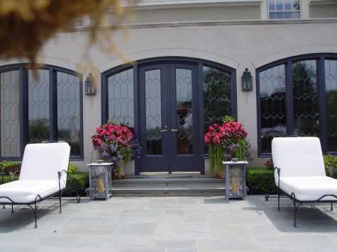 Pots at the back door say first up-here is the door. Secondly, they say hello, and welcome. This landscape without the pots would be fairly austere. Though glass permits a view through, glass in the landscape is not transparent-it reads black from outside. Should you wish your landscape to invite, soften the appearance of that black glass as best you can.
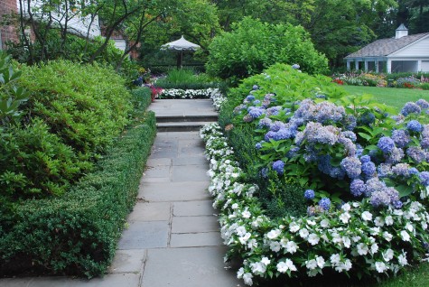 A walkway asks for a landscape of interest on both sides. Avoid a walk with a garden on one side, and lawn on the other. This makes a walk a border, rather than an experience. Lawn has its place. Lawn that is utilitarian, and has a beautiful shape is as muich a part of the landscape as the trees. Treat your guests to a garden tour before they get to the door. A welcoming landscape encourages guests to arrive at the front door, smiling.
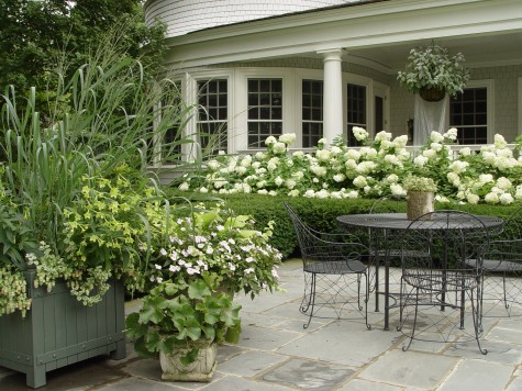 Terraces are a hard surface of a certain dimension laid on the ground plane. They make for a surface that is navigable. Though stone, brick and gravel are hard surfaces, they are natural surfaces. They make it easy for groups to congregate. Your son’s softball team and all of the attending parents, a fundraiser attracting lots of guests, a neighborhood group coming for lunch, a graduation party with friends and family-a terrace gives every guest a firm footing. Beyond that, a terrace can be landscaped such that people feel welcome. When I sit down on a terrace, I want plants at eye level. This makes me feel comfortable, and welcome.
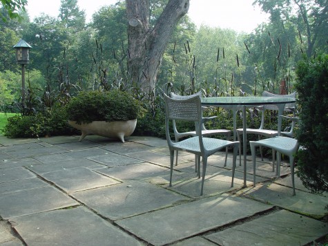 Some very contemporary landscapes make much of what I would call an immature and shallow call to the idea of alienation. As if alienation were a goal a gardener should seek. Nature portrayed as alienated-oh please. Nature is involved up close in the lives of all of us. Great geometry-I am on board with this idea. Want to make your modern landscape inviting-introduce a plant element that waves in the breeze. Great modern landscapes can be as inviting as any cottage garden-just different. Clean, clear, and in motion; this modern terrace is inviting.
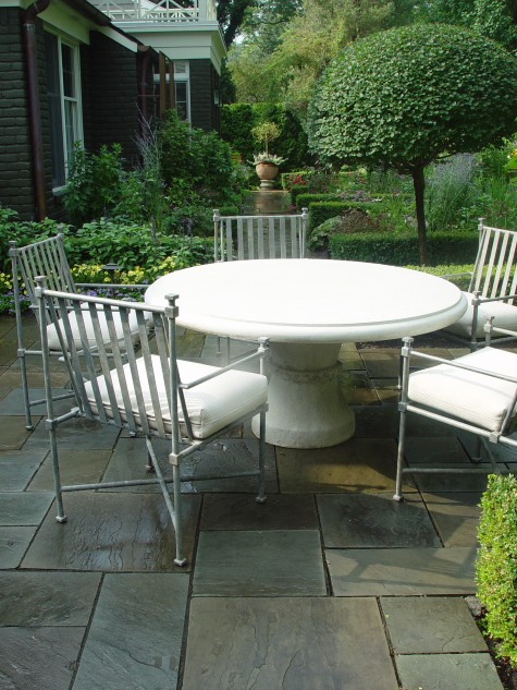 This established landscape is all about providing a comfortable place for friends and family to congregate.
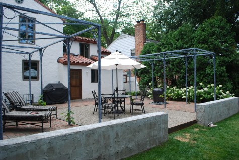
This new landscape is just about ready for those softening elements that will make this space inviting.

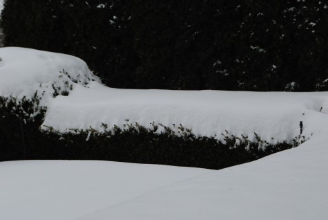




 The fall is the perfect time to talk about light as an element of design in the landscape. How, when and where the sun shines, dramatically influences the visual impact of any landscape or garden. October light in Michigan is cold and low in the sky. Uneven or carved surfaces are cast in sharp relief. Any shadows cast will be dramatically elongated. A client choosing a smooth surfaced ornament for their garden should be happy for a subtle light rendering; if not, choosing ornament with some more graphic surface variation might be in order.
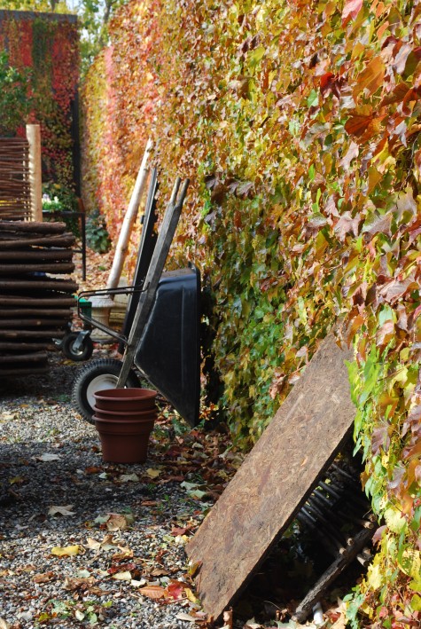 I could write on into the next decade about how light is the engine that gets any outdoor space moving. One of my favorite parts of my Michigan gardening life is how the light can make the appearance of everything change, from hour to hour, and day to day, and season to season. The contrast of light and dark in a garden is its heartbeat. In October, the trees coloring up are all the more dramatic for the ignition supplied by that intensely pale light. Its worth thinking about the degree of shade a tree or shrub will cast in a landscape. A densely shady area is all the more dramatic with a pocket pool of light behind it. Plan for dark spaces close to your view, with light spaces in the distance.
 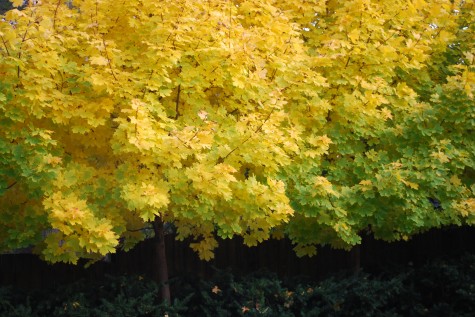 The spring leaves emerging on my Princeton gold maples cannot hold a candle to their yellow fall fire. I am a photographer whose lack of understanding about the mechanics of photography is considerable. So I watch the light. When it suffuses every element in a garden such that the color in my pictures, or the feeling of my pictures, will be saturated-that is the time I photograph. I record; I do not have the skills to generate. It is hard to believe this collection of these maple yellow leaves produces such dense shade underneath; the grey cedar fence appears black by way of contrast, and almost disappears.
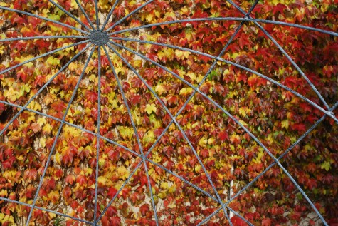 Our thin rod steel spheres permit the view of your choice through to the landscape. How they interact with a garden is the best part about them. Imagine this view in the winter, the early spring, the early summer, the high summer, the fall; you get the idea. Add light to the mix, and your possible visual combinations increase considerably. Garden ornament interests me greatly, given how it offers me a sense of solidity, and steadfast longevity, against the ever changing landscape.
 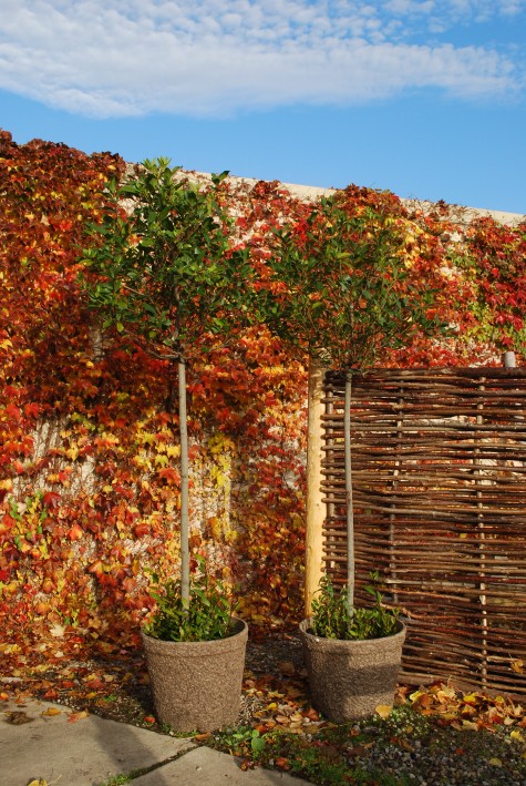 The bright flat October sun sets all it touches on fire. The greens are all that much more electrically green; the reds glow red. If you are looking to see the rhythm established by the masses of light and dark in your landscape, look quick now before the leaves fall. There is instruction coming from the natural world every day, should you care to tune in.
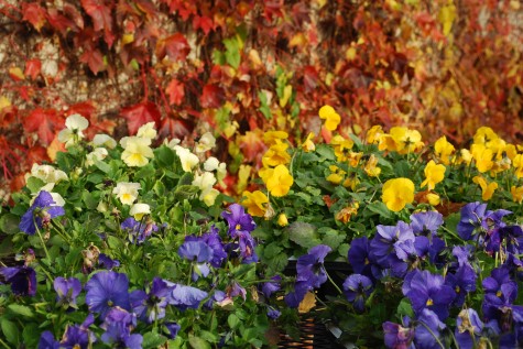 The color of these pansies speaks softly in the spring. The fall light intensifies and electrifies the appearance of their color. On my best days, I think about how the light will fall on a landscape in every season, as this should influence how I place every plant or object.
