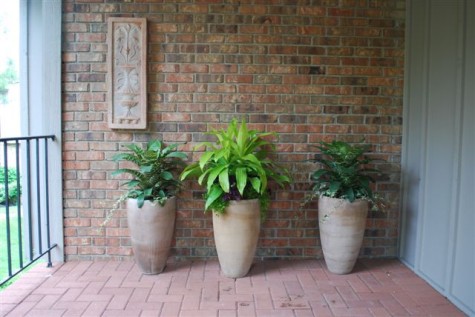
These clients live in a condominium, perched high above the existing grade of the land on three sides. This does not necessarily limit their gardening-it just makes it more of a challenge. Their front walk is actually a catwalk, as their property begins to fall away the minute you step off the driveway.
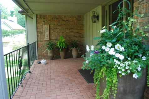 The walk culminates in a covered porch; the front door is at right angles to the walk, and not visible until you are right up there. All of this makes the brick wall they see coming up the walk an important element in their landscape. We started with pots, as there is no ground to plant in; this part looks great. But I thought that wall needed what all walls seem to need-a sculpture, a painting, a mirror?
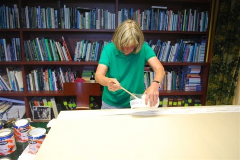 As my clients have quite a collection of art, they were receptive to the idea of a painting. Paintings that survive the weather need to be made of different materials that what an artist ordinarily would choose. I paint on extira board, which is used for making exterior signs. It does not absorb water, nor does it deteriorate outdoors. Porter Paint is a 100% acrylic paint; it is color fast, very tough and hard, and sheds any weather. As this paint is actually exterior house paint, and does not have the body of artist’s colors, I decided I would pour the painting. A beaker was the perfect tool.
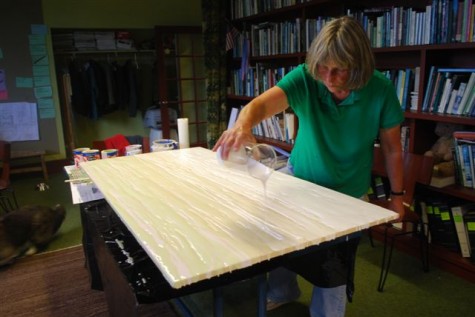 I poured the painting over the course of about 4 hours. Some areas I wanted to blend colors. In other areas, I wanted colors to sit distinctly side by side. All in all, I poured one and a quarter gallons of paint-a big fluid situation, to say the least. I supported the extira board underneath on 8 quart cans of paint, so if the board sagged from the weight of the paint, it would be evenly supported.
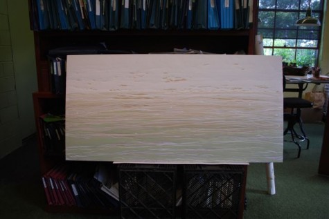 Within 3 days, the surface of the paint had skinned over sufficiently that I could stand it up to take a look. While I was happy with the color and the shapes, I wanted more texture. The painting would be viewed from some distance coming up the walk. The near view, on the porch, would present a different look. I wanted to address both views.
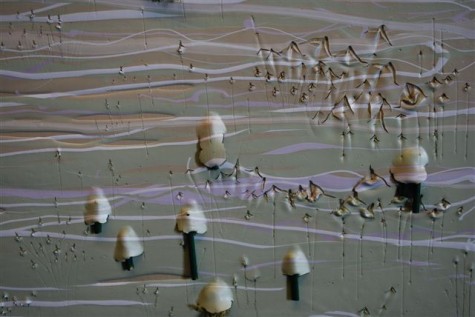 Using a carpenter’s awl, I poked, scratched, lifted up and pushed around that partially dry paint. The areas of paint I lifted off the surface, I stuffed with pieces of bamboo. At this fairly wet stage, I needed to support the paint until it dried. Once the paint was thoroughly dry, I stuffed those shapes with preserved reindeer moss.
 �
�
Though I thought all the existing elements on the porch were good, it seemed like something was missing. Treating this porch like a room made me think differently about furnishing it. I prefer not to think of this as a painting. It is a garden ornament, inspired by the picturesque landscapes in England of the 18th century. Those landscapes were composed to look like landscape paintings. This painting is a version of those English landscapes, with a much more modern point of view.
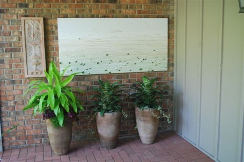 The close view I like. All the elements are different, but they look good together. The Italian terra cotta plaque is so much more important visually than when it had no company.
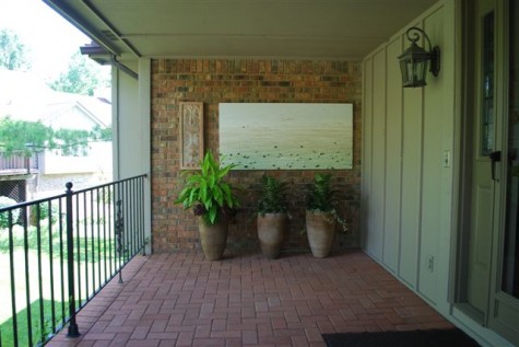
From further away, the painting pulls the colors and shapes of the distant landscape onto the porch. It was actually great fun to make, should you have a spot, and an inclination to paint.