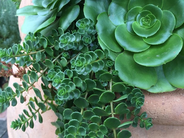
 I have been tinkering some with taking pictures with my new iphone 6. I am not very technically inclined, meaning I have always used a cell phone as a phone, and not much else. But this phone is capable of facilitating communications of all sorts, and in very sophisticated visual ways. The photo feature produces images that are amazingly sharp and detailed. Even at close range, in the hands of an older person.The fact that it is light, and fits in my pocket, means that there is no need to plan ahead. I am almost always ready, for anything that strikes my fancy. Or that unexpected, interesting, or enchanting moment.
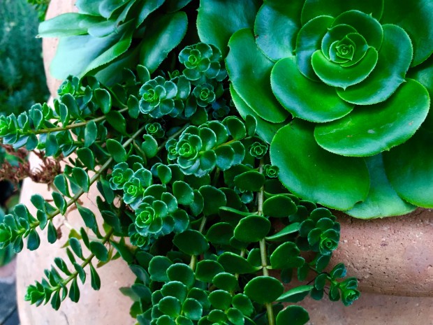 I just learned that I can edit my pictures. I can change or rearrange the composition. This means I can set the four edges of the photograph wherever I want. I can crop-as in blow up the image to the edges I have set, to eliminate all of those unnecessary visual details. This is the heart and soul of editing. Keep what matters the most, feature what brings an idea to life visually in its simplest and most dramatic form, and discard what distracts. This crop feature makes that easy. Even when it is not so easy, this camera is a great tool by which to learn. A photograph is two-dimensional-flat. How the composition of that two dimensional picture is handled can create the illusion of great depth. Think of it. This phone has a filter feature. Any photograph can be overlaid with a number of different transparent color overlays-like acetate gels over a lens. This cropped photograph of succulents got overlaid with a color overlay called chroma. That overlay gives the greens in the picture picture a more intense blue/green cast.
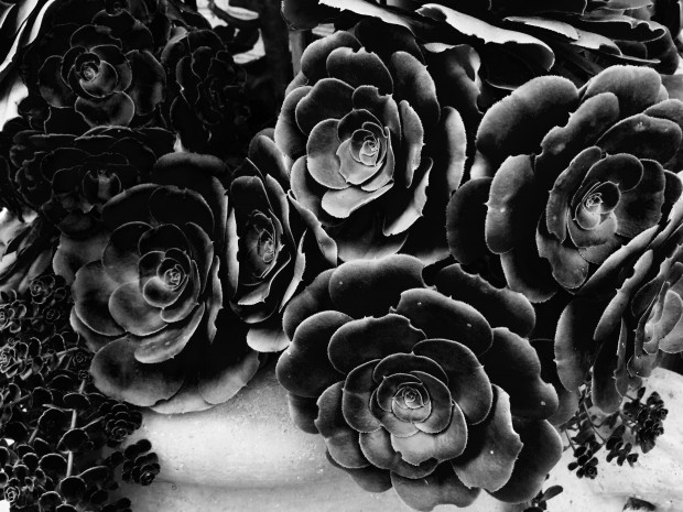 This overlay is called noir. Whatever the color of the overlay, it turns the greens in the original photograph to black. Succulents in black and white-a very different point of view. An interesting point of view.
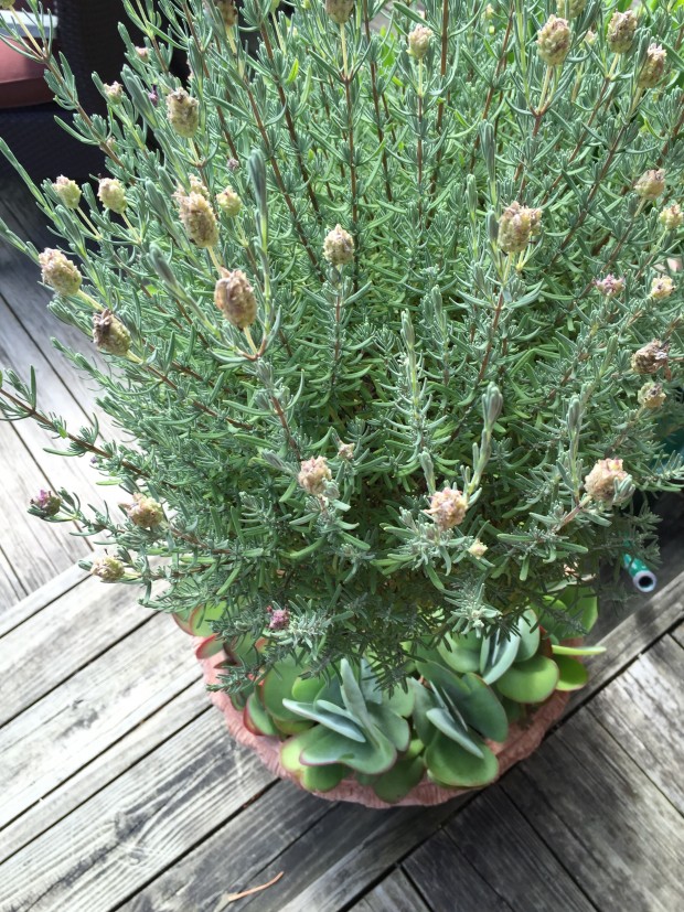
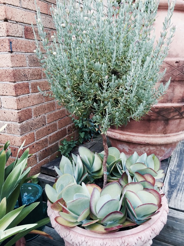 This overlay is called “instant”. I have no idea what that means. I chose it for this picture, as it enhanced the natural pale and muddy blue green of the lavender and the flapjack. The red edges of the flapjack are now a muted, muddy and moody terra cotta color. This overlay does not accurately depict the appearance of the plants the moment that I took the picture, but it accurately depicts how I see these plants.
 Seeing is not only about the optics of vision. How people see things is overlaid by many layers. History, experience, memory, desire-these are but 4 of 1004 factors that influence how any given person sees. No one sees optically. They see emotionally. That complex organism we know as a person sees like no other. For any designer, how they see is their most precious asset. Successfully communicating that seeing can forge an artist from a designer.
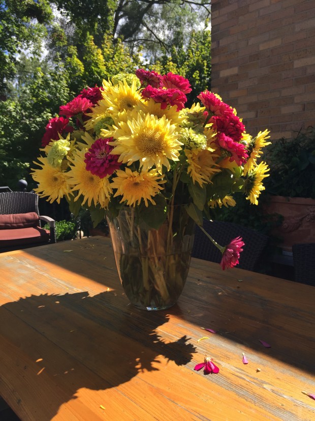 My IPhone recorded this arrangement of flowers on my sunny daytime deck based on numerous scientific calculations about how to handle the exposure in the best and most pleasing way possible.
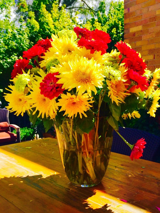 A chroma overlay, with a bright light overlay makes the saturation of the color more intense. This photograph is edited. I would guess that the editing would not read as well if the picture were printed. Computers are glorified light boxes. The light shines through the image, like those Kodak slides from 50 years ago. The intensity of the light is a pleasure to see.
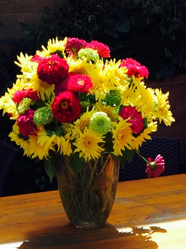 This overlay is even more intense, and dramatic. The photograph begins to have an aura about it.
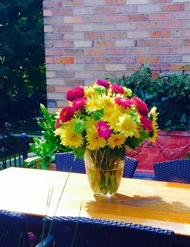 This sunny overlay saturates the color of my terra cotta pot. These pots are a pale peach, on a day with no overlays. Here, the color is on fire. The shadows on my brown chairs are blue. The pink and yellow flowers are brilliantly pink and blue. This edit is a happy edit. A high summer edit.
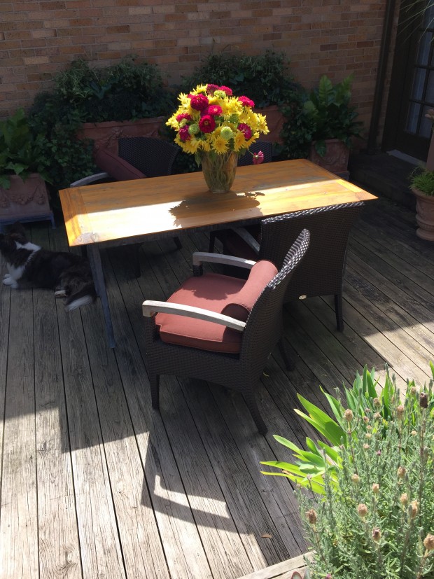 This picture is as the camera read it.
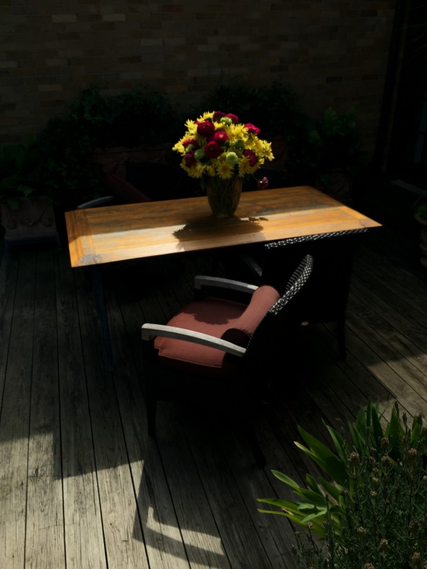 The same picture, edited, is an expression of how I felt, and what I truly saw, when I took this picture. How do I explain this in words? Nature is a vast and ultimately a most important stage. Everything of any consequence goes on there. I have great respect for the story that is to come when the lights dim. The light is drama in and of itself. The light and dark in a landscape-that relationship can be very dramatic.
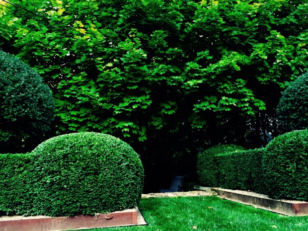 If you are a garden maker, all of the above is of critical importance. The composition. The editing. The plants arranged in a fresh or unexpected way. The design that is is subject to a series of overlays that describe the maker. I feel quite sure that if 100 landscape designers were asked to create a design for the same space, every design would be different. Distinctively different. A designer and client that share certain overlays are bound to produce a project of note. A great landscape rings true, and is emotionally sound.
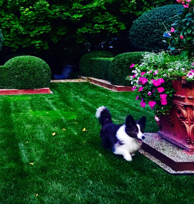 As for me, I like landscape designs that are simple, and saturated. Saturated with thoughtful composition.Saturated with shapes, color, textures, memories, events, and moments. I have not explained this very well, but that process by which gardeners create is loaded with mono, tonal, noir, chroma, fade, process, transfer and instant overlays. A life applied to a landscape design-would that every project I do would have this overlay. Adding some light, dark, and color to this mix we call design- it could be brilliant.