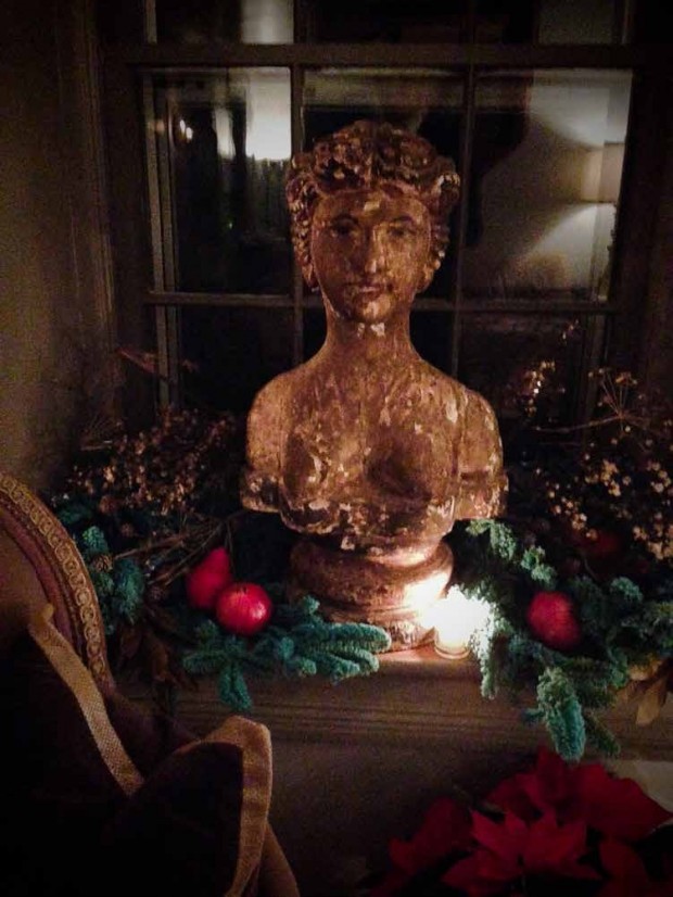
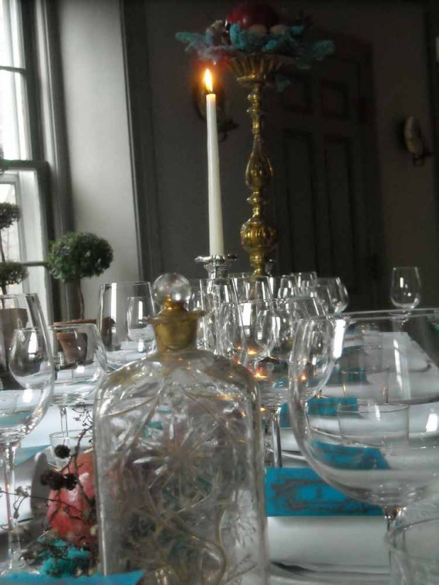
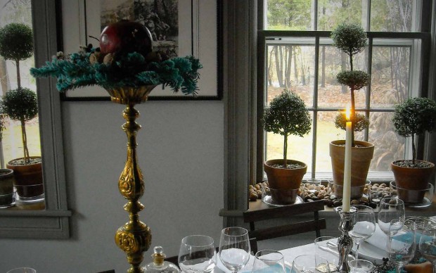
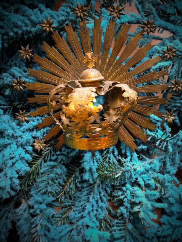
 For the past several years, I have posted pictures from a holiday dinner hosted every year by 2 very good friends. They both have careers in the arts and are keenly interested in design. They have a collection of ornaments amassed over a period of many years. They have strong ties to French art and design. All of this shows, whether the subject at hand is their collection of boxwood in pots, their perennial gardens, or their French style potager. Their holiday is ordinarily a very subtle and understated affair. This year’s table is a significant departure.
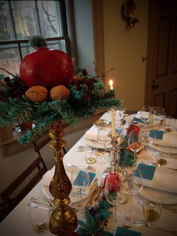
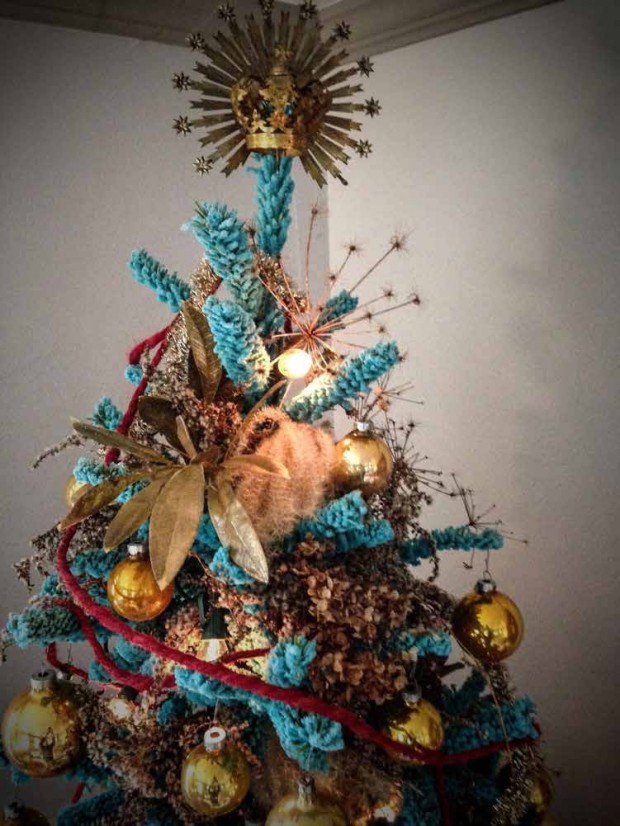 This holiday featured an unexpected turn of events. The French blue flocked tree around which they had planned their holiday was not available. By the time they ordered their tree, the color was sold out. With equal parts pique and nerve, they ordered a flocked tree in turquoise. M sent me a picture of the tree-I could not imagine what they would do with it. The color was very strong. Intensely turquoise. As they felt it was either a turquoise flocked tree, or a tree with no flock, they jumped in.
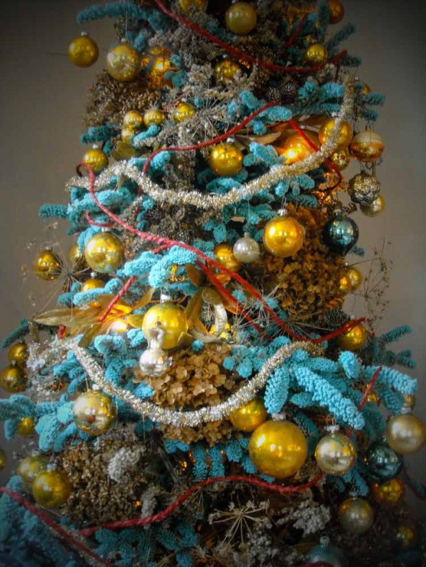 Once the initial shock of the color had worn off, I could see them both accepting, and later enjoying the challenge. They kept me updated, as the decorating process unfolded. My part in all of this? Being available to tell them I was sure what they did would be great. The design process always has those moments. A tree that dies, and leaves an attending shade garden exposed to full sun is a design challenge, as it is based on a circumstance that cannot be altered. The one boxwood or lavender that dies out mid-hedge, or an exceptionally cold winter that kills the roses back to the ground can present significant design challenges. Every gardener experiences moments like this.
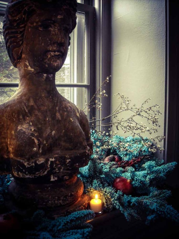
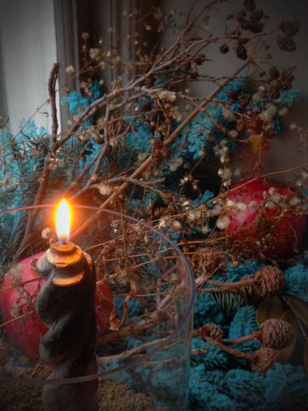
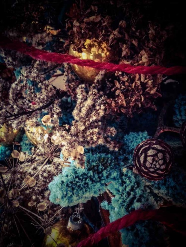
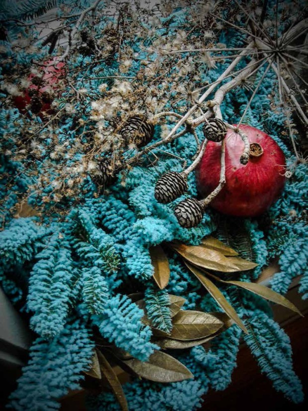
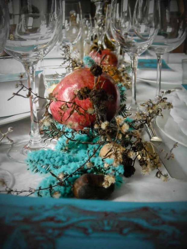
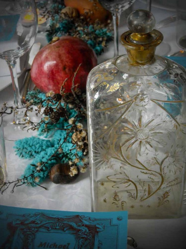
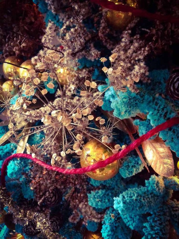 But the glory of their holiday is in what companion colors and materials they chose to make that turquoise look beautiful and deliberate. They harvested lots of weed seed heads, and hydrangeas from their garden. Those cream colored stems are intertwined, and float over that startling blue.
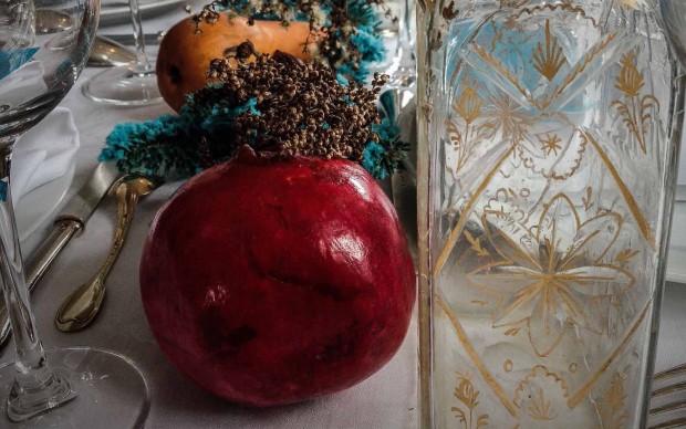
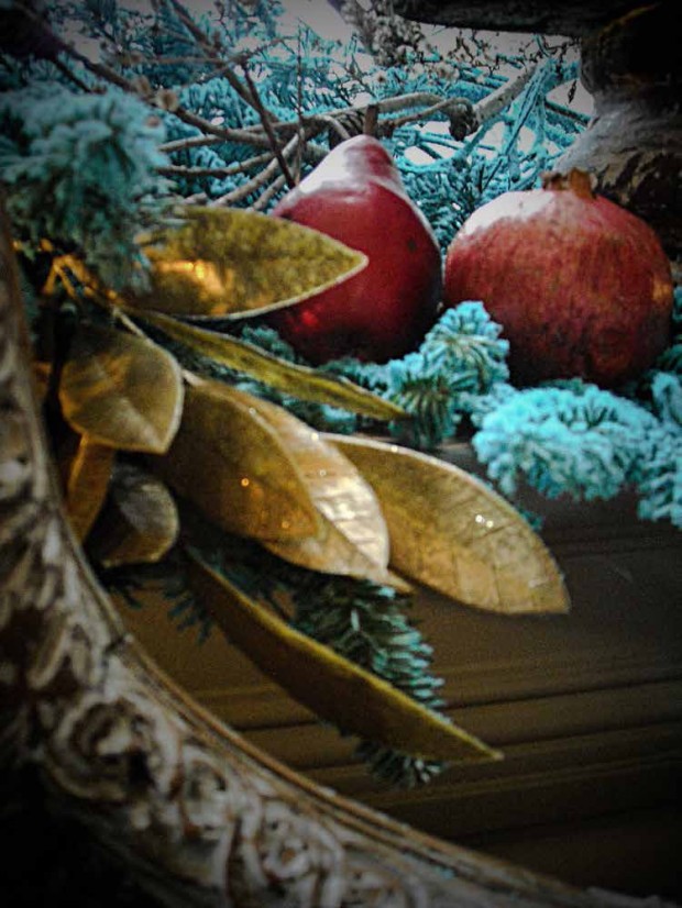
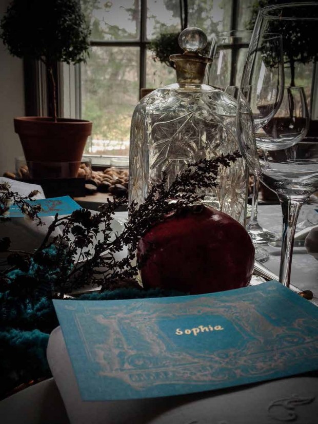
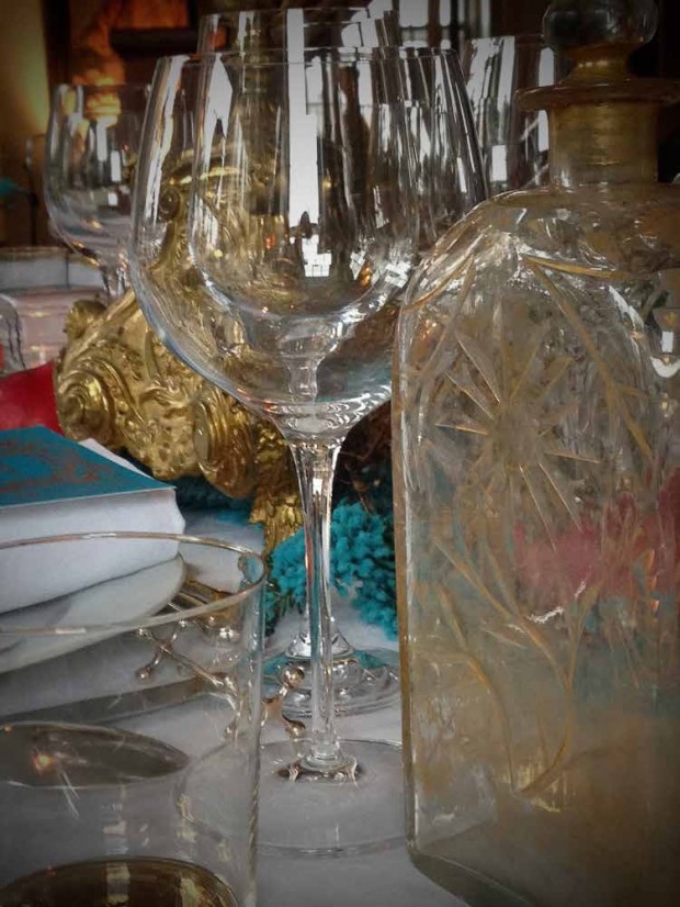
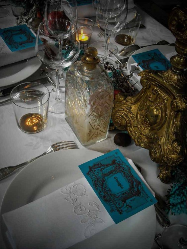
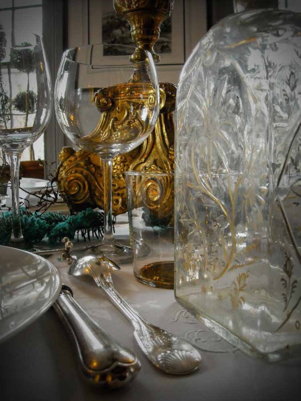
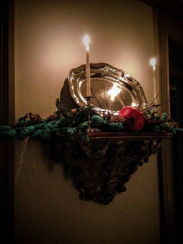 They used lots of red, as in pomegranate, and red amaryllis. I am not sure why red and turquoise is such a striking color combination, but here it is-with gold and cream as an intermediary. Big splashes of gold, and some silver added to the festivities. It was clear this design process was not drawn on paper, or completely imagined in advance. It was a process for which they both had patience. Do enjoy their pictures.
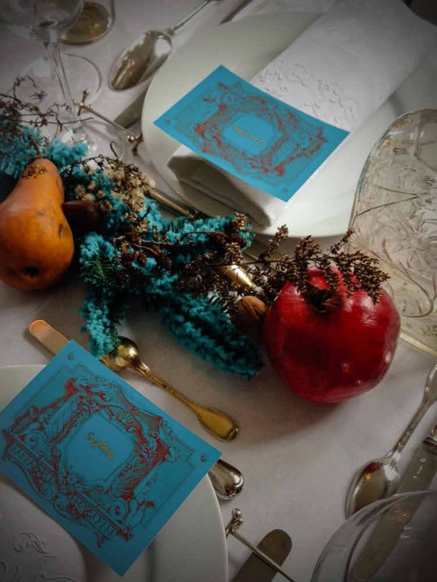 I thought their holiday was incredibly beautiful. Their willingness to take on an unexpected circumstance with energy and verve is equally as stunning. Taking chances with design-how I admire this.
