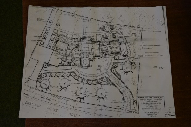
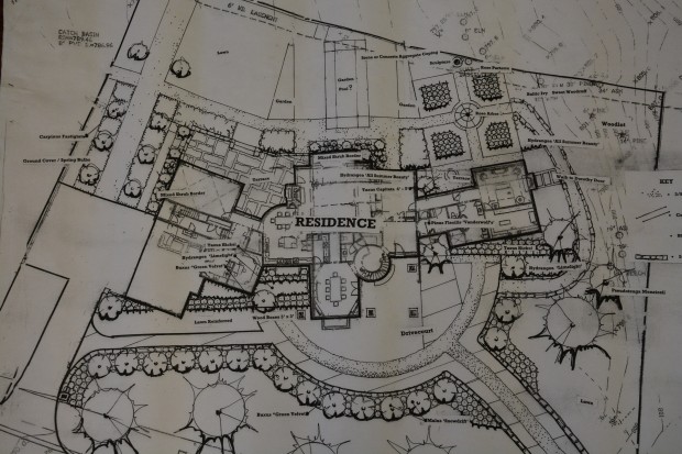
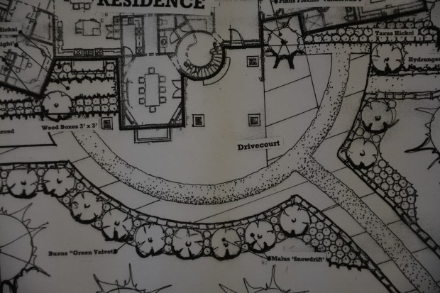
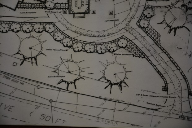
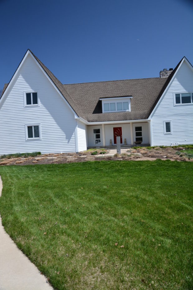
 A few years ago I made my first visit to a large rural property outside Ann Arbor. It was very early in the spring. My clients had built a house very much of their own design. My first impression? An American farmhouse with a decidedly contemporary twist. Plain, but plain in a visually strong way. Their property is especially large, given that they had also purchased the house and property next door when it became available. They do the lion’s share of the work it takes to keep up that landscape, spread out over a number of acres. The landscape of their outlying areas is graceful, generous, and unstudied. There is nothing self conscious about the placement of all of the trees, both evergreen and deciduous, that they have planted. They are good stewards of their land. They called to ask if I could sketch out a master plan for them. A design that would help make better sense of their love of their property, and their love of plants. They were particularly uncertain about how to handle the landscape near the house. My impression, driving up on this early April day? The front of the house featured the winter remains of ornamental grasses, and mulch-a still dormant garden. A landscape friendly to the architecture would provide this view of their house with some year round interest.
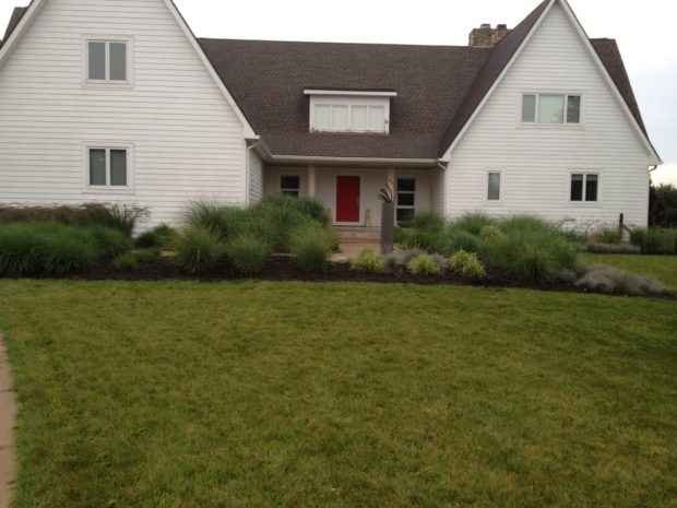 R. sent me this picture of the house in the summer. The front yard grade rose from the street, and rolled until it reached the grade of the house. Though the house was set crisply square and level, perfectly matching the horizon, the ground rolled right, dropped off. Rolling ground can be beautiful, but in this case, the ground falling away from left to right made the landscape fall off. A house needs to sit squarely and securely on level ground. One of my favorite places in my landscape is that spot where I might lie down, and feel the earth supporting me. The word foundation has numerous meanings, but that base upon which all else is imagined and constructed comes to mind. As a designer, I am very interested that a house have a flat and spacious ground plane that supports its mass. Right away I knew I would advise my clients to regrade, and add a retaining wall. Their collection of ornamental grasses is lovely, but they do not constitute a landscape. The texture and mass was beautiful in spots, and sparse in others. The tall and the short of it was that neither the grade nor the planting celebrated the geometry of the house.
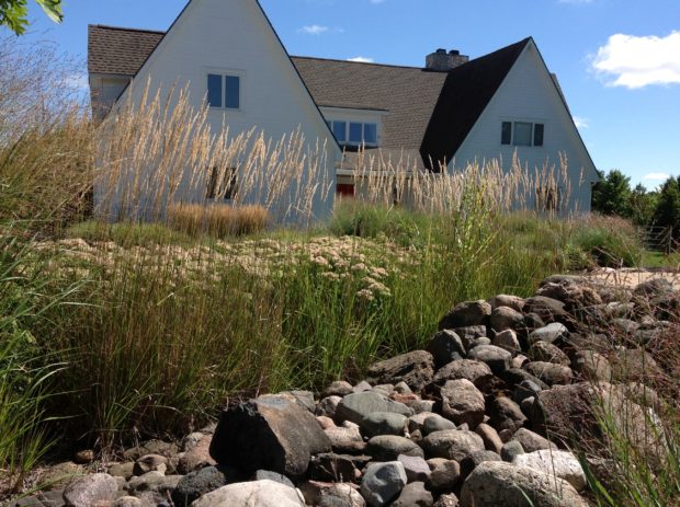 There were other places where those grasses shone. Further down and on the other side of the driveway, they softened the architecture. The interplay between the grasses and the rocks was quite lovely. But this view of the house is not part of the presentation of the house from the road. Ornamental grasses do not sprout until fairly late in the spring-sometimes as late as June in my zone. The house was without a landscape for too many months of the year.
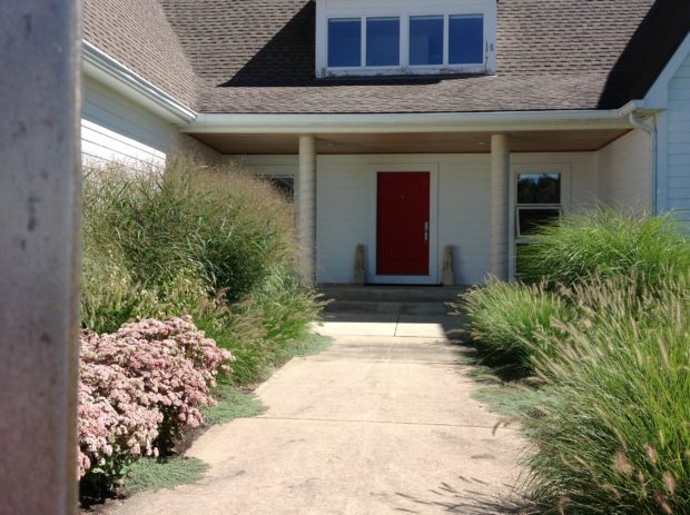 The garden attending the walk to the front door was chaotic, and overwhelming to the porch. This picture tells that story. My clients have a big love for ornamental grasses, but I feel they are best in masses of the same kind, and in open areas where they can get big, and wave in the breeze. A pond on another part of the property would be the perfect spot to transplant them.
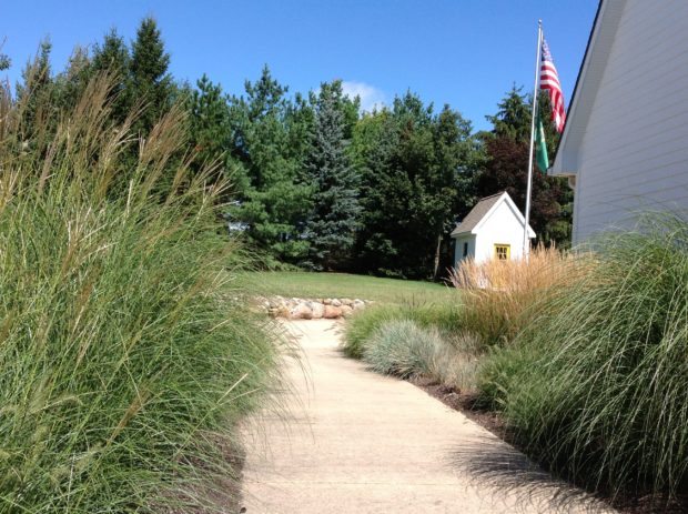 The walk from the front door back to the driveway was equally grassy. They obstructed the view out, and did not relate to the landscape on the far side of the drive.
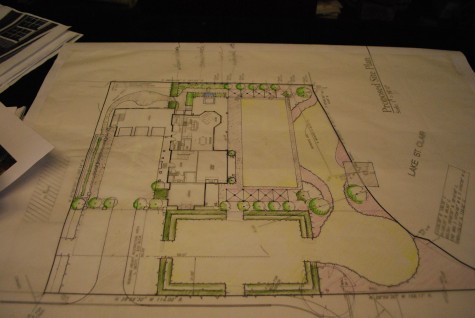
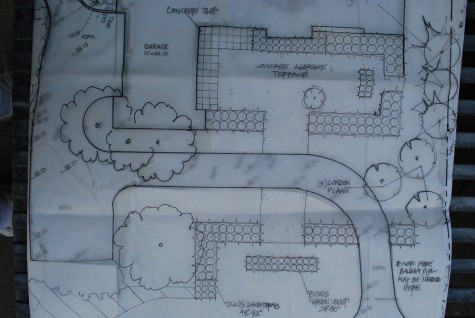
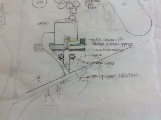 I did a sketch for them for a landscape that would keep the landscape at the front of the house green – all year round. It should be clear from this drawing that their driveway was centered on the house at the road, but angled sharply to the left on its way to the garage. This placement of the drive was of necessity. A raised septic field on left side of the drive made that area off limits for a drive. That angle made me think a landscape design featuring the horizontal dimension would be good. Sketched in pencil on the left side of the drive near the garage was an unspecified landscape feature, cut into the steep slope and boulder retaining wall constructed for the septic field. My clients like blue green foliage. The block of pinus flexilis “Joe Burke” to the far right would help to visually counter the steep slope away from the house. A hedge of dwarf Serbian spruce would traverse the entire front of the house, and continue to the drive. A rock retaining wall to level the ground in front would have a hedge of yucca filamentosa in front. Hydrangea Little Lime would provide a little relief to all of the evergreen elements. Given that my clients are hands on, and very involved in the design process, a rough sketch was all they needed.
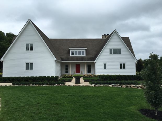 It proved very difficult to locate any dwarf Serbian spruce, so my clients substituted several rows of Hicks yews, faced down by a spreading yew “Everlow”. Their rock wall was constructed as a border until the ground dropped off sharply at the end. Planted above that rock wall, as a transition to the grass, is a hedge of Winter Gem boxwood. Just last weekend they came in and purchased a low and very wide steel bowl from Branch, set on top of a volcanic rock pillar.
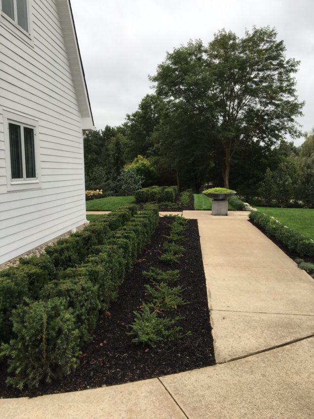 It will take some time for the plants to grow, but it is clear where this layered landscape is going. I especially like how the lawn panels have such a sculptural quality.
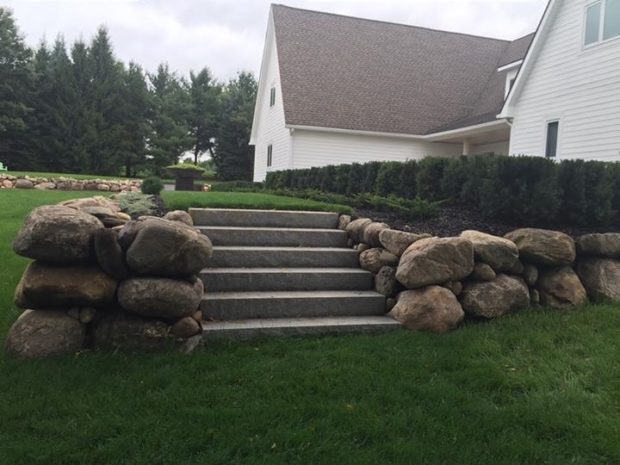 This view furthest from the driveway explains how dramatically the ground dropped away. A set of concrete stairs makes the side yard accessible from the front of the house.
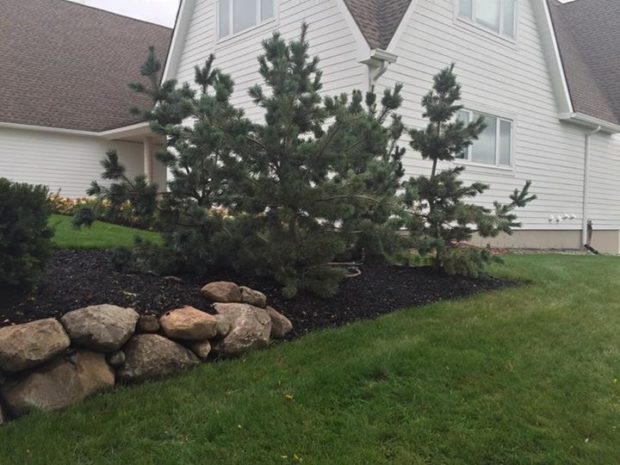 The flexible pines are planted as a block off the corner of the house. Eventually they will present as a single organism. They are doing a great job of visually holding up this corner of the house. The exposed foundation of the house is another clue as to how steep the drop in the grade truly is.
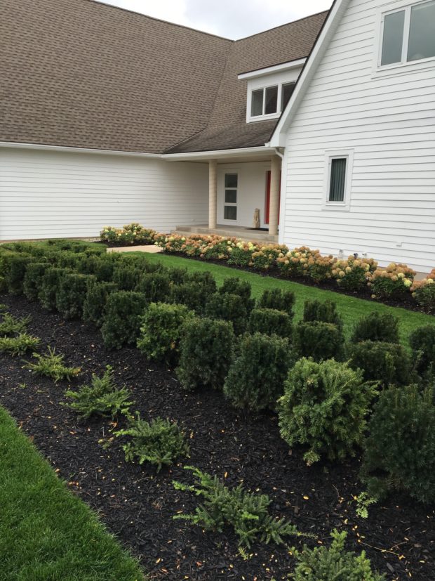 The Little Lime hydrangeas will greatly soften the architecture of the house.
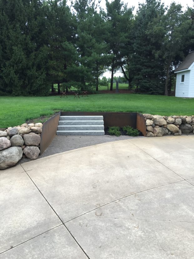 My clients did a great job of creating a landscape feature on the far side of the drive. It made such great sense to put a staircase in that permits access to that upper level. The steel retaining wall is an interesting contrast to the massive boulder wall. I see they have some sculpture set on that upper level. Someday they might break through the evergreen hedge that separates their property from the property they just purchased. That view has a lot of possibilities. It is particularly satisfying when a client takes a sketch and turns it into a landscape all their own.
