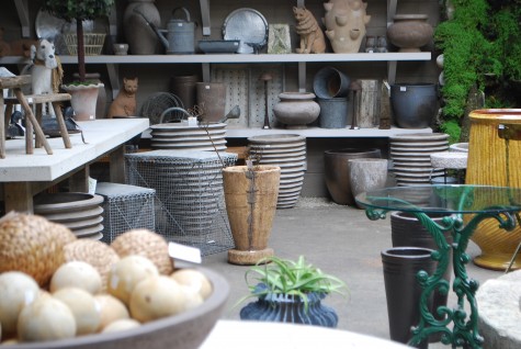
 My last post ended with this picture; lots has happened with this space in the past two days. I am standing in the entrance to my glass/greenhouse space; the camera frames what I see from the doorway. I have tried to arrange everything such that the view of the back wall is framed by objects in the mid ground space. This makes for an invitation to enter the space, and explore. I have combined objects with a vintage, and contemporary feeling on the shelves; I like how they work together. A shelf has height and depth-I try to take advantage of both. Some objects are parallel to the back wall, some objects come forward in the space. The cats and dog are great in this space; they make eye contact, and say hello. Three objects-the glass bistro table with the painted green iron base, the yellow Anduze pot, and the contemporary carved wood vase-attract the eye, as they are much different than the predominant color scheme. It’s only natural that your eye would focus on that which is different. Moving from one of these objects to another constitutes engagement. If you can move a viewer to interact with a space, they will take the time to see what you have going on there. If the spaces are confusing and disorganized, a viewer will opt out, see little, pass by.
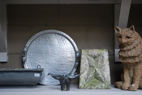 Objects that contrast but still harmonize in shape, size and color make good companions. Always with a vignette I am making a suggestion about what I think would look good together. At the very least, a well organized space can help another person to organize their thoughts about what does not appeal to them. Some are gifted with the ability to see in spite of chaos. I think this quality helps to make Rob the buyer that he is. He can spot the one item in a mountain of stuff that has the potential to endow a garden. He has the ability to focus on an object and not be disturbed or distracted by its environment.
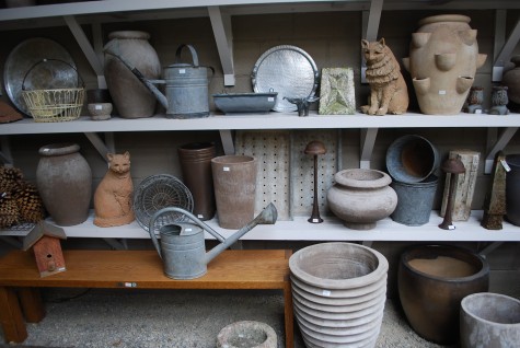 Shelves are rigid and confined structures, but that does not mean that what goes on them needs to be visually confined. Up and down, in and out, what is an unexpected, what is repeated-all of this goes towards engaging the eye. The little primitive wood birdhouse clearly needs a better spot-it looks lost, does it not? The oak bench needs enough of its top available to see, and to test out.
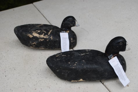 Really special objects ask for a place for the eye to stop and rest. These balsa wood decoys of mud hens date back to the early 20th century-the dealer thought they came from the Maumee Valley of Ohio. Though diminiutive in size, and somber in color, they are quite beautiful sculptures. They deserve a thorough look and see, so I placed them to reflect how I feel about them.
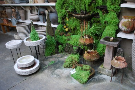 Our wall fountain, encrusted with shells, baby tears and moss attracts a lot of attention. I like for people to be able to walk right up to it. A collection of pots that readily moss up, and granite bird baths of various sizes make sense in this context. The old English stone birdbath stands out, as it is so different in period and shape. Any small subtle object benefits from a placement that draws attention to it.
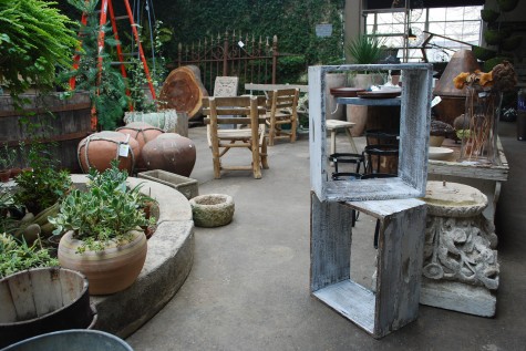
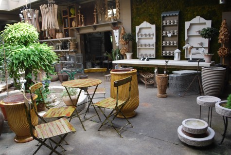
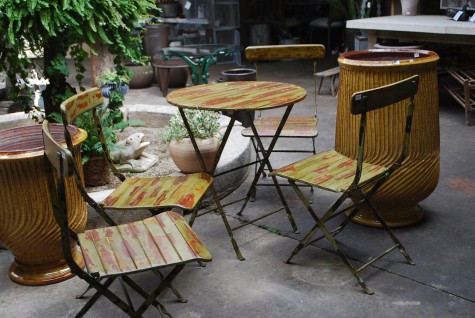 The wood bistro set with matching chairs gets a big boost from the yellow French strie pots. The colors of both harmonize in a very strong way. There is a visual reference between the slat stripes and the clay stripes, that is more subtle than the color relationship, but it is pleasing. Sometimes a client will say they are inspired by something. I would say if an object and its placement triggers some response, for good or for ill, the vignette is working. I am never bothered by anyone saying they do not like something. I am much more bothered by an arrangement people ignore, or walk by.
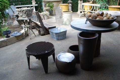 I have moved the washing machine base table away from the wood topped tree trunk table, but kept them associated. The blue galvanized wash bucket across the way echoes the pale blue wash of the big table top, and its galvanized metal edge. A vintage aluminum tray puts a grey metal object on both sides of the aisle. That shiny object draws attention to a group of objects that are dark. The volumes and shapes are simple and friendly to one another. Any objects I would hesitate to put together in my own yard, I would not put together here.
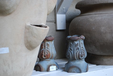 As much as I love the shapes that plants create in a landscape, I love the shapes of all manner of objects. I try to display each-from the smallest to the largest-in a way that communicates my interest in good design. There are so many beautiful things that would not work or be appropriate in my garden, but taking care with their placement is a sign of appreciation for the object, its maker, its history, and its use.
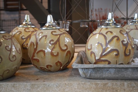
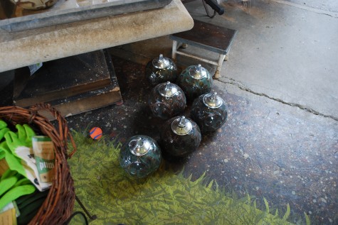 Some landscapes appear and feel spacious for no more complicated a reason than they exist on large properties. The Chicago Botanic Garden has many beautiful long views, as it physically sits on 360 some odd acres. How I visually process space has to do with what is called perspective. If I walk in the Botanic garden, and Daffodil Island is in bloom, the daffodils appear to my eye like tiny yellow dots-and lots of them. Daffodils physically measure up at a fairly decent size, but they appear smaller and smaller, the further away they are from my eye. The position of the eye, relative to an object-perspective. The most dramatic illustration of perspective? Picture yourself 5 feet from the KLM 747 Anna Pavlova; the size is overwhelming. A city with wings. 230 feet long, and wings 200 feet wide-my entire property would hold a quarter of this plane. Only moments after that plane is aloft, it appears as a black speck streaking towards the horizon. Once a black speck, I know it is miles from my eye. These Anamese oil lamps pictured above are on the floor beneath me-I know this, as I am looking at their tops. They are also 10 feet away from my eye.
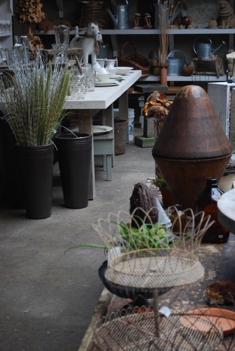
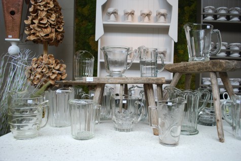 I am in the process of putting the shop back together, as we reopen for the 2010 season next week. The logistics of this has been a little daunting, as my on my feet time is somewhat limited yet. Luckily my four wheeler has a seat-so I can take a break. This puts my eye at dining table height. The table and pitchers loom large in the foreground space. The exaggeration of the size of the foreground elements moves the background even further back.
 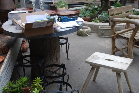 Varying the heights and sizes of the foreground elements helps to give the foreground itself dimension. The visual path your eye takes from one object to the next reveals that each object is in a different plane. A recognition of multiple planes makes for the illusion of space. This is after all, a flat object we call a photograph. But visual space is represented here.
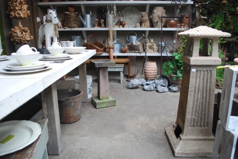 The position and direction of the concrete table in this composition moves the eye into the deep space of the photograph. The table is so wide in the foreground, it runs off the edge of the page. The table width appears much smaller, as the table appears to move back in space. The large masses of table, and lighthouse contrast with the objects on the back wall that appear so small.
 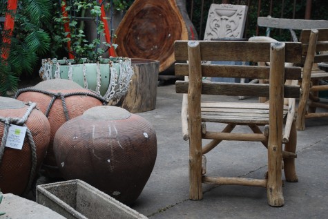 Not every bench in a landscape needs to be placed at the end of a garden. Placed at the beginning, with its back to your eye, the sense of space from front to back is exaggerated. The bench back is like a fence-enclosing the space beyond.
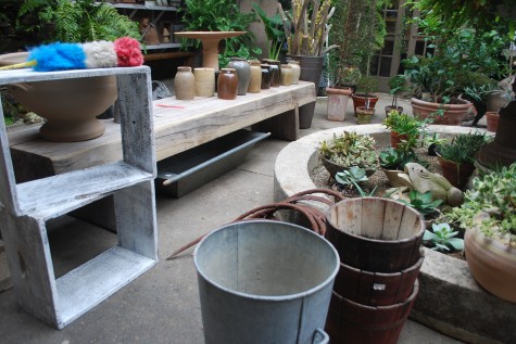 It is important in any composition to direct the eye of the viewer from the front to the back-and out again. The white wood rectangle in this picture frames a view of the foreground appearance of this bench. The frame invites the viewer to focus on what is within the frame. The bench then appears to go back in space-quickly. In the far background-a pair of doors suggesting another space beyond.