Paint is one of the most versatile and accessible of any decorative material. Though cave paintings were done centuries ago, the first patent in the US for paint available in a can was granted in 1867. Early paint was composed of many different materials and colorants, suspended in a medium which would make the color brushable. Vintage painted steel and wood garden furniture is readily available-in various states of disrepair. Old, chipped, and weather worn paint on a garden bench can be charming. A fresh coat of paint can dramatically alter the appearance of a house, or shed. Old style adirondacks chairs with original paint are always in demand. Old chairs repainted in vivid colors are visually invigorating. Paint types and formulas are available for every surface and situation imaginable. Some day I would like to try Annie’s chalk paint ( http://www.anniesloan.com/index.html ) both inside and out. The surface sounds beautiful, and it can be used inside and out. No matter the circumstance, I use Porter Paint. It is a favorite brand of sign painters. In my opinion, it resists cracking, fading, and peeling better than any other paint I have used. The exterior Acrishield is 100% acrylic paint-not latex paint. We use this on any exterior surface we want to paint. Porter Paint is made in Pennsylvania, and is not always easy to find, but amazingly, it is available in my neighborhood ( http://www.pontiacpaint.com/). Paint is a relatively inexpensive decorating material with one caveat. What was once painted will eventually need to be repainted. Is that so bad?
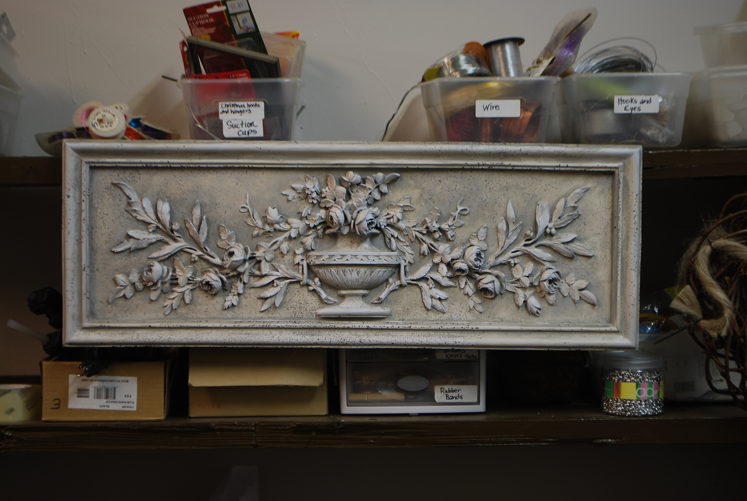
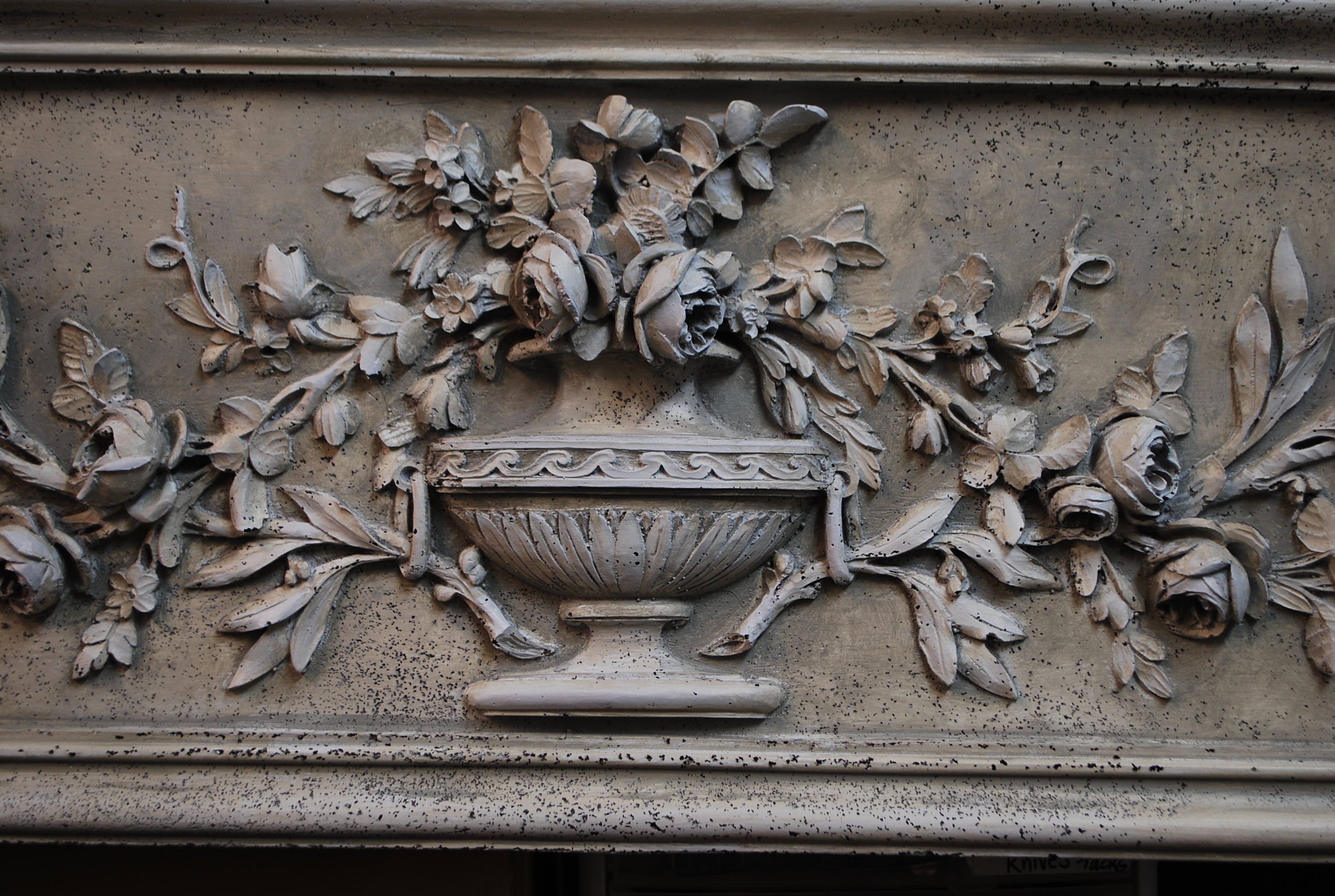
Rob and I bought a small collection of fiberglas garden ornament which was delivered late last week. Though we had a lengthy discussion about the finish with the rep, I was not happy with what got delivered. Fiberglas is a friendly material, in that it is impervious to weather, and light weight. But it is by no means a natural material. If I have to have fiberglas, I like it to look like fiberglas. Fiberglas finished to look like something it is not-just saying. The plaque pictured above had been spray painted the most horrifying shade of dead white imaginable. I knew I had to paint it. A dear friend had just introduced me to hand screened en grisaille wallpaper-meaning wallpaper that is all shades of gray from black to white. Those gray landscapes have been on my mind. I bought 4 quarts of Porter exterior paint, and went to work. What is pictured above-the finish. It is by no means a great work of decorative art, but this painted surface is much easier on the eye than what was.
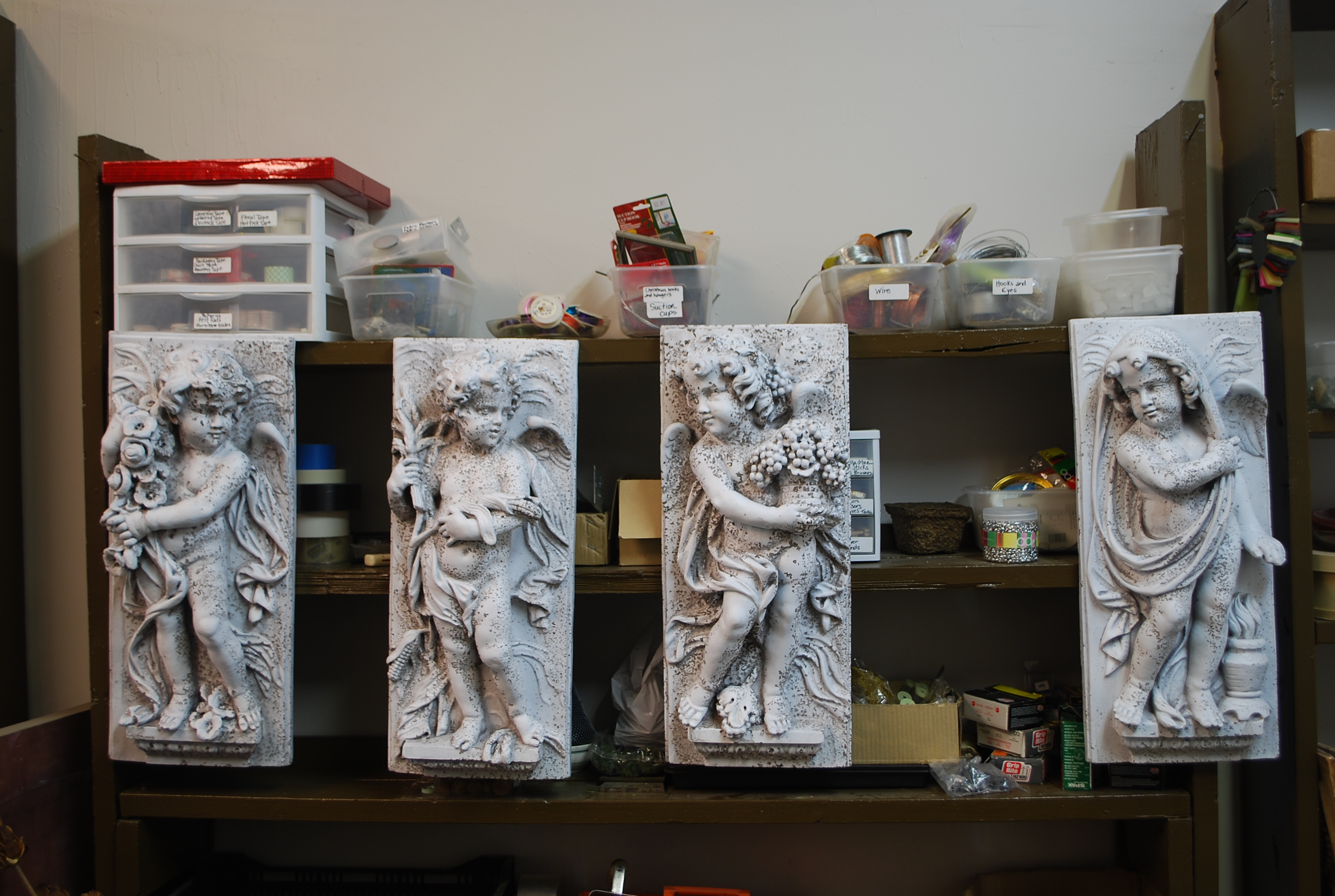
This set of wall hangings depicting a classical interpretation of the four seasons-not so great looking. The white is harsh. The pits in the surface of the fiberglas, even more harsh. Beautiful white painted surfaces outdoors can be difficult to achieve. A very stark architectural white that is fresh and airy on an indoor surface can be strident and off putting outdoors. Toxic white I call it, as no one seems to warm up to it. White outdoors is always warmed by the quality of natural light. This flat and unnatural white made me squint.
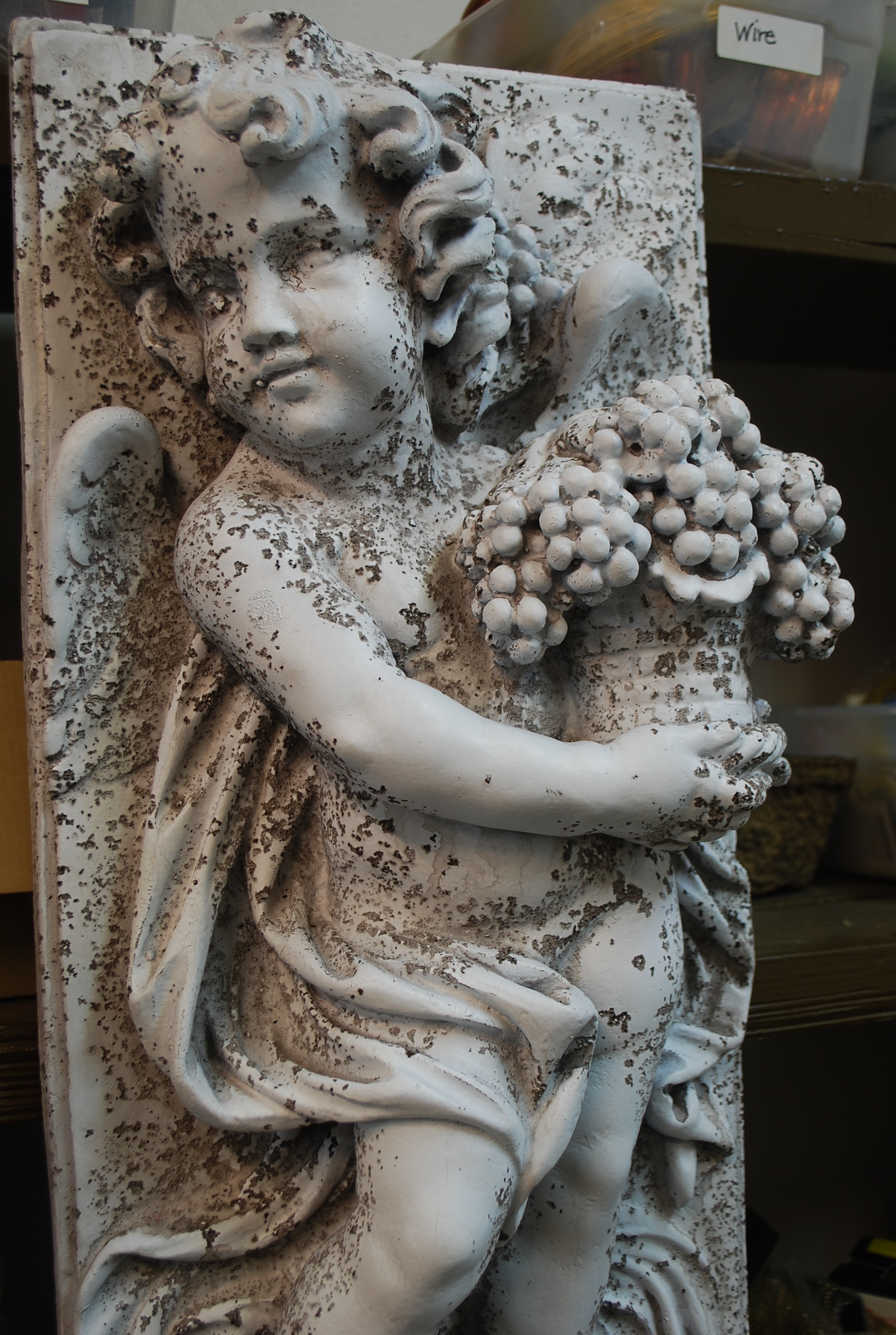
Buck tells me that cast concrete which is not vibrated sufficiently develops what is known as bug holes. The air which produces this pitting has not been vibrated out of the mix. I am sure these fiberglas bug holes were deliberate. This was an effort to make brand new molded fiberglas look like aged stone. I am sure it is as unconvincing a surface to you as it is to me. The pits were sprayed with a very dark stain.
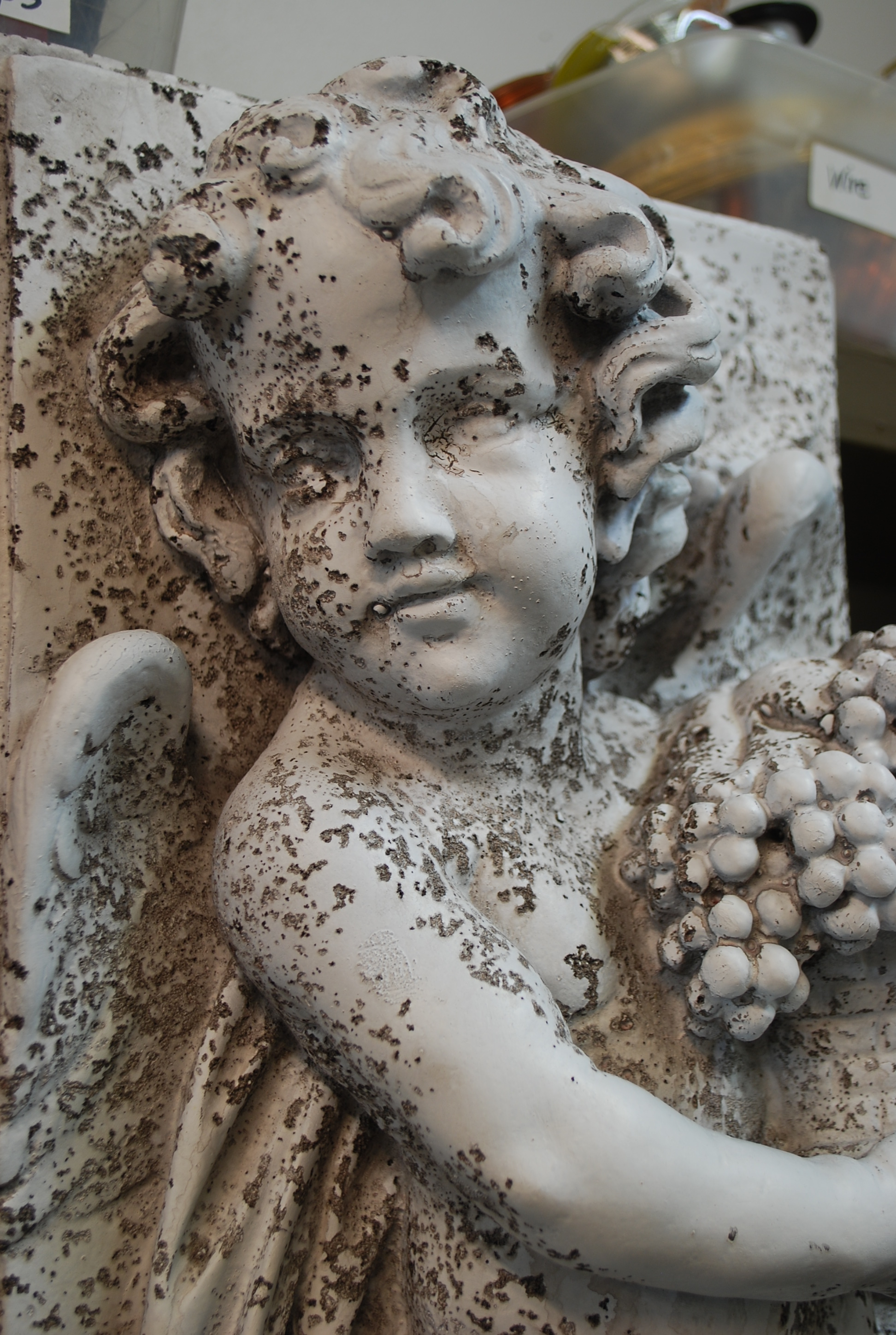
This pitting is not so attractive. After all, cherubs are supposed to look sweet, or devilish-not scary. The runny nose look-not my favorite.

The pitted areas would have been much more effective, has they been confined to the shadow areas. A base coat of Porter exterior satin paint filled in the worst of them.
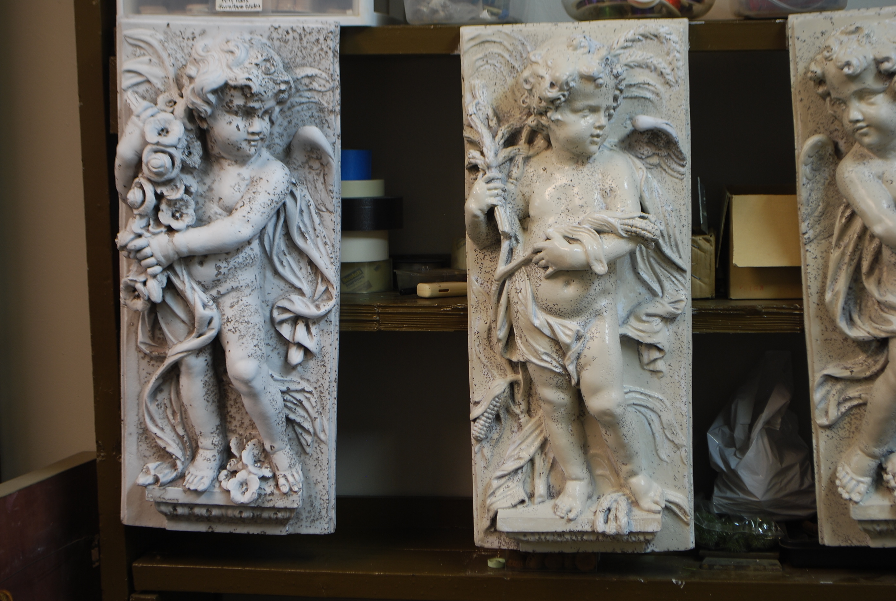
The figure of the summer season on the far left in its original state shows how some ornament for the garden can be vastly improved in appearance with a little paint.

The annotated collection is much more to my liking. After the base coat, I used a slightly darker color in the shadows, and a slightly lighter color on those surfaces closest to my eye. A little paint can go a long way towards improving the looks of anything it touches. The best part? If a first effort or color doesn’t work, there’s always the option to try again.
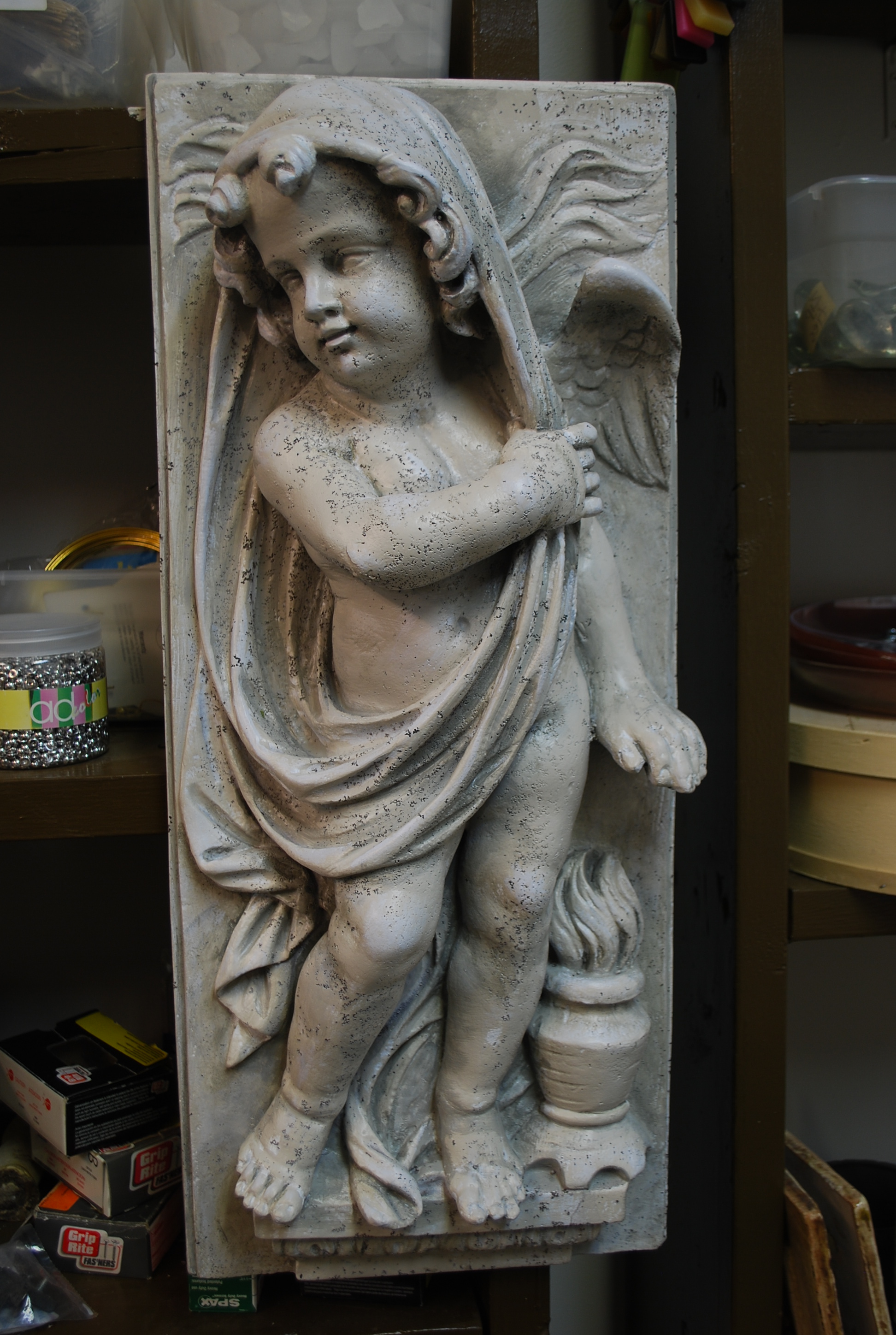
Though I would touch the surface of an antique or lovely vintage ornament for the garden, a little paint can go a long way.


