Client’s routinely ask me for things I would never think of. That is just one of a hundred reasons why I like having clients. People know what they like, and they will tell you, if you ask the right questions. This client is hosting a holiday event tomorrow. She called me well in advance to discuss what work she wanted done. I have done winter pots for her for quite some time-since we installed the landscape and gardens at her new house. But a request for a special holiday installation was not part of our history. After some discussion, I still felt unsure. So I asked if she had a color scheme in mind. That question produced a lengthy reply that did not surprise me a bit. She had a color scheme in mind. Loved that!!!
 A discussion of color is a bridge upon which a designer and client can meet. Most people have strong feelings about color. I admit to it myself. Certain colors attract me-others leave me cold. Some colors are not so swell on their own, but in combination with another color-all of a sudden there is an idea brewing. Most gardeners are big fans of green. But some like green with white. Others like green with yellow orange and red. Still others like their green limey, with a side of pale lavender or purple. There are infinite variations in color, if you consider all of the possible tones and shades. A client who speaks to a color scheme is a gift to this designer.
 Make no mistake, I have more than my fair share of spectacular misses, trying to read what a client will like. Most landscape design projects are forgiving of what I miss. A landscape project takes place over a long period of time. Mistakes can be corrected. A point of view can be tuned up before the installation. A holiday installation is a brief moment in the gardening year. I take special pains to be sure I am on the right track.
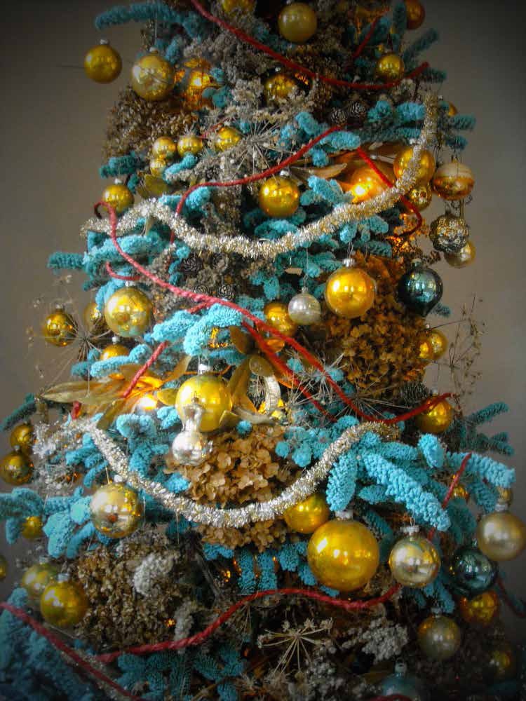
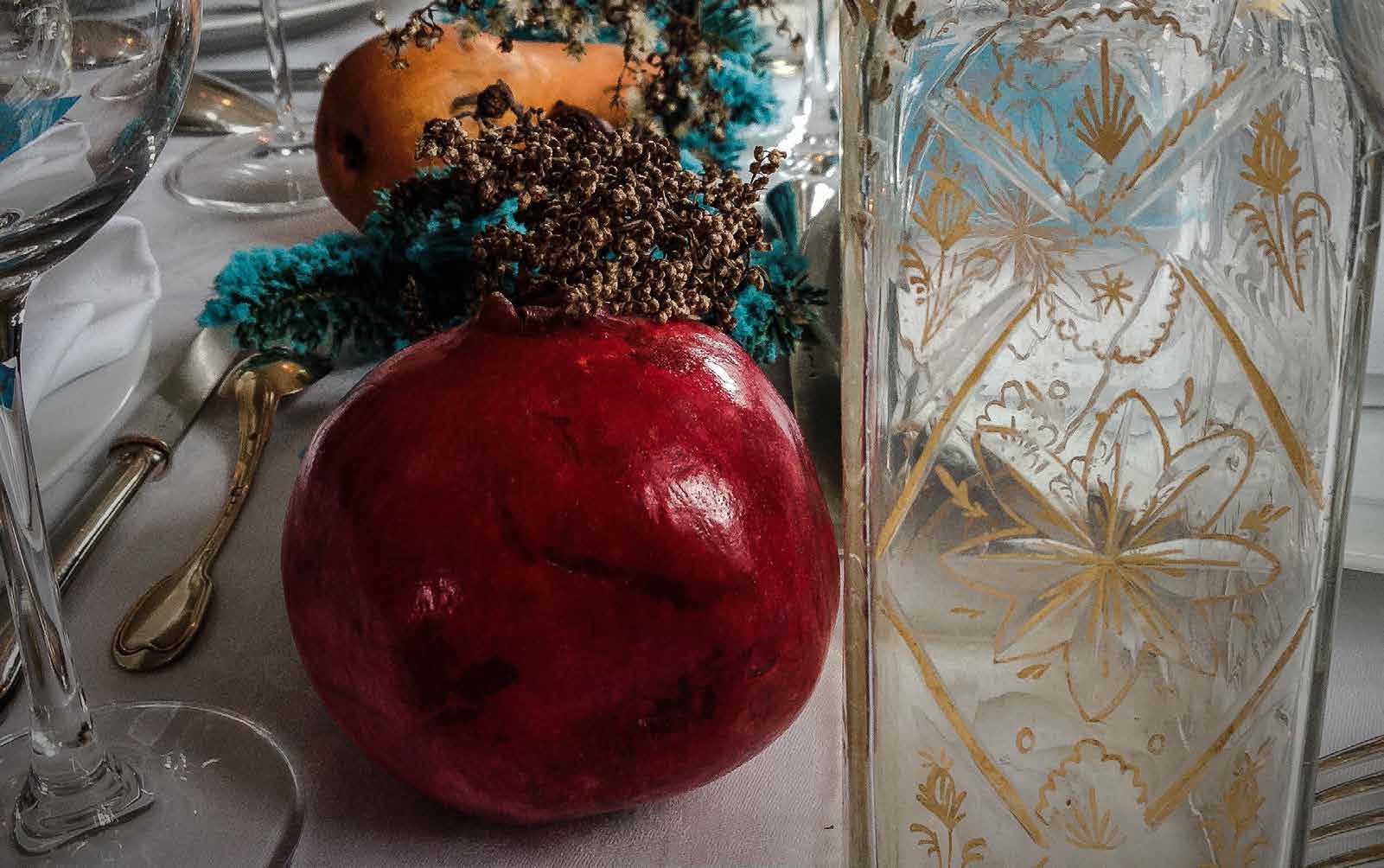
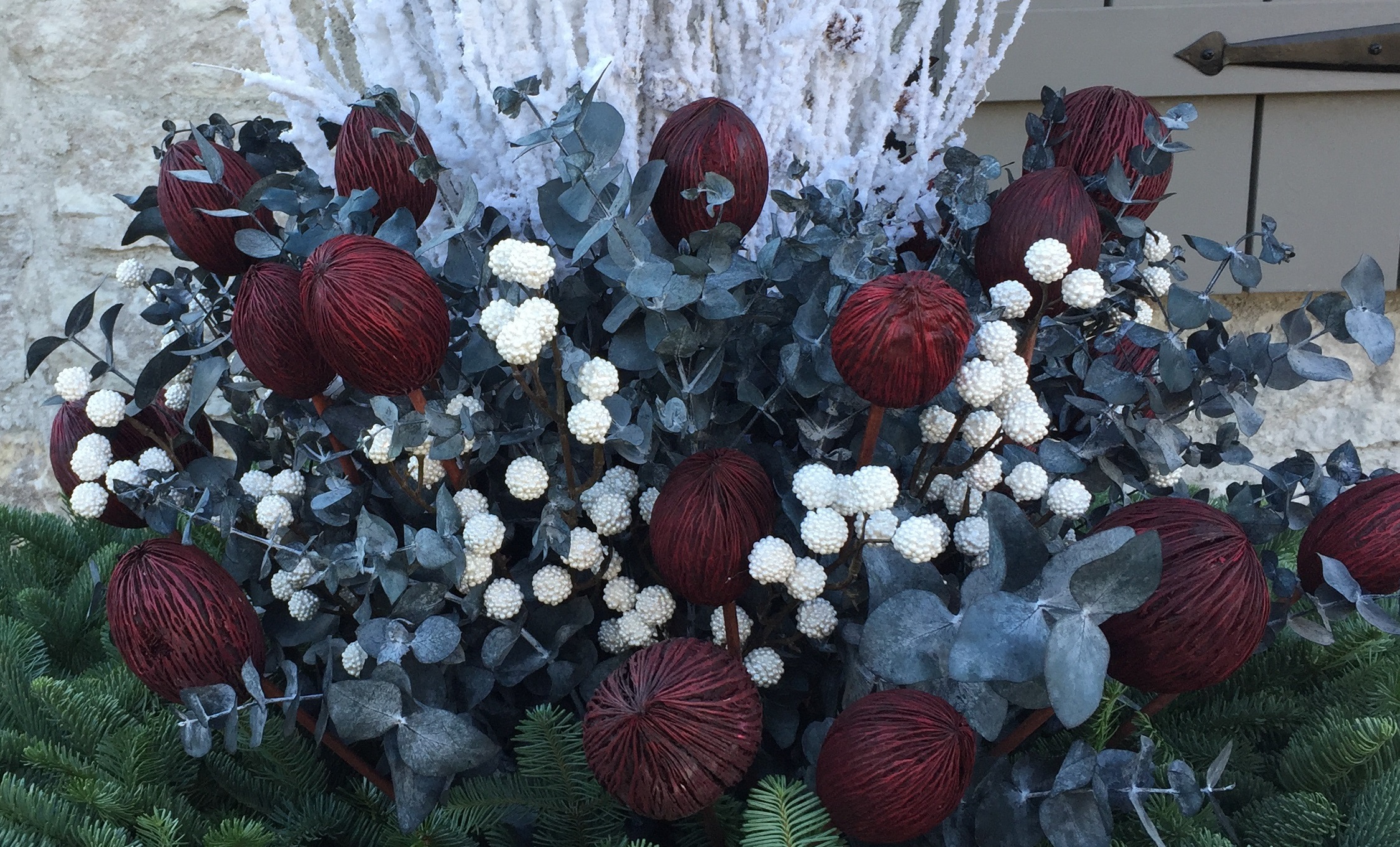
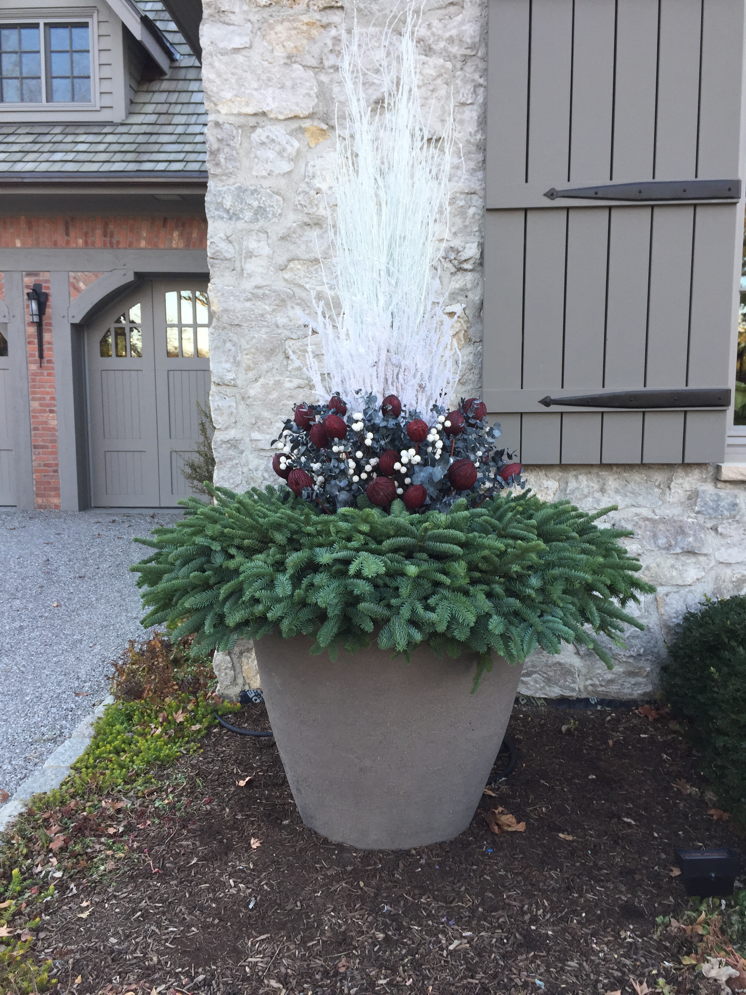
 The question about color proved to be a good question. My client was sure that she wanted a gray and white holiday outdoors, with some accents of maroon or claret red. I was surprised, and intrigued. Rob sees to my having an ocean of materials available to me-thank you Rob. Once I started scouting the materials we had that available, I was able to put together a palette of materials that I thought would satisfy her request.
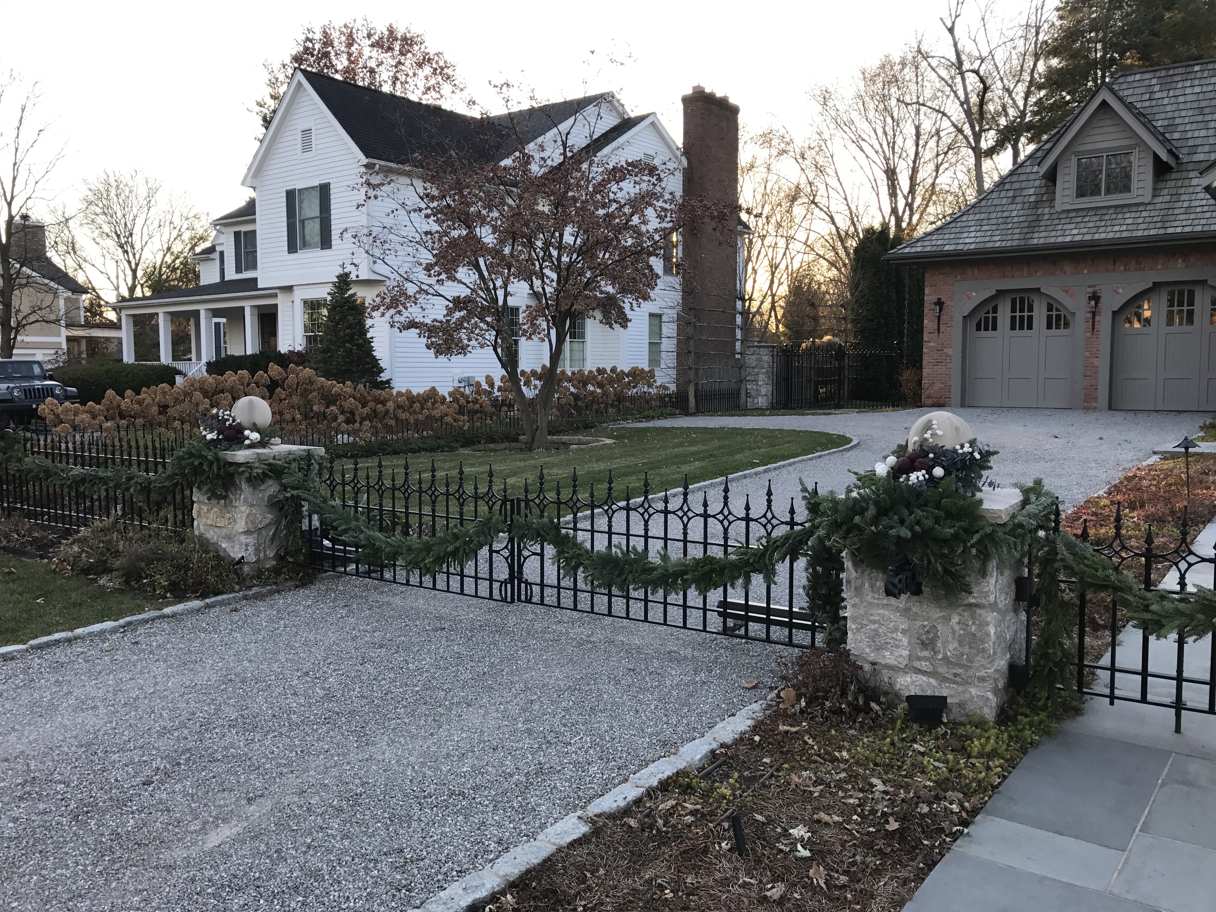
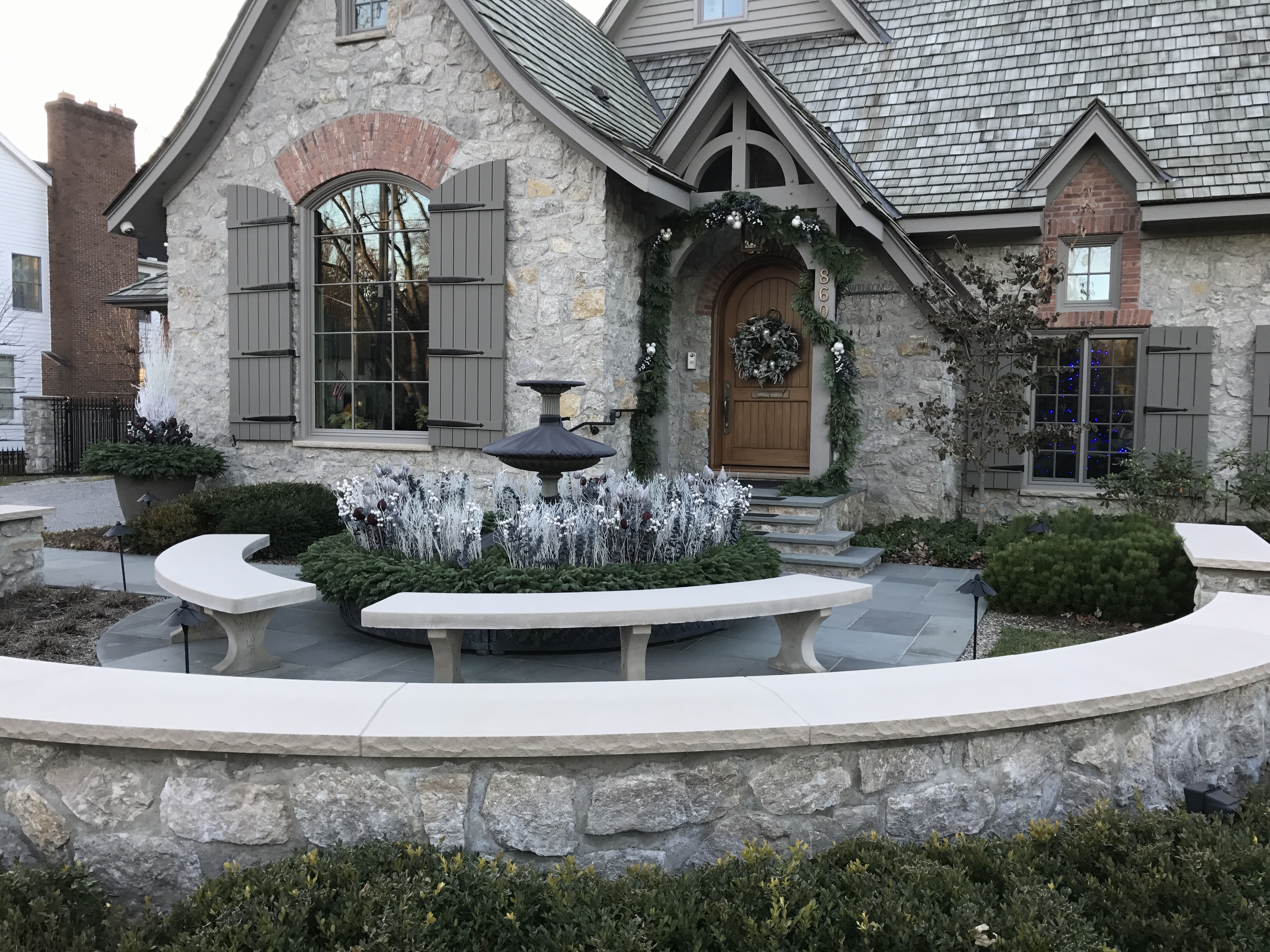
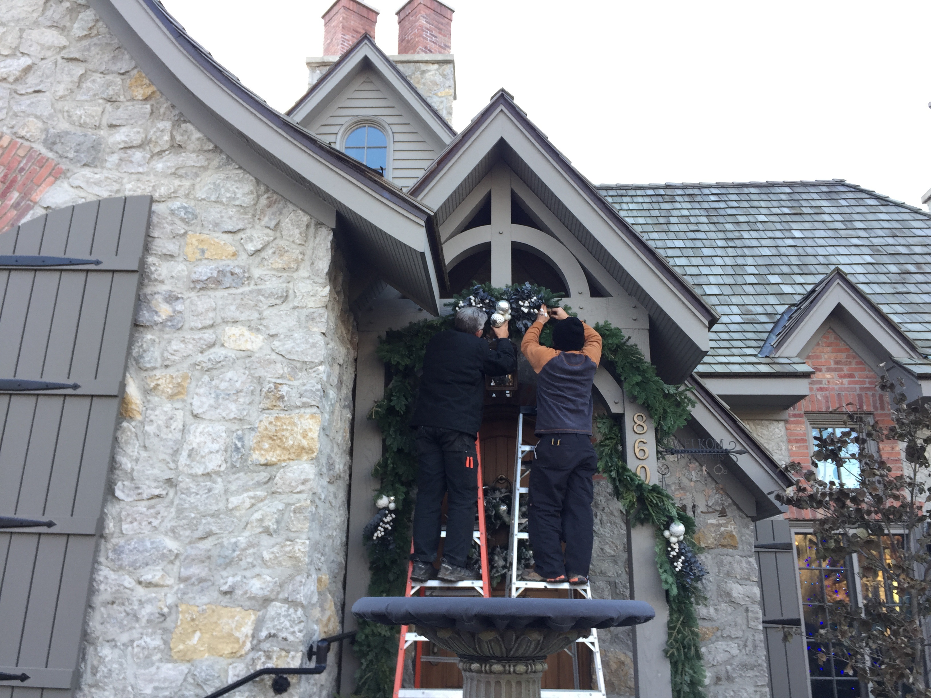 The installation yesterday involved garland on her low fencing out front, and her gates. We spent a good deal of time hanging a garland over the entrance to the front door.
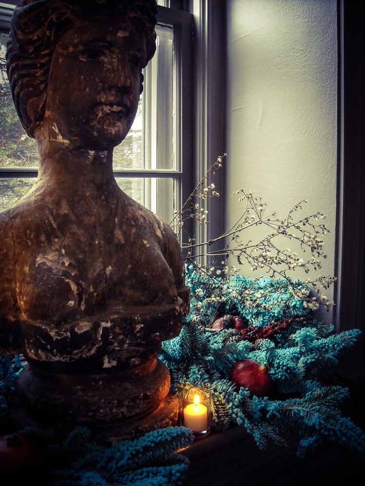
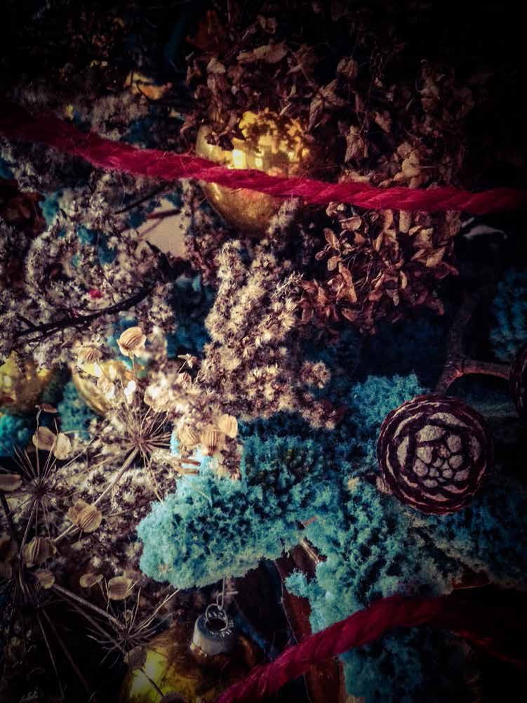
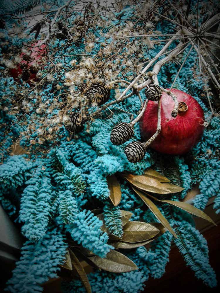
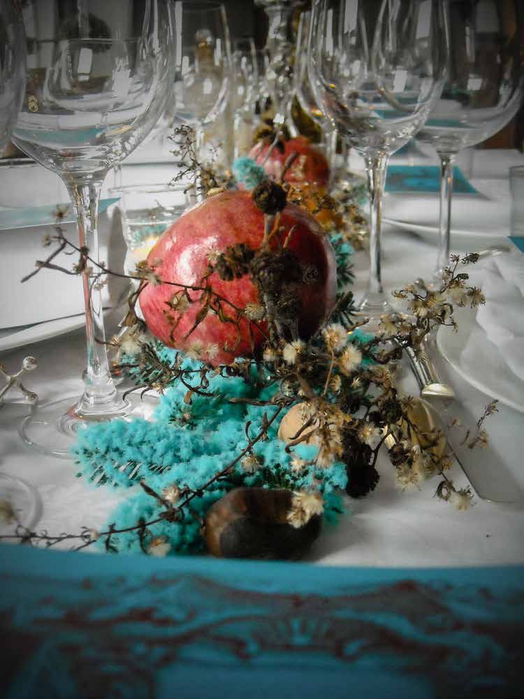
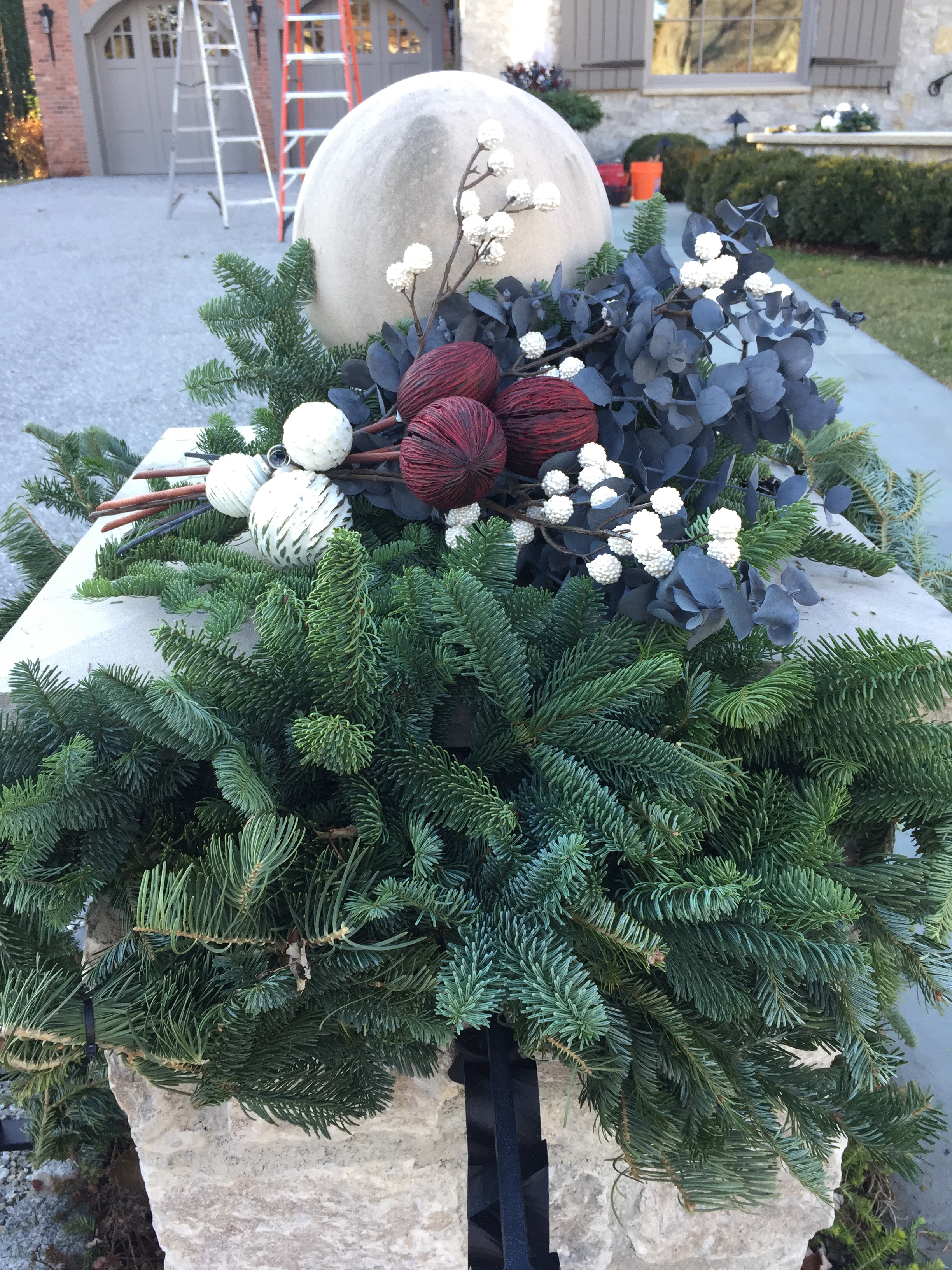
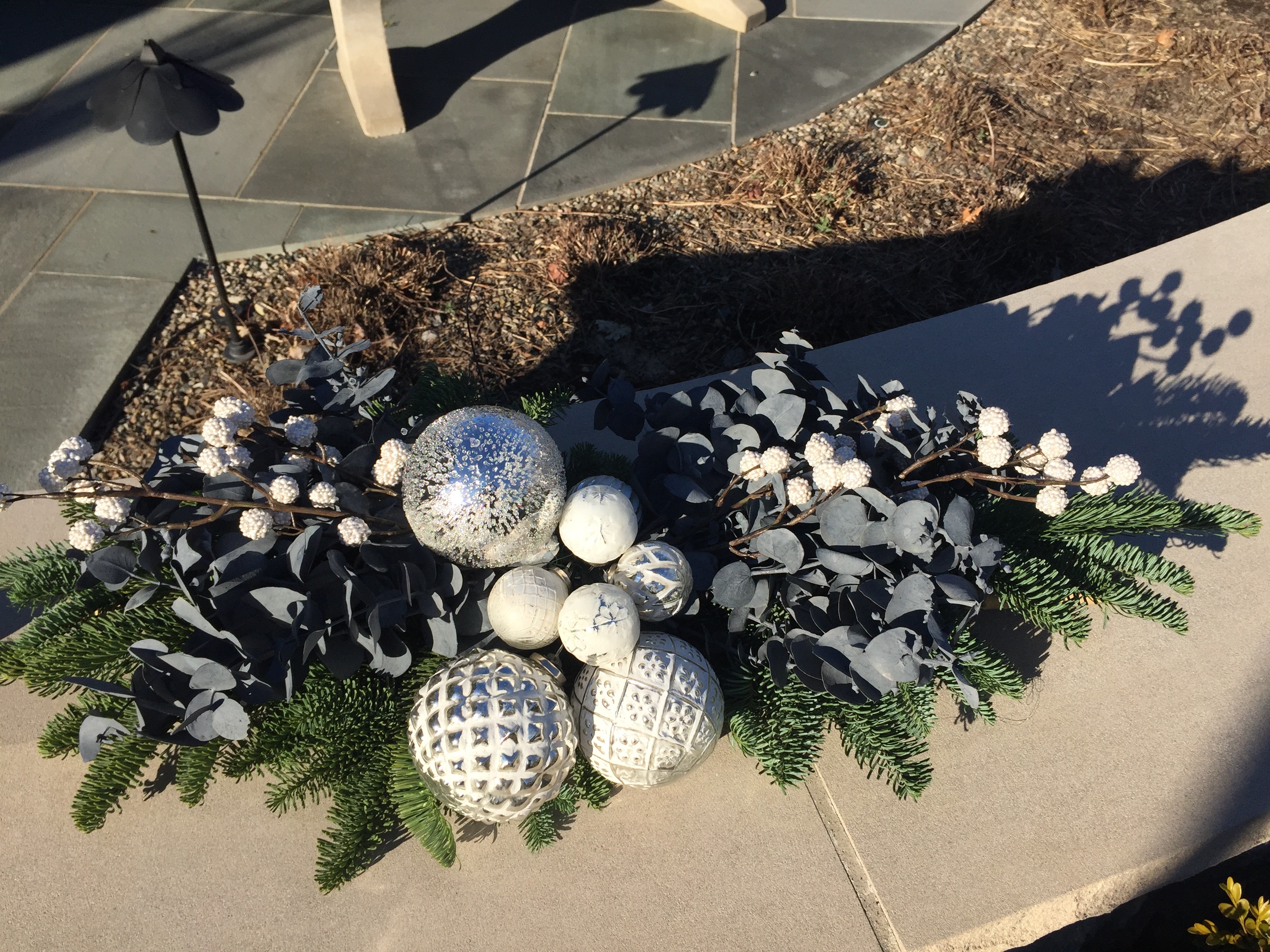 Gray and white, in a number of different forms and materials, would play a prominent role in the creation of the holiday and winter arrangements in a singular large stoneware pot, the planters surrounding her fountain.
 We took particular care to hang the heavy garland with zip ties and wires.
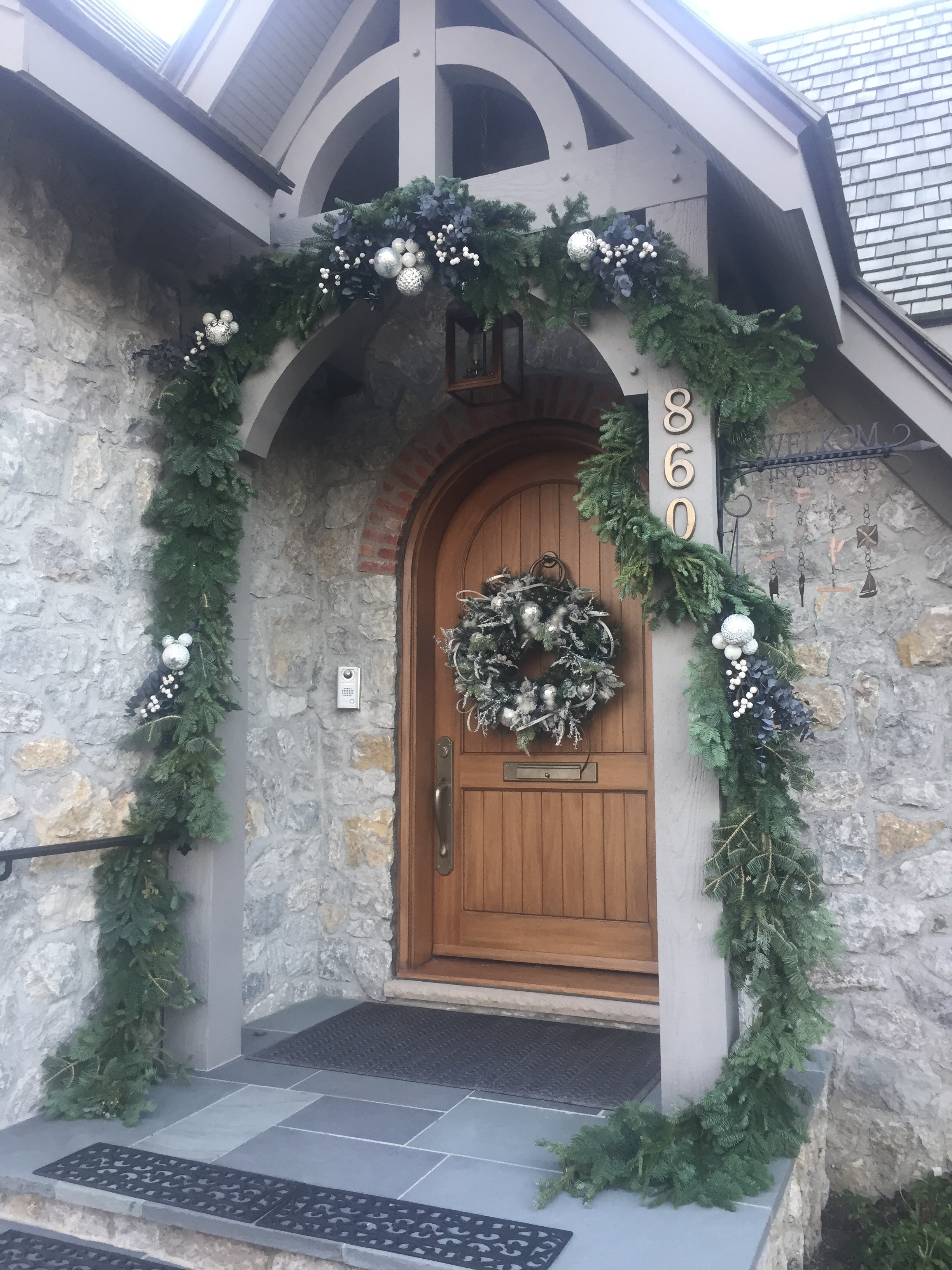 The garland is asymmetrical and quirky-appropriate to the architecture of the front door.
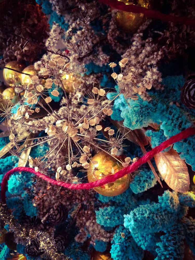
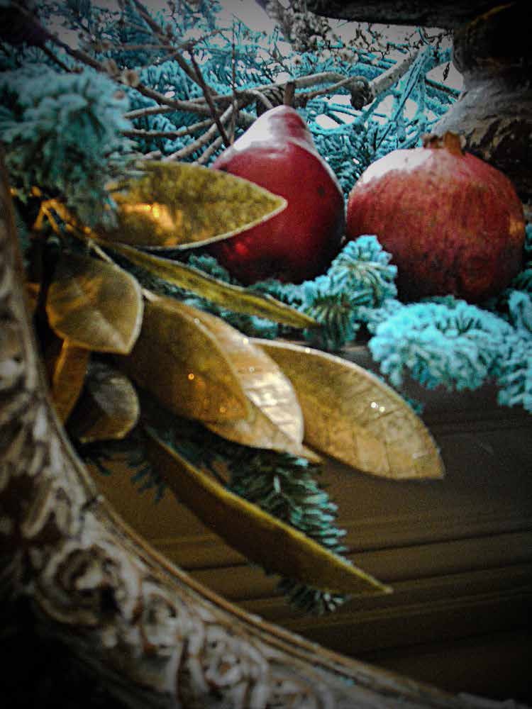
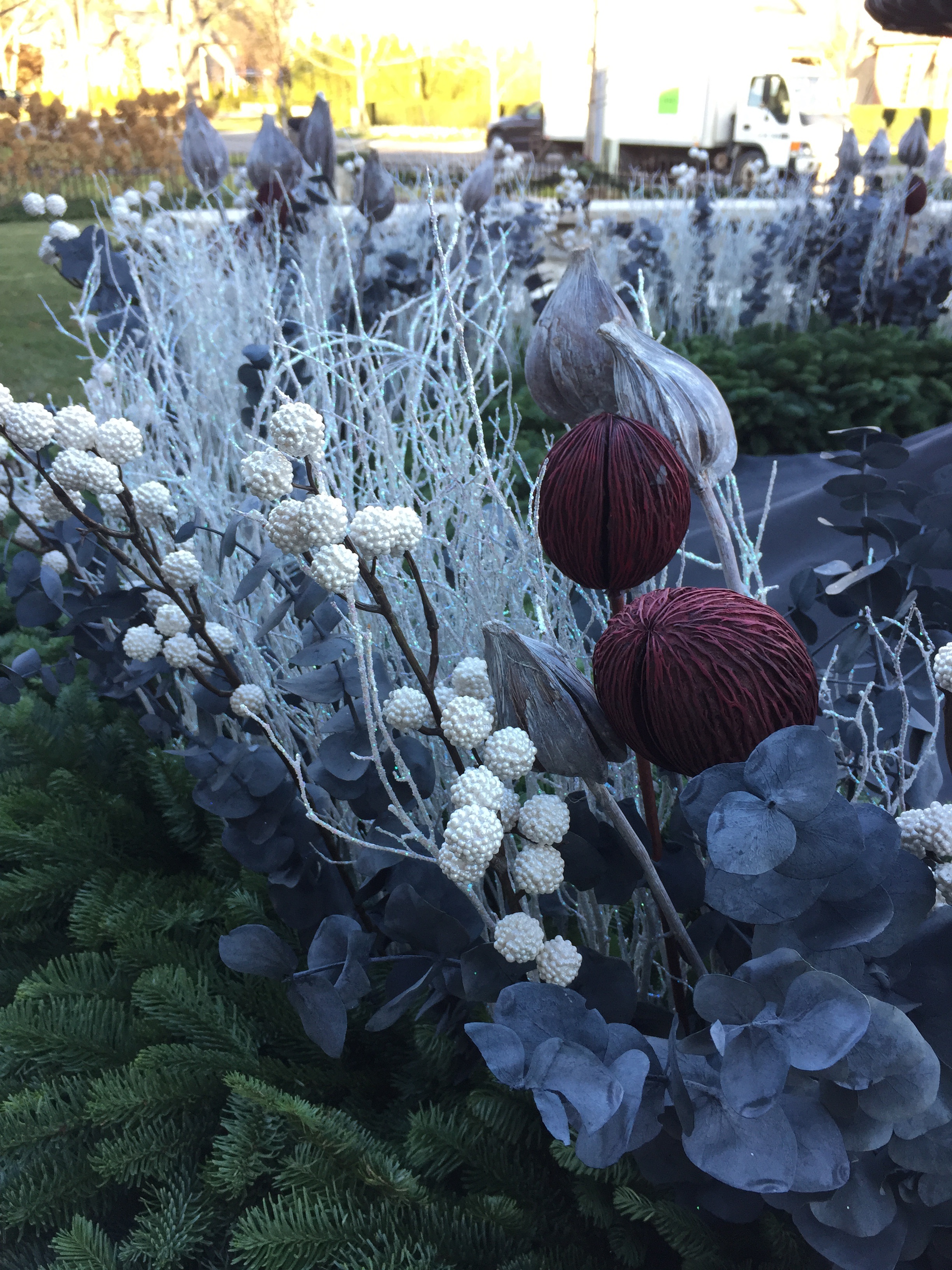
 The front yard fountain had 5 curved Branch lattice boxes surrounding it. We plant those boxes for every season. For holiday and winter, we stuffed each box with noble fir, with a center ring of sparkly white picks, gray pod picks-and a dash of merlot dyed pods.
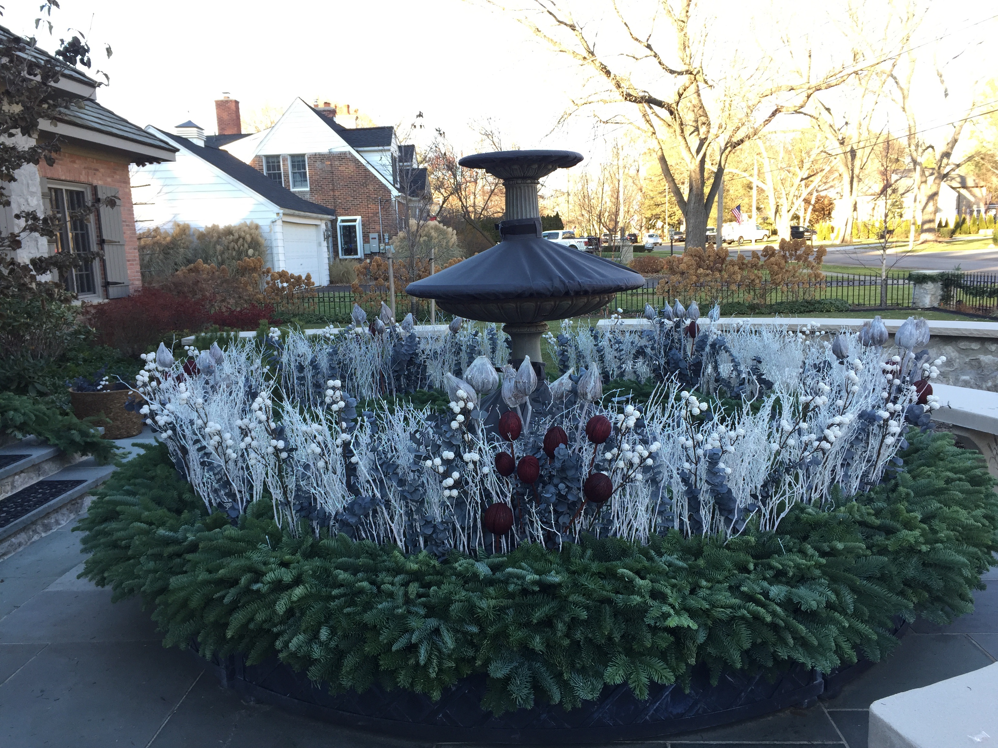 The fountain is shut don for the winter, but the surrounding planters make a big statement about the holiday, and the winter to come.
 Though I would have never imagined a holiday decor scheme with white, gray, and a splash of maroon red, I was delighted by the outcome.
 My client is a serious gardener, through and through. This arrangement in white, gray and maroon per her holiday color scheme is my best effort to represent her relationship with the garden at the holidays.
 Though this color scheme for the holiday is a first for me, I quite like the outcome.
 The big idea here? Be confident in every idea you have about your garden. Or your holiday or your winter. Turn your imagination loose.
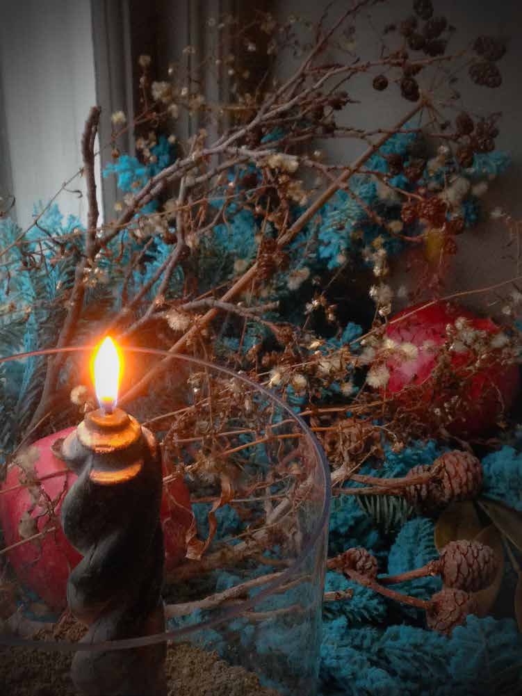
 This late day November sun yesterday set the centerpiece of this winter pot on fire. Love the fire.